Keys To An Accessibility Mindset

Email Newsletter
Weekly tips on front-end & UX.
Trusted by 182,000+ folks.
 Register for Free
 Custom Web Forms for Angular, React, & Vue. Your backend.
 Celebrating 10 million developers


How many times have you heard this when asking about web accessibility? “It’s something we’d like to do more of, but we don’t have the time or know-how.”
From a broad perspective, web accessibility and its importance are understood. Most people will say it’s important to create a product that can be used by a wide array of people with an even wider range of needs and capabilities. However, that is most likely where the conversation ends. Building an accessible product requires commitment from every role at every step of the process. Time, priorities, and education for all involved, so often get in the way.
Performing an accessibility audit can cost a lot of time and money. The results can cost even more with just design, development, and QA (Quality Assurance). An audit becomes even more expensive when considering the other heavy investment. For every role, the learning curve for accessibility can be steep.
There’s so much nuance and technical depth when learning about web accessibility. It’s easy to feel lost in the trees. Instead, this article will take a look at the forest as a whole and demonstrate three keys for approaching accessibility naturally.
The POUR Principles of Web Accessibility
It may sound too simple, but we can break web accessibility down into four core principles: Perceivable, Operable, Understandable, and Robust. These principles, known as POUR, are the perfect starting point for learning how to approach accessibility.
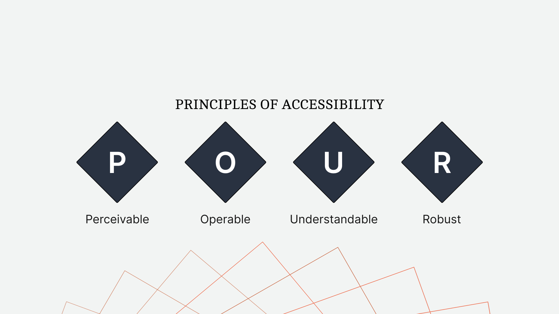
Perceivable
What does it mean for content to be perceivable?
Let’s say you’re experiencing this article by reading it. That would mean the content is perceivable to people who are sighted. Perhaps, you’re listening to it. That would mean the content is perceivable by people who engage with content audibly.
The more perceivable your content is, the more ways people can engage with it.
Common examples of perceivable content would be:
- Images with alternative descriptive text,
- Videos with captions and/or subtitles,
- Indicating a state with more than just color.
A terrific real-world example of perceivable content is a crosswalk. When it is not safe to cross the street, there is a red icon of a standing figure and a slow, repeating beep. Then, once the streetlights change and people can cross safely, the icon changes to a green figure walking, and the beeping speeds up. The crosswalk communicates with understandable icons, colors, and sound to create a comprehensive and safe experience.
Operable
Operable content determines whether a person can use a product or navigate a website.
It is common for the person developing a product to create one that works for themselves. If that person uses a mouse and clicks around the website, that’s often the first, and sometimes the only, experience they develop. However, the ways for operating a website extend far beyond a traditional mouse and keyboard.
Some important requirements for operable content are the following:
- All functionality available by mouse must be available by the keyboard.
- Visible and consistent keyboard focus for all interactive elements.
- Pages have clear titles and descriptive, sequential headings.
Understandable
What good is creating content if the people consuming it can not understand it?
Understandable content is more than defining acronyms and terms. A product must be consistent and empathetic in both its design and content.
Ways to create an understandable experience would include:
- Defining content language(s) to allow assistive technologies to interpret correctly.
- Navigations that are repeated across pages are in the same location.
- Error messages are descriptive and, when possible, actionable.
In Jenni Nadler’s article, “When Life Gives You Lemons, Write Better Error Messages”, she describes her team’s approach to error messaging at Wix. With clear language and an empathetic tone, they’ve created a standard in understandable messaging.
Robust
In a way, many of us are already familiar with creating robust content.
If you’ve ever had to use a compiler like Babel to transpile JavaScript for greater support, you’ve created more robust content. Now, JavaScript is just one piece of the front end, and that same broad, reliable approach should be applied to writing semantic HTML.
Ways to create robust markup include:
- Validating the rendered HTML to ensure devices can reliably interpret it.
- Using markup to assign names and roles to non-native elements.
The POUR principles of web accessibility lay a broad (if a bit abstract) foundation. Yet, it can still feel like a lot to consider when facing roadmaps with other priorities. This depth of information and considerations can be enough to turn some people away.
Web accessibility is not all or nothing.
“
Even small improvements can have a big impact on the accessibility of a product. In the same way software development has moved away from the waterfall approach, we can look at web accessibility with the same incremental mindset.
Even so, sometimes it’s easier to learn more about something you already know than to learn about something anew. At least, that’s what this entire article relies upon.
With slight adjustments to how we approach the design and development of a product, we can create one that more closely aligns with the POUR principles of accessibility but in a way that feels natural and intuitive to what we already know.
Keys To An Accessibility Mindset
There’s a lot to learn about web accessibility. While the POUR principles make the process more approachable, it can still feel like a lot. Instead, by applying these keys to our approach, we can dramatically improve the accessibility of a product and reduce the risk of exhaustive refactors in the future.
Markup Must Communicate As Clearly As The Design
When working from a design, it’s common to build what we see. However, visual design is only one part of creating perceivable content.

Let’s consider the navigation of a website. When a person is on a specific page, we highlight the corresponding link in the navigation with a different background color. Visually, this makes the link stand out. But what about other methods of perception?
The content becomes more perceivable when its markup communicates as clearly as its design.
When dealing with the navigation, what exactly are we communicating with the contrasting styles? We’re trying to say, “this is the page you’re on right now.” While this works visually, let’s look at how our markup can communicate just as clearly.
<a aria-current="page" href="/products">Products</a>
By setting aria-current="page" on the anchor of the current page, we communicate with markup the same information as the design. This makes the content perceivable to assistive technologies, such as screen readers.
In this demo, we’ll hear the difference perceivable markup can make.
See the Pen [Indicate The Current Page - Keys To An Accessibility Mindset [forked]](https://codepen.io/smashingmag/pen/XWPXmGQ) by Daniel Yuschick.
Note: As a bonus, instead of creating an .active class to style the navigation, make your styles more resilient and reflective of the HTML state by using the [aria-current='page'] selector.
The active page of navigation is just one minor example of perceivable content. The idea of this article is not to focus on the markup specifically. Instead, we want to focus on how to think about the development process in a way that leads to accessible content.
When building out a design, though, how can we identify areas that will probably need additional layers of perceivable markup?
- When the design visually communicates the state,
For example, active navigation page, active tab, loading, disabled. - When information is outside the flow of content,
For example, toast messages, dialogs, popover menus, error messages, and tooltips. - When content is dynamic/live,
For example, notifications, chat windows, tabbed content, and immediate attention alerts. - When recreating standard elements,
For example, progress bars, accordions, and select menus.
Of course, we can preface this all with a big ol’ it depends, but these categories can define a great baseline. To show this further, let’s look at another example.
We’re used to engaging with live data, like friend requests and chat messages. If a notification is important enough to be communicated visually, it’s important enough to be communicated in other ways, too.
In the following live notification demo, we’ll hear the difference perceivable markup can make.
See the Pen [Live Notifications - Keys To An Accessibility Mindset [forked]](https://codepen.io/smashingmag/pen/LYJGpwp) by Daniel Yuschick.
While some people may see the notification bubble, using perceivable markup ensures that we communicate the same information in multiple ways.
It’s important to note that while many people benefit from perceivable markup, it does not take away from those who do not. This is not a matter of prioritizing some over others. It’s about providing a consistent experience for all.
Of course, perceivable content is only one of the POUR principles. But a person can’t often consume content if it’s not operable first. This leads to the second key to an accessibility mindset.
Markup Is Functional, Not Visual
The beautiful thing about design is its ability to transform basic tasks into appealing design languages. However, the way something looks is not always indicative of how it works.
Ensuring all the content functions as expected is required for an operable experience.
“
HTML is a functional language, while CSS is its visual counterpart. Therefore, the HTML for an element should be relative to its functionality, not its appearance. This will help enforce the previous key, that markup communicates as clearly as design, and define a baseline of accessibility from the start.
Let’s return to the example of website navigation.
Even though navigation items often look like buttons, we understand that they function as links or anchors instead. This is the perfect example of marking up an element based on its function and not its appearance.
When using an anchor tag, we receive several expected functional benefits by default. The anchor will support keyboard focus. Hovering or focusing on an anchor will reveal the URL to preview. Lastly, whether with a keyboard shortcut or through the context (right-click) menu, a link can be opened in a new window or tab.
If we marked up a navigation item like it appeared, as a button, we would lose the last two expected behaviors of anchor tags. When we break the expectations of an element, accessibility will suffer the most.
The following demo highlights the functional differences when using the a, button, and div elements as a link. By navigating the demo with our keyboard, we can see the differences between each variation.
See the Pen [Links and Buttons - Keys To An Accessibility Mindset [forked]](https://codepen.io/smashingmag/pen/jOvWWOv) by Daniel Yuschick.
One of the worst but most common examples of inoperable content is using a div instead of an interactive element. A reliable rule is not to style a div to be used as a button or link. It is better to use the semantic element instead.
But what happens when the design requires more than the native HTML element can support? This is a common problem with progress bars and select menus. But when functional markup cannot meet the design requirements, we must shift from an operable approach to a perceivable one — markup must communicate as clearly as the design.
In the following demo, we will compare different variations of a progress bar and how those variations communicate with assistive technologies.
See the Pen [Progress Bars - Keys To An Accessibility Mindset [forked]](https://codepen.io/smashingmag/pen/KKxVVwG) by Daniel Yuschick.
Functional markup will often lead to a more accessible experience. You can hear this in the demo as the screen reader reaches the final progress bar, built with the progress element. But the progress element has its styling limitations.
When we cannot use functional elements, we must create perceivable ones.
We built the first progress bar in the demo without perceivable markup. So the screen reader cannot access it and instead reads out “25 percent” with no context. This doesn’t provide much value to a person. However, assistive technologies can reach the second progress bar, which has perceivable markup and provides context to its value.
To ensure content is operable, we must write markup based on the function of the element, not its appearance. When the functional element is too limited or does not exist, we must return to our first key and build perceivable content.
Use More Than Color To Indicate State
Sometimes, to create a clean design, we’ll exclude valuable elements. We can see this anytime an application’s focus rings are removed. Not only should our markup be perceivable, but our designs should be, too. We can do this by indicating information with more than just color.
Consider the following example taken from a recent flight. At first glance, can you tell which measurement system is active?

Without first looking at the altitude and ground speed values, I couldn’t tell which system was active. Maybe the imperial option was active since it was the same color as the data. But maybe the metric option was active because it was a different color.
While it may take us a moment to figure out which option is active, it’s an unnecessary one caused by indicating a state with only color.
In the following mockup, we underline the active option and increase its font weight. With these details, it’s now easier to understand the active state of the screen.

So much of creating perceivable content comes down to communicating in layers. When we write perceivable markup, we’re creating an extra layer of information. Designing is no different. If we indicate a state with only color, that’s one layer. When we add an underline and font weight, we add additional layers of communication.
People learn and experience in different ways. Consider a book that has an audio version and a movie adaptation. Some people will read the book. Others will listen to it. Others still will watch the movie. When we communicate in layers, more people benefit.
Review
Most people will agree that web accessibility is important. But they will also agree that it can be difficult. With so many combinations of hardware and software and so many nuances with each, accessibility can feel overwhelming.
It’s easy to become lost in the weeds of code samples and articles trying to help. One article may suggest an approach, while a second article suggests another. If we’re not able to test each scenario ourselves, it can often feel like guessing. Guessing can be disheartening, even discouraging. It can turn people away from accessibility.
Instead, we can have a dramatic impact on the accessibility of our work by not focusing on specific details but by adjusting how we approach a design from the start. One of the most challenging areas of accessibility is knowing when and where it’s needed. With the keys to an accessibility mindset, we can identify those areas and understand what they need. We may not know how to provide a perceivable or operable experience, but it’s easier to find the answer when you understand the question.
I should note, though, that applying these keys will not ensure your work is accessible. Will it make a positive impact? Yes. But accessibility extends far beyond design and development. For as long as a product is changing, a commitment to accessibility must remain at every step and in every role, from leadership on down.
Ensuring markup communicates as clearly as its design will help provide perceivable content. Writing functional markup instead of visual will help make that content operable. If the functional markup cannot be styled, then return to the first key, and make it perceivable.
Remember, creating an accessible experience for some doesn’t take away from others.
If we think back to the crosswalk example, who are some people who benefit from their design? Of course, those who are blind, even partially, can benefit. But what about a person looking down at their phone? The audible cue can grab their attention to let them know when it’s safe to cross. I’ve benefited from crosswalks in this way. How about a parent using the lights to teach their child how to cross? Everybody can benefit from the accessible design of a crosswalk. Of course, if a person wants to cross when they feel comfortable, regardless of the state of the crosswalk, they can. The accessible design does not prevent that experience. It enables that experience for others.
Accessible design is good design, and it all starts with our mindset.
Resources
- Keys to an Accessibility Mindset Collection on CodePen
- “When Life Gives You Lemons, Write Better Error Messages”, Jenni Nadler
 (yk, il)

