Free Fonts For Interface Designers

Email Newsletter
Weekly tips on front-end & UX.
Trusted by 182,000+ folks.


 Celebrating 10 million developers
 Custom Web Forms for Angular, React, & Vue. Your backend.
Not every project has the budget to spend a lot of money on fonts. But that doesn’t mean that typography needs to play a secondary role when the budget is tight. The variety and quality of free and open-source fonts out there is impressive and enables everyone to use beautiful, well-crafted typefaces.
In this post, we compiled some free fonts that we came across and that you probably haven’t spotted before. Some of them shine with their flexibility, some put a special focus on readability, and others are a great choice if you want to make a bold statement. As different as the fonts are, they all have one thing in common: You can use them for free in both personal and commercial projects. A huge thank-you to the wonderful type designers and contributors for making their fonts available to all of us! 👏🏼👏🏽👏🏾
Recursive
Built to maximize versatility, control, and performance, Recursive is a five-axis variable font that can go from Sans to Mono. Taking full advantage of variable font technology, it gives you full flexibility.
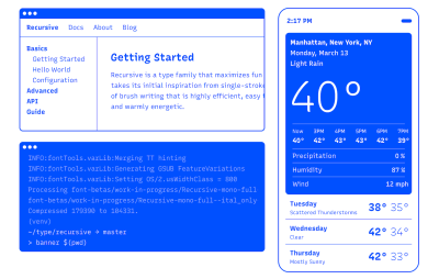
Recursive allows you to choose from a wide range of predefined styles or dial in exactly what you want for each of its axes: Monospace, Casual, Weight, Slant, and Cursive. Inspiration came from single-stroke casual signpainting to give the font a flexible and warmly energetic look, making it a great fit for data-rich-apps, technical documentation, code editors, and much more. Designed by Stephen Nixon, with contributions from Lisa Huang, Katja Schimmel, Rafał Buchner, and Cris R Hernández.
Yrsa & Rasa
The type families Yrsa and Rasa have a different approach than other type projects. They build upon the existing typefaces Merriweather and Skolar Gujarati to produce two entirely new type families that span different writing systems.
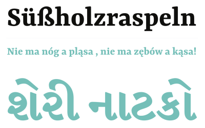
Yrsa supports over 92 languages in Latin script and has a special focus on properly shaping the accents in Central and East European languages. Rasa supports a wide array of basic and compound syllables used in Gujarati. Both type families include five weights and are intended for continuous reading on the web. Perfect for longer articles in online news, magazines, or blogs. Designed by Anna Giedryś and David Březina.
Space Grotesk
Space Grotesk is a proportional sans-serif typeface variant based on Colophon Foundry’s fixed-width Space Mono family. It retains the idiosyncratic details of the monospace while optimizing for improved readability of non-display sizes.
Space Grotesk includes four weights and open-type features like old-style and tabular figures, superscript and subscript numerals, fractions, and stylistic alternates. Latin Vietnamese, Pinyin, and all Western, Central, and South-Eastern European languages are supported. Designed by Květoslav Bartoš for Florian Karsten Typefaces.
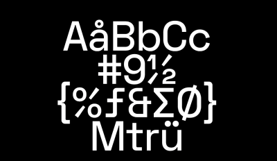
Figtree
Figtree combines friendly curved shapes, a simple monolinear construction, a high x-height, and slight taper into a charming geometric typeface that ensures maximum readability.
Figtree comes in seven weights, ranging from Light to Black, and includes typographic finesses such as fractions, monospace numbers, and scientific inferiors. Minimal but not stiff, casual but not silly, the typeface beautifully manages to maintain a crisp, clean feeling. Designed by Erik Kennedy.
Reforma
Reforma is a versatile font family designed for long-form reading. Commissioned to celebrate the centenary of the university reform of the Universidad Nacional de Córdoba, Argentina, the typeface had to convey four premises: plurality, intellectual heritage, versatility, and free availability.
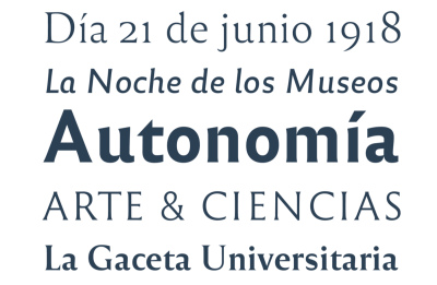
After three years of work, 20 font styles were born that work harmoniously in different contexts. They are grouped into three subfamilies — from a classic serif to a modern sans-serif and an intermediate hybrid style with flare serifs — and are available in three weights plus an ultra-black companion set for headings. Reforma beautifully manages to strike the balance between tradition and novelty while staying super-versatile. Designed by Alejandro Lo Celso, Jorge Ivan Moreno Majul, Francisco Galvez Pizarro, Francis Ramel, and Oscar Yañez.
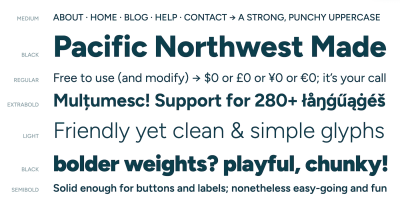
Hanken Grotesk
If you’re looking for a versatile sans-serif typeface inspired by the classic grotesques, Hanken Grotesk might be right down your alley. It shines with a friendly, distinguishable look and is equally suitable for small text and headings.
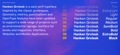
Nine weights are available, ranging from Thin to ExtraLight, Light, Regular, Medium, SemiBold, Bold, ExtraBold, and Black. Each weight comes with matching italics. A modern classic designed by Alfredo Marco Pradil.
Grenze
Grenze combines the best of two worlds. As a hybrid between Roman and Blackletter styles, it transports a sense of boldness and texture while at the same time offering the readability of classical typefaces.
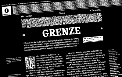
The family includes nine weights (Thin, Extra Light, Light, Regular, Medium, Semibold, Bold, Extra Bold, and Black) with matching italics. To respond to different needs, Grenze comes with some useful advanced features such as ligatures, ornaments, extended language support, and various figure sets. Designed by Renata Polastri and the Omnibus team.
Fira Sans
Originally designed as a system font for Mozilla’s FirefoxOS, the humanist sans-serif Fira Sans grew into a versatile open-source typeface that stays readable across screen qualities and sizes.
Fira Sans is available in 18 styles, including nine weights and accompanying italics. The package also includes a mono-spaced variant. Designed by Carrois Apostrophe in cooperation with Erik Spiekermann.
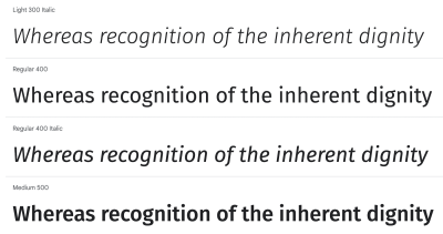
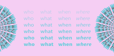
Atkinson Hyperlegible
Certain letters and numbers can be hard to distinguish from one another for low-vision readers. Atkinson Hyperlegible is here to change that. Named after Braille Institute founder J. Robert Atkinson, the typeface focuses on letterform distinction to increase character recognition and improve readability.
Recognizable footprints, differentiated letterforms, unambiguous characters, and exaggerated forms are some of the techniques that optimize readability and give the typeface its distinctive look. Atkinson Hyperlegible includes four fonts, with two weights (Regular, Bold, Italics, Italics Bold). Thanks to accent characters, 27 languages are supported. Designed by Braille Institute of America.
Anek
The multi-script typeface Anek tells a very special story. It covers nine Indian languages plus Latin and was created through a collaboration of twelve type designers working across eight cities in India. The design of each script is deeply rooted in its typographic culture, while the different scripts live together in visual harmony.
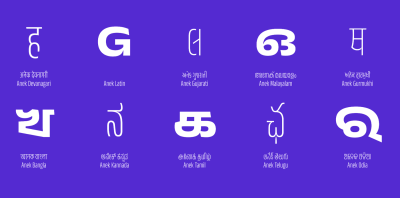
All Anek fonts share visual similarities like circles and circular shapes, robust letter structures, and delicate joineries. With 40 styles per set, Anek is one of the few Indian variable display fonts with such a large set of weight and width styles. Designed by Sarang Kulkarni, Girish Dalvi, Noopur Datye, Hanif Kureshi, Maithili Shingre, Yashodeep Gholap, Divya Kowshik, Aadarsh Rajan, and Shuchita Grover.
Source Sans
Designed by Paul D. Hunt, Source Sans is Adobe’s first open-source typeface family. The sans-serif draws inspiration from classic grotesques and is characterized by a visual simplicity that works equally well in long-form texts just like as short labels in user interfaces.
Source Sans comes in six weights (ExtraLight, Light, Regular, SemiBold, Bold, Black) plus matching italics. The fonts offer wide language support for Western and East European languages, Vietnamese, Pinyin romanization of Chinese, and Navajo. A modern classic.
Beattingvile
If you’re looking for a font to give your project a personal, hand-made touch, Beattingvile by Garisman Studio is worth checking out.
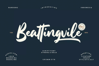
The multilingual script font features stylistic alternates, swashes, and ligatures and is perfect for all projects where you want to make a statement that is a bit bolder. Perfect for headings, branding, label design, logo type, quotes, and much more — both on screen and in print.
Disket Mono
Monospace fonts often have a technical feel to them, waking connotations of coding editors or typewriters. Disket Mono is a bit different. The font strikes a perfect balance between the inspiration it draws from geometry, grids, and architecture and using soft corners for a more tactile, personal feel.
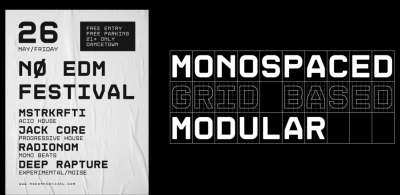
Disket Mono comes in two weights (Regular and Bold) and supports twenty languages. A beautiful display font, designed by Mariano Diez.
Srbija Sans
Srbija Sans is a neo-grotesque sans-serif typeface with a geometric look. It gets by without any decorative details, but when you look more closely, you’ll notice how small design decisions improve readability and give the clear shapes a warm and natural touch.
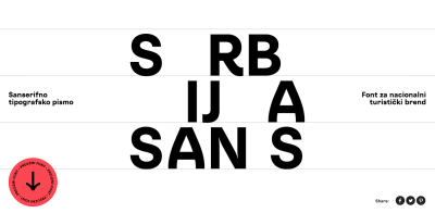
The typeface includes 315 glyphs, supporting Latin and Cyrillic, and featuring accents and ligatures, mathematical symbols, and currencies. Srbija Sans was designed by Vedran Eraković and Studio Metaklinika for the National Tourism Organisation of Serbia.
The League Of Moveable Type
The League of Moveable Type opened its doors back in 2009 when designers were just gaining the ability to put custom fonts on the web. The project’s mission has stayed the same since day one: to raise the design standards of the web.
Micah Rich, maintainer of the foundry, cares deeply about good typography and empowering everyone with great design skills. That’s why the catalogue only features carefully-picked open-source fonts — 17 at the moment. You can use them for free however and wherever you want.
Google Fonts
It’s certainly not an insider’s tip but always a great place to look for free fonts: Google Fonts. The library features more than 1,400 open-source font families for more than 135 languages, plus icons for common actions and items.
By the way, if you want to dive deeper into the principles of typography or delve into all of the artistic and technical aspects of modern typesetting and font technology, the Google Fonts Knowledge library is a treasure chest of typography wisdom.
Wrapping Up
Do you have a favorite free font that isn’t listed in the post? Let us know in the comments below. We’d love to hear about it!
Useful front-end & UX bits, delivered once a week.
With tools to help you get your work done better. Subscribe and get Vitaly’s Smart Interface Design Checklists PDF via email. 🎁
On front-end & UX. Trusted by 182,000+ folks.


