The Potentially Dangerous Non-Accessibility Of Cookie Notices
No matter what your stance is on them, no matter what your perspective is on data protection, web advertisement, setting cookies, EU’s General Data Protection Regulation (GDPR), and privacy preferences, cookie consent widgets (or “cookie banners”) are a reality on the web today.
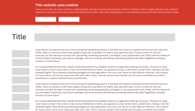
For this reason, it is worth looking into how accessible and usable these banners are or can be. They have become, for better or worse, a component of the majority of today’s websites. Even more, cookie banners are often the first thing a user encounters. And, of course, they are part of every site of a webpage once they are implemented.
Sometimes, cookie banners are a technical necessity because of the page’s feature set or because of advertisements on the page. Even more often, cookie banners are not built by the front-end team but are a ready-made solution, like UserCentrics or others.

Before I explain why the cookie banner deserves special attention regarding its accessibility, let’s quickly explain how the current gold standard of web accessibility, Web Content Accessibility Guidelines (WCAG) Version 2.1, works.
WCAG consists of principles, guidelines, and success criteria. The latter are testable steps to check against a webpage. For example:
- “Is the main language of the document set?”
- “Does this non-text content have a suitable text alternative?”
- “Is it perceivable where my focus is when I’m using the web presence with the keyboard (or another tech that emulates keyboard presses)?”
You may have noticed that these are “yes or no” questions. Accordingly, this means that the final verdict of any given success criterion is either “pass” or “fail.”
Additionally, conformance to WCAG, as defined by the W3C (the governing body of the Web), means that none of its success criteria is allowed to “fail” when the whole document needs to be conformant:
“Conformance to a standard means that you meet or satisfy the ‘requirements’ of the standard. In WCAG 2.0, the ‘requirements’ are the Success Criteria. To conform to WCAG 2.0, you need to satisfy the Success Criteria, that is, there is no content which violates the Success Criteria.”
— W3C Working Group Note
No nuance here. Going back to our cookie consent interface, this means that the banner (or any other component) alone has the potential to negatively affect the WCAG conformance of an entire web project.

WCAG conformance could be a big legal deal for many websites, whether part of the public sector in the European Union or the United States, as it is considered to fall under non-discrimination or market access laws or overall human rights to access to information. Webpages frequently must adhere to directives and regulations that directly or indirectly refer to WCAG, often its newest version, and conformance to its level AA standards. Therefore, all the following WCAG criteria are viewed through this lens, being fully aware that they are only a mere starting point when it comes to true web accessibility. On top of that, cookie consent interfaces are implemented on every subpage of a website, consequently harming accessibility and conformance throughout an entire website.
So, in order to not let a faulty cookie banner interface drag down your page’s conformance with accessibility laws and, more importantly, not exclude users from accessing and exercising their rights, let’s list what to look for, what to configure, and what to build properly in the first place.
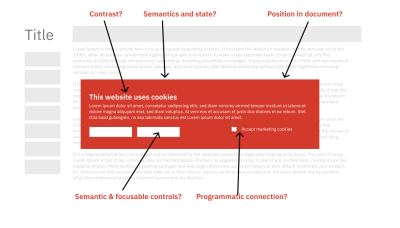
Contrast Errors
This is especially relevant when it comes to important controls such as the setting of cookies or the overall acceptance of the recommended cookie set. It is crucial that form controls and text can be sufficiently perceived. Unsurprisingly, a solid contrast is also important for WCAG in general. Namely, in success criteria 1.4.3 and 1.4.11, both define contrast boundaries.
What To Do
When you are using a ready-made cookie management solution, try to influence the colors (if possible, potentially in your cookie vendor’s settings) and make sure interactive controls have sufficient color contrast.
Additionally, if your website relies on a dedicated contrast mode for WCAG conformance, check whether it extends to (or influences) the cookie management interface. I have seen cases in my accessibility auditor practice where this was not considered, and an inaccessible (often branded) color combination was used in the cookie interface, thinking the contrast mode takes care of every color-related violation. But the contrast setting of the website did not affect the third-party cookie banner due to it being, well, third-party and loaded from external sources or after the contrast mode had done its work, resulting in a “Fail” on WCAG’s contrast-related success criteria.
Pseudo Buttons
Another cookie banner issue can be one thing that is, unfortunately, an error pattern that you can find outside of cookie management: divs or spans with click events posing as links or buttons. These controls may be styled like buttons but lack the semantic information of a button.
On top of that, these controls usually aren’t keyboard focusable. Hence, many serious barriers and WCAG violations are occurring all at once. If we were about to imagine the most “pseudo” button, e.g., a div with a click handler, this would at least violate success criteria 2.1.1 (Keyboard), because it is neither reachable nor “activatable,” and 4.1.2 (Name, Role, Value) because it doesn’t “introduce” itself as a button and lacks a programmatic label.
What To Do
The easiest thing to do, assuming you have built the cookie management interface yourself, is to replace those above-mentioned pseudo buttons with real <button> elements because it provides semantics, focusability, and even keyboard event handlers for free. But even if we don’t talk literally about buttons, the pattern is the same: check your cookie prompt for interactive elements that are built with elements that are only styled to look like “the real thing” but consist of non-semantic divs and spans. This is a red flag for you to implement native interactive elements, like a, button, or input instead.
The situation gets a lot tougher, of course, when these semantic errors are in a third-party script and are, therefore, beyond your direct influence and control. Understandably, we have to leave the engineering side of things and start to dive into politics of some sort. If you work within an organization where the decision of cookie management infrastructure is outside your control, you have to escalate matters to your supervisors and managers (especially, but not only when your web projects have to adhere to accessibility laws).
Three abstract steps have to happen:
- Your organization has to become aware of the barrier and potential legal risk — “up” to the powers that have the influence to change technical decisions like these.
- As a consequence, the vendor that provided the faulty cookie banner has to be contacted about the issue.
- A form of pressure should be applied by your organization — not just for your own sake but also regarding all the other web pages where the faulty cookie banner negatively influences accessibility and conformance.
In a possible fourth step, your company or agency should reflect on its vending process for third-party services and the HTML (and possible barriers) that come with it.
Unlabeled Form Fields
When you think about it, the main user control that one could imagine for cookie management widgets is a form control: You can select which set of cookies you are willing to accept by interacting with checkboxes in a form element. And, of course, it is important that checkbox inputs are built in the correct way.
Alas, that is not always the case. While a checkbox and its label may visually appear adjacent, the checkbox can lack a programmatic label. This adds unnecessary confusion and barriers to the interface and also a failure of success criterion 1.3.1 when you look into the web accessibility standard.
What To Do
The most solid strategy to connect form inputs with their corresponding labels is to:
- Use a
labelelement for the label (obviously). - Establish an
idon the respective input you want to label. - Add a
forattribute, filling it with the control’sidyou created in the last step.
This also works for inputs of all types, like textareas and selects. Here’s an example of how a properly labeled checkbox could look:
<input type="checkbox" id="marketing-cookies" />
<label for="marketing-cookies">Accept marketing cookies</label>
If you can’t directly influence the HTML of the cookie banner’s code, the situation is comparable to the situation around pseudo buttons. Make sure that necessary pressure is applied to your cookie service provider to fix the problem. All of their customers will thank you for it, and even more so the people who visit their sites.
Broken Dialog Semantics (Or None At All)
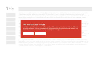
Quite a few cookie banners are actually cookie dialogs, and of the modal kind. Modal, in the context of a dialog, means that such a window blocks everything but itself, leaving only itself accessible. That is, at least, the theory. But quite some cookie management dialogs do “want to be as aggressive,” presenting as a modal part of the interface but have no according semantics and behavior, which would violate WCAG success criterion 4.1.

What To Do
Up until recently, the recommendation was to build a dialog with WAI-ARIA roles and states and implement focus management yourself (or use Kitty Giraudel’s great a11y-dialog) component).
But the situation has (mostly) changed for the better. Lately, the native <dialog> element has matured to the point where it’s being recommended in most contexts as long as it is used reasonably. A great win for accessibility, in my opinion. The past way of building (modal) dialogs had so many moving parts and factors (roles, states, focus behaviors) to think about and implement manually that it was quite difficult to get it right. Now creating a dialog means using an aptly-named HTML element (and initializing it with .showModal() if you think the cookie dialog needs to be interface-blocking).
What I’ve written so far is, of course, also valid when you cannot influence a third party’s code, and what I wrote earlier about comparable situations and potential cookie consent barriers is valid as well. If you detect errors in the third-party script you are implementing (such as no focus trapping, no dialog role, no aria-modal="true" — and if everything else points towards “modalness”), escalate things internally and educate the decision-making powers about web accessibility consequences. Maybe even educate the third-party developers that things concerning modals have gotten a lot better recently.
Cookie Banners Are Hard To Find In The First Place
There are three typical places where you can usually find cookie consent interfaces, at least visually:
- As a modal dialog, i.e., in the middle or — more rarely — corners of the viewport;
- On top, sometimes in a fixed manner;
- At the bottom of the viewport, sometimes also somewhat positioned in a fixed way.
But what matters way more for some people is how easy it is to find, should they go on a hunt for it. A great way of presenting this very problem is a presentation that accessibility specialist Léonie Watson gave some time ago. Léonie is a seasoned screen reader user, and her presentation showcases a bunch of webpages and how the placement and “findability” of cookie banners influence the screen reader experiences, particularly as it is related to privacy. Hampering the ability to find important content in a document can, for example, negatively affect WCAG 1.3.2 (Meaningful Sequence).
What To Do
In Léonie’s presentation, the best practices for cookie notice findability become very clear, especially in the last example:
- Place the banner preferably at the top of the document.
- Use a headline in the cookie banner and make it either visible or visually hidden to help screen reader users “get a grasp about the webpage” and allow them to navigate by headings.
- Build a bridge back to proper dialog semantics by making sure that if a dialog is meant to be the “exclusive” part of the interface, it uses appropriate semantic and state descriptions (see above for details).
When we’re talking about changing third-party code, I reckon you know the drill by now. Try to influence this code indirectly on the “political level” because direct control is not possible.
Conclusion
Hopefully, two things emerged while reading this article:
- Awareness of the issue, namely, that an often unloved stepchild interface element has the potential to make it harder for some people to manage their privacy settings and, on top of that, to even pose a legal risk.
- A sense of how you can possibly remediate barriers you encounter when working with a cookie management banner. The direct way is described in a certain detail in the details I provided earlier and often has to do with code, styling, or overall education on how to prevent this in the future. The indirect way leads to a path of either setting the consent interface up properly or influencing the inner and outer politics of your vendor scripts. And again, there is the aspect of educating everyone involved. This time, structured information may be aimed at the powers that be in your organization, showing them that their choice of service providers may have unintended consequences.
But regardless of whether you and your team manage to fix accessibility bugs directly or indirectly in your cookie consent interfaces, you can see their ubiquity and component architecture as an advantage. By getting the accessibility right in one place, you influence many other pages (or even foreign websites) for the better.
If you want to extend your horizon regarding the user experience side of cookie banners and learn about how you can actually turn privacy settings into a pleasant and respectful involvement with at least EU laws, please proceed to Vitaly’s smashing read, “Privacy UX: Better Cookie Consent Experiences”.
Further Reading On SmashingMag
- “State Of GDPR In 2021: Cookie Consent For Designers And Developers”, Danny Bluestone
- “A Guide To Keyboard Accessibility: HTML And CSS (Part 1)”, Cristian Díaz
- “Keys To An Accessibility Mindset”, Daniel Yuschick
- “Using Automated Test Results To Improve Accessibility”, Noah Mashni and Mark Steadman


 Register Free Now
 Celebrating 10 million developers
 SurveyJS: White-Label Survey Solution for Your JS App


