Re-Creating The Pop-Out Hover Effect With Modern CSS (Part 2)
<img> tag, and in the process, we witnessed how CSS masks, CSS variables, trigonometric functions, and @property could be combined to achieve the final result. The same techniques will be combined to create a different shape for the frame in this article. The idea is to apply the concepts in a new context and gain another view of how trigonometric functions can influence the way we mask elements in CSS.The last time we met, I demonstrated how newer CSS features — particularly trigonometric functions — can be leveraged to accomplish a “pop-out” hover effect. This is what we made together:
See the Pen [Fancy Pop Out hover effect!](https://codepen.io/t_afif/pen/qBQzrwq) by Temani Afif.
We are going to redo the demo but with a different shape. Rather than the rounded floral pattern for the frame that the avatar pops out of, we’ll make a starburst pattern instead.
See the Pen [Fancy Pop Out hover effect!](https://codepen.io/t_afif/pen/mdawrLa) by Temani Afif.
We are going to rely on the same concepts to create this effect, so you will definitely want to read the first part of this little series before continuing. This is more of an opportunity to practice what we learned in a new context. We will still use CSS masks to “draw” the shape with gradients, trigonometric functions, and custom properties.
Drawing The Shape
Creating a starburst shape is a relatively “easy” thing we can create in CSS. People have accomplished it for years with a combination of pseudo-elements with transforms. An updated approach is to use the clip-path property to draw a polygon that forms the shape.
Or, we could simply head over to my online generator to save us the time of drawing it ourselves.
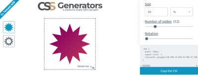
Even the rotation is possible with clip-path polygon():
See the Pen [Starburst rotating images](https://codepen.io/t_afif/pen/dywNWJp) by Temani Afif.
Unfortunately, none of these methods will help us here. In the last article, we learned that the top half of the image needs to overflow the frame in order for the “pop-out” to work. So, we had to get clever and combine mask for the frame’s bottom half and background for its top half.
That means we are unable to rely solely on a clip-path approach. Our solution will rely on mask as we did before, but this time, the mask configuration will be a little more difficult as we will work with a conic-gradient and the mask-composite property to draw the shape. The mask-composite property is probably one you don’t reach for very often, so it will be fun to put it to work on a practical example.
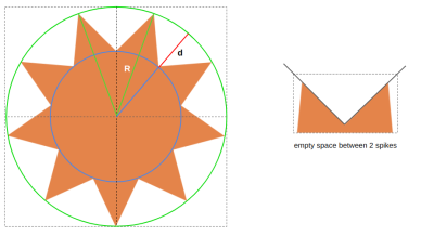
We can define the shape with three parameters:
- The number of spikes (we’ll call this
N); - The radius of the big circle, illustrated in green (we’ll call this
R); - The radius of the small circle illustrated in blue (this will be
R - d).
For the sake of simplicity, I will define d as a percentage of R — R - (R * p) — where p is a number in the range [0 1]. So, in the end, we are left with three variables, N, R, and p.
If you look closely at the shape, you can see it is a series of triangular shapes that are cut out of a large circular shape. That is exactly how we are going to tackle this challenge. We can create triangles with conic-gradient and then cut them out of the circle with the mask-composite property. Getting a circle is pretty easy using border-radius: 50%.
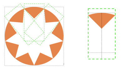
The number of conic gradients is equal to the number of triangles in the pattern. Each gradient can use nearly the same configuration, where the difference between them is how they are rotated. That means the gradient’s code will look something like this:
conic-gradient(from -1*angle at {position}, #000 2*angle, #0000 0);Thankfully, the position we calculated in the last article is similar enough to the point that we can rely on it here as well:
50% + (50% * (1 - p)) * cos(360deg * i/N)
50% + (50% * (1 - p)) * sin(360deg * i/N)
Again, N is the number of triangles, and p controls the radius of the small circle. R is equal to 50%, so the position can also be expressed like this:
R + (R * (1 - p)) * cos(360deg * i/N)
R + (R * (1 - p)) * sin(360deg * i/N)
We need to resort to some geometry to determine the value of angle. I will skip the boring math for the sake of brevity, but please feel free to leave a comment if you’re interested in the formula, and I will be glad to give you more details.
angle = atan(sin(180deg/N)/(p - 1 + cos(180deg/N)))
Now, we need to loop through all of that as many times as there are triangles in the pattern. So, we will do what we did in the last article and switch from vanilla CSS to Sass so we can take advantage of Sass loops.
The following snippet selects the one element in the HTML, <img>, and loops through the conic gradients for as many triangles we set ($n: 9). The output of that loop is saved as another variable, $m, that is applied to the CSS mask.
$n: 9;  /* number of spikes */

img {
  --r: 160px; /* radius */
  --p: 0.25;  /* percent */
  --angle: atan(sin(180deg/#{$n}) / (var(--p) - 1 + cos(180deg/#{$n})));

  width: calc(2 * var(--r));
  aspect-ratio: 1;
  border-radius: 50%;
  $m: ();
  @for $i from 0 through ($n - 1) {
    $m: append($m,
    conic-gradient(
     from calc(90deg + 360deg * #{$i/$n} - var(--angle)) at
       calc(50% + (50% * (1 - var(--p))) v cos(360deg * #{$i/$n}))
       calc(50% + (50% * (1 - var(--p))) * sin(360deg * #{$i/$n})),
      #000 calc(2*var(--angle)), #0000 0),
      comma
    );
   }
  mask: $m;
}
Here’s the result of all that work:
See the Pen [Starburst shape using CSS maks](https://codepen.io/t_afif/pen/KKbaLKQ) by Temani Afif.
Again, if the code looks complex, that’s because it is. It can be complex for a number of reasons, from understanding the conic-gradient() syntax to knowing how the mask property behaves to your comfort level working with trigonometry. Then there’s the additional layer of Sass and loops that don’t make things any easier. I’ve said before, but I will do so again: you would be doing yourself a favor to thoroughly read the previous article. The gradient configuration is less complicated in that demonstration, even though it follows the exact same structure.
Great, we have a star-like shape! We’re done. Right? Of course not. We want the inverse of what we currently have: the starburst to be filled with color. That’s where the mask-composite comes into play. We can invert the shape by excluding the triangles we created from the circle to get the starburst shape.
mask:
  linear-gradient(#000 0 0) exclude,
  $m;
We define a linear gradient that will cover the whole area by default, and we exclude it from the other gradients.
The mask property is a shorthand that combines other mask-* properties, one of which is mask-composite. So, when we declare exclude on mask, it’s really like we’re declaring mask-composite: exclude. Otherwise, our code could have looked like this:
mask:
 linear-gradient(#000 0 0),
 $m;
mask-composite: exclude, add, add, [...], add;
All of the conic gradients need to be added together and then excluded from the first layer. That means we would need to use the add keyword as many times as we have gradients. But since add is the default value for mask-composite, adding exclude in the shorthand property is less work.
In theory, mask-composite: exclude could be enough since there is no intersection between the conic gradients. Later, we will move the gradients and create intersections so having an add composition is mandatory for the conic gradients.
I know mask-composite is a convoluted concept. I highly recommend you read Ana Tudor’s crash course on mask composition for a deeper and more thorough explanation of how the mask-composite property works with multiple layers.
With this in place, we have a proper starburst shape to work with:
See the Pen [Startburst shape using CSS Mask](https://codepen.io/t_afif/pen/XWopwRQ) by Temani Afif.
Rotating The Shape
There is nothing new we need to do in order to rotate the shape on hover. In fact, we can re-use the exact same code we wrote in the previous article and combine it with a trick that slows down or speeds up the rotation on hover.
See the Pen [Rotation the shape](https://codepen.io/t_afif/pen/rNojEBN) by Temani Afif.
Creating The “Pop Out” Effect
For the “pop-out” effect, we will follow the same steps we did for the previous article. First, we will update the mask to maintain only the bottom portion of the starburst frame. Remember, the avatar needs to overflow from the top, so we need the bottom half of the starburst to stack in front of the avatar while the top half stacks behind the avatar.
mask:
  linear-gradient(#000 0 0) top/100% 50% no-repeat,
  linear-gradient(#000 0 0) exclude,
  $m;
I am adding a linear gradient that covers the top half area of the image, exactly like we did in the previous article. In the following demo, you can see how the bottom half of the starburst is still intact while the top half sits behind the avatar as a semi-circle for the time being.
See the Pen [Removing the top portion of the mask](https://codepen.io/t_afif/pen/qBLrEdY) by Temani Afif.
Let’s tackle the top half of the starburst frame. This is where we will rely on the background property to get back the full starburst shape. We can straight-up copy and paste the same gradient configuration from the mask inside the background property as we did in the previous article, but there is a little issue. The gradient configuration includes the mask-composite value that is supported by mask but not the background property.
We are still going to use the same gradient configuration, but we will play with colors to simulate the same result that we would get with mask-composite if we were able to use it in the background:
img {
  /* etc. */
  $m: ();
  @for $i from 0 through ($n - 1) {
    $m: append($m,
      conic-gradient(
        from calc(90deg + 360deg * #{$i/$n} - var(--angle) + var(--a)) at
          calc(50% + (50% * (1 - var(--p)))*cos(360deg * #{$i/$n} + var(--a)))
          calc(50% + (50% * (1 - var(--p))) * sin(360deg * #{$i/$n} + var(--a))),
          red calc(2 * var(--angle)), #0000 0),
        comma
      );
   }
  mask:
    linear-gradient(#000 0 0) top/100% 50% no-repeat,
    linear-gradient(#000 0 0) exclude,
    $m;
  background: $m, blue;
I am using a red color value inside the conic gradients. That won’t affect the masking part because the color doesn’t matter in mask. From there, I will add the conic gradients we are using to the background property with a blue coloration behind (the background-color).
See the Pen [Adding the background configuration](https://codepen.io/t_afif/pen/poqevbN) by Temani Afif.
The mask is doing its job on the half bottom of the starburst frame, and we can see the conic gradients in red on the top half of the frame. The avatar is overflowing from the top like we want, but we still need to remove the red color behind it. The solution is to use the same color as the background behind it, whatever that happens to be.
This won’t make our effect fully transparent, but that’s no big deal for this exercise. Let’s consider this a small drawback until I come up with a clever idea on how to use transparency instead. If you have any ideas that might work, please share them with me in the comments, and I’ll check them out.
This is looking pretty good so far, right?
See the Pen [Updating the gradient colors](https://codepen.io/t_afif/pen/gOZmbgV) by Temani Afif.
The last step is to write the styles that make the avatar bigger on hover while the starburst frame becomes smaller. To decrease the size of the starburst shape, we will use yet another technique from the previous article: update the position of the conic gradients to make them closer to the center. For this we will introduce an --i variable to the equation of the position.
calc(50% + (50%*(1 - var(--p)) - var(--i)) * cos(360deg * #{$i/$n} + var(--a)))
calc(50% + (50%*(1 - var(--p)) - var(--i)) * sin(360deg * #{$i/$n} + var(--a)))
Initially, --i will be equal to 0; on hover, it will become a positive value, which will make the starburst look smaller. Note that this movement will create an intersection between the conic gradients, as we discussed earlier.
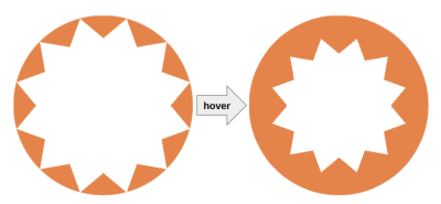
Next, we add the scale effect to the image’s :hover state:
img {
  --f: 1.2; /* the scale factor */
  /* etc */
}
img:hover {
  scale: var(--f);
}
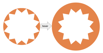
To make sure both starburst shapes have identical sizes (in the non-hover and hover states), --i needs a formula based on the scale factor:
img {
  --f: 1.2; /* the scale factor */
  /* etc */
}
img:hover {
  --i: calc(var(--r) * (1 - var(--p)) * (var(--f) - 1) / var(--f));
  scale: var(--f);
}
And, now, we are finally finished.
See the Pen [Fancy Pop Out hover effect!](https://codepen.io/t_afif/pen/mdawrLa) by Temani Afif.
Another Example
Let’s try another fancy effect where the avatar is hidden, and on hover, it slides from the bottom to “pop out” while, at the same time, we update the starburst shape.
See the Pen [Fancy Pop Out Reveal hover effect!](https://codepen.io/t_afif/pen/VwqWRyj) by Temani Afif.
Cool, right? We are still using only one <img> element in the markup, but this time, I introduced the sliding effect. This will be your homework! I will let you dissect the code to understand what I have changed.
Hint: A CSS Tip where I am using the sliding effect.
Wrapping Up
I hope you enjoy having a little extra practice on the techniques we used in the previous article to create this “pop-out” hover effect. If it feels like I went a little faster this time around, it’s because I did. Rather than spending time explaining the same concepts and techniques, I was more concerned with demonstrating them in a slightly different context. So, we learned a few new ideas for working with gradients in CSS masks and background images!
In spite of the complexity of everything we covered, there is nothing that requires you to understand everything at once or even right away. Take the time to go through this and the previous article step-by-step until you grasp the parts that are toughest for you to grok. In all honesty, you will probably never find yourself in a situation where you need to use all these tricks together. This was a pretty niche exercise. But it provides us with an excuse to individually inspect the techniques that can help you solve some complex problems in CSS without resorting to scripting or extra HTML.
As for the math and the formulas, you don’t need to accurately understand them. The goal is to demonstrate that we can be as accurate as we want when it comes to calculating values and still develop something that is incredibly maintainable with only a few variables. Without trigonometric functions and calc() in CSS, we would be obliged to manually set all of the values once we need to update something, which would be incredibly tedious.
I’ll close this little series with a last demo. Enjoy!
See the Pen [Pop out hover effect featuring Kevin and Alvaro](https://codepen.io/t_afif/pen/zYyWGPY) by Temani Afif.


 Celebrating 10 million developers
 SurveyJS: White-Label Survey Solution for Your JS App
 Register Free Now


