CSS Responsive Multi-Line Ribbon Shapes (Part 1)
calc(), color-mix(), and trigonometric functions. In this article, Temani Afif combines background and gradient tricks to create ribbon shapes in CSS that are not only responsive but support multi-line text and are easily adjustable with a few CSS variables.Back in the early 2010s, it was nearly impossible to avoid ribbon shapes in web designs. It was actually back in 2010 that Chris Coyier shared a CSS snippet that I am sure has been used thousands of times over.
And for good reason: ribbons are fun and interesting to look at. They’re often used for headings, but that’s not all, of course. You’ll find corner ribbons on product cards (“Sale!”), badges with trimmed ribbon ends (“First Place!”), or even ribbons as icons for bookmarks. Ribbons are playful, wrapping around elements, adding depth and visual anchors to catch the eye’s attention.
I have created a collection of more than 100 ribbon shapes, and we are going to study a few of them in this little two-part series. The challenge is to rely on a single element to create different kinds of ribbon shapes. What we really want is to create a shape that accommodates as many lines of text as you throw at them. In other words, there is no fixed dimension or magic numbers — the shape should adapt to its content.
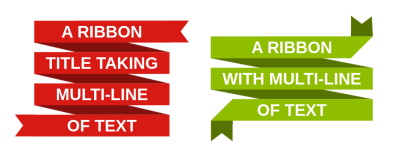
Here is a demo of what we are building in this first part:
See the Pen [Responsive multi-line ribbon shapes](https://codepen.io/smashingmag/pen/LYMjNoo) by Temani Afif.
You can play with the text, adjust the screen size, change the font properties, and the shape will always fit the content perfectly. Cool, right? Don’t look at the code just yet because we will build this together from scratch.
How Does It Work?
We are going to rely on a single HTML element, an <h1> in this case, though you can use any element you’d like as long as it can contain text.
<h1>Your text goes here</h1>
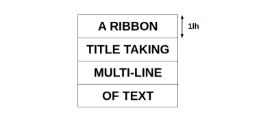
Now, if you look closely at the ribbon shapes, you can notice a general layout that is the same for both designs. There’s really one piece that repeats over and over.

Sure, this is not the exact ribbon shape we want, but all we are missing is the cutouts on the ends. The idea is to first start with this generic design and add the extra decoration as we go.
Both ribbons in the demo we looked at are built using pretty much the same exact CSS; the only differences are nuances that help differentiate them, like color and decoration. That’s my secret sauce! Most of the ribbons from my generator share a common code structure, and I merely adjust a few values to get different variations.
Let’s Start With The Gradients
Any time I hear that a component’s design needs to be repeated, I instantly think of background gradients. They are perfect for creating repeatable patterns, and they are capable of drawing lines with hard stops between colors.
We’re essentially talking about applying a background behind a text element. Each line of text gets the background and repeats for as many lines of text as there happens to be. So, the gradient needs to be as tall as one line of text. If you didn’t know it, we recently got the new line height (lh) unit in CSS that allows us to get the computed value of the element’s line-height. In our case, 1lh will always be equal to the height of one line of text, which is perfect for what we need.

Note: It appears that Safari uses the computed line height of a parent element rather than basing the lh unit on the element itself. I’ve accounted for that in the code by explicitly setting a line-height on the body element, which is the parent in our specific case. But hopefully, that will be unnecessary at some point in the future.
Let’s tackle our first gradient. It’s a rectangular shape behind the text that covers part of the line and leaves breathing space between the lines.

The gradient’s red color is set to 70% of the height, which leaves 30% of transparent color to account for the space between lines.
h1 {
  --c: #d81a14;

  background-image: linear-gradient(var(--c) 70%, #0000 0);
  background-position: 0 .15lh;
  background-size: 100% 1lh;
}
Nothing too complex, right? We’ve established a background gradient on an h1 element. The color is controlled with a CSS variable (--c), and we’ve sized it with the lh unit to align it with the text content.
Note that the offset (.15lh) is equal to half the space between lines. We could have used a gradient with three color values (e.g., transparent, #d81a14, and transparent), but it’s more efficient and readable to keep things to two colors and then apply an offset.
Next, we need a second gradient for the wrapped or slanted part of the ribbon. This gradient is positioned behind the first one. The following figure demonstrates this with a little opacity added to the front ribbon’s color to see the relationship better.

Here’s how I approached it:
linear-gradient(to bottom right, #0000 50%, red 0 X, #0000 0);
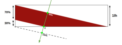
This time, we’re using keywords to set the gradient’s direction (to bottom right). Meanwhile, the color starts at the diagonal (50%) instead of its default 0% and should stop at a value that we’re indicating as X for a placeholder. This value is a bit tricky, so let’s get a visual that illustrates what we’re doing.

The green arrow illustrates the gradient direction, and we can see the different color stops: 50%, X, and 100%. We can apply some geometry rules to solve for X:
(X - 50%) / (100% - 50%) = 70%/100%
X = 85%
This gives us the exact point for the end of the gradient’s hard color stop. We can apply the 85% value to our gradient configuration in CSS:
h1 {
  --c: #d81a14;

background-image:
linear-gradient(var(--c) 70%, #0000 0),
linear-gradient(to bottom left, #0000 50%, color-mix(in srgb, var(--c), #000 40%) 0 85%, #0000 0);
background-position: 0 .15lh;
background-size: 100% 1lh;
}
You’re probably noticing that I added the new color-mix() function to the second gradient. Why introduce it now? Because we can use it to mix the main color (#d81a14) with white or black. This allows us to get darker or lighter values of the color without having to introduce more color values and variables to the mix. It helps keep things efficient!
See the Pen [The gradient configuration](https://codepen.io/smashingmag/pen/eYbwwyo) by Temani Afif.
We have accomplished the main piece of the design! We can turn our attention to creating the ribbon shape. You will notice some unwanted repetition at the top and the bottom. Don’t worry about it; it will be fixed in the next section.
Next, Let’s Make The Ribbons
Before we move in, let’s take a moment to remember that we’re making two ribbons. The demo at the beginning of this article provides two examples: a red one and a green one. They’re similar in structure but differ in the visual details.
For the first one, we’re taking the start and end of the ribbon and basically clipping a triangle out of it. We’ll do a similar thing with the second ribbon example with an extra fold step for the cutout part.
The First Ribbon
The only thing we need to do for the first ribbon is apply a clip-path to cut the triangular shape out from the ribbon’s ends while trimming unwanted artifacts from the repeating gradient at the top and bottom of the ribbon.

We have all of the coordinates we need to make our cuts using the polygon() function on the clip-path property. Coordinates are not always intuitive, but I have expanded the code and added a few comments below to help you identify some of the points from the figure.
h1 {
  --r: 10px; /* control the cutout */

  clip-path: polygon(
   0 .15lh, /* top-left corner */
   100% .15lh, /* top right corner */
   calc(100% - var(--r)) .5lh, /* top-right cutout */
   100% .85lh,
   100% calc(100% - .15lh), /* bottom-right corner  */
   0 calc(100% - .15lh), /* bottom-left corner */
   var(--r) calc(100% - .5lh), /* bottom-left cutout */
   0 calc(100% - .85lh)
  );
}
This completes the first ribbon! Now, we can wrap things up (pun intended) with the second ribbon.
The Second Ribbon
We will use both pseudo-elements to complete the shape. The idea can be broken down like this:
- We create two rectangles that are placed at the start and end of the ribbon.
- We rotate the two rectangles with an angle that we define using a new variable,
--a. - We apply a
clip-pathto create the triangle cutout and trim where the green gradient overflows the top and bottom of the shape.

First, the variables:
h1 {
  --r: 10px;  /* controls the cutout */
  --a: 20deg; /* controls the rotation */
  --s: 6em;   /* controls the size */
}
Next, we’ll apply styles to the :before and :after pseudo-elements that they share in common:
h1:before,
h1:after {
  content: "";
  position: absolute;
  height: .7lh;
  width: var(--s);
  background: color-mix(in srgb, var(--c), #000 40%);
  rotate: var(--a);
}
Then, we position each pseudo-element and make our clips:
h1:before {
  top: .15lh;
  right: 0;
  transform-origin: top right;
  clip-path: polygon(0 0, 100% 0, calc(100% - .7lh / tan(var(--a))) 100%, 0 100%, var(--r) 50%);
}

h1:after {
bottom: .15lh;
left: 0;
transform-origin: bottom left;
clip-path: polygon(calc(.7lh / tan(var(--a))) 0, 100% 0, calc(100% - var(--r)) 50%, 100% 100%, 0 100%);
}
We are almost done! We still have some unwanted overflow where the repeating gradient bleeds out of the top and bottom of the shape. Plus, we need small cutouts to match the pseudo-element’s shape.

It’s clip-path again to the rescue, this time on the main element:
clip-path: polygon(
    0 .15lh,
    calc(100% - .7lh/sin(var(--a))) .15lh,
    calc(100% - .7lh/sin(var(--a)) - 999px) calc(.15lh - 999px*tan(var(--a))),
    100% -999px,
    100% .15lh,
    calc(100% - .7lh*tan(var(--a)/2)) .85lh,
    100% 1lh,
    100% calc(100% - .15lh),
    calc(.7lh/sin(var(--a))) calc(100% - .15lh),
    calc(.7lh/sin(var(--a)) + 999px) calc(100% - .15lh + 999px*tan(var(--a))),
    0 999px,
    0 calc(100% - .15lh),
    calc(.7lh*tan(var(--a)/2)) calc(100% - .85lh),
    0 calc(100% - 1lh)
);
Ugh, looks scary! I’m taking advantage of a new set of trigonometric functions that help a bunch with the calculations but probably look foreign and confusing if you’re seeing them for the first time. There is a mathematical explanation behind each value in the snippet that I’d love to explain, but it’s long-winded. That said, I’m more than happy to explain them in greater detail if you drop me a line in the comments.
Our second ribbon is completed! Here is the full demo again with both variations.
See the Pen [CodePen Home Responsive multi-line ribbon shapes](https://codepen.io/smashingmag/pen/LYMjNoo) by Temani Afif.
Wrapping Up
We looked at two ribbon variations that use almost the same code structure, but we can make many, many more the same way. Your homework, if you accept it, will be to make the following variations using what you have learned so far.

You can still find the code within my ribbons collection, but it’s a good exercise to try writing code without. Maybe you will find a different implementation than mine and want to share it with me in the comments! In the next article of this two-part series, we will increase the complexity and produce two more interesting ribbon shapes.
Further Reading On SmashingMag
- “Art Direction For The Web Using CSS Shapes,” Andrew Clarke
- “Take A New Look At CSS Shapes,” Rachel Andrew
- “Creating Responsive Shapes With Clip-Path And Breaking Out Of The Box,” Karen Menezes
- “New CSS Features That Are Changing Web Design,” Zell Liew


 Register Free Now
 SurveyJS: White-Label Survey Solution for Your JS App
 Try ProtoPie AI free →
 Celebrating 10 million developers


