F-Shape Pattern And How Users Read

Email Newsletter
Weekly tips on front-end & UX.
Trusted by 200,000+ folks.


 Flexible CMS. Headless & API 1st
We rarely read on the web. We mostly scan. That’s a reliable strategy to quickly find what we need in times when we’re confronted with more information than we can handle. But scanning also means that we often skip key details. This is not only inefficient but can also be very damaging to your business.
Let’s explore how users read — or scan — on the web and how we can prevent harmful scanning patterns.
This article is part of our ongoing series on design patterns. It’s also an upcoming part of the 10h-video library on Smart Interface Design Patterns 🍣 and the upcoming live UX training as well. Use code BIRDIE to save 15% off.
Scanning Patterns On The Web
One of the most common scanning patterns is the F-shape pattern. Users start at the top left, read a few lines, and then start to scan vertically. But it isn’t the only scanning pattern on the web. Being aware of different patterns is the first step to helping users better navigate your content.

Different patterns describe how users scan content on the web. The F-shape pattern is probably the best-known one.
- F-Pattern
Users first read horizontally, then read less and less until they start scanning vertically. The first lines of text and the first words on each line receive more attention. It also applies to LTR-interfaces, but the F is flipped. - Layer-Cake Pattern
Users scan consistently across headings, with deliberate jumps into body text in between. Most effective way to scan pages and find key content details. - Love-at-First-Sight Pattern
Users are often “satisficers,” searching for what’s good enough, not exhaustive enough. In search results, they often fixate on a single result. - Lawn-Mower Pattern
In tables, users start in the top left cell, move to the right until the end of the row, and then drop down to the next row, moving in the same pattern. - Spotted Pattern
Skipping big chunks of text and focusing on patterns. Often happens in search when users look for specific words, shapes, links, dates, and so on. - Marking Pattern
Eyes focus in one place as the mouse scrolls or a finger swipes. Common on mobile more than on desktop. - Bypassing Pattern
Users deliberately skip the first words of the line when multiple lines start with the same word. - Commitment Pattern
Reading the entire content, word by word. Happens when users are highly motivated and interested. Common for older adults.
F-Shape Scanning And The Lack Of Rhythm
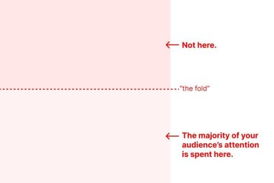
On the web, we often argue about the fold, and while it does indeed exist, it really doesn’t matter. As Christopher Butler said, “length is not the problem — lack of rhythm is.”
A designer’s main job is to direct attention intentionally. Scanning is partial attention. Reading is focused attention. A screen without intentional rhythm will lose attention as it is being scanned. One with controlled rhythm will not only retain attention, it will deepen it.
Think of F-shape scanning as a user’s fallback behavior if the design doesn’t guide them through the content well enough. So prevent it whenever you can. At least, give users anchors to move to E-shape scanning, and at best, direct their attention to relevant sections with Layer-Cake scanning.
Direct Attention And Provide Anchors
Good formatting can reduce the impact of scanning. To structure scanning and guide a user’s view, add headings and subheadings. For engagement, alternate sizes, spacing, and patterns. For landing pages, alternate points of interest.
Users spend 80% of the time viewing the left half of a page. So, as you structure your content, keep in mind that horizontal attention leans left. That’s also where you might want to position navigation to aid wayfinding.

Generally, it’s a good idea to visually group small chunks of related content. To offer anchors, consider front-loading headings with keywords and key points — it will help users quickly make sense of what awaits them. Adding useful visuals can also give users points to anchor to.
Another way to guide users through the page is by adding few but noticeable accents to guide attention. You will need visible, well-structured headings and subheadings that stand out from the other content on the page. In fact, adding subheadings throughout the page might be the best strategy to help users find information faster.
Data-heavy content such as large, complex tables require some extra attention and care. To help users keep their position as they move across the table, keep headers floating. They provide an anchor no matter where your user’s eyes are focusing and make it easier to look around and compare data.
Key Takeaways
- Users spend 80% of time viewing the left half of a page.
- They read horizontally, then skip to content below.
- Scanning is often inefficient as users miss large chunks of content and skip key details.
- Good formatting reduces the impact of F-scanning.
- Add heading and subheadings for structured scanning.
- Show keywords and key points early in your headings to improve scanning.
- For engagement, alternate sizes, spacing, patterns.
- For landing pages, alternate points of interest.
- Visually group small chunks of related content.
- Keep headers floating in large, complex data tables.
- Add useful visuals to give users points to anchor to.
- Horizontal attention leans left: favor top/left navigation.
Useful Resources
- How People Read Online, by Kate Moran
- Layer-Cake Pattern of Scanning, by Kara Pernice
- Horizontal Attention Leans Left, by Therese B. Fessenden
- F-Shaped Pattern: Misunderstood, But Still Relevant, by Kara Pernice
- The Fold Exists, But It Doesn’t Matter, by Christopher Butler
- Best Practices for Better Scannability, by Nemanja Banjanin
- Golden Rules of Web Typography, by yours truly
Meet Smart Interface Design Patterns
If you are interested in similar insights around UX, take a look at Smart Interface Design Patterns, our 10h-video course with 100s of practical examples from real-life projects — with a live UX training later this year. Everything from mega-dropdowns to complex enterprise tables — with 5 new segments added every year. Jump to a free preview.

100 design patterns & real-life
examples.
10h-video course + live UX training. Free preview.


