Best Practices For Naming Design Tokens, Components And Variables
Naming is hard. As designers and developers, we often struggle finding the right name — for a design token, colors, UI components, HTML classes, and variables. Sometimes, the names we choose are too generic, so it’s difficult to understand what exactly is meant. And sometimes they are too specific, leaving little room for flexibility and re-use.
In this post, we want to get to the bottom of this and explore how we can make naming more straightforward. How do we choose the right names? And which naming conventions work best? Let’s take a closer look.
Inspiration For Naming
If you’re looking for some inspiration for naming HTML classes, CSS properties, or JavaScript functions, Classnames is a wonderful resource jam-packed with ideas that get you thinking outside the box.
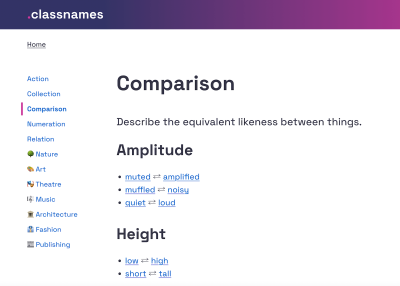
The site provides thematically grouped lists of words perfect for naming. You’ll find terms to describe different kinds of behavior, likeness between things, order, grouping, and association, but also themed collections of words that wouldn’t instantly come to one’s mind when it comes to code, among them words from nature, art, theater, music, architecture, fashion, and publishing.
Naming Conventions
What makes a good name? Javier Cuello summarized a set of naming best practices that help you name your layers, groups and components in a consistent and scalable way.
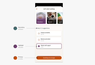
As Javier points out, a good name has a logical structure, is short, meaningful, and known by everyone, and not related to visual properties. He shares do’s and don’ts to illustrate how to achieve that and also takes a closer look at all the fine little details you need to consider when naming sizes, colors, groups, layers, and components.
Design Tokens Naming Playbook
How do you name and manage design tokens? To enhance your design tokens naming skills, Romina Kavcic created an interactive Design Tokens Naming Playbook. It covers everything from different approaches to naming structure to creating searchable databases, running naming workshops, and automation.

The playbook also features a naming playground where you can play with names simply by dragging and dropping. For more visual examples, also be sure to check out the Figma template. It includes components for all categories, allowing you to experiment with different naming structures.
Flexible Design Token Taxonomy
How to build a flexible design token taxonomy that works across different products? That was the challenge that the team at Intuit faced. The parent company of products such as Mailchimp, Quickbooks, TurboTax, and Mint developed a flexible token system that goes beyond the brand theme to serve as the foundational system for a wide array of products.
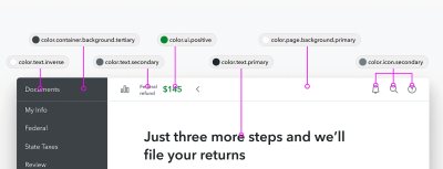
Nate Baldwin wrote a case study in which he shares valuable insights into the making of Intuit’s design token taxonomy. It dives deeper into the pain points of the old taxonomy system, the criteria they defined for the new system, and how it was created. Lots of takeaways for building your own robust and flexible token taxonomy are guaranteed.
Naming Colors
When you’re creating a color system, you need names for all its facets and uses. Names that everyone on the team can make sense of. But how to achieve that? How do you bring logic to a subjective topic like color? Jess Satell, Staff Content Designer for Adobe’s Spectrum Design System, shares how they master the challenge.
As Jess explains, the Spectrum color nomenclature uses a combination of color family classifier (e.g., blue or gray) paired with an incremental brightness value scale (50–900) to name colors in a way that is not only logical for everyone involved but also scalable and flexible as the system grows.
Another handy little helper when it comes to naming colors is Color Parrot. The Twitter bot is capable of naming and identifying the colors in any given image. Just mention the bot in a reply, and it will respond with a color palette.
Common Names For UI Components
Looking at what other people call similar things is a great way to start when you’re struggling with naming. And what better source could there be than other design systems? Before you end up in the design system rabbit hole, Iain Bean did the research for you and created the Component Gallery.
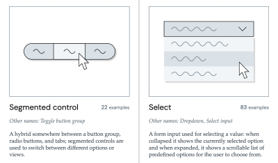
The Component Gallery is a collection of interface components from real-world design systems. It includes plenty of examples for more than 50 UI components — from accordion to visually hidden — and also lists other names that the UI components go by. A fantastic resource — not only with regards to naming.
Variables Taxonomy Map
A wonderful example of naming guidelines for a complex multi-brand, multi-themed design system comes from the Vodafone UK Design System team. Their Variables Taxonomy Map breaks down the anatomy and categorization of a design token into a well-orchestrated system of collections.
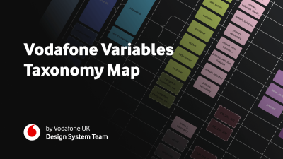
The map illustrates four collections required to support the system and connections between tokens — from brand and primitives to semantics and pages. It builds on top of Nathan Curtis’ work on naming design tokens and enables everyone to gather insight about where a token is used and what it represents, just from its name.
If you want to explore more approaches to naming design tokens, Vitaly compiled a list of useful Figma kits and resources that are worth checking out.
Design Token Names Inventory
Romina Kavcic created a handy little resource that is bound to give your design token naming workflow a power boost. The Design Token Names Inventory spreadsheet not only makes it easy to ensure consistent naming but also syncs directly to Figma.

The spreadsheet has a simple structure with four levels to give you a bird’s-eye view of all your design tokens. You can easily add rows, themes, and modes without losing track and filter your tokens. And while the spreadsheet itself is already a great solution to keep everyone involved on the same page, it plays out its real strength in combination with the Google Spreadsheets plugin or the Kernel plugin. Once installed, the changes you make in the spreadsheet are reflected in Figma. A real timesaver!
Want To Dive Deeper?
We hope these resources will come in handy as you tackle naming. If you’d like to dive deeper into design tokens, components, and design systems, we have a few friendly online workshops and SmashingConfs coming up:
- Design Token and UI Component Architecture with Nathan Curtis, June 6–14
- Creating and Maintaining Successful Design Systems with Brad Frost, Aug 27 — Sept 10
- Figma Workflow Masterclass with Christina Vallaure, Nov 14–22
- SmashingConf Freiburg 2024 🇩🇪 — The Web, Sep 9–11
- SmashingConf New York 2024 🇺🇸 — Front-End & UX, Oct 7–10
- SmashingConf Antwerp 2024 🇧🇪 — Design & UX, Oct 28–31
We’d be absolutely delighted to welcome you to one of our special Smashing experiences — be it online or in person!


 Try ProtoPie AI free →

 Register Free Now
 Celebrating 10 million developers


