New Front-End Features For Designers In 2025
Component-specific styling, styling parents based on their children, relative colors — the web platform is going through exciting times, and many things that required JavaScript in the past can today be achieved with one simple line of HTML and CSS.
As we are moving towards 2025, it’s a good time to revisit some of the incredible new technologies that are broadly available and supported in modern browsers today. Let’s dive right in and explore how they can simplify your day-to-day work and help you build modern UI components.
Table of Contents
Below you’ll find quick jumps to topics you may be interested in, or skip the table of contents.
- anchor-positioning
- auto field-sizing
- container queries
<dialog>- exclusive accordions
:focus-visible:hashidden=until-found- high-definition colors
<hr>in selectinputmodemin(),max(),clamp()- relative colors
- responsive videos
- scroll behavior
- scroll snap
text-wrap: balance:user-validand:user-invalid- View Transitions API
CSS Container Queries And Style Queries
Component-specific styling? What has long sounded like a dream to any developer, is slowly but surely becoming reality. Thanks to container queries, we can now query the width and style of the container in which components live.
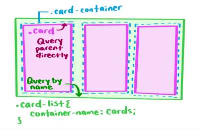
As Una Kravets points out in her introduction to style queries, this currently only works with CSS custom property values, but there are already some real-world use cases where style queries shine: They come in particularly handy when you have a reusable component with multiple variations or when you don’t have control over all of your styles but need to apply changes in certain cases.
If you want to dive deeper into what’s possible with container style queries and the things we can — maybe — look forward to in the future, also be sure to take a look at Geoff Graham’s post. He dug deep into the more nuanced aspects of style queries and summarized the things that stood out to him.
No More Typographic Orphans And Widows
We all know those headlines where the last word breaks onto a new line and stands there alone, breaking the visual and looking, well, odd. Of course, there’s the good ol’ <br> to break the text manually or a <span> to divide the content into different parts. But have you heard of text-wrap: balance already?
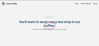
text-wrap: balance. (Large preview)By applying the text-wrap: balance property, the browser will automatically calculate the number of words and divide them equally between two lines — perfect for page titles, card titles, tooltips, modals, and FAQs, for example. Ahmad Shadeed wrote a helpful guide to text-wrap: balance in which he takes a detailed look at the property and how it can help you make your headlines look more consistent.
When dealing with large blocks of text, such as paragraphs, you might want to look into text-wrap: pretty to prevent orphans on the last line.
Auto Field-Sizing For Forms
Finding just the right size for an input field usually involves a lot of guesswork — or JavaScript — to count characters and increase the field’s height or width as a user enters text. CSS field-sizing is here to change that. With field-sizing, we can auto-grow inputs and text areas, but also auto-shrink short select menus, so the form always fits content size perfectly. All we need to make it happen is one line of CSS.
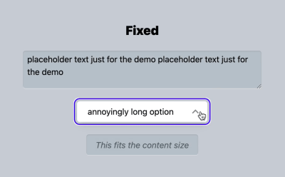
Adam Argyle summarized everything you need to know about field-sizing, exploring in detail how field-sizing affects different <form> elements. To prevent your input fields from becoming too small or too large, it is also a good idea to insert some additional styles that keep them in shape. Adam shares a code snippet that you can copy-and-paste right away.
Making Hidden Content Searchable
Accordions are a popular UI pattern, but they come with a caveat: The content inside the collapsed sections is impossible to search with find-in-page search. By using the hidden=until-found attribute and the beforematch event, we can solve the problem and even make the content accessible to search engines.

hidden=until-found makes hidden content in accordions searchable. (Large preview)As Joey Arhar explains in his guide to making collapsed content searchable, you can replace the styles that hide the section with the hidden=until-found attribute. If your page also has another state that needs to be kept in sync with whether or not your section is revealed, he recommends adding a beforematch event listener. It will be fired on the hidden=until-found element right before the element is revealed by the browser.
Styling Groups Within Select Menus
It’s a small upgrade for the <select> element, but a mighty one: We can now add <hr> into the list of select options, and they will appear as separators to help visually break up the options in the list.

If you want to refine things further, also be sure to take a look at <optgroup>. The HTML element lets you group options within a <select> element by adding a subheading for each group.
Simpler Snapping For Scrollable Containers
Sometimes, you need a quick and easy way to make an element a scrollable container. CSS scroll snap makes it possible. The CSS feature enables us to create a well-controlled scrolling experience that lets users precisely swipe left and right and snap to a specific item in the container. No JavaScript required.

Ahmad Shadeed wrote a practical guide that walks you step by step through the process of setting up a container with scroll snap. You can use it to create image galleries, avatar lists, or other components where you want a user to scroll and snap through the content, whether it’s horizontally or vertically.
Anchor Positioning For Tooltips And Popovers
Whether you use it for footnotes, tooltips, connector lines, visual cross-referencing, or dynamic labels in charts, the CSS Anchor Positioning API enables us to natively position elements relative to other elements, known as anchors.
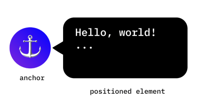
In her introduction to the CSS Anchor Positioning API, Una Kravets summarized in detail how anchor positioning works. She takes a closer look at the mechanism behind anchor positioning, how to tether to one and multiple anchors, and how to size and position an anchor-positioned element based on the size of its anchor. Browser support is still limited, so you might want to use the API with some precautions. Una’s guide includes what to watch out for.
High-Definition Colors With OKLCH And OKLAB
With high-definition colors with LCH, okLCH, LAB, and okLAB that give us access to 50% more colors, the times of RGB/HSL might be over soon. To get you familiar with the new color spaces, Vitaly wrote a quick overview of what you need to know.
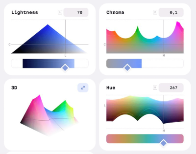
Both OKLCH and OKLAB are based on human perception and can specify any color the human eye can see. While OKLAB works best for rich gradients, OKLCH is a fantastic fit for color palettes in design systems. OKLCH/OKLAB colors are fully supported in Chrome, Edge, Safari, Firefox, and Opera. Figma doesn’t support them yet.
Relative Colors In CSS
Let’s say you have a background color and want to reduce its luminosity by 25%, or you want to use a complementary color without having to calculate it yourself. The relative color syntax (RCS) makes it possible to create a new color based on a given color.
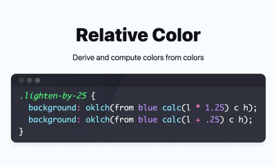
To derive and compute a new color, we can use the from keyword for color functions (color(), hsl(), oklch(), etc.) to modify the values of the input color. Adam Argyle shares some code snippets of what this looks like in practice, or check the spec for more details.
Smooth Transitions With The View Transitions API
There are a number of use cases where a smooth visual transition can make the user experience more engaging. When a thumbnail image on a product listing page transitions into a full-size image on the product detail page, for example, or when you have a fixed navigation bar that stays in place as you navigate from one page to another. The View Transitions API helps us create seamless visual transitions between different views on a site.

View transitions can be triggered not only on a single document but also between two different documents. Both rely on the same principle: The browser takes snapshots of the old and new states, the DOM gets updated while rendering is suppressed, and the transitions are powered by CSS Animations. The only difference lies in how you trigger them, as Bramus Van Damme explains in his guide to the View Transitions API. A good alternative to single page apps that often rely on heavy JavaScript frameworks.
Exclusive Accordions
The ‘exclusive accordion’ is a variation of the accordion component. It only allows one disclosure widget to be open at the same time, so when a user opens a new one, the one that is already open will be closed automatically to save space. Thanks to CSS, we can now create the effect without a single line of JavaScript.

To build an exclusive accordion, we need to add a name attribute to the <details> elements. When this attribute is used, all <details> elements that have the same name value form a semantic group and behave as an exclusive accordion. Bramus Van Damme summarized in detail how it works.
Live And Late Validation
When we use :valid and :invalid to apply styling based on a user’s input, there’s a downside: a form control that is required and empty will match :invalid even if a user hasn’t started interacting with it yet. To prevent this from happening, we usually had to write stateful code that keeps track of input a user has changed. But not anymore.

:user-valid and :user-invalid improve the user experience of input validation. (Large preview)With :user-valid and :user-invalid, we now have a native CSS solution that handles all of this automatically. Contrary to :valid and :invalid, the :user-valid and :user-invalid pseudo-classes give users feedback about mistakes only after they have changed the input. :user-valid and :user-invalid work with input, select, and textarea controls.
Smooth Scrolling Behavior
Imagine you have a scrolling box and a series of links that target an anchored position inside the box. When a user clicks on one of the links, it will take them to the content section inside the scrolling box — with a rather abrupt jump. The scroll-behavior property makes the scrolling transition a lot smoother, only with CSS.

scroll-behavior sets the behavior for a scrolling box when scrolling is triggered by the navigation. (Large preview)When setting the scroll-behavior value to smooth, the scrolling box will scroll in a smooth fashion using a user-agent-defined easing function over a user-agent-defined period of time. Of course, you can also use scroll-behavior: auto, and the scrolling box will scroll instantly.
Making Focus Visible
Focus styles are essential to help keyboard users navigate a page. However, for mouse users, it can be irritating when a focus ring appears around a button or link as they click on it. :focus-visible is here to help us create the best experience for both user groups: It displays focus styles for keyboard users and hides them for mouse users.
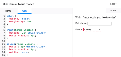
:focus-visible shows focus styles only when necessary. (Large preview):focus-visible applies while an element matches the :focus pseudo-class and the User Agent determines via heuristics that the focus should be made visible on the element. Curious how it works in practice? MDN Web Docs highlights the differences between :focus and :focus-visible, what you need to consider accessibility-wise, and how to provide a fallback for old browser versions that don’t support :focus-visible.
Styling Parents Based On Children
Historically, CSS selectors have worked in a top-down fashion, allowing us to style a child based on its parent. The new CSS pseudo-class :has works the other way round: We can now style a parent based on its children. But that’s not all yet. Josh W. Comeau wrote a fantastic introduction to :has in which he explores real-world use cases that show what the pseudo-class is capable of.

:has makes it possible to style one element based on the property or status of any other element. (Large preview):has is not limited to parent-child relationships or direct siblings. Instead, it lets us style one element based on the properties or status of any other element in a totally different container. And it can be used as a sort of global event listener, as Josh shows — to disable scrolling on a page when a modal is open or to create a JavaScript-free dark mode toggle, for example.
Interpolate Between Values For Type And Spacing
CSS comparison functions min(), max(), and clamp() are today supported in all major browsers, providing us with an effective way to create dynamic layouts with fluid type scales, grids, and spacing systems.
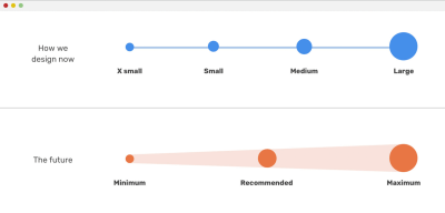
To get you fit for using the functions in your projects right away, Ahmad Shadeed wrote a comprehensive guide in which he explains everything you need to know about min(), max(), and clamp(), with practical examples and use cases and including all the points of confusion you might encounter.
If you’re looking for a quick and easy way to create fluid scales, the Fluid Type Scale Calculator by Utopia has got your back. All you need to do is define min and max viewport widths and the number of scale steps, and the calculator provides you with a responsive preview of the scale and the CSS code snippet.
Reliable Dialog And Popover
If you’re looking for a quick way to create a modal or popup, the <dialog> HTML element finally offers a native (and accessible!) solution to help you get the job done. It represents a modal or non-modal dialog box or other interactive component, such as a confirmation prompt or a subwindow used to enter data.

<dialog> menus for blocking pop-ups and popovers for non-blocking menus. (Large preview)While modal dialog boxes interrupt interaction with a page, non-modal dialog boxes allow interaction with the page while the dialog is open. Adam Argyle published some code snippets that show how <dialog> can block pop-ups and popovers for non-blocking menus, out of the box.
Responsive HTML Video And Audio
In 2014, media attribute support for HTML video sources was deleted from the HTML standard. Last year, it made a comeback, which means that we can use media queries for delivering responsive HTML videos.

Scott Jehl summarized how responsive HTML video — and even audio — works, what you need to consider when writing the markup, and what other types of media queries can be used in combination with HTML video.
The Right Virtual Keyboard On Mobile
It’s a small detail, but one that adds to a well-considered user experience: displaying the most comfortable touchscreen keyboard to help a user enter their information without having to switch back and forth to insert numbers, punctuation, or special characters like an @ symbol.

To show the right keyboard layout, we can use inputmode. It instructs the browser which keyboard to display and supports values for numeric, telephone, decimal, email, URL, and search keyboards. To further improve the UX, we can add the enterkeyhint attribute: it adjusts the text on the Enter key. If no enterkeyhint is used, the user agent might use contextual information from the inputmode attribute.
A Look Into The Future
As we are starting to adopt all of these shiny new front-end features in our projects, the web platform is, of course, constantly evolving — and there are some exciting things on the horizon already! For example, we are very close to getting masonry layout, fully customizable drop-downs with <selectmenu>, and text-box trimming for adjusting fonts to be perfectly aligned within the grid. Kudos to all the wonderful people who are working tirelessly to push the web forward! 👏
In the meantime, we hope you found something helpful in this post that you can apply to your product or application right away. Happy tinkering!
Smashing Weekly Newsletter

Also, when you subscribe, you really help us pay the bills. Thank you for your kind support!


 Try ProtoPie AI free →
 Celebrating 10 million developers

 Register Free Now
 SurveyJS: White-Label Survey Solution for Your JS App


