Designing For Stress And Emergency

Email Newsletter
Weekly tips on front-end & UX.
Trusted by 182,000+ folks.
IMPACT to save 20% off today). With a live UX training starting next week.No design exists in isolation. As designers, we often imagine specific situations in which people will use our product. It might be indeed quite common — but there will also be other — urgent, frustrating, stressful situations. And they are the ones that we rarely account for.
So how do we account for such situations? How can we help people use our products while coping with stress — without adding to their cognitive load? Let’s take a closer look.
Study Where Your Product Fits Into People’s Lives
When designing digital products, sometimes we get a bit too attached to our shiny new features and flows — often forgetting the messy reality in which these features and flows have to neatly fit. And often it means 10s of other products, 100s of other tabs, and 1000s of other emails.

If your customers have to use a slightly older machine, with a smallish 22” screen and a lot of background noise, they might use your product differently than you might have imagined, e.g., splitting the screen into halves to see both views at the same time (as displayed above).
Chances are high that our customers will use our product while doing something else, often with very little motivation, very little patience, plenty of urgent (and way more important) problems, and an unhealthy dose of stress. And that’s where our product must do its job well.
What Is Stress?
What exactly do we mean when we talk about “stress”? As H Locke noted, stress is the body’s response to a situation it cannot handle. There is a mismatch between what people can control, their own skills, and the challenge in front of them.
If the situation seems unmanageable and the goal they want to achieve moves further away, it creates an enormous sense of failing. It can be extremely frustrating and demotivating.
Some failures have a local scope, but many have a far-reaching impact. Many people can’t choose the products they have to use for work, so when a tool fails repeatedly, causes frustration, or is unreliable, it affects the worker, the work, the colleagues, and processes within the organization. Fragility has a high cost — and so does frustration.
How Stress Influences User Interactions
It’s not a big surprise: stress disrupts attention, memory, cognition, and decision-making. It makes it difficult to prioritize and draw logical conclusions. In times of stress, we rely on fast, intuitive judgments, not reasoning. Typically, it leads to instinctive responses based on established habits.
When users are in an emergency, they experience cognitive tunneling — it’s a state when their peripheral vision narrows, reading comprehension drops, fine motor skills deteriorate, and patience drops sharply. Under pressure, people often make decisions hastily, while others get entirely paralyzed. Either way is a likely path to mistakes — often irreversible ones and often without time for extensive deliberations.
Ideally, these decisions would be made way ahead of time — and then suggested when needed. But in practice, it’s not always possible. As it turns out, a good way to help people deal with stress is by providing order around how they manage it.
Single-Tasking Instead Of Multi-Tasking
People can’t really multi-task, especially in very stressful situations or emergencies. Especially with a big chunk of work in front of them, people need some order to make progress, reliably. That’s why simpler pages usually work better than one big complex page.
Order means giving users a clear plan of action to complete a task. No distractions, no unnecessary navigation. We ask simple questions and prompt simple actions, one after another, one thing at a time.
An example of the plan is the Task List Pattern, invented by fine folks at Gov.uk. We break a task into a sequence of sub-tasks, describe them with actionable labels, assign statuses, and track progress.
To support accuracy, we revise default settings, values, presets, and actions. Also, the order of actions and buttons matters, so we put high-priority things first to make them easier to find. Then we add built-in safeguards (e.g., Undo feature) to prevent irreversible errors.
Supporting In Emergencies
The most effective help during emergencies is to help people deal with the situation in a well-defined and effective way. That means being prepared for and designing an emergency mode, e.g., to activate instant alerts on emergency contacts, distribute pre-assigned tasks, and establish a line of communication.
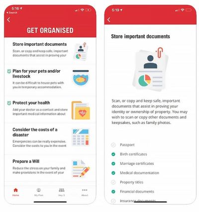
Rediplan App by Australian Red Cross is an emergency plan companion that encourages citizens to prepare their documents and belongings with a few checklists and actions — including key contracts, meeting places, and medical information, all in one place.
Just Enough Friction
Not all stress is equally harmful, though. As Krystal Higgins points out, if there is not enough friction when onboarding new users and the experience is too passive or users are hand-held even through the most basic tasks, you risk that they won’t realize the personal value they gain from the experience and, ultimately, lose interest.
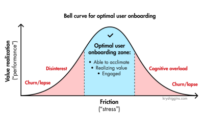
Design And Test For Stress Cases
Stress cases aren’t edge cases. We can’t predict the emotional state in which a user comes to our site or uses our product. A person looking for specific information on a hospital website or visiting a debt management website, for example, is most likely already stressed. Now, if the interface is overwhelming, it will only add to their cognitive load.
Stress-testing your product is critical to prevent this from happening. It’s useful to set up an annual day to stress test your product and refine emergency responses. It could be as simple as running content testing, or running tests in a real, noisy, busy environment where users actually work — at peak times.
And in case of emergencies, we need to check if fallbacks work as expected and if the current UX of the product helps people manage failures and exceptional situations well enough.
Wrapping Up
Emergencies will happen eventually — it’s just a matter of time. With good design, we can help mitigate risk and control damage, and make it hard to make irreversible mistakes. At its heart, that’s what good UX is exceptionally good at.
Key Takeaways
People can’t multitask, especially in very stressful situations.
- Stress disrupts attention, memory, cognition, decision-making.
- Also, it’s difficult to prioritize and draw logical conclusions.
- Under stress, we rely on fast, intuitive judgments — not reasoning.
- It leads to instinctive responses based on established habits.
Goal: Design flows that support focus and high accuracy.
- Start with better default settings, values, presets, and actions.
- High-priority first: order of actions and buttons matters.
- Break complex tasks down into a series of simple steps (10s–30s each).
- Add built-in safeguards to prevent irreversible errors (Undo).
Shift users to single-tasking: ask for one thing at a time.
- Simpler pages might work better than one complex page.
- Suggest a step-by-step plan of action to follow along.
- Consider, design, and test flows for emergency responses ahead of time.
- Add emergency mode for instant alerts and task assignments.
Meet “How To Measure UX And Design Impact”
You can find more details on UX Strategy in 🪴 Measure UX & Design Impact (8h), a practical guide for designers and UX leads to measure and show your UX impact on business. Use the code 🎟 IMPACT to save 20% off today. Jump to the details.

Video + UX Training
$ 495.00 $ 799.00 Get Video + UX Training25 video lessons (8h) + Live UX Training.
100 days money-back-guarantee.
Video only
25 video lessons (8h). Updated yearly.
Also available as a UX Bundle with 2 video courses.
Useful Resources
- “Designing The SOS Emergency System”, by Ritik Jayy
- “Designing For Crisis”, by Eric Meyer
- “Designing For Stressed Out Users” (Series), by H Locke
- Designing For Stress (Podcast), by Katie Swindler
- Designing For Edge Cases and Exceptions, by yours truly
- Design For Real Life, by Sara Wachter-Boettcher, Eric Mayer
- “Optimal Stress Levels For Onboarding, by Krystal Higgins
Further Reading
- “How To Minimize The Environmental Impact Of Your Website”, James Chudley
- “AI In UX: Achieve More With Less”, Paul Boag
- “How To Make Your UX Research Hard To Ignore”, Vitaly Friedman
- “From Prompt To Partner: Designing Your Custom AI Assistant,” Lyndon Cerejo