Masonry: Things You Won’t Need A Library For Anymore
About 15 years ago, I was working at a company where we built apps for travel agents, airport workers, and airline companies. We also built our own in-house framework for UI components and single-page app capabilities.
We had components for everything: fields, buttons, tabs, ranges, datatables, menus, datepickers, selects, and multiselects. We even had a div component. Our div component was great by the way, it allowed us to do rounded corners on all browsers, which, believe it or not, wasn’t an easy thing to do at the time.

Our work took place at a point in our history when JS, Ajax, and dynamic HTML were seen as a revolution that brought us into the future. Suddenly, we could update a page dynamically, get data from a server, and avoid having to navigate to other pages, which was seen as slow and flashed a big white rectangle on the screen between the two pages.
There was a phrase, made popular by Jeff Atwood (the founder of StackOverflow), which read:
“Any application that can be written in JavaScript will eventually be written in JavaScript.”
— Jeff Atwood
To us at the time, this felt like a dare to actually go and create those apps. It felt like a blanket approval to do everything with JS.
So we did everything with JS, and we didn’t really take the time to research other ways of doing things. We didn’t really feel the incentive to properly learn what HTML and CSS could do. We didn’t really perceive the web as an evolving app platform in its entirety. We mostly saw it as something we needed to work around, especially when it came to browser support. We could just throw more JS at it to get things done.
Would taking the time to learn more about how the web worked and what was available on the platform have helped me? Sure, I could probably have shaved a bunch of code that wasn’t truly needed. But, at the time, maybe not that much.
You see, browser differences were pretty significant back then. This was a time when Internet Explorer was still the dominant browser, with Firefox being the close second, but starting to lose market share due to Chrome rapidly gaining popularity. Although Chrome and Firefox were quite good at agreeing on web standards, the environments in which our apps were running meant that we had to support IE6 for a long time. Even when we were allowed to support IE8, we still had to deal with a lot of differences between browsers. Not only that, but the web of the time just didn’t have that many capabilities built right into the platform.

Fast forward to today. Things have changed tremendously. Not only do we have more of these capabilities than ever before, but the rate at which they become available has increased as well.
Let me ask the question again, then: Would taking the time to learn more about how the web works and what is available on the platform help you today? Absolutely yes. Learning to understand and use the web platform today puts you at a huge advantage over other developers.
Whether you work on performance, accessibility, responsiveness, all of them together, or just shipping UI features, if you want to do it as a responsible engineer, knowing the tools that are available to you helps you reach your goals faster and better.
Some Things You Might Not Need A Library For Anymore
Knowing what browsers support today, the question, then, is: What can we ditch? Do we need a div component to do rounded corners in 2025? Of course, we don’t. The border-radius property has been supported by all currently used browsers for more than 15 years at this point. And corner-shape is also coming soon, for even fancier corners.
Let’s take a look at relatively recent features that are now available in all major browsers, and which you can use to replace existing dependencies in your codebase.
The point isn’t to immediately ditch all your beloved libraries and rewrite your codebase. As for everything else, you’ll need to take browser support into account first and decide based on other factors specific to your project. The following features are implemented in the three main browser engines (Chromium, WebKit, and Gecko), but you might have different browser support requirements that prevent you from using them right away. Now is still a good time to learn about these features, though, and perhaps plan to use them at some point.
Popovers And Dialogs
The Popover API, the <dialog> HTML element, and the ::backdrop pseudo-element can help you get rid of dependencies on popup, tooltip, and dialog libraries, such as Floating UI, Tippy.js, Tether, or React Tooltip.
They handle accessibility and focus management for you, out of the box, are highly customizable by using CSS, and can easily be animated.
Accordions
The <details> element, its name attribute for mutually exclusive elements, and the ::details-content pseudo-element remove the need for accordion components like the Bootstrap Accordion or the React Accordion component.
Just using the platform here means it’s easier for folks who know HTML/CSS to understand your code without having to first learn to use a specific library. It also means you’re immune to breaking changes in the library or the discontinuation of that library. And, of course, it means less code to download and run. Mutually exclusive details elements don’t need JS to open, close, or animate.
CSS Syntax
Cascade layers, for a more organized CSS codebase, CSS nesting, for more compact CSS, new color functions, relative colors, and color-mix, new Maths functions like abs(), sign(), pow() and others help reduce dependencies on CSS pre-processors, utility libraries like Bootstrap and Tailwind, or even runtime CSS-in-JS libraries.
The game changer :has(), one of the most requested features for a long time, removes the need for more complicated JS-based solutions.
JS Utilities
Modern Array methods like findLast(), or at(), as well as Set methods like difference(), intersection(), union() and others can reduce dependencies on libraries like Lodash.
Container Queries
Container queries make UI components respond to things other than the viewport size, and therefore make them more reusable across different contexts.
No need to use a JS-heavy UI library for this anymore, and no need to use a polyfill either.
Layout
Grid, subgrid, flexbox, or multi-column have been around for a long time now, but looking at the results of the State of CSS surveys, it’s clear that developers tend to be very cautious with adopting new things, and wait for a very long time before they do.
These features have been Baseline for a long time and you could use them to get rid of dependencies on things like the Bootstrap’s grid system, Foundation Framework’s flexbox utilities, Bulma fixed grid, Materialize grid, or Tailwind columns.
I’m not saying you should drop your framework. Your team adopted it for a reason, and removing it might be a big project. But looking at what the web platform can offer without a third-party wrapper on top comes with a lot of benefits.
Things You Might Not Need Anymore In The Near Future
Now, let’s take a quick look at some of the things you will not need a library for in the near future. That is to say, the things below are not quite ready for mass adoption, but being aware of them and planning for potential later use can be helpful.
Anchor Positioning
CSS anchor positioning handles the positioning of popovers and tooltips relative to other elements, and takes care of keeping them in view, even when moving, scrolling, or resizing the page.
This is a great complement to the Popover API mentioned before, which will make it even easier to migrate away from more performance-intensive JS solutions.
Navigation API
The Navigation API can be used to handle navigation in single-page apps and might be a great complement, or even a replacement, to React Router, Next.js routing, or Angular routing tasks.
View Transitions API
The View Transitions API can animate between the different states of a page. On a single-page application, this makes smooth transitions between states very easy, and can help you get rid of animation libraries such as Anime.js, GSAP, or Motion.dev.
Even better, the API can also be used with multiple-page applications.
Remember earlier, when I said that the reason we built single-page apps at the company where I worked 15 years ago was to avoid the white flash of page reloads when navigating? Had that API been available at the time, we would have been able to achieve beautiful page transition effects without a single-page framework and without a huge initial download of the entire app.
Scroll-driven Animations
Scroll-driven animations run on the user’s scroll position, rather than over time, making them a great solution for storytelling and product tours.
Some people have gone a bit over the top with it, but when used well, this can be a very effective design tool, and can help get rid of libraries like: ScrollReveal, GSAP Scroll, or WOW.js.
Customizable Selects
A customizable select is a normal <select> element that lets you fully customize its appearance and content, while ensuring accessibility and performance benefits.
This has been a long time coming, and a highly requested feature, and it’s amazing to see it come to the web platform soon. With a built-in customizable select, you can finally ditch all this hard-to-maintain JS code for your custom select components.
CSS Masonry
CSS Masonry is another upcoming web platform feature that I want to spend more time on.
With CSS Masonry, you can achieve layouts that are very hard, or even impossible, with flex, grid, or other built-in CSS layout primitives. Developers often resort to using third-party libraries to achieve Masonry layouts, such as the Masonry JS library.
But, more on that later. Let’s wrap this point up before moving on to Masonry.
Why You Should Care
The job market is full of web developers with experience in JavaScript and the latest frameworks of the day. So, really, what’s the point in learning to use the web platform primitives more, if you can do the same things with the libraries, utilities, and frameworks you already know today?
When an entire industry relies on these frameworks, and you can just pull in the right library, shouldn’t browser vendors just work with these libraries to make them load and run faster, rather than trying to convince developers to use the platform instead?
First of all, we do work with library authors, and we do make frameworks better by learning about what they use and improving those areas.
But secondly, “just using the platform” can bring pretty significant benefits.
Sending Less Code To Devices
The main benefit is that you end up sending far less code to your clients’ devices.
According to the 2024 Web Almanac, the average number of HTTP requests is around 70 per site, most of which is due to JavaScript with 23 requests. In 2024, JS overtook images as the dominant file type too. The median number of page requests for JS files is 23, up 8% since 2022.
And page size continues to grow year over year. The median page weight is around 2MB now, which is 1.8MB more than it was 10 years ago.
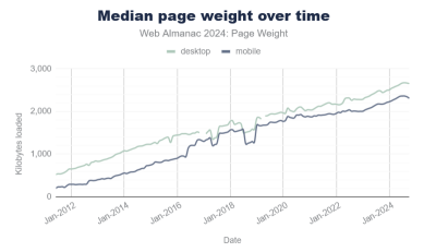
Sure, your internet connection speed has probably increased, too, but that’s not the case for everyone. And not everyone has the same device capabilities either.
Pulling in third-party code for things you can do with the platform, instead, most probably means you ship more code, and therefore reach fewer customers than you normally would. On the web, bad loading performance leads to large abandonment rates and hurts brand reputation.
Running Less Code On Devices
Furthermore, the code you do ship on your customers’ devices likely runs faster if it uses fewer JavaScript abstractions on top of the platform. It’s also probably more responsive and more accessible by default. All of this leads to more and happier customers.
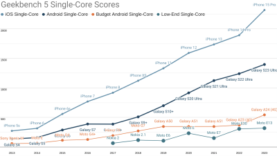
Check my colleague Alex Russell’s yearly performance inequality gap blog, which shows that premium devices are largely absent from markets with billions of users due to wealth inequality. And this gap is only growing over time.
Built-in Masonry Layout
One web platform feature that’s coming soon and which I’m very excited about is CSS Masonry.
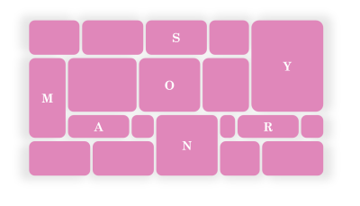
Let me start by explaining what Masonry is.
What Is Masonry
Masonry is a type of layout that was made popular by Pinterest years ago. It creates independent tracks of content within which items pack themselves up as close to the start of the track as they can.

Many people see Masonry as a great option for portfolios and photo galleries, which it certainly can do. But Masonry is more flexible than what you see on Pinterest, and it’s not limited to just waterfall-like layouts.
In a Masonry layout:
- Tracks can be columns or rows:

- Tracks of content don’t all have to be the same size:
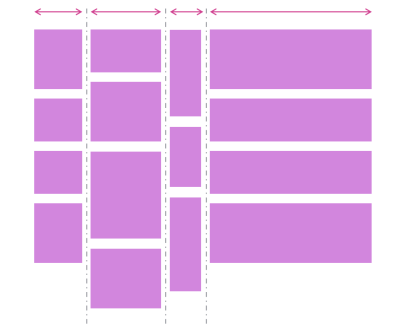
- Items can span multiple tracks:

- Items can be placed on specific tracks; they don’t have to always follow the automatic placement algorithm:

Demos
Here are a few simple demos I made by using the upcoming implementation of CSS Masonry in Chromium.
A photo gallery demo, showing how items (the title in this case) can span multiple tracks:
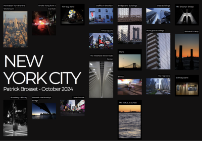
Another photo gallery showing tracks of different sizes:

A news site layout with some tracks wider than others, and some items spanning the entire width of the layout:

A kanban board showing that items can be placed onto specific tracks:
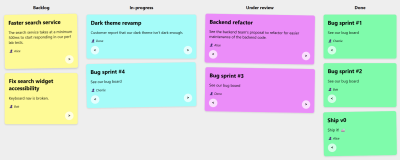
Note: The previous demos were made with a version of Chromium that’s not yet available to most web users, because CSS Masonry is only just starting to be implemented in browsers.
However, web developers have been happily using libraries to create Masonry layouts for years already.
Sites Using Masonry Today
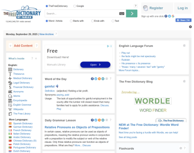
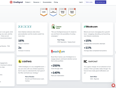
Indeed, Masonry is pretty common on the web today. Here are a few examples I found besides Pinterest:


And a few more, less obvious, examples:

So, how were these layouts created?
Workarounds
One trick that I’ve seen used is using a Flexbox layout instead, changing its direction to column, and setting it to wrap.
This way, you can place items of different heights in multiple, independent columns, giving the impression of a Masonry layout:

There are, however, two limitations with this workaround:
- The order of items is different from what it would be with a real Masonry layout. With Flexbox, items fill the first column first and, when it’s full, then go to the next column. With Masonry, items would stack in whichever track (or column in this case) has more space available.
- But also, and perhaps more importantly, this workaround requires that you set a fixed height to the Flexbox container; otherwise, no wrapping would occur.
Third-party Masonry Libraries
For more advanced cases, developers have been using libraries.
The most well-known and popular library for this is simply called Masonry, and it gets downloaded about 200,000 times per week according to NPM.
Squarespace also provides a layout component that renders a Masonry layout, for a no-code alternative, and many sites use it.
Both of these options use JavaScript code to place items in the layout.
Built-in Masonry
I’m really excited that Masonry is now starting to appear in browsers as a built-in CSS feature. Over time, you will be able to use Masonry just like you do Grid or Flexbox, that is, without needing any workarounds or third-party code.
My team at Microsoft has been implementing built-in Masonry support in the Chromium open source project, which Edge, Chrome, and many other browsers are based on. Mozilla was actually the first browser vendor to propose an experimental implementation of Masonry back in 2020. And Apple has also been very interested in making this new web layout primitive happen.
The work to standardize the feature is also moving ahead, with agreement within the CSS working group about the general direction and even a new display type display: grid-lanes.
If you want to learn more about Masonry and track progress, check out my CSS Masonry resources page.
In time, when Masonry becomes a Baseline feature, just like Grid or Flexbox, we’ll be able to simply use it and benefit from:
- Better performance,
- Better responsiveness,
- Ease of use and simpler code.
Let’s take a closer look at these.
Better Performance
Making your own Masonry-like layout system, or using a third-party library instead, means you’ll have to run JavaScript code to place items on the screen. This also means that this code will be render blocking. Indeed, either nothing will appear, or things won’t be in the right places or of the right sizes, until that JavaScript code has run.
Masonry layout is often used for the main part of a web page, which means the code would be making your main content appear later than it could otherwise have, degrading your LCP, or Largest Contentful Paint metric, which plays a big role in perceived performance and search engine optimization.
I tested the Masonry JS library with a simple layout and by simulating a slow 4G connection in DevTools. The library is not very big (24KB, 7.8KB gzipped), but it took 600ms to load under my test conditions.
Here is a performance recording showing that long 600ms load time for the Masonry library, and that no other rendering activity happened while that was happening:
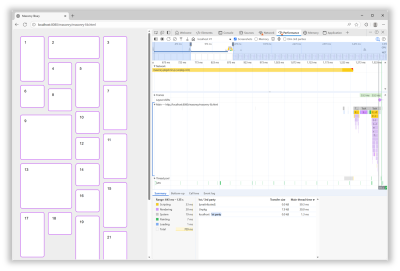
In addition, after the initial load time, the downloaded script then needed to be parsed, compiled, and then run. All of which, as mentioned before, was blocking the rendering of the page.
With a built-in Masonry implementation in the browser, we won’t have a script to load and run. The browser engine will just do its thing during the initial page rendering step.
Better Responsiveness
Similar to when a page first loads, resizing the browser window leads to rendering the layout in that page again. At this point, though, if the page is using the Masonry JS library, there’s no need to load the script again, because it’s already here. However, the code that moves items in the right places needs to run.
Now this particular library seems to be pretty fast at doing this when the page loads. However, it animates the items when they need to move to a different place on window resize, and this makes a big difference.
Of course, users don’t spend time resizing their browser windows as much as we developers do. But this animated resizing experience can be pretty jarring and adds to the perceived time it takes for the page to adapt to its new size.
Ease Of Use And Simpler Code
How easy it is to use a web feature and how simple the code looks are important factors that can make a big difference for your team. They can’t ever be as important as the final user experience, of course, but developer experience impacts maintainability. Using a built-in web feature comes with important benefits on that front:
- Developers who already know HTML, CSS, and JS will most likely be able to use that feature easily because it’s been designed to integrate well and be consistent with the rest of the web platform.
- There’s no risk of breaking changes being introduced in how the feature is used.
- There’s almost zero risk of that feature becoming deprecated or unmaintained.
In the case of built-in Masonry, because it’s a layout primitive, you use it from CSS, just like Grid or Flexbox, no JS involved. Also, other layout-related CSS properties, such as gap, work as you’d expect them to. There are no tricks or workarounds to know about, and the things you do learn are documented on MDN.
For the Masonry JS lib, initialization is a bit complex: it requires a data attribute with a specific syntax, along with hidden HTML elements to set the column and gap sizes.
Plus, if you want to span columns, you need to include the gap size yourself to avoid problems:
<script src="https://unpkg.com/masonry-layout@4.2.2/dist/masonry.pkgd.min.js"></script>
<style>
  .track-sizer,
  .item {
    width: 20%;
  }
  .gutter-sizer {
    width: 1rem;
  }
  .item {
    height: 100px;
    margin-block-end: 1rem;
  }
  .item:nth-child(odd) {
    height: 200px;
  }
  .item--width2 {
    width: calc(40% + 1rem);
  }
</style>

<div class="container"
  data-masonry='{ "itemSelector": ".item", "columnWidth": ".track-sizer", "percentPosition": true, "gutter": ".gutter-sizer" }'>
  <div class="track-sizer"></div>
  <div class="gutter-sizer"></div>
  <div class="item"></div>
  <div class="item item--width2"></div>
  <div class="item"></div>
  ...
</div>
Let’s compare this to what a built-in Masonry implementation would look like:
<style>
  .container {
    display: grid-lanes;
    grid-lanes: repeat(4, 20%);
    gap: 1rem;
  }
  .item {
    height: 100px;
  }
  .item:nth-child(odd) {
    height: 200px;
  }
  .item--width2 {
    grid-column: span 2;
  }
</style>

<div class="container">
  <div class="item"></div>
  <div class="item item--width2"></div>
  <div class="item"></div>
  ...
</div>
Simpler, more compact code that can just use things like gap and where spanning tracks is done with span 2, just like in grid, and doesn’t require you to calculate the right width that includes the gap size.
How To Know What’s Available And When It’s Available?
Overall, the question isn’t really if you should use built-in Masonry over a JS library, but rather when. The Masonry JS library is amazing and has been filling a gap in the web platform for many years, and for many happy developers and users. It has a few drawbacks if you compare it to a built-in Masonry implementation, of course, but those are not important if that implementation isn’t ready.
It’s easy for me to list these cool new web platform features because I work at a browser vendor, and I therefore tend to know what’s coming. But developers often share, survey after survey, that keeping track of new things is hard. Staying informed is difficult, and companies don’t always prioritize learning anyway.
To help with this, here are a few resources that provide updates in simple and compact ways so you can get the information you need quickly:
- The Web platform features explorer site:
- You might be interested in its release notes page.
- And, if you like RSS, check out the release notes feed, as well as the Baseline Newly Available and Widely Available feeds.
- The Web Platform Status dashboard:
- You might like its various Baseline year pages.
- Chrome Platform Status’ roadmap page.
If you have a bit more time, you might also be interested in browser vendors’ release notes:
For even more resources, check out my Navigating the Web Platform Cheatsheet.
My Thing Is Still Not Implemented
That’s the other side of the problem. Even if you do find the time, energy, and ways to keep track, there’s still frustration with getting your voice heard and your favorite features implemented.
Maybe you’ve been waiting for years for a specific bug to be resolved, or a specific feature to ship in a browser where it’s still missing.
What I’ll say is browser vendors do listen. I’m part of several cross-organization teams where we discuss developer signals and feedback all the time. We look at many different sources of feedback, both internal at each browser vendor and external/public on forums, open source projects, blogs, and surveys. And, we’re always trying to create better ways for developers to share their specific needs and use cases.
So, if you can, please demand more from browser vendors and pressure us to implement the features you need. I get that it takes time, and can also be intimidating (not to mention a high barrier to entry), but it also works.
Here are a few ways you can get your (or your company’s) voice heard: Take the annual State of JS, State of CSS, and State of HTML surveys. They play a big role in how browser vendors prioritize their work.
If you need a specific standard-based API to be implemented consistently across browsers, consider submitting a proposal at the next Interop project iteration. It requires more time, but consider how Shopify and RUMvision shared their wish lists for Interop 2026. Detailed information like this can be very useful for browser vendors to prioritize.
For more useful links to influence browser vendors, check out my Navigating the Web Platform Cheatsheet.
Conclusion
To close, I hope this article has left you with a few things to think about:
- Excitement for Masonry and other upcoming web features.
- A few web features you might want to start using.
- A few pieces of custom or 3rd-party code you might be able to remove in favor of built-in features.
- A few ways to keep track of what’s coming and influence browser vendors.
More importantly, I hope I’ve convinced you of the benefits of using the web platform to its full potential.


 Claim Your Free Spot!

 Register Free Now
 SurveyJS: White-Label Survey Solution for Your JS App
 Celebrating 10 million developers

