Smashing Animations Part 7: Recreating Toon Text With CSS And SVG

Email Newsletter
Weekly tips on front-end & UX.
Trusted by 182,000+ folks.

 Register Free Now
 Celebrating 10 million developers

 SurveyJS: White-Label Survey Solution for Your JS App
After finishing a project that required me to learn everything I could about CSS and SVG animations, I started writing this series about Smashing Animations and “How Classic Cartoons Inspire Modern CSS.” To round off this year, I want to show you how to use modern CSS to create that element that makes Toon Titles so impactful: their typography.
Title Artwork Design
In the silent era of the 1920s and early ’30s, the typography of a film’s title card created a mood, set the scene, and reminded an audience of the type of film they’d paid to see.
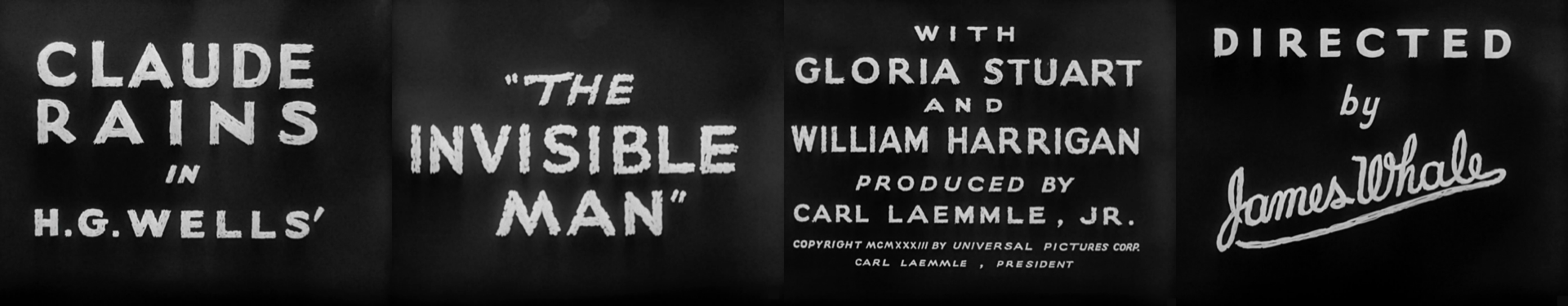
Cartoon title cards were also branding, mood, and scene-setting, all rolled into one. In the early years, when major studio budgets were bigger, these title cards were often illustrative and painterly.
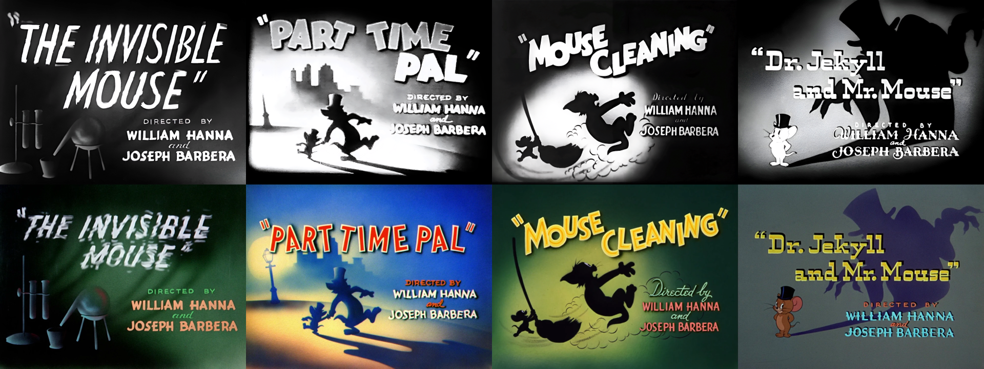
But when television boomed during the 1950s, budgets dropped, and cards designed by artists like Lawrence “Art” Goble adopted a new visual language, becoming more graphic, stylised, and less intricate.
Note: Lawrence “Art” Goble is one of the often overlooked heroes of mid-century American animation. He primarily worked for Hanna-Barbera during its most influential years of the 1950s and 1960s.
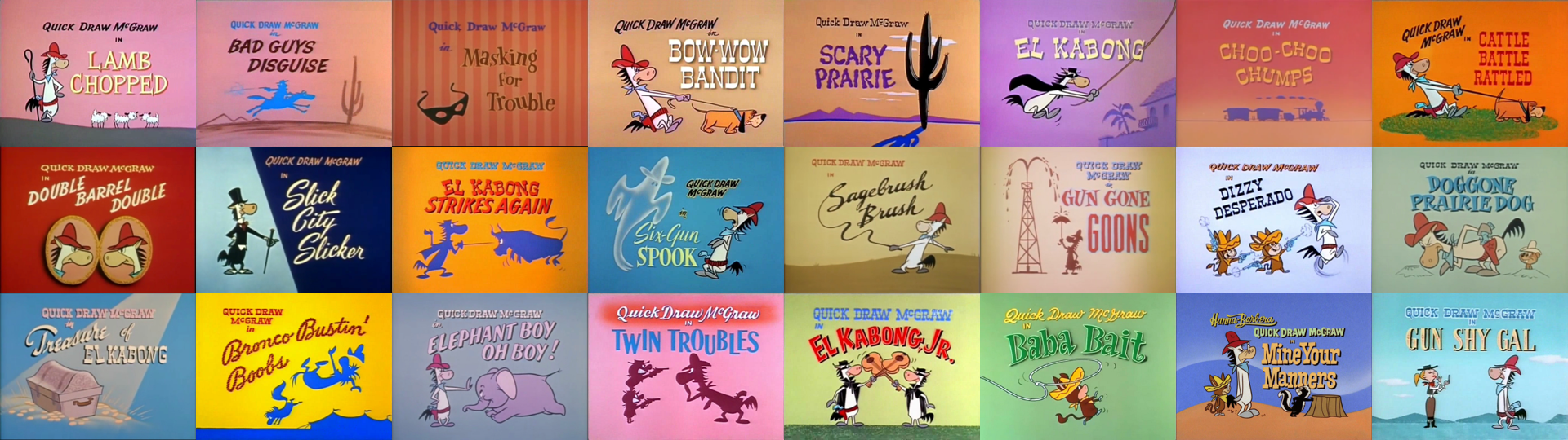
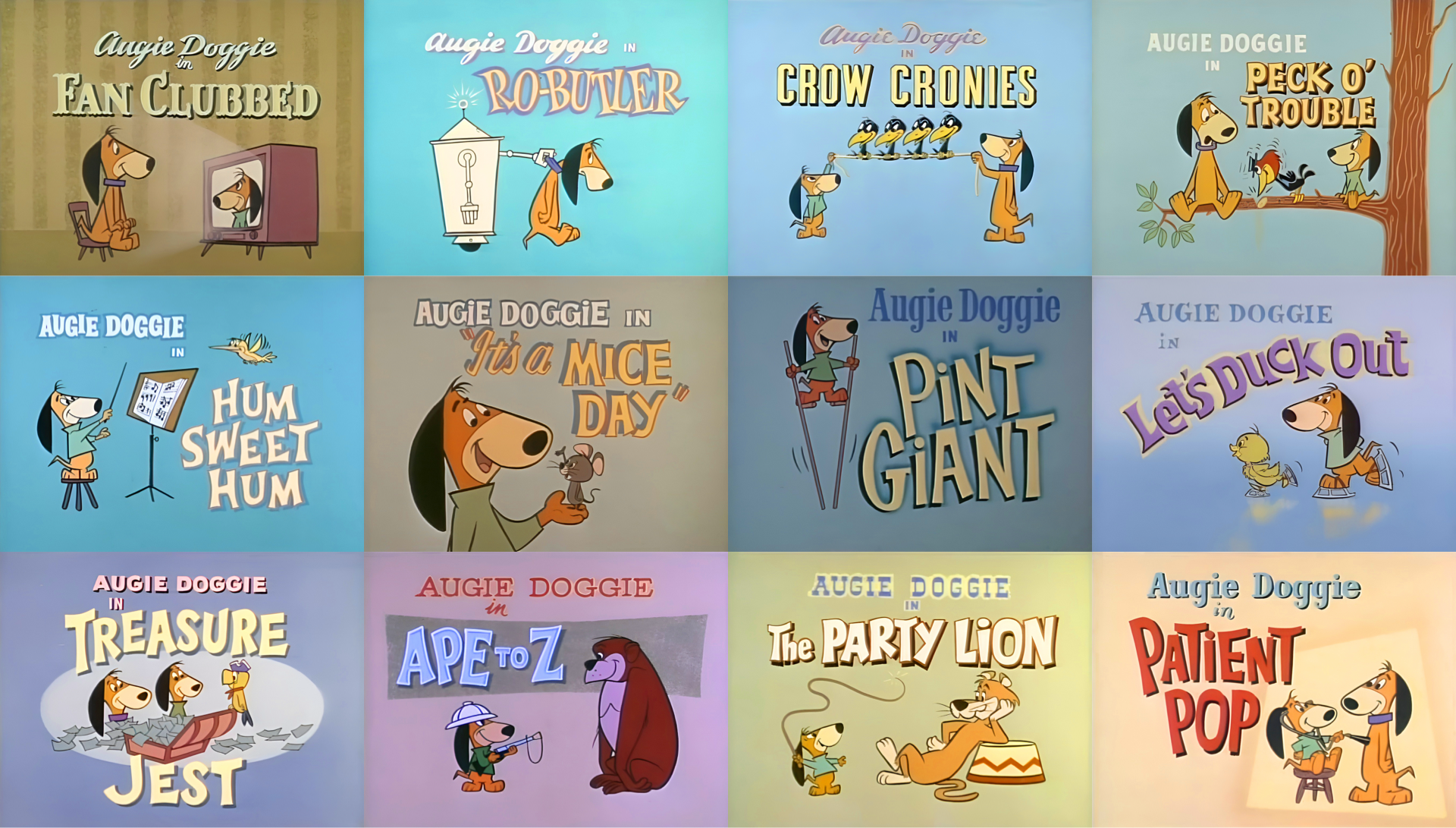
Goble wasn’t a character animator. His role was to create atmosphere, so he designed environments for The Flintstones, Huckleberry Hound, Quick Draw McGraw, and Yogi Bear, as well as the opening title cards that set the tone. His title cards, featuring paintings with a logo overlaid, helped define the iconic look of Hanna-Barbera.
Goble’s artwork for characters such as Quick Draw McGraw and Yogi Bear was effective on smaller TV screens. Rather than reproducing a still from the cartoon, he focused on presenting a single, strong idea — often in silhouette — that captured its essence. In “The Buzzin’ Bear,” Yogi buzzes by in a helicopter. He bounces away, pic-a-nic basket in hand, in “Bear on a Picnic,” and for his “Prize Fight Fright,” Yogi boxes the title text.
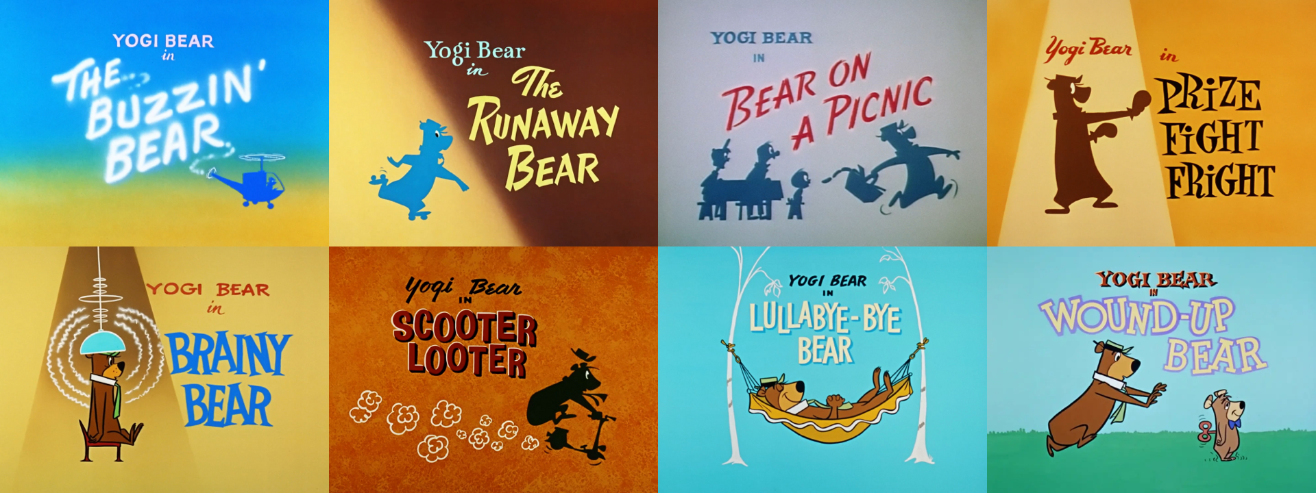
With little or no motion to rely on, Goble’s single frames had to create a mood, set the scene, and describe a story. They did this using flat colours, graphic shapes, and typography that was frequently integrated into the artwork.
As designers who work on the web, toon titles can teach us plenty about how to convey a brand’s personality, make a first impression, and set expectations for someone’s experience using a product or website. We can learn from the artists’ techniques to create effective banners, landing-page headers, and even good ol’ fashioned splash screens.
Toon Title Typography
Cartoon title cards show how merging type with imagery delivers the punch a header or hero needs. With a handful of text-shadow, text-stroke, and transform tricks, modern CSS lets you tap into that same energy.
The Toon Text Title Generator
Partway through writing this article, I realised it would be useful to have a tool for generating text styled like the cartoon titles I love so much. So I made one.
My Toon Text Title Generator lets you experiment with colours, strokes, and multiple text shadows. You can adjust paint order, apply letter spacing, preview your text in a selection of sample fonts, and then copy the generated CSS straight to your clipboard to use in a project.
Toon Title CSS
You can simply copy-paste the CSS that the Toon Text Title Generator provides you. But let’s look closer at what it does.
Text shadow
Look at the type in this title from Augie Doggie’s episode “Yuk-Yuk Duck,” with its pale yellow letters and dark, hard, offset shadow that lifts it off the background and creates the illusion of depth.
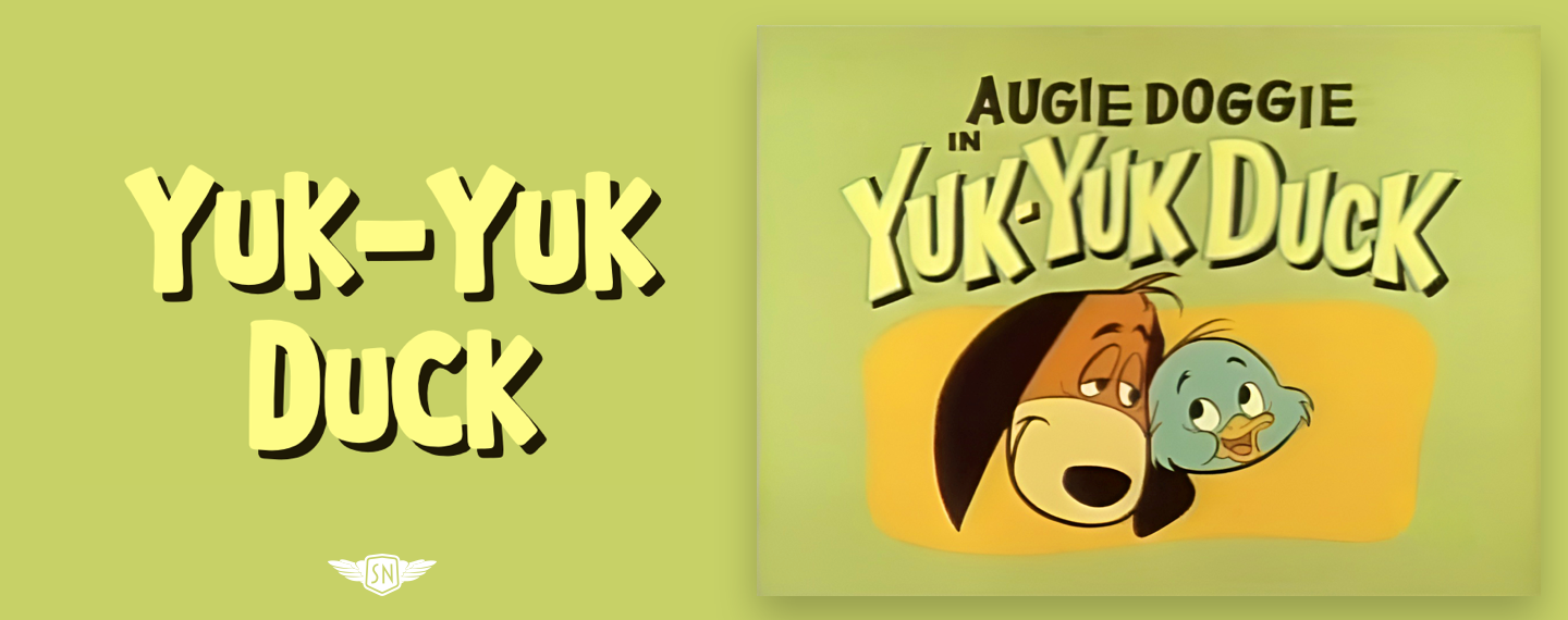
You probably already know that text-shadow accepts four values: (1) horizontal and (2) vertical offsets, (3) blur, and (4) a colour which can be solid or semi-transparent. Those offset values can be positive or negative, so I can replicate “Yuk-Yuk Duck” using a hard shadow pulled down and to the right:
color: #f7f76d;
text-shadow: 5px 5px 0 #1e1904;
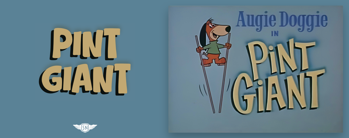
On the other hand, this “Pint Giant” title has a different feel with its negative semi-soft shadow:
color: #c2a872;
text-shadow:
  -7px 5px 0 #b100e,
  0 -5px 10px #546c6f;
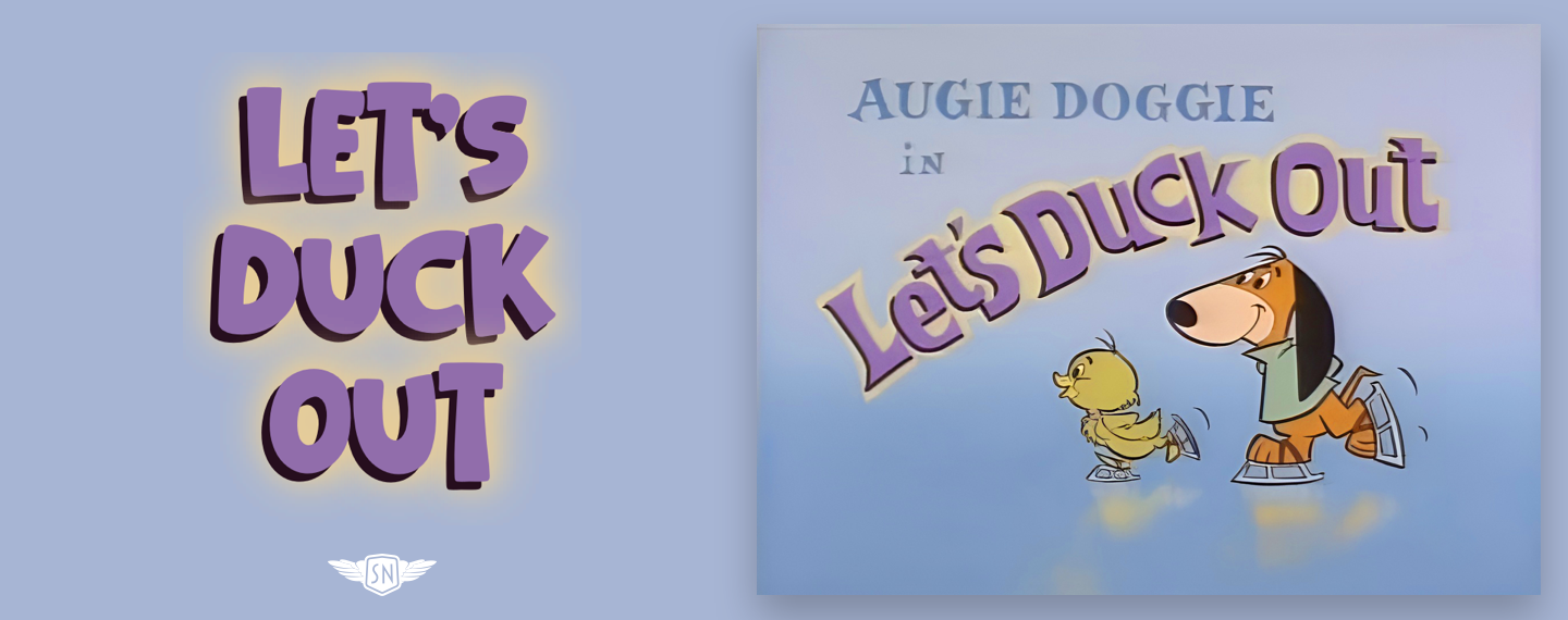
To add extra depth and create more interesting effects, I can layer multiple shadows. For “Let’s Duck Out,” I combine four shadows: the first a solid shadow with a negative horizontal offset to lift the text off the background, followed by progressively softer shadows to create a blur around it:
color: #6F4D80;
text-shadow:
  -5px 5px 0 #260e1e, /* Shadow 1 */
  0 0 15px #e9ce96,   /* Shadow 2 */
  0 0 30px #e9ce96,   /* Shadow 3 */
  0 0 30px #e9ce96;   /* Shadow 4 */
These shadows show that using text-shadow isn’t just about creating lighting effects, as they can also be decorative and add personality.
Text Stroke
Many cartoon title cards feature letters with a bold outline that makes them stand out from the background. I can recreate this effect using text-stroke. For a long time, this property was only available via a -webkit- prefix, but that also means it’s now supported across modern browsers.
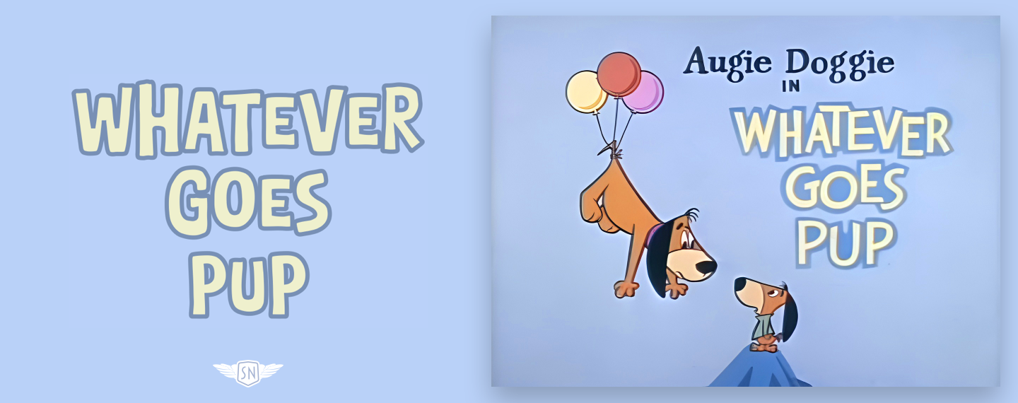
text-stroke is a shorthand for two properties. The first, text-stroke-width, draws a contour around individual letters, while the second, text-stroke-color, controls its colour. For “Whatever Goes Pup,” I added a 4px blue stroke to the yellow text:
color: #eff0cd;
-webkit-text-stroke: 4px #7890b5;
text-stroke: 4px #7890b5;
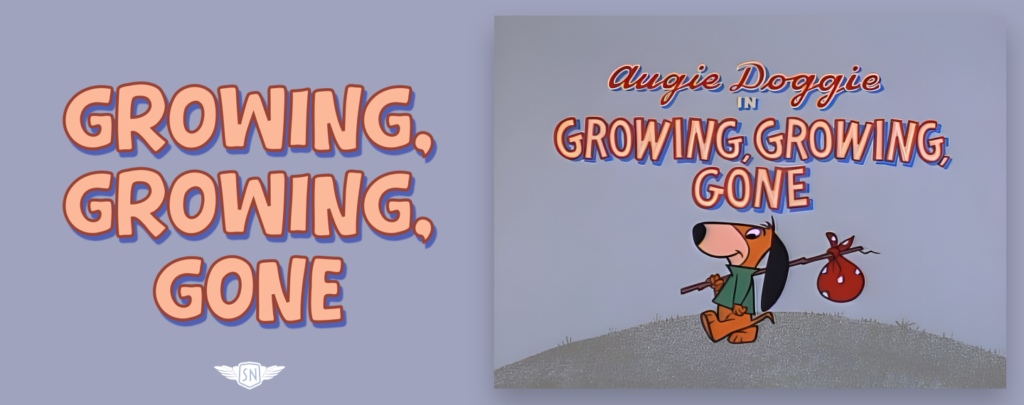
Strokes can be especially useful when they’re combined with shadows, so for “Growing, Growing, Gone,” I added a thin 3px stroke to a barely blurred 1px shadow to create this three-dimensional text effect:
color: #fbb999;
text-shadow: 3px 5px 1px #5160b1;
-webkit-text-stroke: 3px #984336;
text-stroke: 3px #984336;
Paint Order
Using text-stroke doesn’t always produce the expected result, especially with thinner letters and thicker strokes, because by default the browser draws a stroke over the fill. Sadly, CSS still does not permit me to adjust stroke placement as I often do in Sketch. However, the paint-order property has values that allow me to place the stroke behind, rather than in front of, the fill.
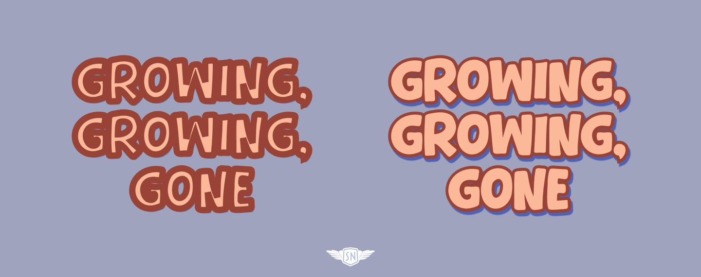
paint-order: stroke. Right: paint-order: fill. (Large preview)paint-order: stroke paints the stroke first, then the fill, whereas paint-order: fill does the opposite:
color: #fbb999;
paint-order: fill;
text-shadow: 3px 5px 1px #5160b1;
text-stroke-color:#984336;
text-stroke-width: 3px;
An effective stroke keeps letters readable, adds weight, and — when combined with shadows and paint order — gives flat text real presence.
Backgrounds Inside Text
Many cartoon title cards go beyond flat colour by adding texture, gradients, or illustrated detail to the lettering. Sometimes that’s a texture, other times it might be a gradient with a subtle tonal shift. On the web, I can recreate this effect by using a background image or gradient behind the text, and then clipping it to the shape of the letters. This relies on two properties working together: background-clip: text and text-fill-color: transparent.
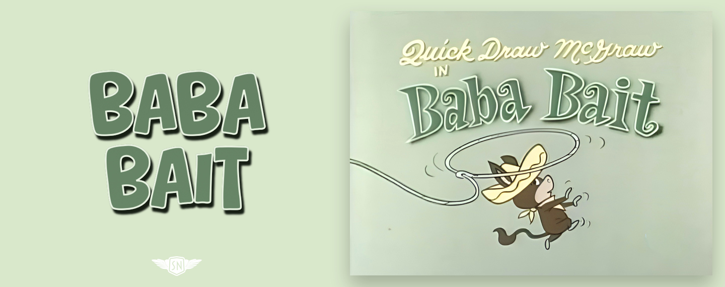
First, I apply a background behind the text. This can be a bitmap or vector image or a CSS gradient. For this example from the Quick Draw McGraw episode “Baba Bait,” the title text includes a subtle top–bottom gradient from dark to light:
background: linear-gradient(0deg, #667b6a, #1d271a);
Next, I clip that background to the glyphs and make the text transparent so the background shows through:
-webkit-background-clip: text;
-webkit-text-fill-color: transparent;
With just those two lines, the background is no longer painted behind the text; instead, it’s painted within it. This technique works especially well when combined with strokes and shadows. A clipped gradient provides the lettering with colour and texture, a stroke keeps its edges sharp, and a shadow elevates it from the background. Together, they recreate the layered look of hand-painted title cards using nothing more than a little CSS. As always, test clipped text carefully, as browser quirks can sometimes affect shadows and rendering.
Splitting Text Into Individual Characters
Sometimes I don’t want to style a whole word or heading. I want to style individual letters — to nudge a character into place, give one glyph extra weight, or animate a few letters independently.
In plain HTML and CSS, there’s only one reliable way to do that: wrap each character in its own span element. I could do that manually, but that would be fragile, hard to maintain, and would quickly fall apart when copy changes. Instead, when I need per-letter control, I use a text-splitting library like splt.js (although other solutions are available). This takes a text node and automatically wraps words or characters, giving me extra hooks to animate and style without messing up my markup.
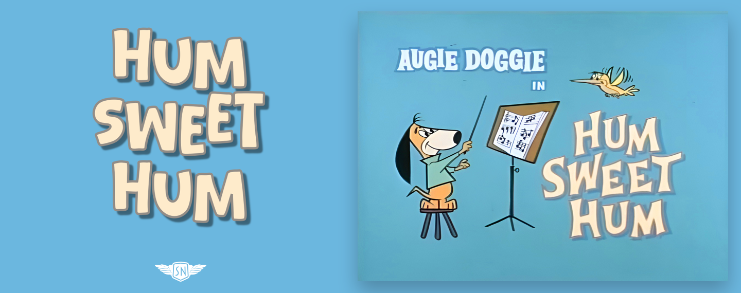
It’s an approach that keeps my HTML readable and semantic, while giving me the fine-grained control I need to recreate the uneven, characterful typography you see in classic cartoon title cards. However, this approach comes with accessibility caveats, as most screen readers read text nodes in order. So this:
<h2>Hum Sweet Hum</h2>
…reads as you’d expect:
Hum Sweet Hum
But this:
<h2>
<span>H</span>
<span>u</span>
<span>m</span>
<!-- etc. -->
</h2>
…can be interpreted differently depending on the browser and screen reader. Some will concatenate the letters and read the words correctly. Others may pause between letters, which in a worst-case scenario might sound like:
“H…” “U…” “M…”
Sadly, some splitting solutions don’t deliver an always accessible result, so I’ve written my own text splitter, splinter.js, which is currently in beta.
Transforming Individual Letters
To activate my Toon Text Splitter, I add a data- attribute to the element I want to split:
<h2 data-split="toon">Hum Sweet Hum</h2>
First, my script separates each word into individual letters and wraps them in a span element with class and ARIA attributes applied:
<span class="toon-char" aria-hidden="true">H</span>
<span class="toon-char" aria-hidden="true">u</span>
<span class="toon-char" aria-hidden="true">m</span>
The script then takes the initial content of the split element and adds it as an aria attribute to help maintain accessibility:
<h2 data-split="toon" aria-label="Hum Sweet Hum">
  <span class="toon-char" aria-hidden="true">H</span>
  <span class="toon-char" aria-hidden="true">u</span>
  <span class="toon-char" aria-hidden="true">m</span>
</h2>
With those class attributes applied, I can then style individual characters as I choose.
For example, for “Hum Sweet Hum,” I want to replicate how its letters shift away from the baseline. After using my Toon Text Splitter, I applied four different translate values using several :nth-child selectors to create a semi-random look:
/* 4th, 8th, 12th... */
.toon-char:nth-child(4n) { translate: 0 -8px; }
/* 1st, 5th, 9th... */
.toon-char:nth-child(4n+1) { translate: 0 -4px; }
/* 2nd, 6th, 10th... */
.toon-char:nth-child(4n+2) { translate: 0 4px; }
/* 3rd, 7th, 11th... */
.toon-char:nth-child(4n+3) { translate: 0 8px; }
But translate is only one property I can use to transform my toon text.
I could also rotate those individual characters for an even more chaotic look:
/* 4th, 8th, 12th... */
.toon-line .toon-char:nth-child(4n) { rotate: -4deg; }
/* 1st, 5th, 9th... */
.toon-char:nth-child(4n+1) { rotate: -8deg; }
/* 2nd, 6th, 10th... */
.toon-char:nth-child(4n+2) { rotate: 4deg; }
/* 3rd, 7th, 11th... */
.toon-char:nth-child(4n+3) { rotate: 8deg; }
But translate is only one property I can use to transform my toon text. I could also rotate those individual characters for an even more chaotic look:
/* 4th, 8th, 12th... */
.toon-line .toon-char:nth-child(4n) {
rotate: -4deg; }

/* 1st, 5th, 9th... */
.toon-char:nth-child(4n+1) {
rotate: -8deg; }

/* 2nd, 6th, 10th... */
.toon-char:nth-child(4n+2) {
rotate: 4deg; }

/* 3rd, 7th, 11th... */
.toon-char:nth-child(4n+3) {
rotate: 8deg; }
And, of course, I could add animations to jiggle those characters and bring my toon text style titles to life. First, I created a keyframe animation that rotates the characters:
@keyframes jiggle {
0%, 100% { transform: rotate(var(--base-rotate, 0deg)); }
25% { transform: rotate(calc(var(--base-rotate, 0deg) + 3deg)); }
50% { transform: rotate(calc(var(--base-rotate, 0deg) - 2deg)); }
75% { transform: rotate(calc(var(--base-rotate, 0deg) + 1deg)); }
}
Before applying it to the span elements created by my Toon Text Splitter:
.toon-char {
animation: jiggle 3s infinite ease-in-out;
transform-origin: center bottom; }
And finally, setting the rotation amount and a delay before each character begins to jiggle:
.toon-char:nth-child(4n) { --base-rotate: -2deg; }
.toon-char:nth-child(4n+1) { --base-rotate: -4deg; }
.toon-char:nth-child(4n+2) { --base-rotate: 2deg; }
.toon-char:nth-child(4n+3) { --base-rotate: 4deg; }

.toon-char:nth-child(4n) { animation-delay: 0.1s; }
.toon-char:nth-child(4n+1) { animation-delay: 0.3s; }
.toon-char:nth-child(4n+2) { animation-delay: 0.5s; }
.toon-char:nth-child(4n+3) { animation-delay: 0.7s; }

One Frame To Make An Impression
Cartoon title artists had one frame to make an impression, and their typography was as important as the artwork they painted. The same is true on the web.
“
With a few carefully chosen CSS properties — shadows, strokes, clipped backgrounds, and some restrained animation — we can recreate that same impact. I love toon text not because I’m nostalgic, but because its design is intentional. Make deliberate choices, and let a little toon text typography add punch to your designs.
 (gg, yk)

