Rethinking “Pixel Perfect” Web Design

Email Newsletter
Weekly tips on front-end & UX.
Trusted by 182,000+ folks.
 Try ProtoPie AI free →

 Celebrating 10 million developers
 SurveyJS: White-Label Survey Solution for Your JS App

It’s 2026. We are operating in an era of incredible technological leaps, where advanced tooling and AI-enhanced workflows have fundamentally transformed how we design, build, and bridge the gap between the two. The web is moving faster than ever, with groundbreaking features and standards emerging almost daily.
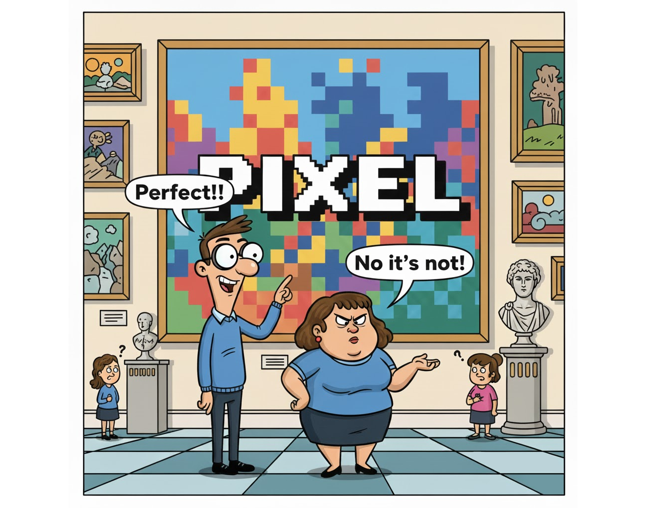
Yet, in the middle of this high-speed evolution, there’s one thing we’ve been carrying with us since the early days of print, a phrase that feels increasingly out of sync with our modern reality: “Pixel Perfect.”
I’ll be honest, I’m not a fan. In fact, I believe the idea that we can have pixel-perfection in our designs has become misleading, vague, and ultimately counterproductive to the way we build for the modern web. As a community of developers and designers, it’s time we take a hard look at this legacy concept, understand why it’s failing us, and redefine what “perfection” actually looks like in a multi-device, fluid world.
A Brief History Of A Rigid Mindset
To understand why many of us still aim for pixel perfection today, we have to look back at where it all began. It didn’t start on the web, but as a stowaway from the era when layout software first allowed us to design for print on a personal computer, and GUI design from the late 1980s and ’90s.
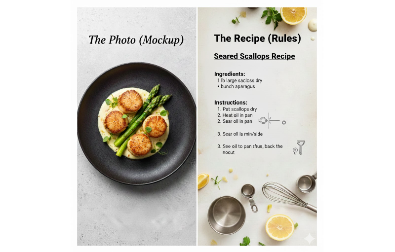
In the print industry, perfection was absolute. Once a design was sent to the press, every dot of ink had a fixed, unchangeable position on a physical page. When designers transitioned to the early web, they brought this “printed page” mentality with them. The goal was simple: The website must be an exact, pixel-for-pixel replica of the static mockup created in design applications like Photoshop and QuarkXPress.
I’m old enough to remember working with talented designers who had spent their entire careers in the print world. They would hand over web designs and, with total sincerity, insist on discussing the layout in centimeters and inches. To them, the screen was just another piece of paper, albeit one that glowed.
In those days, we “tamed” the web to achieve this. We used table-based layouts, nested three levels deep, and stretched 1×1 pixel “spacer GIFs” to create precise gaps. We designed for a single, “standard” resolution (usually 800×600) because, back then, we could actually pretend we knew exactly what the user was seeing.
<!-- A typical "Pixel Perfect" layout from 1998 -->
<table width="800" border="0" cellpadding="0" cellspacing="0">
  <tr>
    <td width="150" valign="top" bgcolor="#CCCCCC">
      <img src="spacer.gif" width="150" height="1"> <!-- Sidebar -->
    </td>
    <td width="10"><img src="spacer.gif" width="10" height="1"></td>
    <td width="640" valign="top">
      <!-- Content goes here -->
    </td>
  </tr>
</table>
Cracks In The Foundation
The first major challenge to the fixed-table mindset came as early as 2000. In his seminal article, “A Dao of Web Design”, John Allsopp argued that by trying to force the web into the constraints of print, we were missing the point of the medium entirely. He called the quest for pixel-perfection a “ritual” that ignored the web’s inherent fluidity.
When a new medium borrows from an existing one, some of what it borrows makes sense, but much of the borrowing is thoughtless, “ritual,” and often constrains the new medium. Over time, the new medium develops its own conventions, throwing off existing conventions that don’t make sense.
Nonetheless, the “pixel-perfection” refused to die. While its meaning has shifted and morphed over the decades, it has rarely been well-defined. Many have tried, such as in 2010 when the design agency ustwo released the Pixel Perfect Precision (PPP) (PDF) handbook. But that same year, Responsive Web Design also gained massive momentum, effectively killing the idea that a website could look identical on every screen.
Yet, here we are, still using a term born from the limitations of monitors dated to the ’90s to describe the complex interfaces of 2026.
Note: Before we continue, it’s important to acknowledge the exceptions. There are, of course, scenarios where pixel precision is non-negotiable. Icon grids, sprite sheets, canvas rendering, game engines, or bitmap exports often require exact, pixel-level control to function correctly. These, however, are specialized technical requirements, not a general rule for modern UI development.
Why “Pixel Perfect” Is Failing the Modern Web
In our current landscape, clinging to the idea of “pixel perfection” isn’t just anachronistic, it’s actively harmful to the products we build. Here is why.
It Is Fundamentally Vague
Let’s start with a simple question: When a designer asks for a “pixel-perfect” implementation, what are they actually asking for? Is it the colors, the spacing, the typography, the borders, the alignment, the shadows, the interactions? Take a moment to think about it.
If your answer is “everything”, then you’ve just identified the core issue.
“
The Multi-Surface Reality
The concept of a “standard screen size” is now a relic of the past. We are building for an almost infinite variety of viewports, resolutions, and aspect-ratios, and this reality is not likely to change any time soon. Plus, the web is no longer confined to a flat, rectangular piece of glass; it can be on a foldable phone that changes aspect ratios mid-session, or on a spatial interface projected into a room.
Every Internet-connected device has its own pixel density, scaling factors, and rendering quirks.
A design that is “perfect” on one set of pixels is, by definition, imperfect on another. Striving for a single, static “perfection” ignores the fluid, adaptive nature of the modern web. When the canvas is constantly shifting, the very idea of a fixed pixel implementation becomes a technical impossibility.

The Dynamic Nature Of Content
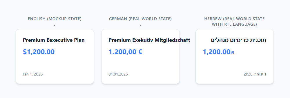
A static mockup is a snapshot of a single state with a specific set of data. But content is rarely static like that in the real world. Localization is a prime example: a label that fits perfectly inside a button component in English might overflow the container in German or require a different font entirely for CJK languages.
Beyond text length, localization means changes with currency symbols, date formatting, and numeric systems. Any of these variables can significantly impact a page layout. If a design is built to be “pixel-perfect” based on a specific string of text, it is inherently fragile. A pixel-perfect layout completely collapses the moment content changes.
Accessibility Is The Real Perfection
True perfection means a site that works for everyone. If a layout is so rigid that it breaks when a user increases their font size or forces a high-contrast mode, it isn’t perfect — it’s broken. “Pixel perfect” often prioritizes visual aesthetics over functional accessibility, creating barriers for users who don’t fit the “standard” profile.
Think Systems, Not Pages
We no longer build pages; we build design systems. We create components that must work in isolation and a variety of contexts, whether in headers, in sidebars, or in dynamic grids. Trying to match a component to a specific pixel coordinate in a static mockup is a fool’s errand.
A pure “pixel-perfect” approach treats every instance as a unique snowflake, which is the antithesis of a scalable, component-based architecture. It forces developers to choose between following a static image and maintaining the integrity of the system.
Perfection Is Technical Debt
When we prioritize exact visual matching over sound engineering, we aren’t just making a design choice; we are incurring technical debt. Chasing that last pixel often forces developers to bypass the browser’s natural layout engine.
Working in exact units leads to “magic numbers”, those arbitrary margin-top: 3px or left: -1px hacks, sprinkled throughout the codebase to force an element into a specific position on a specific screen. This creates a fragile, brittle architecture, leading to a never-ending cycle of “visual bug” tickets.
/* The "Pixel Perfect" Hack */
.card-title {
  margin-top: 13px; /* Matches the mockup exactly on 1440px */
  margin-left: -2px; /* Optical adjustment for a specific font */
}
/* The "Design Intent" Solution */
.card-title {
  margin-top: var(--space-m); /* Part of a consistent scale */
  align-self: start; /* Logical alignment */
}
By insisting on pixel-perfection, we are building a foundation that is difficult to automate, difficult to refactor, and ultimately, more expensive to maintain. We have much more flexible ways to calculate sizing in CSS, thanks to relative units.
Moving From Pixels To Intent
So far, I’ve spent a lot of time talking about what we shouldn’t do. But let’s be clear: Moving away from “pixel perfection” isn’t an excuse for sloppy implementation or a “close enough” attitude. We still need consistency, we still want our products to look and feel high-quality, and we still need a shared methodology for achieving that.
So, if “pixel perfection” is no longer a viable goal, what should we be striving for?
The answer, I believe, lies in shifting our focus from individual pixels to design intent. In a fluid world, perfection isn’t about matching a static image, but ensuring that the core logic and visual integrity of the design are preserved across every possible context.
Design Intent Over Static Values
Instead of asking for a margin: 24px in a design, we should be asking: Why is this margin here? Is it to create a visual separation between sections? Is it part of a consistent spacing scale? When we understand the intent, we can implement it using fluid units and functions (like rem and clamp(), respectively) and use advanced tools, like CSS Container Queries, that allow the design to breathe and adapt while still feeling “right”.
/* Intent: A heading that scales smoothly with the viewport */
h1 {
  font-size: clamp(2rem, 5vw + 1rem, 4rem);
}
/* Intent: Change layout based on the component's own width, not the screen */
.card-container {
  container-type: inline-size;
}
@container (min-width: 400px) {
  .card {
    display: grid;
    grid-template-columns: 1fr 2fr;
  }
}
Speaking In Tokens
Design tokens are the bridge between design and code. When a designer and developer agree on a token like --spacing-large instead of 32px, they aren’t just syncing values, but instead syncing logic. This ensures that even if the underlying value changes to accommodate a specific condition, the relationship between elements remains perfect.
:root {
  /* The logic is defined once */
  --color-primary: #007bff;
  --spacing-unit: 8px;
  --spacing-large: calc(var(--spacing-unit) * 4);
}

/* And reused everwhere */
.button {
  background-color: var(--color-primary);
  padding: var(--spacing-large);
}
Fluidity As A Feature, Not A Bug
We need to stop viewing the web’s flexibility as something to be tamed and start seeing that flexibility as its greatest strength. A “perfect” implementation is one that looks intentional at 320px, 1280px, and even in a 3D spatial environment. This means embracing intrinsic web design based on an element’s natural size in any context — and using modern CSS tools to create layouts that “know” how to arrange themselves based on the available space.
Death To The “Handover”
In this intent-driven world, the “handover” of traditional design assets has become another relic of the past. We no longer pass static Photoshop files across a digital wall and hope for the best. Instead, we work within living design systems.
Modern tooling allows designers to specify behaviors, not just positions. When a designer defines a component, they aren’t just drawing a box; they’re defining its constraints, its fluid scales, and its relationship to the content. As developers, our job is to implement that logic.
The conversation has shifted from “Why is this three pixels off?” to “How should this component behave when the container shrinks?” and “What happens to the hierarchy when the text is translated to a longer language?”
Better Language, Better Outcomes
Speaking of conversations, when we aim for “pixel perfection”, we set ourselves up for friction. Mature teams have long moved past this binary “match-or-fail” mindset towards a more descriptive vocabulary that reflects the complexity of our work.
By replacing “pixel perfect” with more precise terms, we create shared expectations and eliminate pointless arguments. Here are a few phrases that have served me well for productive discussions around intent and fluidity:
- “Visually consistent with the design system.”
Instead of matching a specific mockup, we ensure the implementation follows the established rules of our system. - “Matches spacing and hierarchy.”
We focus on the relationships and rhythm between elements rather than their absolute coordinates. - “Preserves proportions and alignment logic.”
We ensure that the intent of the layout remains intact, even as it scales and shifts. - “Acceptable variance across platforms.”
We acknowledge that a site will look different, within a defined and agreed-upon range of variation, and that’s okay as long as the experience remains high-quality.
“
A Note To My Design Colleagues
When you hand over a design, don’t give us a fixed width, but a set of rules. Tell us what should stretch, what should stay fixed, and what should happen when the content inevitably overflows. Your “perfection” lies in the logic you define, not the pixels you draw.
The New Standard Of Excellence
The web was never meant to be a static gallery of frozen pixels. It was born to be a messy, fluid, and gloriously unpredictable medium. When we cling to an outdated model of “pixel perfection”, we are effectively trying to put a leash on a hurricane. It’s unnatural in today’s front-end landscape.
In 2026, we have the tools to build interfaces that think, adapt, and breathe. We have AI that can generate layouts in seconds and spatial interfaces that defy the very concept of a “screen”. In this world, perfection isn’t a fixed coordinate but a promise; it’s the promise that no matter who is looking, or what they are looking through, the soul of the design remains intact.
So, let’s bury the term once and for all. Let’s leave the centimeters to the architects and the spacer GIFs to the digital museums. If you want something to look exactly the same for the next hundred years, carve it in stone or print it on a high-quality cardstock. But if you want to build for the web, embrace the chaos.
Stop counting pixels. Start building intent.
 (gg, yk)

