Practical Interface Patterns For AI Transparency (Part 2)

Email Newsletter
Weekly tips on front-end & UX.
Trusted by 182,000+ folks.
 Register for Free
 Custom Web Forms for Angular, React, & Vue. Your backend.


 Celebrating 10 million developers
In the first part of this series, we talked about the Decision Node Audit. We mapped out the internal workings of our AI system to pinpoint the exact moments it makes decisions based on probabilities. This told us when the system needs to be transparent with the user. Now, the big question is how to share that information.
You’ve got your Transparency Matrix ready. You know which behind-the-scenes API calls need a visible status update. Your engineers are on board with the technical aspects. The next step is designing the visual container for those updates.
We face a legacy problem. For thirty years, interface designers have relied on a single pattern to handle latency: the spinner. The spinning wheel, the throbber, the progress bar. These patterns communicate a specific technical reality. They tell the user that the system is retrieving data. The delay is caused by bandwidth or file size.
AI agents introduce a new kind of wait time. When an agent pauses for twenty seconds, it’s not just downloading something; it’s thinking. It’s figuring out the best steps, weighing options, and creating the content you asked for.
If we use a basic spinning icon for this “thinking time,” users get confused and anxious. They watch a looping animation and can’t tell if the system is stalled or crashed. They don’t know if the agent is handling a very complicated task or if it has simply failed.
To build user trust, we need to turn this waiting time into a moment for reassurance. Instead of a passive “something is happening,” we need to communicate an active, “Here is exactly how I am working to solve your problem.”
Writing Clear Status Updates
We often think of transparency as a visual design problem, but it’s really about the words we use. Simple, clear explanations (the microcopy) are what build trust and separate a reliable AI from one that feels broken.
We need to retire generic placeholders like Loading or Working. These words are remnants of the era of static software. Instead, we must construct our status updates using a specific formula that mirrors the agency of the system. Let’s stop using vague words like “Loading” or “Working.” Those terms belong to the past, when software was simple and static. Instead, we should create status updates that clearly tell the user what the system is actually doing and make the system’s actions transparent.
Imagine, for the sake of an example, you are deploying agentic AI that will help team members organize their calendars and plan recurring meetings on their behalf, once prompted.
When an AI displays a message like “Checking availability” for an unknown amount of time, users often feel lost because it doesn’t offer enough information. While they understand the AI is looking at a calendar, they don’t know whose calendar it is, what other steps are involved (before or after), or if the AI even remembered the people and purpose of the scheduling request. Waiting for the final result can be a tense, uneasy experience, like anticipating a gift that you suspect might be a prank.
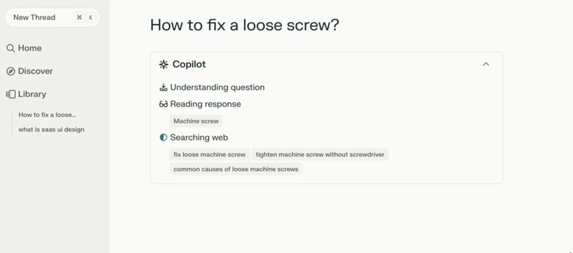
Perplexity AI provides a strong example of doing status updates right. Figure 1 below shows that when users ask a question, the interface displays exactly what it is doing in real time. You see a list of activities updating as they are accomplished. Users do not need to guess what is happening as the AI works.
The Agentic Update Formula
To give people useful status updates, we need to connect what the system is doing with why it’s doing it. Keeping with our scheduling agent example, the system should break down that waiting period into at least four clear, separate steps.
- First, the interface displays Checking your calendar to find open times for a recurring Thursday call with [Name(s)].
- Then, it updates to: Cross-checking availability with [Name(s)] calendars.
- Next, it might display: Syncing [Name(s)] schedules to secure your meeting time on [Data and Time].
- Finally, at the conclusion, the agent might state they have successfully completed the task and request the user check their email to confirm the invite that’s been shared with the group having the recurring meeting.
This communication process grounds the technical process in the user’s actual life.
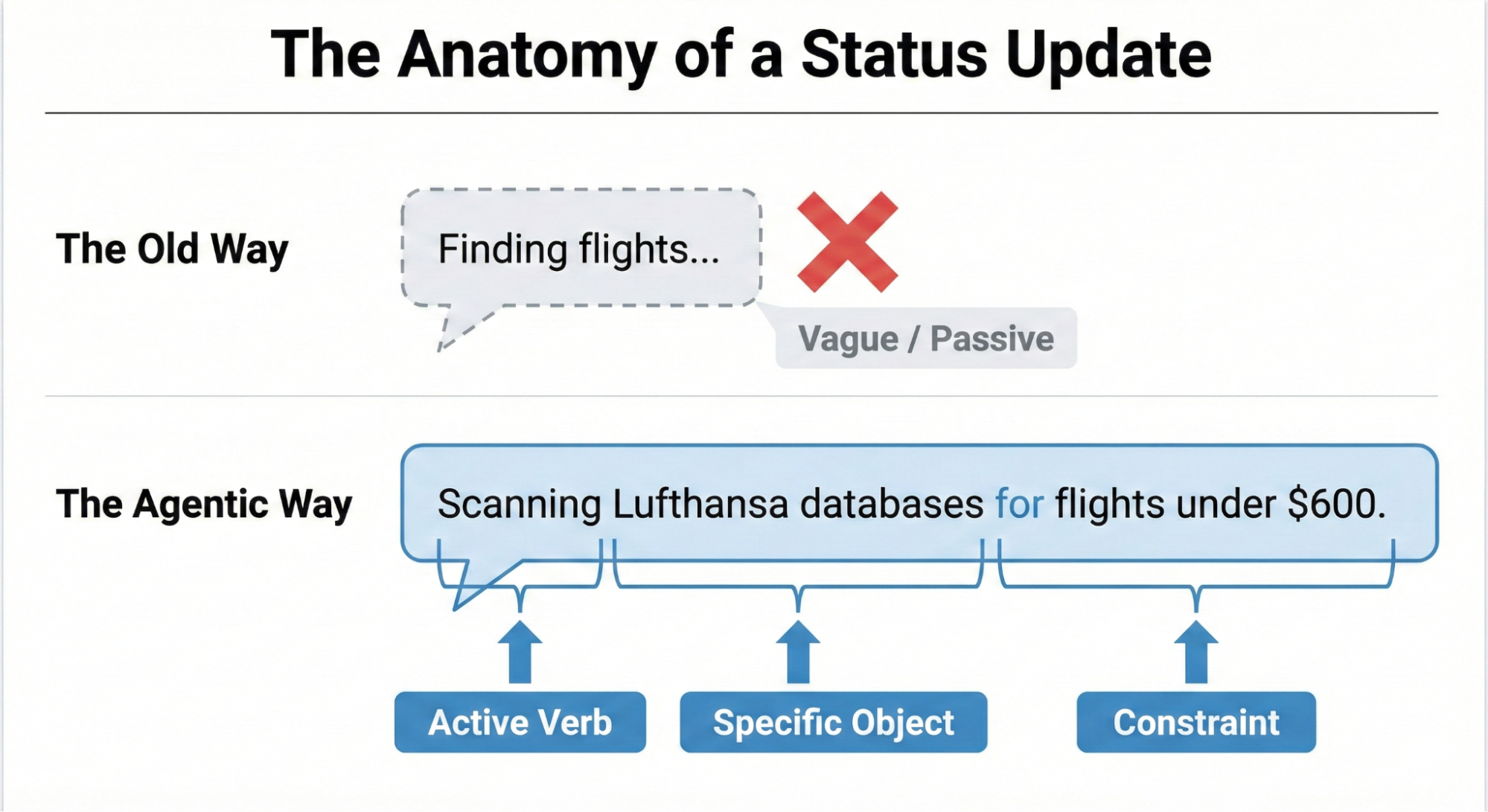
Making an AI’s progress easy to understand boils down to a three-part structure: a strong Action Word, what the AI is working on (the Specific Item), and any Limits or rules it has to follow.
Think about an AI helping you book a trip. A weak, unhelpful update would just be: Searching for flights…
A much better update uses the formula:
- Action Word: Scanning
- Specific Item: the prices on Lufthansa and United
- Limits/Rules: to find anything under $600.
This approach clearly shows the user that the AI understood their request and is working within the set boundaries.
Matching Tone to the Risk Matrix
Should an AI sound like a person or act like a robot? The right answer depends on the task’s importance, which we can figure out using the Impact/Risk Matrix from our Decision Node Audit.
For simple, low-risk tasks, a friendly, conversational tone works best. For example, a scheduling assistant can say it’s checking your calendar for the best time. This creates a comfortable, easygoing experience for the user.
However, high-stakes tasks demand clear, mechanical accuracy. If the AI is managing a big financial transfer or a complicated database migration, users don’t want a playful interface; they want precision. A screen that says “I am thinking hard about your money” would possibly cause panic. Instead, the interface should use straightforward language like “Verifying account routing numbers.” By adjusting the AI’s “personality” to match the level of risk, we give users exactly the experience they need in that moment. While the Impact/Risk Matrix provides a necessary starting point, the ultimate determinant of the appropriate AI voice and tone is rigorous user research.
It’s impossible for any set of rules to predict the exact words or tone that will build trust or cause stress for every group of users or in every situation. That’s why hands-on research is essential. You need to:
- Run A/B tests on different ways the AI “talks” to people.
- Conduct usability studies to see how users react emotionally to the system’s messages.
- Perform interviews to truly understand what users expect from an AI in terms of openness.
This kind of research ensures the AI’s “personality” is comfortable and appropriate for the actual people who will be using the system in their specific context.
We’ve now covered the “what” — the critical microcopy, the clear action words, and the necessary limits that make an AI status update honest and informative. But words alone aren’t enough. A perfect sentence hidden in a poor interface is still a failure of transparency.
The next challenge is the “how” — designing the physical delivery system for that message. You can think of the status update formula as the engine, and the interface pattern as the car. A powerful engine needs a reliable, well-designed chassis to carry it down the road.
Interface Patterns: A Library For Agents
Once we have the right words, we need the right container. The key is matching the message’s weight to the pattern’s visibility. A tiny background task (like an agent gently tidying up your files) doesn’t need a loud, flashing banner. That message is best delivered subtly. A high-stakes, multi-step process (like moving money) potentially demands a more robust container that forces the user to pay attention.
By creating a library of these patterns, we ensure the right level of transparency is delivered at the right moment, turning the anxiety of waiting into a moment of informed confidence. Let’s review a few common, critical patterns.
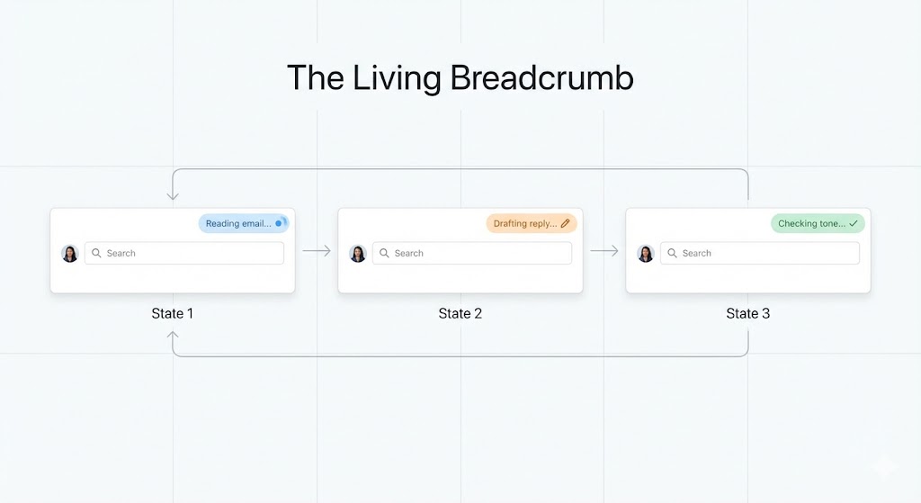
The Living Breadcrumb: AI Working in the Background
For those low-importance tasks that an AI is handling quietly in the background, we need a way to show users it’s working without constantly distracting them. We can call this the living breadcrumb.
Think of an email app where an AI is drafting a reply for you. You don’t want a disruptive pop-up message. Instead, a small, subtle status indicator pulses within the application’s border or menu area.
The solution needs to go beyond a static icon. The living breadcrumb smoothly transitions between different text updates. It might pulse from Reading email to Drafting reply to Checking tone. It’s there if you want to check on its progress, offering a quiet assurance that the task is underway, but it won’t demand your immediate attention.
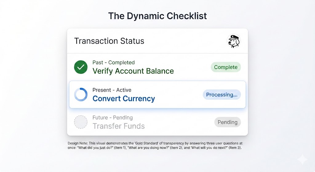
Dynamic Checklists
When dealing with critical, high-stakes tasks — like processing a complex financial transaction or migrating a large, intricate dataset — we recommend using a Dynamic Checklist (illustrated in Figure 3).
This pattern serves as a powerful anchor for the user, providing clarity and confidence about the process’s progress. Instead of a simple bar, the Dynamic Checklist lays out every planned step the AI agent will take. It clearly highlights the step that is currently in progress, marks preceding steps as complete, and lists future actions as pending.
For example:
- Step 1: Verify Account Balance [Complete].
- Step 2: Convert Currency [Processing].
- Step 3: Transfer Funds [Pending].
The Dynamic Checklist offers a significant advantage over a traditional progress bar because it expertly manages unpredictable time. If the currency conversion (Step 2) unexpectedly requires an extra ten seconds, the user won’t feel sudden anxiety or panic. They have full visibility into the system’s exact location, understanding that the delay is occurring during the Converting Currency step. Because they recognize this is a potentially complex action, they are naturally more patient and trusting of the system’s ongoing work.
The pattern itself is a compelling UI idea, but designers must remember that its implementation transforms the task into a full-stack design requirement. Unlike a simple loading flag, the dynamic checklist requires a robust front-end state management system to listen for step-completion events, which are typically triggered by a back-end webhook structure. This ensures the interface is always reflecting the agent’s real-time position in the workflow.
The Thinking Toggle
Some users with higher information needs or higher needs for transparency may not trust a simple summary; they want to see the system’s raw processing. For this audience, we’ve designed the Thinking Toggle.
This is a simple progressive disclosure UI control, like a chevron or a “View Logs” button, that lets the user expand a friendly status update into a raw terminal view. It displays the sanitized logic logs of the AI agent, such as:
- Querying API endpoint /v2/search;
- Response received: 200 OK;
- Filtering results by relevance score > 0.8.
Many people will never open this view. However, for the user who needs deep transparency, the very presence of this toggle is a signal of trust. It reassures them that the system is not concealing anything.
Keep in mind, with this deep transparency comes a critical technical risk. Even for your most expert audience, you must sanitize and abstract these raw logs before display. This step is non-negotiable to prevent accidentally exposing proprietary business logic, internal data structure names, or security tokens that could be exploited. This process ensures trust is built through honesty, not security vulnerability.
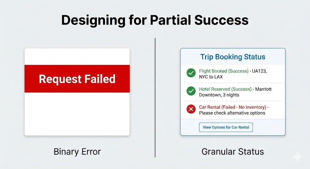
Designing For Partial Success
In standard software, things are often black or white. A file either saves or it doesn’t. But with AI agents, things are often grey. An agent might plan most of a trip perfectly, yet struggle to book that one special restaurant.
We need to design for when the AI is mostly successful.
Standard binary (yes or no) error messages are trust-killers because they suggest the AI failed completely. If an agent does 90% of a task and only misses the last 10%, a big red “Request Failed” banner is misleading.
Instead, the interface should clearly show what worked and what didn’t:
- Flight booked: UA 492 [Success].
- Hotel reserved: Marriott Downtown [Success].
- Car rental: Hertz [Failed — No inventory].
This way, you only have to step in and fix the parts that failed, like booking the car yourself, while keeping all the good work the agent already did.
Disentangling The Tool
When an AI system doesn’t perform as expected, it’s crucial to be absolutely clear about the true reason for the failure. Users often mistakenly blame the AI itself for problems that are actually caused by an external service or tool the AI relies on.
For example, imagine a virtual assistant tries to look at your schedule, but the connection to the Google Calendar API is down. The error message shouldn’t make the assistant look like it failed to do its job.
- Less helpful: “I could not check your calendar.” (This suggests the assistant is incompetent.)
- More helpful and honest: “The Google Calendar connection is not responding. I will automatically try again in 30 seconds.”
The first message is frustrating because it makes the AI look like it failed. The second message, though, is much clearer. It explains that the AI is capable, but a broken tool outside its control is causing the issue. This distinction is really important because it keeps the user from losing faith in the AI, even when things go wrong.
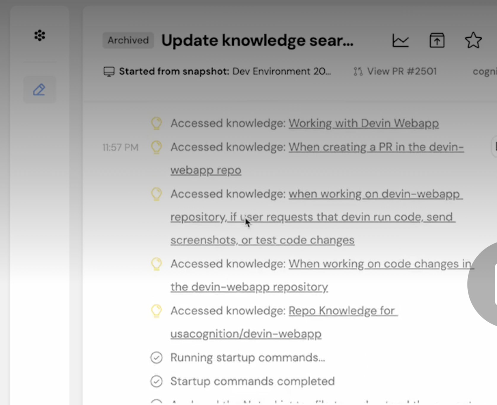
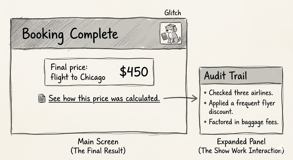
The Audit Trail: Trust After The Fact
Real-time transparency is fleeting. If a user walks away from their desk while the agent is working, they miss the Dynamic Checklist. They return to a finished screen. If the result looks odd, they have no way to verify the work. This is why every agentic workflow requires a persistent Audit Trail.
We need to design a Show Work interaction. On the final result screen, provide a link or history log that allows the user to replay the decision logic.
- See how this price was calculated;
- View search sources.
This receipt is the ultimate safety net. It allows the user to spot-check the validity of the output. Even if they never click it, the mere presence of the receipt tells the user that the system stands behind its work.
ChatGPT provides an example of how now providing users with an easy way to audit the information AI uses can cause confusion or user frustration. ChatGPT remembers you in the way a file cabinet quietly fills up with notes about everything you’ve ever said, then uses those notes to shape every future conversation without telling you. This is called memory. According to developer Simon Willison, in April 2025, that memory was getting fed into every new conversation automatically.
The problem with ChatGPT’s memory at that time was that you couldn’t see what it remembers, or when it’s using that information, or how it’s influencing what you get back. There’s no log. No timeline. No plain-language list of “here’s what the AI has decided about you.”
The only way to glimpse the dossier was to know a specific prompt trick — essentially asking the model to quote its own hidden instructions back to you. Most users will never discover this. They’ll just notice, as Willison did, that ChatGPT placed a “Half Moon Bay” sign in the background of an image they generated (Figure 8) because it had silently cross-referenced their location from previous conversations. This is the absence of transparency (the ability to audit the memory with ease) disguised as personalization. You need to provide users with both.

The Audit Trail pattern is the ultimate solution to the memory audit problem demonstrated by ChatGPT. It is one of four core design solutions that, together, create a library of options for improving AI transparency.
Here is a quick summary of the key interface patterns discussed in this article, which are designed to transform AI waiting time from a moment of anxiety into an opportunity to build user confidence:
| Pattern | Best Use Case | The User’s Anxiety | The Trust Signal |
|---|---|---|---|
| The Living Breadcrumb | Low-stakes, background tasks (e.g., drafting emails, sorting files). | Did the system stall or freeze? | I am active, but I won't disturb you. |
| The Dynamic Checklist | High-stakes workflows with variable time (e.g., financial transfers, booking travel). | Is it stuck? What step is taking so long? | I have a plan, and I am currently executing Step 2. |
| The Thinking Toggle | Expert tools or complex data analysis (e.g., code generation, market research). | Is this hallucinating or using real data? | I have nothing to hide; here are my raw logs. |
| The Audit Trail | Post-task review for any outcome (e.g., final reports, completed bookings). | How do I know this result is accurate? | Here is the receipt of my work for you to verify. |
Table 1: Four design patterns enhancing transparency.
The Reality of Attention: When Users Ignore the Interface
Even the most perfectly designed checklist or the clearest status message may still go ignored by many users.
When people are working on tons of tasks, especially professionals, they often tune out the interface. Think of an insurance underwriter creating fifty quotes a day — they’re not watching a progress bar. They click “Generate,” switch tabs to answer an email, and only come back when the task is done.
My research with these experts shows they judge the system based entirely on the final result. They have a good idea of what the answer should be. If a salesperson expects a premium between $500 and $600, and the system returns $550, they accept it right away, and trust is established.
These experts tell me that over time, as the AI continues to provide what they perceive as accurate outputs, usage will increase, and they will save time versus manual quoting. Essentially, the system is now viewed as an efficient accelerator of an otherwise monotonous yet mandatory task.
But if the system returns $900, the user stops. The output is not aligned with expectations, and that’s a problem they must solve. At that moment, the user switched tabs; they missed the little explanation about the high-risk surcharge that popped up in real-time. They didn’t see the specific rule that was triggered. If that explanation disappeared with the progress bar, the user has no way to understand the difference between expectation and outcome. They certainly won’t run the query again just to watch the animation play out.
They will run the quote by hand, effectively treating the AI’s output as useless and initiating a complete rework of their effort. This manual recalculation feels like a waste of time, which further erodes their confidence in the tool. Once this happens, the user is not interested in why the system chose $900; they are focused purely on validating or invalidating the system’s accuracy against their own, trusted methods. This lack of transparency, especially in moments of disagreement, is a primary barrier to adoption and consistent use. The audit trail allows us to provide persistent transparency and is the mechanism that prevents the AI from creating more work.
We need to keep this in mind, particularly when delivering AI-powered tools meant for enterprise use. If the tool delivers a result that misaligns with expectations, you rarely get a second chance. If the user must spend ten minutes investigating why the AI provided that number, they will stop using the AI.
Predictability, Reliability, and Understanding Are The Product
We are not building magic tricks. A magic trick relies on misdirection and hidden mechanics. We are building colleagues.
Think of a good colleague, they keep you in the loop. They let you know what they’re up to, what’s taking their time, and when they hit a snag. That honesty is what helps you trust them.
We can apply this to AI. By using the practical patterns we discussed: giving specific updates, showing a dynamic checklist, acknowledging partial wins, and keeping an audit trail, we stop seeing AI as a mysterious black box that just needs a nice coat of paint. Instead, we start treating it like a team member we can rely on and manage, which builds trust and a clear understanding.
The main reason for using these interface ideas is to achieve real transparency, going beyond explaining the AI’s complicated inner workings. Here, transparency means showing the user the AI’s process and performance right when they need to see it. This involves plainly communicating the AI’s current status, its known limits, and an easy-to-follow history of its decisions. This level of openness changes the interaction from just accepting what the AI does to actively working with it. It lets users understand why they got a certain result and how they can best step in or guide the system for the best possible outcome.
References
- “The Essential Guide to A/B Testing”, Ali E. Noghli
- “Usability testing: the complete guide”, Andrew Tipp
- “How to Conduct User Interviews”, IxDF


