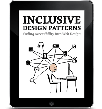
Inclusive Design Patterns (eBook)
We make inaccessible and unusable websites and apps all the time, but it’s not for lack of skill or talent. It’s just a case of doing things the wrong way. We try to build the best experiences we can, but we only make them for ourselves and for people like us.
About The Book
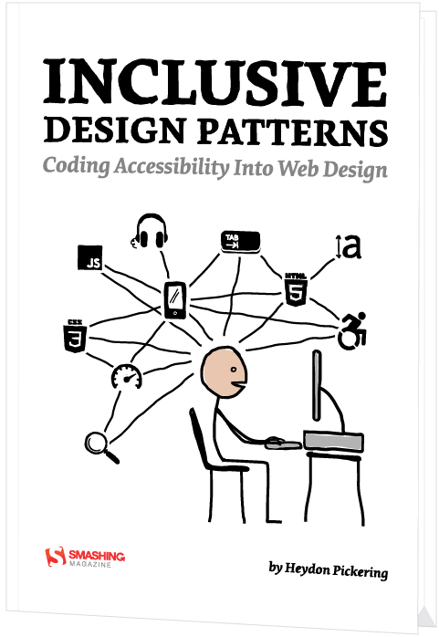
Inclusive Design Patterns was written by Heydon Pickering.
Many web design articles and books are all about improving your workflow and making your life easier as a developer. Should you wish to adopt a framework or employ a processor to speed up your development process, be our guest. However, this book is not about you; it’s about your audience.
Inclusive Design Patterns covers all the techniques, gotchas and strategies you need to be aware of when building accessible, inclusive interfaces. We’ll explore the document outline, external links and “skip” links, navigation regions and landmarks, labelling and alternative text for illustrations, buttons, tables of contents, JavaScript patterns, touch targets, filter widgets and infinite scrolling and “load more” button and grid display and dynamic content and tab interfaces and password validation and web forms and error messages — and pretty much anything else you need to know about accessibility, including how to prototype with inclusivity in mind, how to deal with legacy browsers and dozens of practical snippets to use when building inclusive interfaces.
What’s in there for you? You can take the lessons learned in the book and apply them within any framework sufficiently flexible to allow you to write and organize good interfaces. One thing is certain: once you read the book, accessibility won’t appear difficult nor confusing any longer — you’ll know exactly what to do, and when.
Why This Book Is For You
There’s no such thing as an ‘average’ user, but there is such a thing as an average developer. This book will take you from average to expert in the area that matters the most: making things more readable and more usable to more people. You’ll learn:
- Accessibility myths and misconceptions as well as common solutions and rules of thumbs
- A library of well-tested accessible HTML/CSS components that you can use right away
- How to properly use WAI-ARIA roles and Content Accessibility Guidelines
- How to tackle common accessibility issues in RWD
- How to deal with “skip” links and external links, as well as navigation regions and landmarks
- How to keep labels, buttons, tables of contents, dynamic widgets and tabbed interfaces accessible
- How to implement infinite scrolling, grid display and dynamic content accessibly
- How to deal with password validation, error messages, web forms, JavaScript patterns and touch targets
- How to keep an interface accessible in legacy browsers
- How to prototype with accessibility in mind
About The Author
 Heydon Pickering is a writer, designer and public speaker, the accessibility editor for Smashing Magazine, and an accessibility consultant working with The Paciello Group. He's interested in new and innovative ways to make The Web an inclusive place. User research, systems thinking and plain old semantic HTML all play their part. When Heydon isn't writing, coding or illustrating, he experiments with sound design and thrashes out Doom Metal riffs of his detuned SG copy.
Table of Contents
- 0. Introduction — We will look at an interactive element, a button, from the perspective of three types of designers. The purpose of this example is to show you how a little bit of knowledge about the medium can lead to a simpler and (therefore) more inclusive solution.
- 1. The Document — We will look into discrete interface patterns; modules, components, widgets, conventions, whatever-you-want-to-call-thems. It would be foolhardy not to first acknowledge that each will ultimately belong to a web document. HTML pages vary dramatically in shape and size and can include any combination of patterns, but there are a handful of 'document level' best practices to which we should adhere. The aim here is not to go in search of the ultimate 'boilerplate' but to configure a parent web page to support inclusive design.
- 2. A Paragraph — We'll be looking at typefaces, leading, measure, justification, contrast, focus indication and more, to help you design paragraphs suited for a hugely diverse audience. We'll also tackle specific issues for folks with limited vision, dyslexia, Irlen syndrome, low literacy and limited technical knowledge.
- 3. A Blog Post — We'll show how to incorporate accessible landmarks and a sound section structure to make the content more navigable and interoperable to a diversity of users and parsers. This will be bolstered by giving well-written and context independent structural as well asand context independent structural and navigational cues.
- 4. Navigation — We'll progressively enhance HTML's primitives to create the inclusive means to navigate within and between web pages. We will also cover design provisions transferable to many other patterns, including logical source order and the virtue of eliminating redundancy. We will also tackle how to progressively enhance the navigation with JavaScript.
- 5. A Menu Button — In this chapter, we'll ensure our menu button and the content it reveals are inclusive of differing user settings, circumstances, devices, and assistive technology software.
- 6. Inclusive Prototyping — By going straight from paper to HTML, we lay the foundations for efficient code and inclusive experiences.
- 7. A List Of Products — In this chapter, we'll practice our inclusive design chops. As in previous patterns, the organization and structure of content is paramount. We'll look deeply into image accessibility, from both the perspectives of alternative text composition and performance. In catering to blind consumers, to those who cannot afford generous data contracts, and anyone accessing your content from outside your interface, this is a chance to really push the limits of inclusive design.
- 8. A Filter Widget — We'll explore the importance of giving users choice and control over how their content is arranged. We'll also use some techniques to make sure our design was tolerant of dynamic and fluctuating content. Inclusive design also means a visual design which is not too strict about the nature of the content imparted to it.
- 9. A Registration Form — This chapter will give you everything you need to develop inclusive forms. By using standard form elements, effective labeling and facilitating the correction of errors, users of all walks are able to access and contribute to your websites and apps. By keeping the form simple and avoiding irritating experiences like disappearing labels and passwords that you cannot check, we've made sure using the form isn't just possible but pleasurable.
- 10. Test-driven Markup — Test-driven development allows developers working with frequent iterations to move forward with confidence. By writing tests first, to prescribe outcomes, then creating the functionality to achieve them, you can ensure successful builds behave in a predictable and reliable fashion.
Technical Details
- Formats: ePUB, Kindle, PDF (DRM-free)
- Pages: 312
- Language: English
- Released: September 2016
- Publisher: Smashing Magazine
- ISBN (PDF): 978-3-945749-43-2
More Books
Accessible UX Research
Success At Scale
Interface Design Checklists
166 practical cards for common interface design challenges.
Understanding Privacy
How to put your users first and make a better web.
Touch Design for Mobile Interfaces
Want to learn how to improve the design of your mobile digital products? Learn how touchscreen devices really work — and how people really use them.
Image Optimization
Deliver high-quality responsive images in the best format and size, and at the moment your users need them.
TypeScript in 50 Lessons
Everything you need to know about TypeScript, its type system, and all its benefits in 50 lessons.
Click!
A guide to increasing conversion and driving sales sustainably.
The Ethical Design Handbook
A practical guide on ethical design for digital products.
Inclusive Components
Handbook for building robust, accessible interfaces.
Smashing Print
A printed magazine designed to make you think.
Art Direction for the Web
Creating engaging, art-directed experiences on the web.
Smashing Book 6
Exploring new frontiers in front-end and design.
Design Systems
Create effective design systems that empower teams to create great digital products.
Form Design Patterns
Designing and coding inclusive and usable web forms.
User Experience Revolution
Help organizations understand and embrace digital.
White Hat UX
How to avoid dark patterns and improve user experience.
Digital Adaptation
Helping traditional companies embrace and make use of digital.
Inclusive Design Patterns
Creating bulletproof, accessible HTML/CSS components.
Smashing Book #5
Smart responsive design techniques from real projects.
The Sketch Handbook
Everything you need to know to understand and use Sketch.


