Smashing Special: WordPress Theme Trends For 2012: Development
This special is the first in our series of Smashing Specials — extended articles and studies dedicated to a specific topic. The special features current WordPress theme trends for 2012, covering past trends, new developments in theme design and trends in the theme development.
Development
Front-End Posting

WordPress 3.3, which launched just before Christmas, saw the introduction of a lovely new function called wp_editor. It slipped under most people’s radar, but it has given theme developers a powerful new tool. Developers can now, for example, put two rich-text editors on a single administration screen, a feat that required significant hackery in the past.
In 2012 we’ll see theme developers use wp_editor for front-end editing. Per Soderlind’s article “Front-End Editor in WordPress 3.3 Is Easy” demonstrates just how easy adding a front-end editor in WordPress is. I don’t know about you, but no matter how many times I show them, some clients still struggle with WordPress’ back end. Front-end editing is a great way to enable clients to edit their website while keeping them out of WordPress’ dashboard. Not only that, but it’s useful for anyone who wants to be able to see their website while adding content or to make a simple correction without having to go to the back end.
Not convinced about front-end editing? The most recent updates of the Front-End Editor plugin by Silviu-Cristian Burca will show you just how beautiful editing from the front end can be.
Greater Interactivity With jQuery 1.9 UI

The release of WordPress 3.3 saw the jQuery 1.8 UI come bundled with WordPress’ core. This put a huge library of fun widgets at the disposal of every theme developer. If you aren’t playing with it yet, check out the jQuery demos to see what you can do. 2012 will hopefully see the release of jQuery 1.9 UI, giving even more power to theme developers. Just a glance at the planning wiki shows some of the treats that jQuery has in store for us. Old favorites, such as the slider and accordion, are getting an API redesign, while new features will be showing up, such as menus, pop-ups and tooltips.
Here’s what theme developer Marshall Sorensson has to say about this:
Theme designers already have the complete jQuery UI 1.8 stack available to them, although you don’t see many themes which utilize the widgets. jQuery UI 1.9 will hopefully be released in the first half of 2012, which will likely include the new menu, menu bar and tooltip widgets. Designers who tap into the power of the new widgets will certainly have an advantage over those who don’t.
Once jQuery UI 1.9 drops, we’ll no doubt start seeing savvy theme developers turbo-charge their themes with the latest jQuery widgets. This will mean an increase in drag-and-drop functionality, which will make working with WordPress themes even easier.
Child Themes in the WordPress Directory?
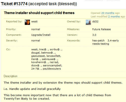
This has been on the horizon for a while, but 2012 might just be the year that we see child themes on WordPress.org. A trac ticket was opened 20 months ago, and I reported on it a whole year ago. There was another discussion about it in April, when Otto said that a patch was ready, but nothing has appeared.
The inclusion of child themes would open the WordPress directory to many designers who might be great at CSS but haven’t cut their teeth on PHP. It could mean a whole new generation of themes that use Twenty Eleven and other parent themes as their base. So, I’ll go out on a limb here and say that, yes, we will definitely have child themes on WordPress.org in 2012! And if I’m wrong? Well, I guess I’ll be wrong, and there’s not a whole lot anyone can do about it.
So Far In 2012
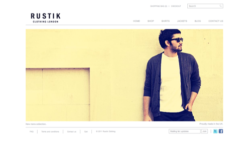
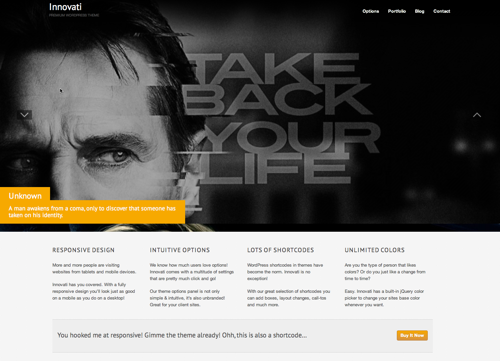
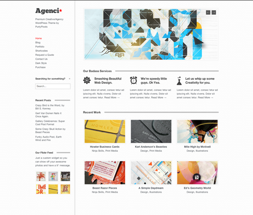
We’re just a month into 2012, but a number of themes have already been released.
Commercial Themes


Free Themes
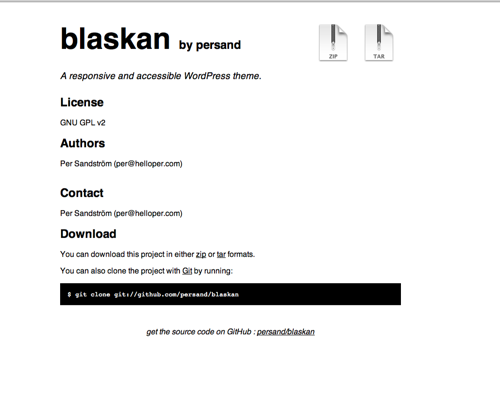

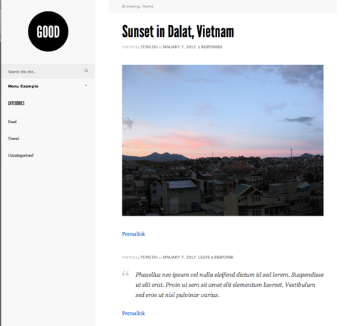
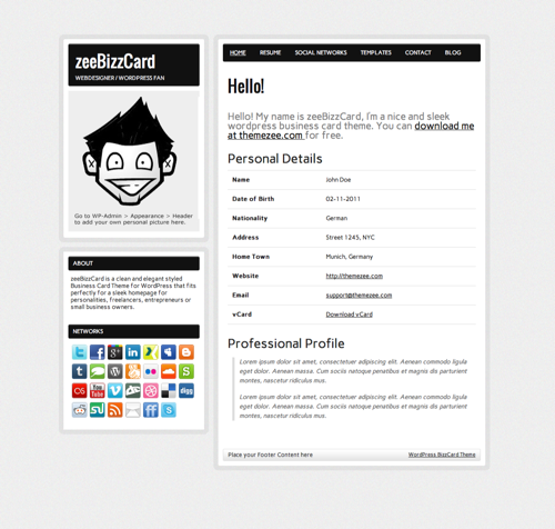
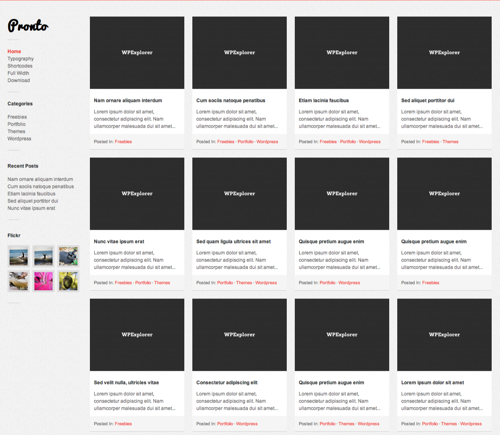
As you can see, some of the things we’ve predicted are already catching on. All of the commercial themes listed above and one of the free themes are responsive. It’s great to see this becoming a standard, and with commercial theme developers driving it. Despite Ian Stewart’s dour predictions in 2008 about the end of the premium theme market, commercial themes (and plugin developers) are where the real innovation has been. Sadly, as much as we would like to spend our time doing what we love for free, eventually we have to pay the bills. But being able to do what we love and get paid for it is great. With a burgeoning commercial theme market, hundreds of WordPress theme developers are producing gorgeous themes using next-generation technology, and 2012 will be a great year for WordPress themes.
Conclusion
WordPress has evolved fast ever since it was a twinkle in the eye of Mike Little and Matt Mullenweg. It has gone from blogging platform to CMS. Theme design has come a long way with it. We’ve gone through blog themes, magazine themes, news themes, portfolio themes and frameworks. The proliferation of magazine and news themes in recent years always felt like designers were testing the waters to see what WordPress could do. Now that we know what WordPress is capable of, it’s less about showing off every piece of functionality and more about finding the right functionality for the need, out of the box.
We’ve hit responsive HTML5 themes this year. WordPress feels all grown up now, a capable platform on which designers can really flex their muscles. That is an exciting place to be. It would be great if, by the end of 2012, many of the trends we’ve looked at go from novelties to standards. Very likely, the designers and developers who don’t get on board will quickly fall behind.
What do you think? Where do you think WordPress theme design and development are headed in 2012? Have we got it totally wrong? Do you think we’ll see a resurgence of on-load music and animated GIFs? Let us know in the comments!
Further Reading
- “Responsive Data Table Roundup,” Chris Coyier, CSS-Tricks
- “HTML5 Semantics,” Bruce Lawson
- “Theme Options: Friend or Foe?,” Matty Cohen, the WooThemes Blog
- “Responsive Web Design for WordPress Theme Designers,” Oliver Dale, WPLift
Tools
- Modernizr A JavaScript library for serving up responsive WordPress websites.
- Modernizr plugin A plugin that adds the Modernizr JavaScript library to your WordPress installation.
- Selectivizr Emulate CSS3 pseudo-classes and attribute selectors in Internet Explorer 6 to 8
- Bones An HTML5 starter theme for WordPress
- Roots An HTML5 starter theme for WordPress.
Smashing Special: A Three-Part Series
This series consists of three parts:
- Part 1: Past Predictions
- Part 2: WordPress Design Trends for 2012
- Part 3: WordPress Development Trends for 2012


 SurveyJS: White-Label Survey Solution for Your JS App

 Agent Ready is the new Headless


