May 9, 2017 Smashing Newsletter: Issue #180
This newsletter issue was sent out to 230,055 newsletter subscribers on Tuesday, May 25th 2017.

When we talk about responsive design in the community, we usually tend to focus on screens alone. However, responsive design isn’t just about mapping an experience from one viewport to another.
During my presentation at FITC Toronto yesterday, I mentioned the possibilities for the use of the Battery Level API to adapt the experience in a responsive way. The API (which is quite well supported) communicates with the device’s hardware and exposes data about the device’s charging state, accessible via navigator.getBattery().
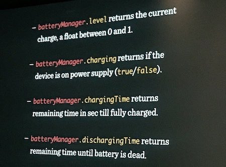
What does this mean for us as designers? If you designed a rich immersive experience, it’s likely to be hardly usable on low battery. So, what about replacing videos with static images, removing parallax effects, Retina images, web fonts, animations and heavy JavaScripts if a user’s battery level is under 5–7% and it is not being charged? We could also save users’ data just in case, and inform them about the low power state.
I wasn’t expecting the backlash of security, privacy and fingerprinting concerns about the API, referencing mischievious tactics of abusing the API. In fact, it has been removed from WebKit as well as from Firefox. From Firefox 52 onwards, the Battery Status API is only available in chrome/privileged code. Why? The combination of battery life as a percentage and battery life in seconds offers 14m combinations, providing a pseudo-unique identifier for each device.
There are always ways to misuse technology, unfortunately. Be it by displaying install prompts on mobile screens, or using “Like” buttons in a wrong way, slowing down users and sending data about their behaviors to Facebook or Google. It’s not a reason for promising APIs to disappear though.
Responding to the battery level meaningfully and respectfully can make a user experience better by removing barriers on their way to completing tasks on a draining battery. Perhaps the API could be modified to sandbox the impact of modified behavior and styling, like it is the case with restrictions on :visited pseudo-class in CSS. The spec and implementations will only get better if we, as designers and developers, actually use them in our projects.
Can you see a way how your website or app could benefit from the API? Why not add it to a project or two and see if it bears any benefits? Your users just might appreciate it.
Stay charged (or not)!
Vitaly (@smashingmag)
Table of Contents
- The Invisible Parts Of CSS
- Never Give Up! Never Surrender!
- A Curated Directory Of Boilerplates
- Checking For Interaction Feature Support
- FAQs To Smoothen Your Job Hunt
- Export Sketch Designs As HTML Email Templates
- An Online Magazine Dedicated To How Teams Work
- Making Oops Less Awkward
1. The Invisible Parts Of CSS
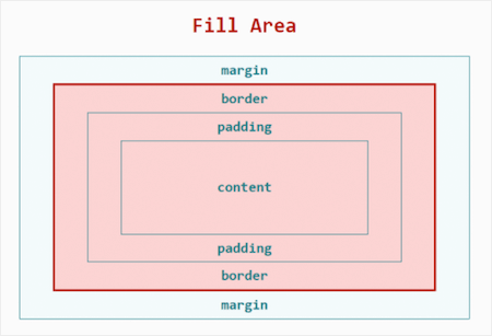
As a developer you wrangle with CSS on a daily basis. But let’s be honest, could you describe in simple terms what display: block actually does? Well, it could be difficult, because, most of the time, we tend to care more about correct syntax and the visual results instead of how the underlying principles work. To help us gain a better understanding of how CSS actually works, Mike Riethmuller wrote up an exhaustive CSS refresher that is great for beginners and experts alike.
The article sheds a light into the hidden, invisible parts of CSS, the ones that hold everything together and make things work as they should. It removes misunderstandings about the Box Model, Visual Formatting Model, Cascade, and positioning schemes, for example, so you don’t have to rely on your intuition any longer when coding CSS but have a profound knowledge that can help you write better code. (cm)
2. Never Give Up! Never Surrender!
While designing web experiences today, it seems like sorting through all the ever-changing variables requires superpowers. And yet, don’t you feel like Wonderwoman or Superman when you finally squash your bugs? We do, and we’re inviting you to share your superpowers, skills, and experiences with us at SmashingConf New York on June 13–14!
This 2-day-one-track-event brings together smart and friendly people willing to share their tricks and training methods, like Sara Soueidan, Jake Archibald, Yiying Lu and Eric Reiss.
We are also running 10 Smashing Workshops on June 12th and 15th! Learn about amazing illustrations from Yuko Shimizu, fighting UX and design battles with Joe Leech, and commanding Responsive Web Design with Vitaly Friedman, plus so many more! We sold out all workshops in the last year, so please don’t wait too long to secure your seat! (cm)
3. A Curated Directory Of Boilerplates
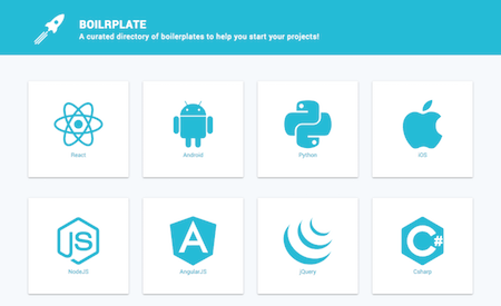
Boilerplates can always come in handy when starting a new project. But there are so many out there that you can easily loose track of what’s available and, most importantly of all, which one is the best fit for you. Boilrplate provides a remedy.
The curated collection neatly sorts existing boilerplates by language/technology, so that you can easily find what you’re looking for — be it a simple HTML boilerplate, or one for React, Bootstrap or Android, for example. A nice detail: The directory provides the most important information about each boilerplate such as size, creation and update date at one glance. Worth bookmarking. (cm)
4. Checking For Interaction Feature Support
Side projects give you the freedom to think outside the box and tinker with new techniques. And some might even have the potential to inspire fellow developers. Melanie Richards, developer at the Microsoft Edge browser platform, for example, reads a lot, and, thus, wanted a place where she could keep highlights from books and articles. So she whipped up a small Jekyll site hosted on GitHub Pages. Nothing too fancy, but with one neat little detail that’s interesting for all of us; she uses interaction feature queries to handle hover-dependent interactions.
The index of her highlights site presents rough papercut-style illustrations of the book covers. If you hover over an illustration, it fades to a high-fidelity version of the cover. A beautiful effect, but so far still nothing groundbreaking, because, well, what if your device doesn’t have hover capabilities? That’s where the media query which detects whether the hover feature is available or not comes into play. If the hover feature query is false or unsupported, there’s still visual feedback on the element. Melanie describes in detail what this could look like. Inspiring! (cm)
5. FAQs To Smoothen Your Job Hunt
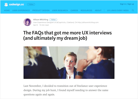
When UX designer Allison Milchling was hunting for a job at the end of last year, she needed to answer the same interview questions again and again. What does design mean to you? What’s the difference between a good and a great designer? What’s the most interesting project you worked on? That’s when she decided to collect her favorite questions and wrote down exhaustive answers for each.
The undertaking turned out to have two positive effects: It helped Allison think about her true answers for each question and, thus, gave her more confidence during the actual interviews. For hiring managers, on the other hand, the fact that she linked to the FAQs in the cover letter also meant a better opportunity to assess Allison and her way to tackle UX design projects more thoroughly. An ingenious idea. (cm)
6. Export Sketch Designs As HTML Email Templates
Designing HTML emails can be tough. The Sketch plugin Slinky now attempts to change that, with a simple yet clever idea: Once installed, it lets you export your Sketch designs into ready-to-send HTML email templates with just one click.
As the plugin is still in an early phase, it isn’t free of bugs yet, of course. So there’s a few things to keep in mind when using it. Links are still a bit hacky, for example, and it’s also suggested that you use cross-platform fonts only as Slinky doesn’t check the template for custom fonts yet. If you encounter any issues, you can contribute them to the GitHub repository and help the plugin improve. Promising. (cm)
7. An Online Magazine Dedicated To How Teams Work
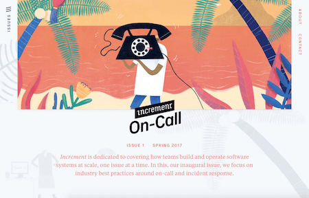
Keeping team members on call is a necessity in the tech business — to be prepared for those moments when something unexpected happens that needs to be fixed quickly. But how do you handle on-call efficiently? And how do big players like Google, Amazon, and Netflix do it? These are just two of the questions that the first issue of the new online magazine Increment wants to answer.
Increment tackles the aspects of how software engineering teams can work together more effectively to achieve their goals smarter and faster. The issues are released quarterly and focus on testing, deployment, development tools, and code review topics. A good read that also shines with unique illustrations. (cm)
8. Making Oops Less Awkward
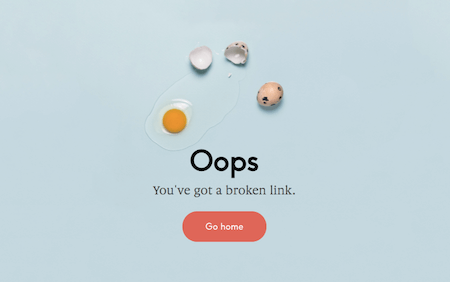
Mistakes happen. 404 pages are the best example. But what’s crucial is how you deal with pages that aren’t found and links that end in an impasse. A friendly tone and some wit can make the situation for your users — but especially for you — a lot less awkward. Yes, things have even gone so far that a creative 404 page can help shape your brand’s identity and make you stand out from the crowd. Just take a look at the “Oops” pages that Andreas Storm collected from all over the web.
The showcase is full of surprising, clever, and funny ideas on how you can give an unpleasant 404 error a nice twist. Some are kept rather simple but shine with great copy, others seek inspiration in popular memes, yet others spin their visual identity further to develop little pieces of “Oops” art. Even if we try hard to prevent 404 situations, putting some love into their pages can never hurt. (cm)
Smashing Newsletter
Useful front-end & UX bits, delivered once a week. Subscribe and get the Smart Interface Design Checklists PDF — in your inbox. 🎁
You can always unsubscribe with just one click.
Previous Issues
- Designing For Complex UIs
- Hidden Gems of the Web
- Web Performance 2026
- Designing Surveys
- Accessibility and Inclusive Design
- Interface Design Patterns
- UX Research Strategies and Tools
- Inspiring Little Websites
- State of CSS, UX, JavaScript and AI in 2025
- Product Design & UX
Looking for older issues? Drop us an email and we’ll happily share them with you. Would be quite a hassle searching and clicking through them here anyway.

