35 Designers x 5 Questions
35 designers. 5 questions. 5 precise answers. Result: 175 professional suggestions, tips and ideas from some of the best web-developers all around the world. In March we’ve selected over 35 prominent designers and design companies, contacted them and asked to answer five design-related questions, sharing their knowledge and experience with fellows developers. Here on Smashing Magazine.
You may want to take a look at the following related posts:
- Group Interview: Expert Advice For Students and Young Web Designers
- Women In Web Design: Group Interview
- The Lost Files – Interviews: Expert Tips From Renowned Designers (part 2 of 4)
35 Designers: how did we find them?
How do you find the best designers worldwide? OK, a legitimate question. The fact is that we’ve tried so select the best ones, but we definitely have missed many creative, talented artists with solid portfolios, who are rather unknown in the community.
We didn’t choose by our intuition, we weren’t looking for any suggestions. Instead, we’ve spent few days analyzing Technorati rankings, Alexa rankings, link popularity, 9Rules directory, Design-Feed contributors and few more design-related web-sites. Besides, we’ve taken a close look at the professional experience of designers, their reputation in the design-community and the popularity of articles they’ve written in their weblogs.
We’ve browsed through numerous articles and hundreds of portfolios and in the end we’ve managed to select over 45 out of them. We’d like to thank all designers for participation and also thank to designers who had informed us in time whether they will be able to participate or not.
Five Questions
We’ve asked five questions. One single text line would have sufficed.
- 1 aspect of design you give the highest priority to.
- 1 most useful CSS-technique you use very often.
- 1 font you use in your projects very often.
- 1 design-related book you highly recommend to read.
- 1 design magazine you read on a daily/weekly basis (online or offline).
In the end we’ve received more answers than we expected. The results - over 80 CSS-based tips, design ideas, suggestions, fonts, design-related books and online-magazines - are listed below. It’s interesting to know, how designers work their magic. It’s interesting to know what you can actually learn from them.
1 aspect of design you give the highest priority to.
The initial part of the design process is probably the most creative and sophisticated part of web-development. First sketches, first layouts, first typography and color decisions - sometimes it appears that there are simply too many things to keep in mind - but also too many things left out by mistake in the final design. Yet there have to be the most important ones. Design aspects you, being a professional web-developer, give - or should give - the highest priority to; the ones that make or break a web-site.
You don’t learn them - you explore and grasp them. Depending on your personal style and your personal workflow, you determine the things you consider to be the most important in your designs - according to your professional experience, demanding clients, users’ behavior and constructive feedback. Communication is the key, but to find the right key is the task web-developers have to accomplish. In fact, every developer makes his/her own decision, setting the priorities of the things to be considered during the whole design process.
Yet it’s interesting to know, which aspects of design are given the highest priority by experienced and competent web-developers.
1.1 Communication
- The ability for it to communicate. This is also what I admire the most in design. [Filipe Varela, Portugal]
- Design is all about finding the right solution to a particular problem (usually a communication problem when dealing with sites). That’s why I feel that the most important aspect would be understanding the user and centering everything around him/her. Lucian Slatineanu, US/Romania]
- The initial stages of design: meeting the client to establish key audiences and aims; designing overall site labelling and architecture that meets the aims of these audiences; testing initial layouts to determine if they are successfully achieving the key aims. If these aspects have not been thought through carefully and tested then the overall site could fail - regardless of how elegant or engaging the design. [Russ Weakley, Australia]
1.2. Usability
- I think design usability has to be right up there. I like to think about how people will navigate the site even before starting any other design elements. By getting the navigation clear in my mind, the design begins to fall into place around it. Andy Peatling, Canada]
- Usability. There’s a lot of room for creativity, but I want my web sites to be functional first and foremost. I’ll compromise graphic design for usability, but try not to compromise usability for graphic design. [Patrick Griffiths, UK]
- Usability, always! Everything we design should be easy to use. [Paul Boag, UK]
- I think that I apply the most emphasis on usability in my designs. As well as being aesthetically pleasing, a design should be a joy to use. It’s no good having the sexiest user interface in existence, if the user can’t figure out how to use it. It’s practically worthless. The true challenge of design, I feel, is making something look visually beautiful - but combining this with a lot of usability. Nobody says that something which is accessible can’t be aesthetically pleasing - in my mind, there are different levels of beauty, and to make a design work, utility has to be a major one of them. [Oliver Beattie, UK]
- Usability and functionality is always the first priority, but past that there are no boundaries. Thanks to css and javascript, you can make most anything happen on the web now. [Nick Francis, US]
- Usefulness. [Mike Davidson, USA]
1.3. Typography
- Designing on a grid. This makes things far more orderly visually, not to mention it allows the code to be more modular. Lately, I have had clients who are making the jump to layouts that are tailored to the 1024×768 pixel resolution. As such, I have found myself gravitating towards 960 pixels as the optimal width to work with. [Nathan Smith, US]
- Typographic Design. [Mark Boulton, UK]
- Symmetry and equal spacing. [Kyle Neath, US]
- Good typography. [Matthew Buchanan, New Zealand]
- Hierarchy! Too many designers ignore it in part or in full. [Cameron Moll, USA]
1.4. Navigation
- Readability and clear indication of what is navigation and what is content. There is nothing worse than a really pretty page that leaves me thinking where I am and what I can do. [Christian Heilmann, UK]
- Navigation. Doesn’t matter how the site looks, or what Javascript trickery you tack on, if the navigation doesn’t make sense the site simply isn’t user-friendly. [Ryan Masuga, US]
- I think that the navigation of any website is the most important element. I try to make sure that the site content is organised into logical sections and that the navigation then reflects this. [Dan Lindop, UK]
1.5. Details
- Details. Little things like spacing and buttons have a huge impact on the overall design. [R. Marie Cox, US]
- I try to give highest priority to the small details. You know, the stuff that most people overlook. That means noticing the extra 1px of padding, the color of that gradient, or the size of that text. [Keegan Jones, US]
- Attention to detail. [Wolfgang Bartelme, Austria]
- Never underestimate the power of a detailed wire-frame. Take the time at the beginning to plan, it will pay off immensely during design/development. [Matt Downey, US]
- I try to take a balanced outlook on the importance of individual design elements. However, one area I often catch myself obsessing over is color selection. [Rob Goodlatte, US]
1.6. Standards, Accessibility
- Standards and accessibility. It is the main consideration I have with anything that I build or design, sometimes to the detriment of the design itself. Accessible and standards-based designs do not automatically mean they will be ugly, but I know I’m a stronger coder than I am a designer, so I tend to find that if I focus on that aspect, the design suffers from ‘neglect’ if that makes sense. [Ian Lloyd, UK]
- Accessibility. [Roger Johansson, Sweden]
1.7. Content
- Content - page content will make or break a website. [Derek Punsalan, US]
1.8. Approach
- I’d say it’s impossible to nail it down to one thing, but if I have to, the simple answer is purpose. It’s easy to create something that appears to be visually sophisticated, but it rarely serves a purpose.For me, design is about the underlying purpose and what you want to communicate. Design as decoration, or design without purpose, often hurts more than it helps. However, I’ve found that if the goal and the underlying content is valuable, the rest of the design will generally take care of itself. [Garrett Dimon, US]
- We consciously don’t consider code at all during the design process. Our designer still does a lot of print work, and what’s great about print is that there are no constraints. Print design has no boundaries with texture, typography or the smallest of details. As long as it fits on the page, it works! So in many ways, we try to bring the layering and the detail of print design to the web. It takes twice as long to code it, but who cares, we are in this for great design. [Nick Francis, US]
- I always try to give priority to a solution for the problem at hand, even if it means doing something less aesthetically pleasing or having to ignore a coding standard. [James Mathias, US]
- Rest - the most important (and least utilized) tool in design is to make time AWAY from design in order to strengthen the time you do spend designing. [Natalie Jost]
- I usually spend the most amount of time focused on solving my clients #1 objective (or solving the largest problem). Aesthetically speaking, I tend to get caught up in the subtle details of design, trying to make sure everything is just right. [Jesse Bennett-Chamberlain, Canada]
1 most useful CSS-technique you use very often.
As we’ve found out earlier, there are at least dozens of CSS-based techniques a web-developer should always keep ready to hand. However, some techniques are being used more often than the other ones. Learning through each and every designed web-site, developers follow their personal development schemes, using the same tricks all the time, using the same approach consequently during the design process.
A look behind the scenes reveals: professionals permanently use CSS Global Reset, numerous browser bugs workarounds, CSS Image Replacement as well as some further techniques. They all are listed below.
2.1. Global Reset
Whitespace reset. Though I’m a bit more judicious in my selection of which elements to zero out. [Cameron Adams]
* { margin: 0; padding: 0; }I prefer all elements (across the browser board) to start at 0. Helps ensure that pages look consistent. [Derek Punsalan, US]
Resetting the browser default styles. Either manually or using the styles from Yahoo. [Mark Boulton, UK]
I never start coding a site without stripping the default browser styling. To quickly achieve this, I’m using a modified version of Tantek Celik’s “undohtml.css“. More details can be found in Undoing html.css and using debug scaffolding. [Lucian Slatineanu, US/Romania]
Whitespace reset in CSS (originally inspired by Left Justified). It’s gone into all of my projects for the past 2 years. [Kyle Neath, US]
* {
padding:0;
margin:0;
}

h1, h2, h3, h4, h5, h6, p, pre, blockquote, label, ul, ol, dl, fieldset, address { margin:1em 5%; }
li, dd { margin-left:5%; }
fieldset { padding: .5em; }
2.2. Browser Bugs Workarounds
- I like using
#whatever { height: 1%; }in amsie_patch.cssfile (linked with conditional comments) as it fixes a great deal of problems with that browser. [James Mathias, US] - The underscore hack. [Mike Davidson, USA]
- An understanding of what the HasLayout bug is and how to work around it. [Paul Boag, UK]
- One particularly useful tool are conditional comments, allowing me to serve up fixes for the broken rendering in Internet Explorer 6 and 7. Even though IE7 is newer, it is still far from being a good product. I am thankful that Microsoft at least provided us with a work-around solution for their shoddy browsers. [Nathan Smith, US]
- I would love to say something like “testing systematically across as many browsers and platforms as possible during the markup/css phase”. Although this is very important, the most useful technique for me is the use of conditional comments to deal with older versions of Internet Explorer. This technique allows you to isolate these browsers odd behaviours and deal with them in a single file - away from your other css rules, without any hacks. It is a module and clean way of working. [Russ Weakley, Australia]
- If you’re having problems getting a layout to work correctly across different browsers, apply different background colours to the elements you’re struggling with. This is particularly useful for sorting out issues with floated elements and margins as you can normally see exactly where the problem is. [Dan Lindop, UK]
2.3. CSS Image Replacement
- The basic CSS image replacement for logos and headers. I use that on every single logo - that way, it’s text underneath for the search engines and readers, but looks as it should for the user. [Ryan Masuga, US]
I think the power of using background images is amazing. Whenever you need to display text as an image due to fonts or for something like a logo, it’s easy to make it work and keep it 100% accessible. This is not rocket science, but it’s important. For instance, if I wanted to display a logo. The wrong way:
<img src="logo.gif" alt="Company Logo" />The right way:XHTML: <h1 id="logo">Company Name</h1> CSS: h1 { height:100px /* height of logo */ width:100px /* width of logo */ background:url(logo.gif) no-repeat; text-indent:-9000px; }- Look at your website on a mobile phone if you want to understand why “the right way” is better. You will also appreciate it when it comes time to redesign the site and you don’t have to touch the html. [Nick Francis, US]
- Replacing text with a background image. For instance, if you want to display the logo of your company instead of just plain text, you could do something like that:
- This is not just great for people using a screenreaders, but may also have a positive impact on your Google PageRank. [Wolfgang Bartelme, Austria]
- The background-position rollover trick popularized by Dave Shea - CSS Sprites. [Rob Goodlatte, US]
- Combining several background images into one and using background-position to display the part I want. [Roger Johansson, Sweden]
- Sliding doors is an obvious choice, especially when creating fluid layouts or tabbed navigation. I’ve almost got to the point where I use a whole bunch so regularly, they all blend into one! Andy Peatling, Canada]
- Auto selecting navigation. [Jesse Bennett-Chamberlain, Canada]
- Using
overflow:autoto clear floated elements. Simple Clearing of Floats. [Matthew Buchanan, New Zealand] - Every web site must have a menu of some sort so I’ll go with the use of unordered lists to create them. The flexibility it allows amazes me every time I use it. [Filipe Varela, Portugal]
Using more than one class per element. For example, I could give a paragraph tag two classes.
<p class="highlight clear">. This may seem extremely novice but I find that when I talk to people about this, they have no idea it’s possible. (This also comes in handy when you want the last element class to take on a slightly different property as the ones before it.) [Matt Downey, US]<p class="highlight clear">A trick that I use a lot in development is this:
div { border: 1px solid red; }. In other words, quickly set borders on for everything to help work out layout issues (I also use the Web Developer Toolbar a lot for this kind of thing) [Ian Lloyd, UK]div { border: 1px solid red; }This would have to be Easy Clearing. [R. Marie Cox, US]
.clearfix:after {
  content: ".";
  display: block;
  height: 0;
  clear: both;
  visibility: hidden;
  }

.clearfix {display: inline-block;}

/* Hides from IE-mac */
* html .clearfix {height: 1%;}
.clearfix {display: block;}
/* End hide from IE-mac */
Making the absolute relative. More about this technique in Making the Absolute, Relative. [Christian Heilmann, London, England]
Absolute positioning. I wouldn’t say I use it nearly as often as other techniques, but it’s invaluable for getting solving tough coding challenges. [Cameron Moll, USA]
Liquid and elastic design, if you can call them CSS techniques! [Patrick Griffiths, UK]
Simple shorthand is the most basic and useful technique - nothing fancy, just beautiful simplicity. [Natalie Jost]
Google.com & Firebug. :) [Garrett Dimon, US]
Reusable code. In nearly all of the CSS which I’ve written recently, I’ve started developing code which can be applied to any element. For example, I might have a ‘hide’ class for an element on a page which I want to be hidden, or a ‘mute’ class for something which I want to be ‘muted’ (i.e. with less emphasis than regular content — footnotes, for example). To see this technique in action, just take a look at any of my stylesheets.Another technique I use is to develop a robust grid, with ‘column block’ making up the grid. To do this, I define several classes, such as ‘col_1′, ‘col_2′ — but not how you might expect. Where you could assume that ‘col_1′ is the first column in the design, I take a slightly different approach by defining this as a column which spans 1 ‘column block’ — ‘col_2′ would span 2 ‘column blocks’ etc. [Oliver Beattie]
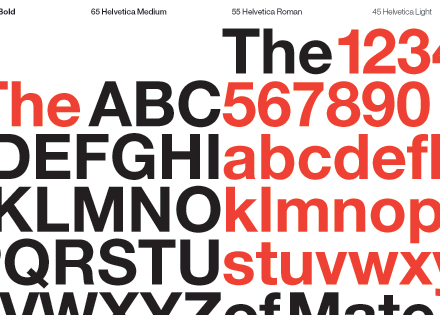
Helvetica [Mark Boulton, UK]
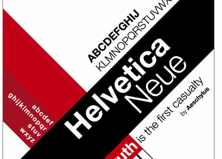
Helvetica Nueve. Can’t get enough. [Kyle Neath, US]
I love simple fonts like Helvetica, Chalet etc. - and there are so many classic serif fonts that are absolutely gorgeous; Times is a classic but today’s users seem to tire of it because of overuse — so others like Garamond, Caslon, Baskerville, Minion and Palatino all hold a special place with me. [Oliver Beattie]
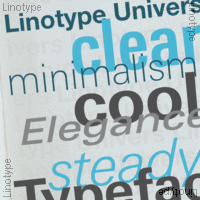
Using Univers Condensed a fair bit at the moment [Cameron Adams]
Each project is unique and if you want to help achieve a proper degree of differentiation there is no such thing as a “very often used font”. However, if I were to choose one of my personal favorites, I would have to go with the Univers family from Linotype. [Lucian Slatineanu, US/Romania]
Helvetica for a sans-serif and Lucida Bright for a serif. [Natalie Jost]
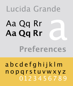
Lucida Grande. [Nick Francis, US]
Lucida Grande. [Roger Johansson, Sweden]
Lucida Grande is a beautiful font for normal text. I also like the cleanness of Trebuchet MS or Arial when used big on headers. [Filipe Varela, Portugal]
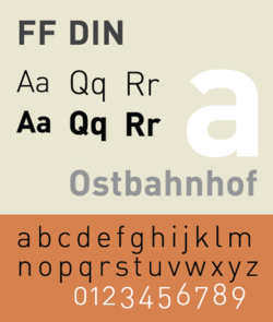
FF DIN. [Keegan Jones, US]
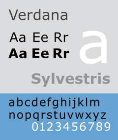
I do like Trebuchet, and Verdana (10px and below). “Regular” font: Lately, I’ve been using DIN. [Ryan Masuga, US]
It’s hard to pick just one, but I’d be lying if I didn’t say FF DIN. [Rob Goodlatte, US]
I love simple fonts like Helvetica, Chalet etc. - and there are so many classic serif fonts that are absolutely gorgeous; Times is a classic but today’s users seem to tire of it because of overuse - so others like Garamond, Caslon, Baskerville, Minion and Palatino all hold a special place with me. [Oliver Beattie]
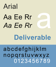
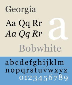
I use Arial (sans-serif) or Georgia (serif) in every web-site project. [James Mathias, US]
Keeping “web friendly fonts” in mind, the most often used font for coded pages is Arial. [Derek Punsalan, US]
As well as the usual Arial, Verdana etc. for body copy, I tend to use clean sans-serif fonts for headings. I try to use a variety of different fonts but I am quite partial to a bit of Rockwell at the moment. [Dan Lindop, UK]
Arial. Sorry! I’ve been leaving typography, which I know embarrassingly little about, to the designers I’ve been working with recently. [Patrick Griffiths, UK]
I am totally not a font person, so I just use the usual suspects. Arial, Verdana. I’m sure that’s like fingernails on chalkboards for some people. [R. Marie Cox, US]
Web: Verdana 11px (150% leading). Display: Maple (Process Type). Print: Mercury Text (H&FJ) [Matthew Buchanan, New Zealand]
Mmm, I’m a big fan of Georgia. I know that means that if Georgia is not available, it means falling back to Times New Roman, but hey ho, them’s the breaks. [Ian Lloyd, UK]
I find myself using Georgia and Verdana quite a bit. They are good utility fonts and are fairly ubiquitous. While I wish there was more variety available, there are only a handful of fonts which are reliable, due to the limited selection installed across multiple operating systems. The key to best using fonts is to know what typefaces are available in which environments. I have seen quite a few sites which resort to using sIFR, but I think that with a little research and patience, there is still quite a bit that can be done within the browser itself. One thing I have learned by dabbling in typography is that the default sans-serif font on Ubuntu is considerably wider than the sans-serif on other operating systems. While the sans-serif for Windows and Mac tends to look like Arial or Helvetica, the default sans-serif on Ubuntu is actually closer to Verdana in width. [Nathan Smith, US]
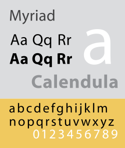
I use Myraid Pro quite a lot, probably too much. I’m just in love with it’s different variations, each one can portray a very different message. Andy Peatling, Canada]
“Myriad Pro” and “Neue Helvetica” are my favorites. Both flexible, elegant and yet readable. [Wolfgang Bartelme, Austria]
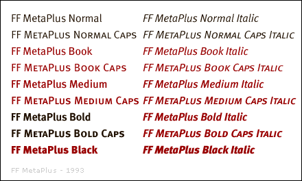
MetaPlus. [Mike Davidson, USA]
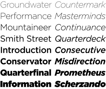
Gotham. [Jesse Bennett-Chamberlain, Canada]
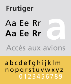
It always depends on the context, but I’ve found Frutiger to be a reliable standby. [Garrett Dimon, US]
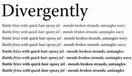
Warnock Pro (entire family) [Cameron Moll, USA]
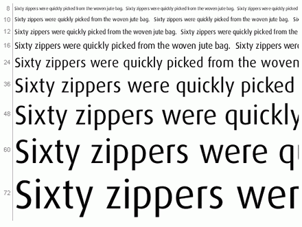
Dax Regular [Paul Boag, UK]
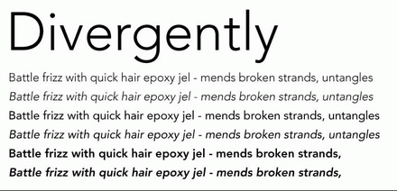
Lately I’ve really liked the way Avenir looks on the screen. The font has a very fresh feel and works well with hum-drum web fonts. [Matt Downey, US]
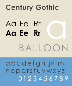
Century Gothic, I just like the cleanliness of it. [Christian Heilmann, London, England]
Many of my corporate clients have existing corporate identities. In these cases, my role is often about interpreting corporate identities into the web environment. This means that fonts are often dictated from the outset. For other clients, I don’t think I have particular favourite fonts. I use different fonts - depending on the client and the feeling we are trying to get across. Even within serif font families there have not been particular favourites. I’ve used Rockwell, Clarendon, Goudy and even American Typewriter.I generally try to use as few actual image-based fonts as possible. I’m always conscious that the site may be viewed by small screen devices, by people who have images turned off, by blind users or people with screen magnifiers. Often image-based fonts are a barrier or an irritation to these people. Ideally, I prefer my content to be able to scale, display well on any device and be flexible enough so that users can override my settings.I generally try to use as few actual image-based fonts as possible. I’m always conscious that the site may be viewed by small screen devices, by people who have images turned off, by blind users or people with screen magnifiers. Often image-based fonts are a barrier or an irritation to these people.Ideally, I prefer my content to be able to scale, display well on any device and be flexible enough so that users can override my settings. [Russ Weakley, Australia]
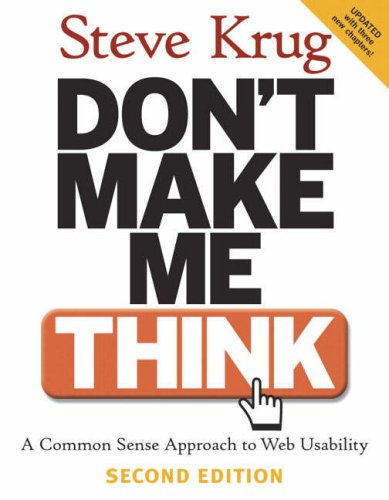
“Don’t Make Me Think” by Steve Krug. [Jesse Bennett-Chamberlain, Canada]
“Don’t Make Me Think” by Steve Krug. It’s a small book with a big message about web usability. If you’re a web designer and haven’t read it, I would highly recommend it. Andy Peatling, Canada]
Don’t Make Me Think by Steve Krug. Again, not sure if this is quite ‘designer’ enough for you, but I wish more web developers and designers would read this before creating their first web site. It should be the law. [Ian Lloyd, UK]
“Don’t Make Me Think” by Steve Krug. It is a simple book but also very powerful. It is an ideal book to give to entire teams to read - including content writers, designers, developers and clients. [Russ Weakley, Australia]
“Don’t Make Me Think” - it was fast enough pace to keep my attention. [R. Marie Cox, US]
“Don’t make me think!” by Steve Krug. best hour of your time you ever spent on learning usability. [Christian Heilmann, London, England]
Hands down, bar-none, undoubtedly the best book written about web design is Don’t Make Me Think by Steve Krug. [Patrick Griffiths, UK]
More usability than design related, but one of the influential books for me was Steve Krug’s - Don’t Make Me Think [Lucian Slatineanu, US/Romania]
For CSS Design I would recommend CSS Mastery by Andy Budd. For UI design and understanding usable layouts I would recommend Don’t Make Me Think! by Steve Krug. Many people may not consider the second book a design book, but I think it is crucial for any designer to understand how users think. Design is not only aesthetic, but also has to be functional in order to create results for your client. [Nick Francis, US]
“CSS Mastery” by Andy Budd is a great introduction to producing good CSS layouts. I’ve read a few others on this subject but this is the best in my opinion. [Dan Lindop, UK]
With seamingly endless resources online, I find it hard to justify purchasing an actual book off the shelf. The only book that I have purchased and can recommend CSS Mastery by Andy Budd (with Cameron Moll & Simon Collison). A great primer for anyone interested in building a strong foundation from which to build off of. [Derek Punsalan, US]
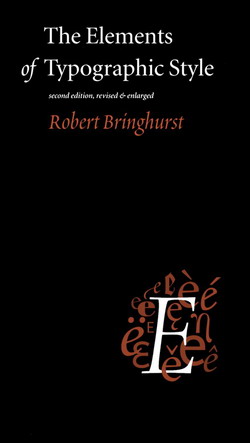
The Elements of Typographical Style, by Robert Bringhurst. This is the book which inspired WebTypography.net. Another great book about user interface design is Don’t Make Me Think by Steve Krug. It encourages web designers to create intuitive site navigation and messages. [Nathan Smith, US]
The Elements of Typographic Style [Cameron Moll, USA]
Elements of Typographic Style by Bringhurst. [Mark Boulton, UK]
The Elements of Typographic Style is pretty boring, but it’s amazing how much you pick up from it while you’re dozing off. [Cameron Adams]
Jeffrey Zeldman’s “Designing with Web Standards” [Paul Boag, UK]
I like “Transcending CSS”, it has some good ideas and is great for inspiration, plus my screenshot is in there (page 48). [James Mathias, US]
If there is one book that many, many people working in the Web industry desperately need to read it is Ian Lloyd’s “Build Your Own Website The Right Way Using HTML & CSS”. [Roger Johansson, Sweden]
“How to be a Graphic Designer Without Losing Your Soul” by Adrian Shaughnessy [Rob Goodlatte, US]
Web Standards Solutions by Dan Cederholm. [Matthew Buchanan, New Zealand]
The only book I have on my desk is “Bulletproof Web Design” by Dan Cederholm. That’s more CSS than design - but I don’t buy design books. They’re way too expensive, they take up space, and I can find everything I need online, if I need something. [Ryan Masuga, US]
Pro CSS Techniques book by Jeff Croft, Ian Lloyd and Dan Rubin. But if I had to pick one book that I’d recommend to everyone starting on their journey towards standards development it would be Web Standards Solutions by Dan Cederholm. [Matt Downey, US]
Well, it’s a not a book to read but sure is eye candy. And it’s not just one either: ‘Los Logos’, ‘Dos Logos’ and ‘Tres Logos’. Love ‘em. [Filipe Varela, Portugal]
Can’t recall a book that I’ve read specifically on design. But here are some web related books that I recommend: Books for your brain. [Keegan Jones, US]
All of Edward Tufte’s books. They aren’t directly related to design per se, but they have an incredible wealth of information with regards to communicating and pragmatic aesthetics. [Garrett Dimon, US]
Making and Breaking the Grid by Timothy Samara. An introduction to grid based layouts. Highly recommendable. [Wolfgang Bartelme, Austria]
Ogilvy On Advertising. [Mike Davidson, USA]
I’ve just got a copy of Web Standards Creativity by (among many, many others) Cameron Adams, Mark Boulton, Andy Clarke, Jeff Croft, Dan Rubin etc. - that one’s a pretty good read. Also, it’s good to read other books not directly related to web designs. For example, I’ve got quite a few print books:1) Letterpress - New applications for traditional skills (David Hury)2) Grid Systems (Kimberley Elam) 3) The Elements of Typographic style etc.
Chasing the Perfect by Natalia Ilyin. [Natalie Jost]
Defensive Design (37 Signals). [Kyle Neath, US]
Two CSS books that are absolutely brilliant are Transcending CSS by Andy Clarke and Pro CSS Techniques by Jeff Croft, Ian Lloyd and Dan Rubin. [Oliver Beattie]
I don’t read any design magazines on a regular basis - online or offline. I just started reading Digital Web a little bit. I have a newsreader that I hardly open anymore because I’m busy with work! I sift through cssmania.com now and then just to see what people are up to, and spend all my time on the ExpressionEngine forums. [Ryan Masuga, US]
Digital Web. [Jesse Bennett-Chamberlain, Canada]
There aren’t really any printed magazines that I read regularly. I suppose that my online reading list is probably fairly typical for most web designers, consisting of the usual suspects: Digital Web Magazine, A List Apart, UX Magazine, Boxes + Arrows, and of course Smashing – though you guys need a unique site design. [Nathan Smith, US]
A List Apart. [Mike Davidson, USA]
Online, I trust A List Apart, sorry that one’s probably obvious. I really like Create Magazine in print, just because I enjoy looking at the ads. [Nick Francis, US]
I don’t get design magazines from the shops, at all - I tend to find them too pretentious or up themselves, to be honest! Likewise, I’ve not bought techie magazines for a long while. For me, it’s all online, and once more I’m thinking more on the technical/techniques front. So for me it’s still alistapart.com - great writers, good ideas and nicely presented. [Ian Lloyd, UK]
A List Apart. [Oliver Beattie]
Design Observer. [Lucian Slatineanu, US/Romania]
Does Wired count as a design magazine? It’s certainly got some of the best infographics I’ve ever seen. [Cameron Adams]
Pingmag [Derek Punsalan, US]
I really live the vibe and the variety that Netdiver features every day. [Filipe Varela, Portugal]
UX Magazine is a great read, and post a lot of fun articles. I also fill my feed reader with a bunch of web standards/web design/usability blogs and scan through them when I can find a spare minute from working! Andy Peatling, Canada]
I Check out Smashing Magazine from time to time, but I don’t really read a lot of design magazines, unless they have something specific. I do, however, watch Pixelperfect with Bert Monroy every week. [James Mathias, US]
Why Smashing Magazine, of course. [R. Marie Cox, US]
Fontblog.de - a German weblog on typography and other design related stuff. [Wolfgang Bartelme, Austria]
.net magazine (cheating, I get it for free as I am a contributor) [Christian Heilmann, London, England]
Communication Arts. [Kyle Neath, US]
Relevant Magazine. It’s extremely well designed (even the ads!), and it’s inspiring to flip through. If nothing else, it helps spark good design ideas. [Keegan Jones, US]
Computer Arts and .net magazine monthly. [Dan Lindop, UK]
HOW magazine is always an incredible source of design inspiration for me. Seeing printed and promotional pieces really challenge me to think about how to display and organize information on the web. [Matt Downey, US]
I like to read things that will broaden my horizons as a designer, not narrow them. A recent magazine I picked up in the UK which had great design, but also great content, was a magazine called Monocle. [Mark Boulton, UK]
I don’t follow any particular design magazines. Occasionally I’ll browse through a copy of Computer Arts or Communication Arts. [Rob Goodlatte, US]
I don’t read any on a regular basis any more - there are so many nowadays I just follow links and suggestions to interesting articles. [Patrick Griffiths, UK]
I really haven’t read any magazines. I’ve spent most of my time exploring books and finding books on classical aspects of design like typography and the grid. I’ve also found it incredibly enlightening to read books from different industries or different periods in art and history. It’s easy to follow the latest “fads” and apply that to a design, but it’s the classical and unchanging principles that really make a quality design stand out regardless of its particular style. I’m also starting to get into books on psychology, anthropology, and other related books that lend themselves to understanding human behavior and think of how we can apply that knowledge to the web. [Garrett Dimon, US]
I don’t read design magazines anymore. I used to, but these days I don’t have the time. Or the interest. [Roger Johansson, Sweden]
I don’t read any particular one on a weekly basis, but I pick up any design-related mags as often as I can with topics that range from food to architecture to aircraft design etc. [Cameron Moll, USA]
I do not read offline magazines now. Even with online magazines, I do not really “read” them in the true sense. I skim across a wide range of sites every couple of days as well as hitting a wide range of RSS feeds. Russ Weakley, Australia
XHTML:

  <h1 id="logo">My Company</h1>

CSS:

#logo {
  background: transparent url("pathtoyourimage.png") no-repeat 0 0;
  display: block;
  width: 100px;
  height: 50px;
  overflow: hidden;
  line-height: 1000px;
}
2.4. Approach
One font you use in your projects very often.
Web-typography defines the content. Or was it the other way around? Nevermind: the point is that if you use web-typography properly, you can not only improve the readability of your content, but also give it a more profound structure and provide your readers with efficient visual cues and hints.
Where to start your search for professional typefaces? Professionals deliver answers.
3.1. Helvetica, Helvetica Neue
[ Source: Slowcode.com]
3.2. Univers
[ Source: Linotype.com]
3.3. Lucida Grande, Lucida Bright
[ Source: Wikipedia]
3.4. FF DIN
[ Source: Wikipedia]
3.5. Arial, Verdana
[ Source: Wikipedia]
[ Source: Wikipedia]
3.6. Georgia
[ Source: Wikipedia]
3.7. Myriad Pro
[ Source: Wikipedia]
3.8. Meta Plus
[ Source: Fontshop]
3.9. Gotham
[ Source: Typography.com]
3.10. Frutiger
[ Source: Wikipedia]
3.11. Warnock Pro
[ Source: Veer.com]
3.12. Dax Regular
3.13. Avenir
[ Source: Veer.com]
3.14. Century Gothic
[ Source: Wikipedia]
3.15. Approach
1 design-related book you highly recommend to read.
[ Source: Slowcode.com]

3.2. Univers

[ Source: Linotype.com]
3.3. Lucida Grande, Lucida Bright

[ Source: Wikipedia]
3.4. FF DIN

[ Source: Wikipedia]
3.5. Arial, Verdana

[ Source: Wikipedia]

[ Source: Wikipedia]
3.6. Georgia

[ Source: Wikipedia]
3.7. Myriad Pro

[ Source: Wikipedia]
3.8. Meta Plus

[ Source: Fontshop]
3.9. Gotham

[ Source: Typography.com]
3.10. Frutiger

[ Source: Wikipedia]
3.11. Warnock Pro

[ Source: Veer.com]
3.12. Dax Regular

3.13. Avenir

[ Source: Veer.com]
3.14. Century Gothic

[ Source: Wikipedia]
3.15. Approach
1 design-related book you highly recommend to read.
Of course, the Web is full of information. And of course, you can find everything you need, googling for few minutes. However, studying a complex subject, it’s always nice to have a good book about your topic right in front of you.
So if you’d be asked to suggest a design-related book, what book would you suggest?
4.1. “Don’t Make Me Think” by Steve Krug
4.2. “CSS Mastery” by Andy Budd
4.3. “The Elements of Typographical Style” by Robert Bringhurst


 How To Measure UX and Design Impact, 8h video + UX training

 Devs love Storyblok - Learn why!
 JavaScript Form Builder — Create JSON-driven forms without coding.
 Register For Free

