Creative Calendar Designs
How many creative solutions for calendar design are out there? If you take a look around you’ll find out that most calendars are designed in a “standard” linear fashion. Calendar cards usually have the same structure: the month is designed in bold while the days are placed below within a rigid grid structure. Well, it doesn’t have to be like this. In fact, there are a number of creative approaches one can consider when designing calendars.
Indeed, designers sometimes risk unique design solutions. However, unusual design is not necessarily a good design. It is important that your calendar design reveals function and remains usable. Function is more important than the design. In fact, some designs listed below may be not that user-friendly, but they may serve as a nice starting point and give you some fresh ideas for your future designs.
This post showcases creative examples of calendar design. We have tried to include creative, visually appealing and interesting design solutions. Hopefully, everybody will find something interesting and unusual for herself or himself.
You may want to take a look at our related posts
- Beautiful Brochures and Booklets
- Data Visualization and Infographics
- Beautiful and Expressive Packaging Design
Beautiful and Creative Calendars
Magnetic Calendar
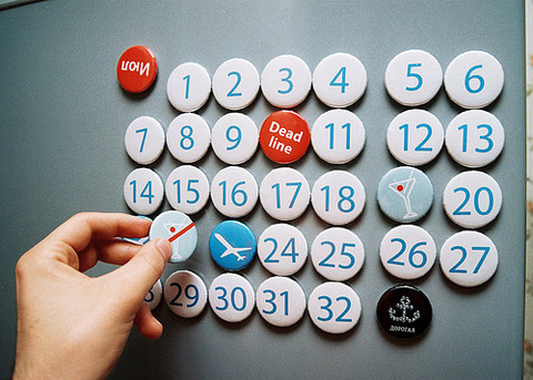
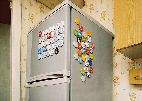
Eternal, easy customized magnetic calendar. With, even, 32nd day of month just in case. Month’s names abbreviated to 3 letters. Chips can be placed one over another. Special appeal of this calendar is special chips, like “Deadline”, “Arrival”, “Departure”, five “Drink Day” and one “Don’t Drink Day”. Designed by Serhiy and Igor Chebotaryov.
Tielen perpetual calendar
Designed by Sander Tielen from Netherlands.
A-Calendar
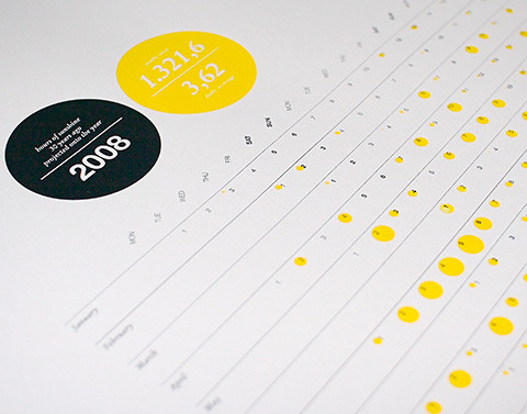
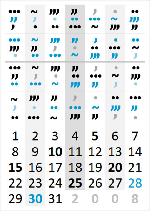
Fun little project: this calendar displays the daily hours of sunshine 30 years ago, projected onto the year 2008. Well, that was a lot of work. Designed by Sven Ellingen.
Too cool for words
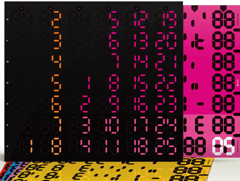
It’s actually extremely simple: you just need to commit to memory that .|..|…|~|,,,|,,|, > January to December. So if you want to find out what day name was November 20, you go to 20, move up to the November row, find … and you know immediately that it was a Tuesday. And it has some BIG type as well.
Perpetual Calendar
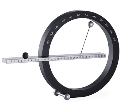
This boldly original calendar is designed to be used year after year. Simply move the two magnetic balls to mark the date and month. Made for the Museum out of plastic and magnets, it can be wall-mounted or used on a desktop. Designed by Gideon Dagan.
Folding calendar
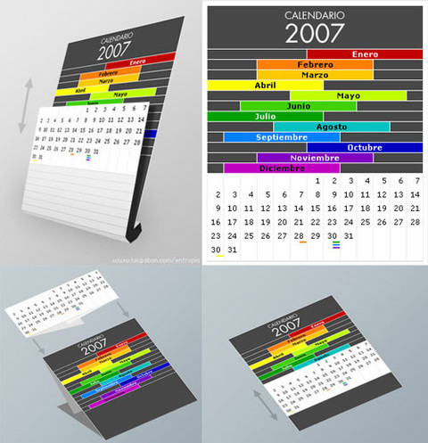
This design makes use of a “folding” dimension in order to share a common grid of numbers among different month headers. Designed by Luis Pabon.
Color Calendar
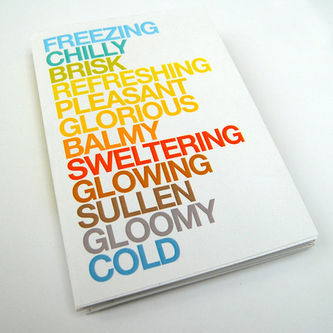
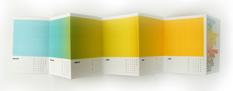
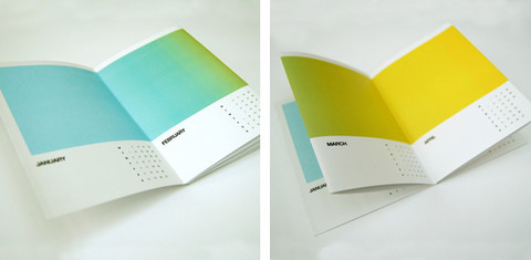
A pretty colorful calendar concept. Each month color is associated with a month — e.g. blue stands for January and red stands for July. The last page contains contact references to designer’s portfolio. That’s an effective brochure design. Designed by Jonathan Davies.
Pulse Calendar
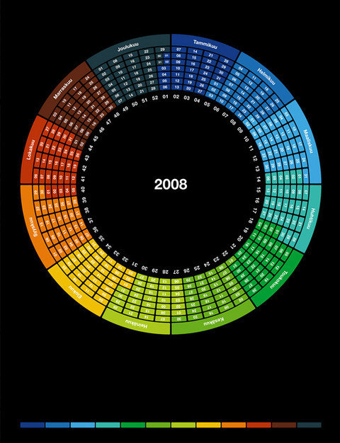
A circular calendar design concept from Finland. Designed by Pulse247 design agency.
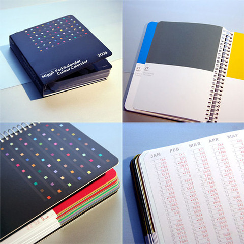
Colour calendar
Colour Calendar 2008 – and every day once again gets its own special color from Switzerland’s design genius, Moritz Zwimpfer. This appealing, spiral-bound desk calendar is a bit like a Pantone book with room for notes; each day’s color brings its own scent, taste and sound, the implications of memory, the possibilities of the future. A beautiful little object, impeccably printed, for the desk or attaché case of a design aficionado, promising enjoyment long after 2008 is history. The appendix includes a calendar overview for 2008-2009, Pantone codes for the 365 colors, and blank pages for memos. Designed by Moritz Zwimpfer.
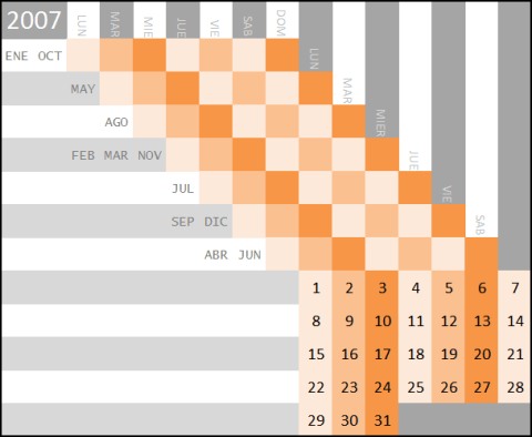
Orange diagonal with outer numbers
For one thing, orange and gray are a great combination, but more importantly it has an other-worldly weirdness that I very much appreciate it. I guess the strangeness comes from being a novel (I think) way to extend everyday two-dimensional tables with one extra dimension. It’s not a perfect extension–confusing and difficult to follow–but it’s intriguing.
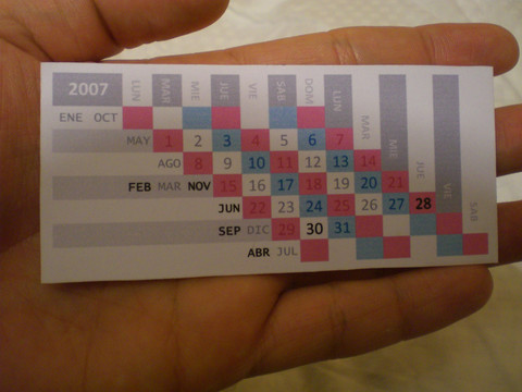
Compact calendar
Designed by David Seah.
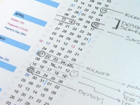
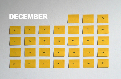
Post-It Calendar
Calendar made from post-it paper, the layout and design still needs some work (as always, any of your suggestions and thoughts are more than welcome), but here is the rough concept. The principle how it works: for each day you have a post-it note, each one has a date and a to-do list, before you leave your house, you peel todays note from the wall/frige/whatever and put it in you wallet. Designed by Andrei Slobtsov.
Step perpetual calendar
Simplicity and good design make up this pleasing, yet space-conscious desk accessory. This two piece perpetual desk calendar is made of wood.
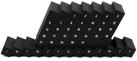
Dupont - Corian Calendar
Corian 40 years/40 designers was created to recognize the input designers have made and continue to make to Corian. DuPont asked 40 international designers to create a genuinely functional object - a table or desktop accessory - that reflects the ingenuity of the designers as well as the design possibilities of Corian.
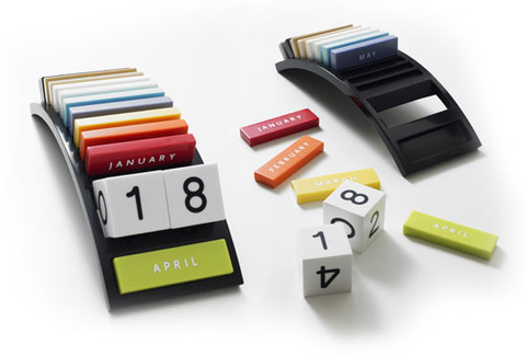
Vintage Calendar System
Simplicity and good design make up this pleasing, yet space-conscious desk accessory. This two piece perpetual desk calendar is made of wood.
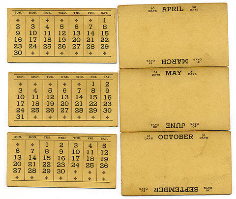
Calendar 2008
Calendar doesn’t have to be linear, it can be designed in a shape of a spiral. However, it is not clear how one can actually use this concept. Maybe you have some idea? Created by Krizan Design Studio.
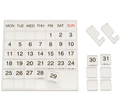
Acrylics Calendar MUJI
This calendar features a grid of movable acrylic cubes with days of the week and numbers that can be adjusted with each month. Comes with a stand for placing on the desktop. Made of acrylic.
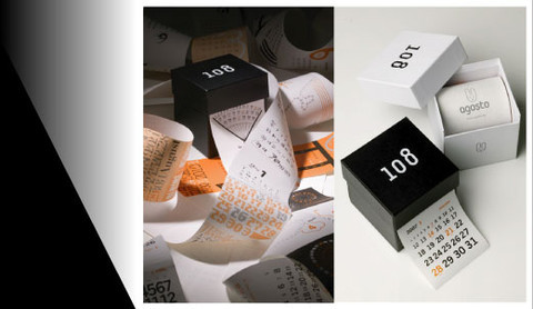
108time box
The calendar of 9 years. The endless time flows from the time box. 108 visual pictures consisted of the numerals depicted different axes.
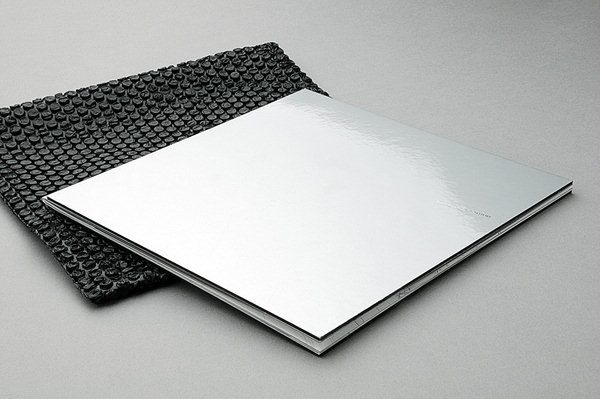
Pershing Calendar
Even a simple calendar doesn’t need to look like a calendar. With a moderate use of white space a calendar can be seamlessly integrated in a brochure or booklet. Slick design by Manuel Dall’olio.
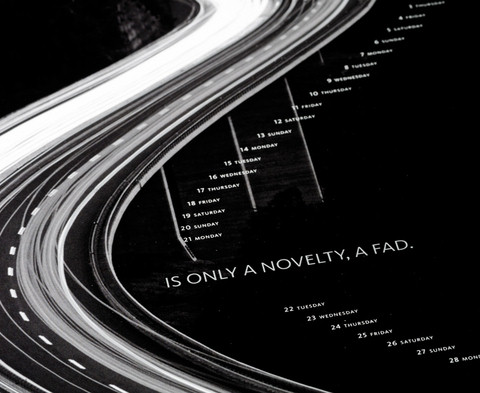
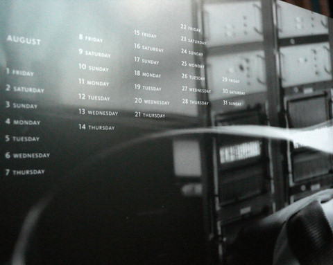
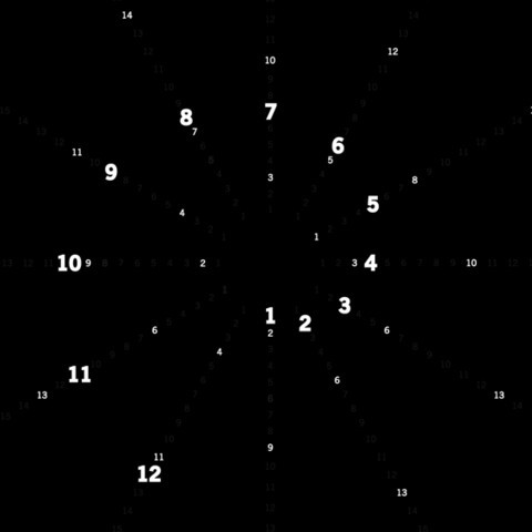
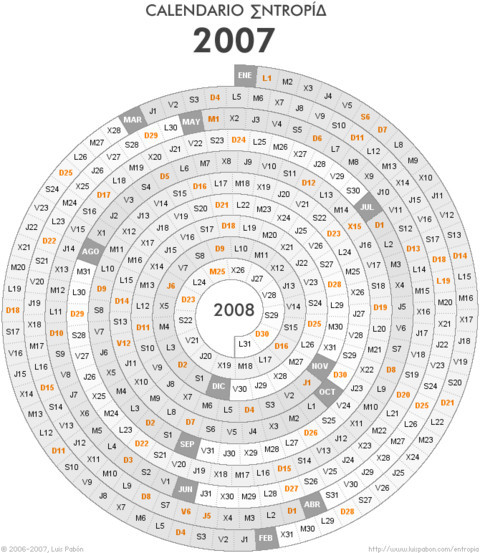
Circular calendar
Designed by Entropia.
Information Aesthetic Calendar
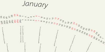
The design is not meant as a sterile design object, but rather as a sort of graph paper for personal life: people are invited to invent their unique, personal visual code: they can bracket trips along perimeters, circle birthdays, arc weekly meetings, mark time and so on. Pdf-version is available.
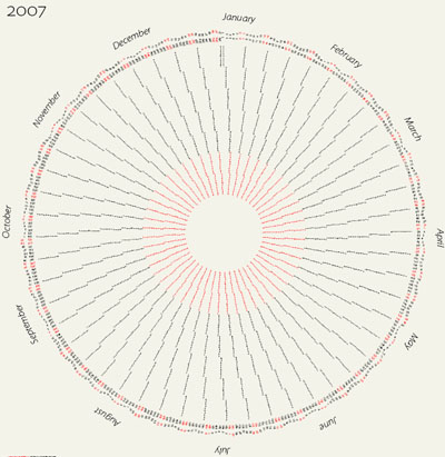
Calendar Card
“There is a number of outstanding issues with the design, esp. how to determine day of the week for each date (I’ve tried to address this by highlighting Mondays with a white dot). Type may still be too small as well.” Designed by Ben Stevens.
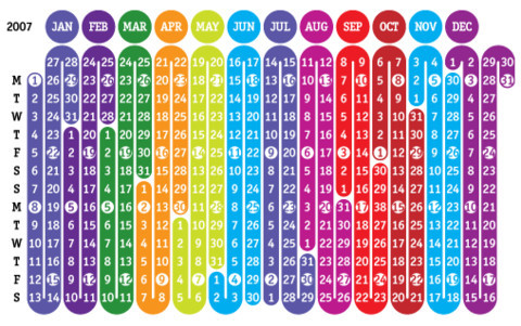
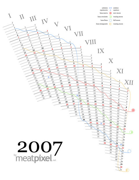
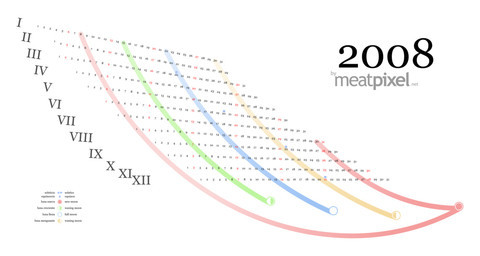
Meatpixel Calendars
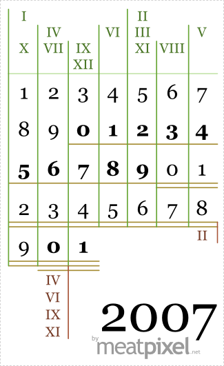
A calendar featuring moon phases, solar phases and another phases of plus minus 30 days. The last calendar is a simple pocket calendar for people with troubles seeing tiny stuff. The roman numbers are the months, above is the first MONDAY and under is the last day.
Slow printings
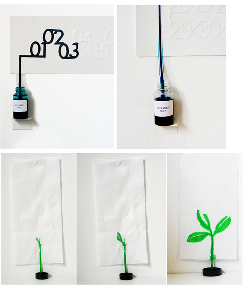
Series of “self-printed” calendar and plant posters made by controlling the ink bleeding on the paper. Designed by Oscar Diaz.
Helvetica 2008 Calendar
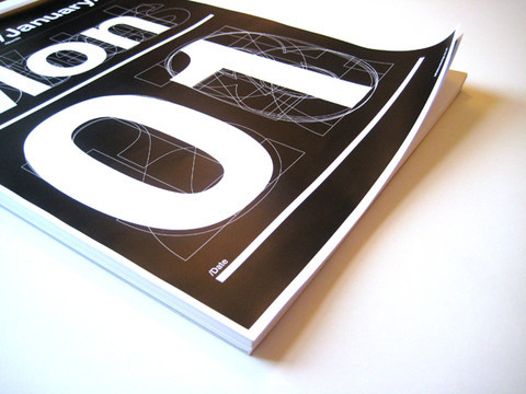
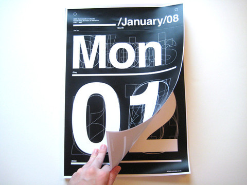
The calendar is 365 perforated pages with the month, day and date in large and bold type. Each month is shown solid at the top of each page with the overlayed outlines of the 7 days of Mon - Sun, the left numbers 0 - 3 and the right 0 - 9 on each page. Each page corresponds to one day of the year with the particular day and date picked out in solid white over the outlines. Designed by EffektiveDesign agency.
Circle the date stickers
These are so fun! You’ll be organized and having fun all at the same time with these Circle the Date Stickers. Use them on your photo boxes, scrapbook pages, journals, cards - you can even use these in your pantry! Or, bring them to school or work and use them on your reports or projects that have due dates! The possibilities are endless!


Information Aesthetic Calendar
The design is not meant as a sterile design object, but rather as a sort of graph paper for personal life: people are invited to invent their unique, personal visual code: they can bracket trips along perimeters, circle birthdays, arc weekly meetings, mark time and so on. Pdf-version is available.


Calendar Card
“There is a number of outstanding issues with the design, esp. how to determine day of the week for each date (I’ve tried to address this by highlighting Mondays with a white dot). Type may still be too small as well.” Designed by Ben Stevens.

Meatpixel Calendars
A calendar featuring moon phases, solar phases and another phases of plus minus 30 days. The last calendar is a simple pocket calendar for people with troubles seeing tiny stuff. The roman numbers are the months, above is the first MONDAY and under is the last day.


Slow printings
Series of “self-printed” calendar and plant posters made by controlling the ink bleeding on the paper. Designed by Oscar Diaz.

Helvetica 2008 Calendar
The calendar is 365 perforated pages with the month, day and date in large and bold type. Each month is shown solid at the top of each page with the overlayed outlines of the 7 days of Mon - Sun, the left numbers 0 - 3 and the right 0 - 9 on each page. Each page corresponds to one day of the year with the particular day and date picked out in solid white over the outlines. Designed by EffektiveDesign agency.


Circle the date stickers
These are so fun! You’ll be organized and having fun all at the same time with these Circle the Date Stickers. Use them on your photo boxes, scrapbook pages, journals, cards - you can even use these in your pantry! Or, bring them to school or work and use them on your reports or projects that have due dates! The possibilities are endless!

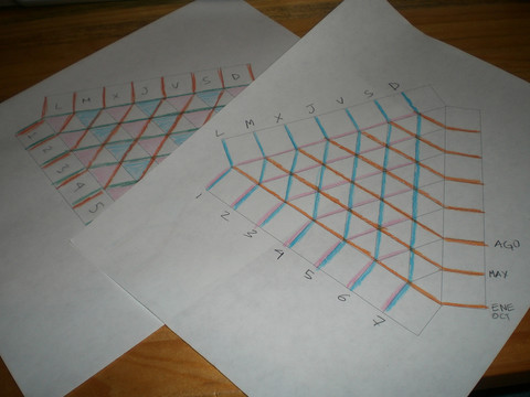
Triangular Calendar
“For one thing, orange and gray are a great combination, but more importantly it has an other-worldly weirdness that I very much appreciate it. I guess the strangeness comes from being a novel (I think) way to extend everyday two-dimensional tables with one extra dimension. It’s not a perfect extension–confusing and difficult to follow — but it’s intriguing.” Who knows, maybe you could develop the idea further?
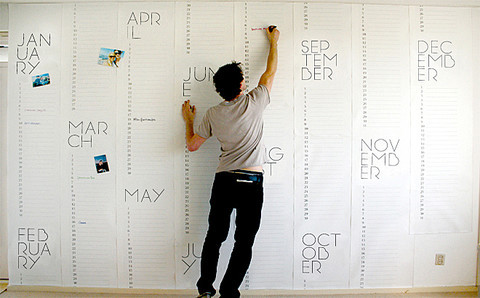
Wallpaper Calendar
Real design ninjas create a calendar wallpaper from scratch, print it out and use it as a (not desktop) wallpaper. Design by Christiaan Postma.
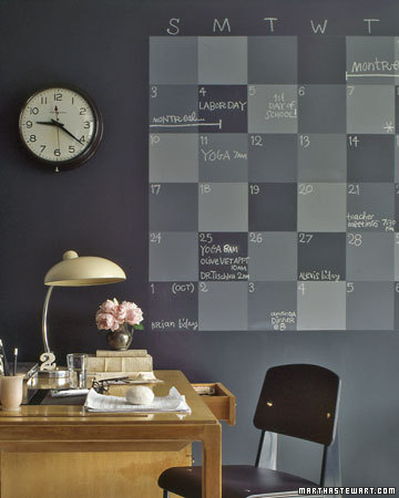
Chalkboard Wall Calendar
A home office is the ideal spot for a family planner. Six weeks worth of squares in a variety of shades can accommodate several schedules. The entire wall is also coated with chalkboard paint for more memos. Start with a base coat of store-bought black chalkboard paint, then mix in varying amounts of white chalkboard paint for lighter squares.
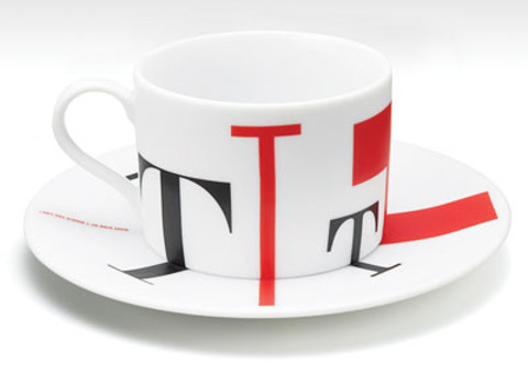
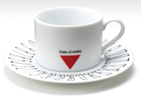
Coffee Cup Calendar
Designed by Takeshi Nishioka. Have a smashing lunch, folks!


 Get a Free Trial


 Devs love Storyblok - Learn why!
 Enterprise UX Masterclass, with Marko Dugonjic
 Register For Free

