How To Use Photos To Sell More Online
This article pulls together principles from psychology, marketing, UX design and photographic theory. It provides a set of principles to follow when commissioning and editing photography and when planning and designing profitable e-commerce user experiences.
Also consider the following related articles:
Show Off Product Benefits
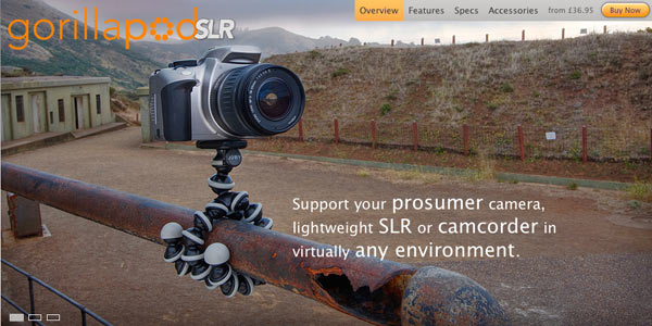
The best way to sell products is to let them sell themselves. Consider the Gorilla Pod shown below. The photo demonstrates brilliantly the benefits of the product. The copy is supplementary; the image does the heavy lifting. Let photography do the selling for you as much as possible.
Don’t Give Reasons Not to Buy
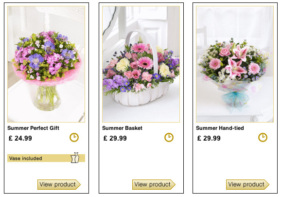
One client sold flowers online, and many customers were buying flowers for hospitalized relatives. Many of the arrangements were displayed in glass vases in the photos on the website but were not actually delivered in vases. Not knowing this, many users felt that they couldn’t buy from that website, because hospitals in the UK (where the business was located) do not allow vases onto the wards.
Create an Immersive Experience
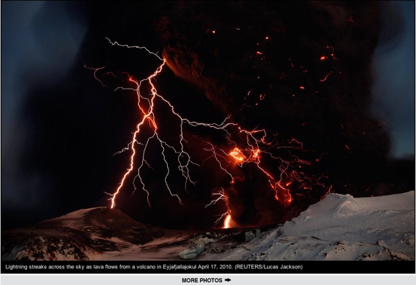
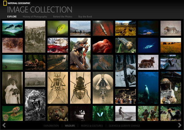
Photographs have the potential to elicit an emotional response. They can also communicate information quickly; they are easier to “read” than text. Photographs give depth and context to a story, thereby creating a more immersive experience than text can do alone. Photos can be used to inspire, enrage, inform, provoke or entertain.
Make ‘em Laugh
Photos have the capacity to entertain as much as to inform. If it suits your brand, why not inject a bit of humor? If your website asks users to perform chores (such as doing admin tasks or paying bills), a dash of humor can ease the burden—and your customers might love it.
Educate and Inform
“Tell me and I’ll forget, but show me and I’ll remember.” Learning can be difficult, but supporting theory with visual stimuli can help us grasp complex concepts and confirm our understanding. Images are easy to remember; how often have you met a new person and found later that you could recall their face but not their name?
Tell a Story
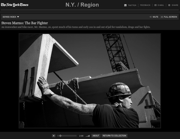
From an early age we are told stories, and we spend our lives telling stories to friends and families. We know that pictures are effective storytelling tools. Even in the news media, multimedia slideshows are produced to give life to news stories.
Highlight Innovation
People have certain expectations of how things should look and function. If you have a product that differs from the norm, expect a large portion of interest to come from word of mouth; friends will show it to friends, who will show it to their friends, and so on.
Show People How to Do Something
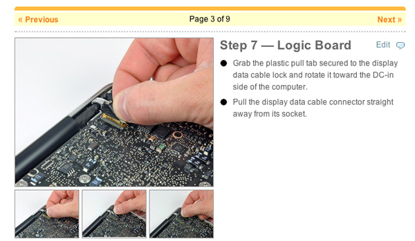
I’m usually the first one to toss out the instructions and work it out for myself. How hard could it be?! The example below illustrates how useful imagery can be when conveying a complex procedure.
Don’t Mislead Users
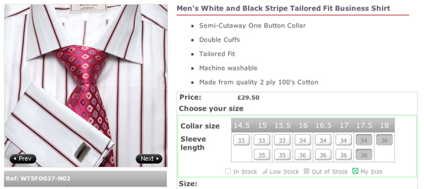
People often jump to conclusions when shown certain types of images. We showed pictures of shirts during some recent testing, and people assumed they would come with cufflinks and ties, but these were added by the stylist to make the shirt look appealing.
Evoke an Emotional Response
Photography is often used to communicate hard-hitting messages (about the environment or human suffering, for example) because it evokes strong emotions. Charity campaigns, for example, know that by photography can get them the type of reaction they want.
Plug Accessories
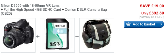
Showing the product’s accessories helps users imagine how they could enhance their experience of a product. Photos of accessories stimulate desire and offer suggestions about where to direct that desire (i.e. what to purchase next).
Show Features and Versatility
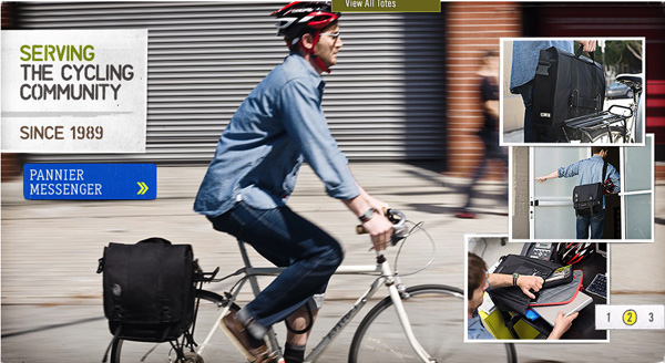
Showing a product in use communicates what it’s for and how to use it, and it helps users imagine how it will fit into their lives. It can result in a feeling of need; it will solve problems the users didn’t realize they had!
Understand Needs
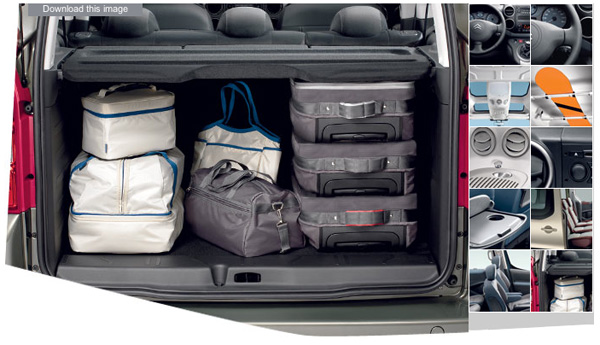
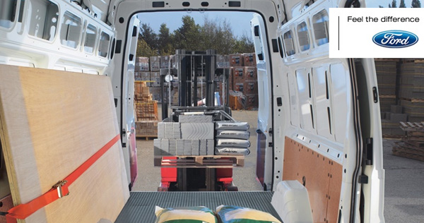
I remember doing some testing for a major automotive client. The fellow was a keen kite surfer, so his primary interest was the size of the car’s trunk. He is the perfect example of a customer who has primary considerations, or “deal-breakers”, on which they are not willing to compromise. Photography can help your website communicate that needs are being met; sometimes, the more photos, the better.
Match the Imagery to the Brand
Brands are created and reinforced by photography. A mental disconnect occurs when photos don’t accord with the user’s preconceptions about the brand. It feels wrong and makes the user question what the brand is all about.
Sell a Lifestyle
Whether it’s rural life, the good life or city living, everyone strives to live what they believe to be their perfect lifestyle, and we buy things that match that lifestyle. So, when products are displayed in the context of a lifestyle, we assign value to the product based on our desires. For a wonderful example from a TV campaign, check out the John Lewis “Never Knowingly Undersold” TV ad.
Demonstrate Exciting Features
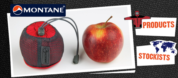
Photography is instant communication, so make it about the best features of your product. I hate getting wet when I cycle, but a coat takes up loads of space in my bag; imagine how compelling the Montane image (below) was for me. I bought a Montane jacket.
Make It Beautiful
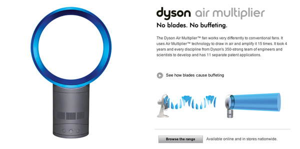
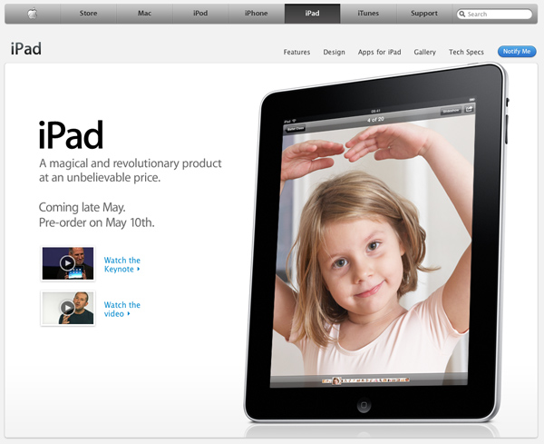
The camera generally lies. That is, beyond setting and context, there are all manner of camera tricks to help you make the subject look beautiful and desirable. Consider the iPad as a photo frame, and see how the picture is enhanced.
Avoid Clichéd Stock Shots
We commonly get feedback from users about their universal loathing of stock photography. A recent project for a university client showed how users preferred “real” photos to stock images, despite their less polished look. Users wanted a realistic vision of what actually went on at that university.
Create Desire
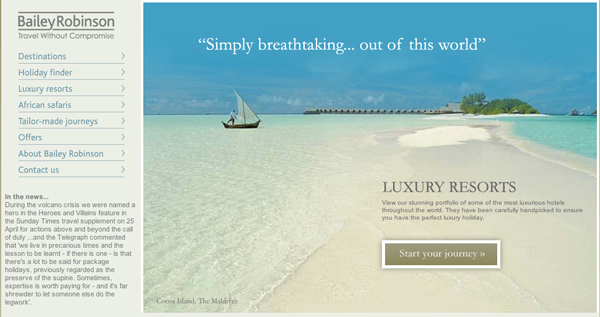
The Web is about self-service. It’s also an ideal way to escape reality. Travel websites know how important it is for potential customers to see resorts and rooms before purchase and travel. They know that the customer needs to envision themselves in that hot relaxing place when they book tickets from their cold home in January.
Be Stylistically Consistent
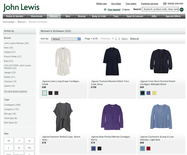
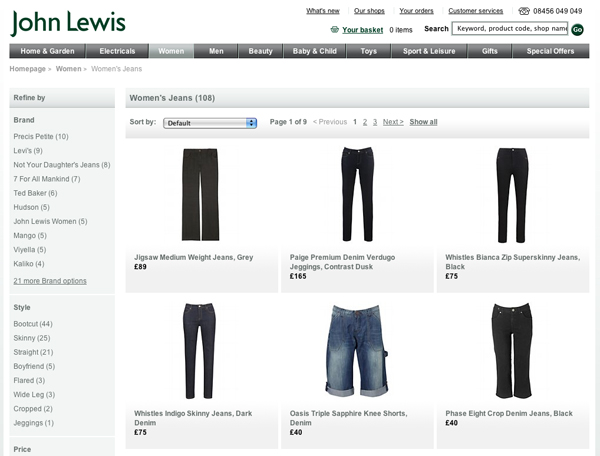
John Lewis, the UK department store, takes a painstaking approach to product photography, often taking up to 30 minutes to style individual items within a vast product range. The company defines and adheres to a particular photographic style. The results are stunning because the style is applied consistently.
Convey the Intangibles
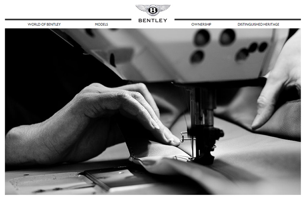
Bentley’s sales often result from brand values such as quality, craftsmanship, heritage and tradition. Often, the qualities related to a product are hard to put into words. Photography can help convey those qualities clearly.
Show Some Personality
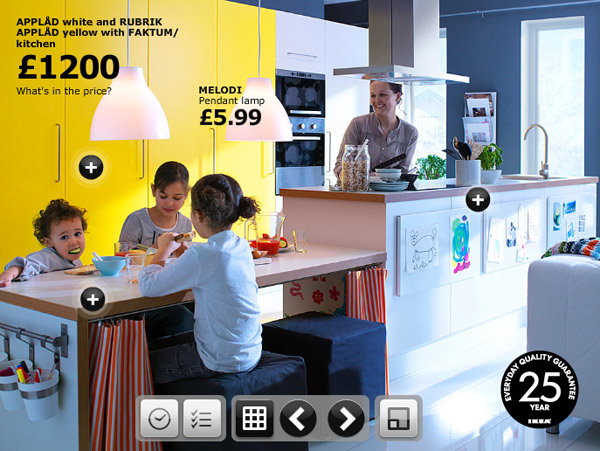
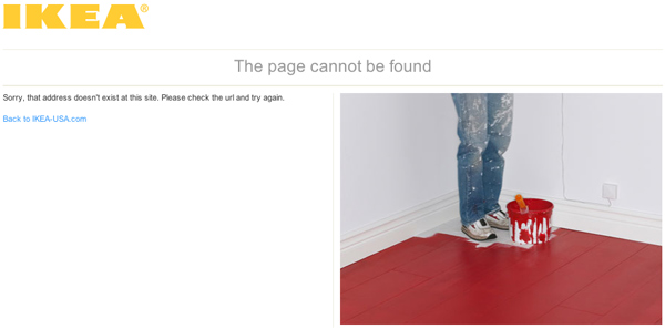
Photography can convey the essence of a product or service, but it can surprise and delight, too. I was looking for something recently on the Ikea website and came across the page below. It reinforces the fact that Ikea doesn’t take itself too seriously, which is a nice touch, and easy to do.
Be Subtle Sometimes
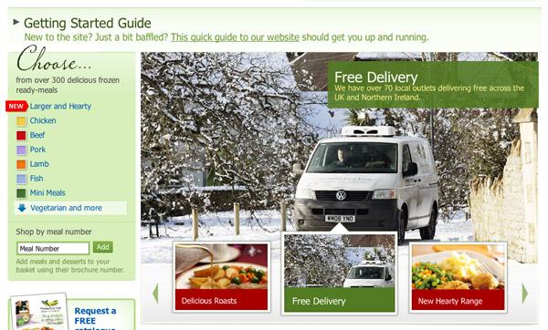
I recently conducted some research for Wiltshire Farm Foods. The response to this photo was amazing: users got the impression that food would be delivered to their elderly relatives whatever the weather. This was of critical importance to them because of the harsh winter. It’s amazing how powerful subtlety can be.
Look Professional
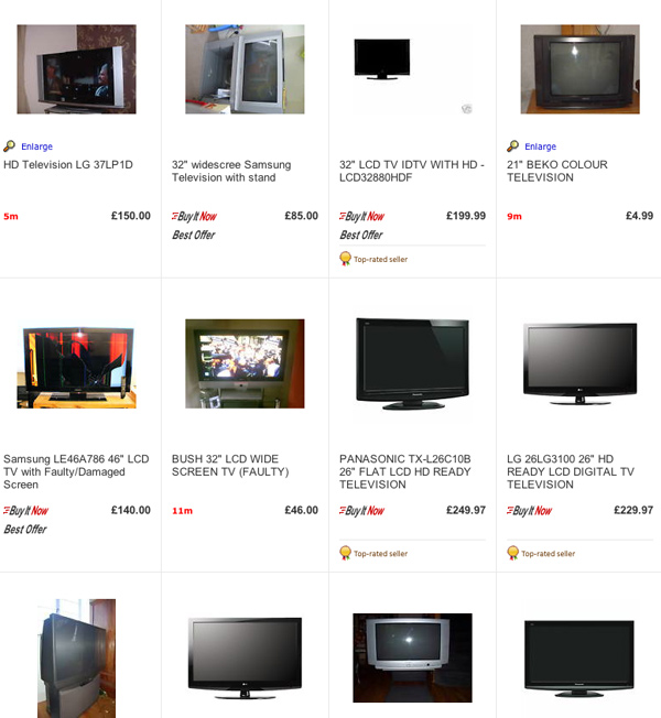
The rules of portraiture dictate that a simple uncluttered background will focus interest on the subject. This rule is applied well on product gallery pages, where product images are cut out and presented against a white background.
eBay unavoidably suffers from inconsistency, and the page below illustrates how much easier seeing products against a simple background is. Research into websites such as eBay and Etsy shows how important product photography is to buyers. Would you bid on a TV that you couldn’t see a picture of?
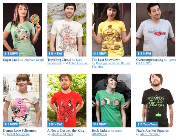
Threadless breaks the rules, but with good reason. The varied backgrounds feels relaxed and shows off the product in a natural setting. The crop on the subject is tight enough that you get an impression of the environment that doesn’t distract you from the subject.
Be Consistent
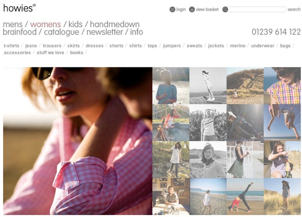
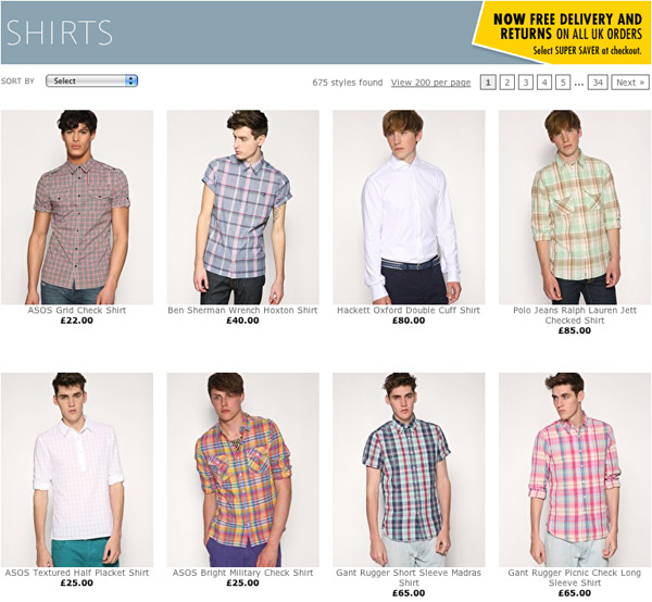
Consistency draws attention to the important things (in the example below, shirts for sale). The eye is drawn to inconsistency, so make sure any inconsistency in your composition is deliberate.
A studio is the perfect controlled environment; you can ensure that lighting remains exactly the same between shots. The lighting style reinforces the brand’s image. Examples include hard edgy light in photographs for a youth clothing brand, and soft ethereal light in photographs for an environmental lifestyle brand.
Use Unusual Vantage Points
You can make an otherwise everyday object seem more interesting by shooting it from an angle that differs from the normal human line of sight. Sound advice: get high or get low. Do whatever you can to give a unique perspective.

Shoot From the Best Angles
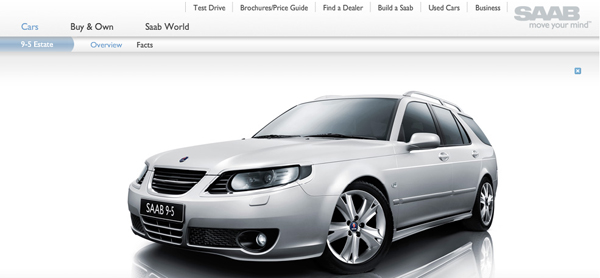
You will often hear people claim that they prefer to be photographed from a certain side or from their “best angle.” Products also have flattering and unflattering angles. Peruse some automotive websites and brochures; see how many cars are shot from a three-quarter angle. This angle suggests power and scale. The shots are clearly designed to appeal to a masculine audience.
Show Objects in Their Natural Environment
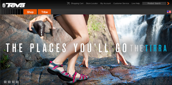
The environment in which you place the subject helps the viewer understand the product’s purpose and suitability. A shot of a grizzly in its natural habitat seems much more fitting and “real” than a shot of that grizzly bear in, say, a parking lot. Product shots in an appropriate environment suggest both where and how the product can be used.
Convey a Sense of Scale
Buying something online can be problematic. Predicting its suitability is difficult without seeing or touching it. (Will it fit? Will it match? Will it look right?) Including an object with a known size in the photograph presents the viewer with an immediate visual reference.
Image Size Is Important
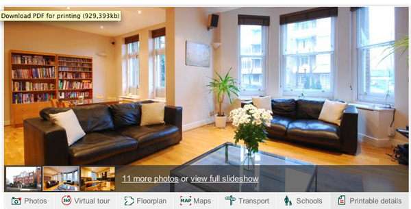
Increasingly fast Internet connections allow clients to work with large images. On real estate websites, for examples, images can’t be big enough; users want to fully explore their potential new homes. That said, if you will be offering a “larger view” of a photo, make sure it really is significantly larger. (My experience with testing has shown me that users are annoyed by “larger” images that are only marginally larger.)
Show the Product in Use
People want to be sure they are buying what they want or need. Show the product in use to help the user see that it suits their needs. Following the advice “show, don’t tell” removes the need for additional explanatory text.
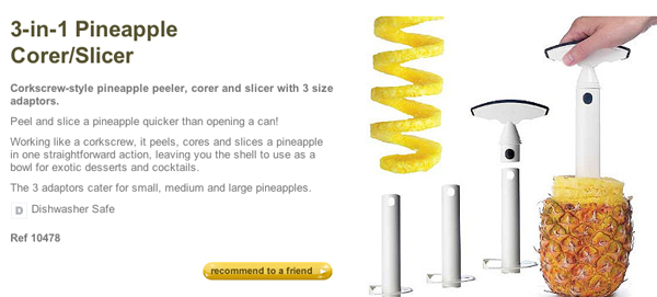
Show How It Works
Consider the pineapple slicer (below). You’d pick it up in a kitchen shop and think, “What the heck is this?” Now try explaining how it works on a website without a photo. A nightmare. Again, show, don’t tell.
Make Choosing Easy
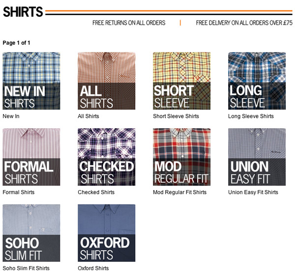
A recent client had over 90 variations of an everyday product available for sale. The variations were meant to offer flexibility, but they bamboozled customers. The example from Ben Sherman (below) is another case of too much or poorly explained variety. How does “mod” style differ from “union” style, for example? I have no idea. The photography should make it clear but doesn’t.
Enhance the Experience
I don’t know why Bing decided to put images behind its search screen, but I like to imagine that they thought, “Heck, why not?” We like things that are emotional or visceral. Good experiences with products and services feed on our tastes and bring return business. So, if Bing helps you find what you’re looking for and is also visually appealing, you’ll use it again and again.
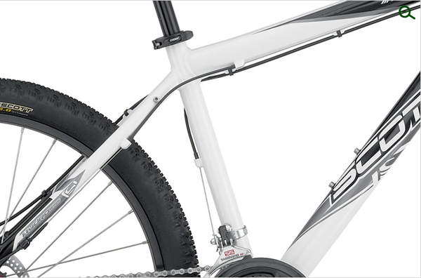
Show Details
Here is a true example of why showing details works. I recently bought a bike. A deal-maker for me was the ability to secure a rack to a fixed part of the bike; I wasn’t going to buy a bike without this. The Evans website provided large zoomable photos that allowed me to check for this detail. I bought my bike from Evans.
Show Me What It Looks Like
I’ve mentioned this already in a roundabout way, but showing the product raises interest and brings business.
Encourage Interaction
A recent test I was involved in asked users to try out the websites of different real estate agents. One user completely reversed their initial opinion of one of the agents when they saw the number of detailed photographs available; they expressed delight and interest. Encouraging interaction by providing functions such as zoom and rotate leads to a satisfying user experience.
Show Me I’m in the Right Place
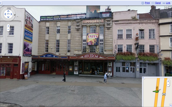
An important aspect of way-finding in digital environments is showing people where they are. Google accomplished this in a literal sense with Street View on Google Maps; this was an innovative use of photography. When we meet with clients in unfamiliar locations, for example, we can see what the place looks like beforehand. We feel prepared and less anxious about being late.
Conclusion
Photographs play a crucial role in informing, influencing, educating and reassuring customers throughout the buying process. Review your website’s photography and question its role. What is the job of a particular photo at that particular stage of the process? Is it effective? When might customers drop out, and how could photos prevent that from happening?
The task of image selection often falls to the designer. User experience professionals should actively influence the process of selecting photos for the buying process. The days of having a placeholder for images in our wireframes and prototypes are over. We should be annotating our work to influence decisions that art directors make when selecting images. Consider these principles to ensure that the images you choose not only “look right” but also work well.
Website owners should recall the principles mentioned in this article when commissioning new photos and researching stock. Focus on the purpose of the images, and you will turn photos from window dressing into key conversion tools.
How have you used photography to maximize conversion? We’d love to hear success stories and anecdotes from user testing.
Further Resources
If you liked this article, you’ll love the following ones:
- Improve Your E-Commerce Design With Brilliant Product Photos
- 50 Incredible Photography Techniques and Photo Tutorials
- 50 Excellent Digital Photography Photoshop Tutorials
- Design To Sell: 8 Useful Tips To Help Your Website Convert


 Agent Ready is the new Headless
 SurveyJS: White-Label Survey Solution for Your JS App
