[Ask SM] Transparent Background, Positioning Problem
This is our fourth installment of Ask SM, featuring reader questions about Web design, focusing on HTML, CSS and JavaScript. In this post we’ll cover how you can style only the text inputs, refreshing a content block automatically, how to avoid some positioning problems and create and use transparent div-backgrounds; we also discuss further CSS-related problems and deliver answers to a couple of quickfire questions.
Styling Only Text Inputs
Editor's Note (May 25, 2024): The following question is no longer a concern since Microsoft dropped support for Internet Explorer in favor of a new Edge browser that is currently a fork of the same Chromium rendering engine used to power Google's Chrome browser.
DonRonito writes:
Since I use a CMS for generating forms, I have encountered a problem with styling of forms that are auto-generated. I can use input[type=text], which only styles the text inputs, but it does not work in Internet Explorer. I wonder if there is another good way to do this.Hi Don, as you seem to know, that selector is what is known as an attribute selector in CSS. You can use it on any element if you intend to select only elements with particular values of inputs. For example, a[title="home"] is a valid attribute selector, which will target elements like this <a title="home" ... >. In the case of inputs, this is particularly useful because there are so many different types: text, submit, radio, image, etc., but they are all <input>'s. You may want to apply a width to text inputs but not radio buttons, for example.
As you also found out, IE 6 and below doesn't like attribute selectors (it just ignores them). Huge bummer. One solution, which was pointed out right away in the forums, is to apply an ID or class to these inputs. You could then use the ID or class to target them in the CSS and apply your unique styling that way, without fear of affecting other types of inputs. But you say that these forms are being generated by a CMS, which seems to imply that you don't have this type of fine-grained control.
A bit of a rough situation you have there. But there is hope, if you don't mind a little JavaScript. If you use jQuery, it supports CSS selectors that accurately do the selecting for you, even in IE 6:
$("input[type=text]").css({
    // apply styling
});
Perhaps an even better solution is to use the Dean Edward's ie7-js script, which automatically makes your CSS attribute selector just work, as well as fix a slew of other IE 6 bugs:
<!--[if lt IE 7]>

<script src="[https://ie7-js.googlecode.com/svn/version/2.0(beta3)/IE7.js](https://ie7-js.googlecode.com/svn/version/2.0\(beta3\)/IE7.js)" type="text/javascript"></script>
<![endif]-->
Auto-Refreshing RSS Content
Editor's Note (May 25, 2024): Chris Coyier has shared a more modern approach to his answer for the following question since this article was originally published.
Niki Brown writes:
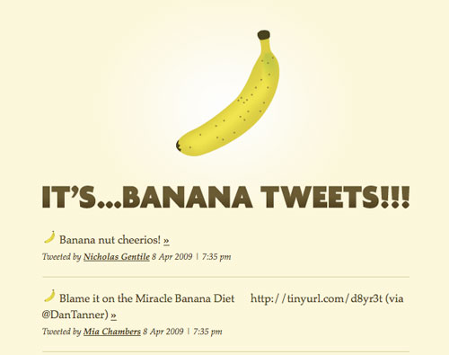
I followed your SimplePie tutorial (Ask SM, 3rd ed.) and made Banana Tweets. But now I'm wondering how I would get the tweets to auto-refresh, say, every 20 seconds.

Hey Niki, great question! We can get this done fairly easily with the AJAX powers of jQuery. We can start where we left off last time. In that example, when the page has loaded, SimplePie works its magic by fetching the RSS (or Atom) feed data and displaying it.
Instead, we'll pull out all that SimplePie PHP and put it into a separate file (which we'll call feeder.php).
<?php
require_once('inc/simplepie.inc');

$feed = new SimplePie();
$feed->set_feed_url(array(
    'https://search.twitter.com/search.atom?q=twitter'
));

$feed->enable_cache(true);
$feed->set_cache_location('cache');
$feed->set_cache_duration(10);

$feed->init();
$feed->handle_content_type();

if ($feed->error): ?>
    <p><?php echo $feed->error; ?></p>
<?php endif; ?>

<?php foreach ($feed->get_items() as $item): ?>

    <div class="chunk">
        <h4 style="background:url(<?php $feed = $item->get_feed(); echo $feed->get_favicon(); ?>) no-repeat; text-indent: 25px; margin: 0 0 10px;"><a href="<?php echo $item->get_permalink(); ?>"><?php echo $item->get_title(); ?></a></h4>
        <p class="footnote">Source: <a href="<?php $feed = $item->get_feed(); echo $feed->get_permalink(); ?>"><?php $feed = $item->get_feed(); echo $feed->get_title(); ?></a> | <?php echo $item->get_date('j M Y | g:i a T'); ?></p>
    </div>

<?php endforeach;
?>
This "feeder" file could be loaded directly, but it would be completely unstyled. The point is to use some AJAX to load the content from that page and plug it into our real page. Then we can set up a JavaScript interval to call this file every 20 seconds and replace the current content:
function getFresh() {
    $("#loadArea").fadeOut(400, function() {
        $("#loadArea").load("feeder.php", function() {
            $("#loadArea").fadeIn();
        });
    });
};

$(function() {
    getFresh();
    var int = setInterval("getFresh()", 10000);
});
Note that the above code is dependent on jQuery.
Positioning Blues
James Bull writes:
On my website, I was wondering how to avoid a scaling problem. If you drag the browser smaller than the width of the page, there are issues with my top-corner images. I've tried various min-width values on different containers and can't seem to solve it. Know how to do this?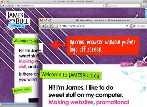
Hey James, first of all, your background looks like it is a combination of four different layered images: one on the html element, body element, .image_left, and .image_right. Because yours is a centered fixed-width website, you could get this done with only two: one for the background texture, and the other for all the other frills.
But in looking at the problem at hand, the percentage positioning you are using for those "corner" images is the problem. Your image_left.png is set to a right position of 50%. That means this image will be perfectly willing to hang off the left side of the browser window without limit and without causing scroll. The image_right.png container is set to a left position, which will cause horizontal scroll (weird, huh?).
The quick fix in your case is to make sure the viewport area cannot shrink any narrower than the width of image_left.png (i.e., 876px). So you can set this:
html {
    min-width: 876px;
}
In your particular design, you might wanna beef that up to about 912px to keep your full name visible at all times. Remember that IE 6 doesn't support min-width, but it looks like you hide those images for IE 6 anyway.
Transparent Div Background
Editor’s Note (May 24, 2024): CSS now offers more robust features for managing color and setting an alpha transparency that is supported by all modern browsers. The following values are examples of colors that support transparency:
rgb(0 0 0 / .5)
hsl(0 0% 0% / .5)
oklch(0% 0 0 / .5)
It’s also worth mentioning that hex color values can incorporate some transparency with an additional channel at the end of the normal syntax. So, if #000000 (or #000) is black, then #00000099 (or #0009) is a lighter variation.
Louie Livon-Bemel writes:
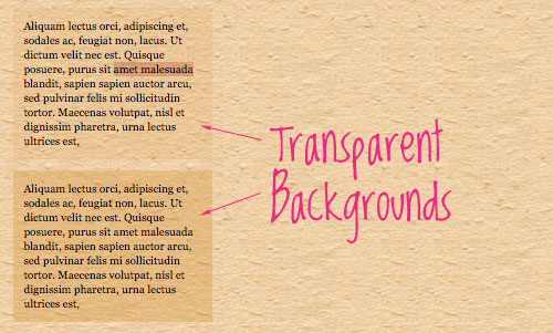
Is there an easy way to give a div's background a low opacity but have the content be normal. The only way I know of is to position a second div behind the content with z-index and give the background div a lower opacity. And if possible, I'd want this to work in all browsers.
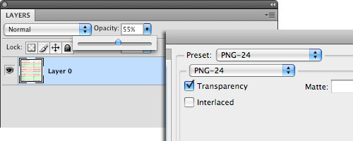
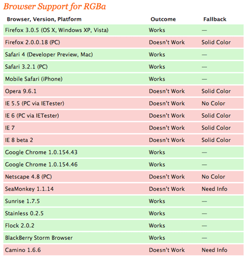
They way you describe works, but going to those lengths is probably unnecessary. If the background of the div is an image, you could lower its opacity in Photoshop and save it as an alpha-transparent PNG (PNG-24 in Photoshop). Then use that PNG as your background image. You'll need PNG hack for IE 6. If you have a solid-color background, you could use a repeating 1x1 pixel alpha-transparent PNG of that color, or use RGBa.
To Use A CSS Framework?
Andrew Turner writes:
I was wondering whether you think it best to use available CSS frameworks for projects (e.g. Blueprint CSS) or to build one yourself from the ground up? Are there any disadvantages or advantages to using frameworks?

The common arguments against frameworks are (1) bloat -- that is, a bunch of unnecessary CSS for alternate grids you may never use -- and (2) semantics problems. Your markup will be using things like <div id=grid_13_b .. />, which isn't very helpful or semantic.
My argument is that CSS is not (for the most part) a very complicated language. Writing it from scratch for each project isn't all that time-consuming and results in exactly what you need and nothing else.
All that being said, I do believe that if you dedicate some time to learning all the ins and outs of a particular framework, it could potentially save you some time as well as lend a familiar feel to all of your projects. If Blueprint CSS is good enough for Jeff Croft and Blueflavor, it can work for you.
Image The Size Of A Table Cell
Editor's Note (May 24, 2024): A more modern approach to the following question is to set background-size: cover on the table cell that comtains a background image.
If a background image is a no-go for you — e.g., the image is part of the actual table content, then take a look at the CSS object-fit property for images that adapt to the amount of avalable space.
William Woolard writes:
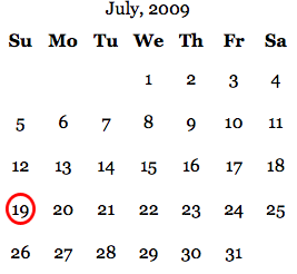
I've created a calendar using PHP that generates the days within table cells. I've modified it to add a class="currentdate" to the current date. The single-digit day cells are one size (1) and the double-digit day cells are twice as large (24). Is there a way to apply a background image to the cell that adjusts according to the size of the cell? For instance, the background is a circle, as if the day has been circled (for single-digit days) and expands to look like an oval on the days that are double digits?This is really a rock-and-a-hard-place scenario. CSS background images are not resizeable, so that's out. The other way to include an image on the page is with an inline <img ... />. These are resizeable, so we may be on to something. The go-to method for stretching an image to the size of its parent is to use absolute positioning and set the top, bottom, left and right values to zero. Unfortunately, the parent needs to have relative positioning for this to work, and table cells do not accept relative positioning.
Divs, however, do accept relative positioning. So, a div inside will stretch it to the width of the parent table cell, but not necessarily the height, and we are unable to force it because of the no-relative-positioning-on-table-cells problem mentioned above.
With CSS alone, we can almost get it:
<td class="currentDay">
    <div>
        <img src="images/circle.png" class="circle" alt="" />
        19
    </div>
</td>
td {
padding: 5px;
vertical-align: middle;
text-align: center;
}
td div { position: relative; }
.circle {
position: absolute;
top: 0;
left: 0;
right: 0;
bottom: 0;
}The height is still a problem though, and I don't see a purely CSS solution. What we need to do is set the height and width of that image to be the exact height and width of the table cell that it's in. We can lean on a bit of jQuery to do that math for us:
$(function() {
    var theImage = $(".circle");
    var theCell = theImage.parent().parent();

    var theWidth = parseInt(theCell.css("width")) + parseInt(theCell.css("padding-left")) + parseInt(theCell.css("padding-right"));

    var theHeight = parseInt(theCell.css("height")) + parseInt(theCell.css("padding-top")) + parseInt(theCell.css("padding-bottom"));

    $(".circle")
    .width(theWidth)
    .height(theHeight)
    .css({
        "top": -parseInt(theCell.css("padding-top")),
        "left": -parseInt(theCell.css("padding-left"))
    });
});
Kind of a lot of work for such a seemingly simple problem, but at least it works and is adaptable. If anyone can figure out a purely CSS solution, I'd love to see it!
Styling the HTML Element
Aaron Bazinet writes:
Can you style the HTML element directly, such as by applying a background image and color to it. I remember someone mentioning it once, but is it safe/valid to do, or bad mojo?
Hey Aaron, just to clarify for readers, all Web pages have an <html> element that wraps the entire page. The tag usually comes just after the DOCTYPE specification. So is something like this do-able in CSS?:
name="code">html { background-color: #ccc; }Yep, it is, should be fine. And in fact, it can fix some otherwise weird issues. I believe you need to go all the way back to IE 5 to see problems with it, which isn't a concern anymore. Sitepoint has a little more info on this and reminds us to avoid positioning this element. ## Quickfire Questions
Have you ever used or heard of Sweetcron? We need a tutorial on theming it! Please help!
I have heard of Sweetcron. I think it is incredibly well-done, self-hosted, life-streaming software. It was produced by Tokyo-based Web developer Yongfook, who uses Sweetcron on his personal website. I did a tutorial on building a custom life-stream website with it on NETTUTS.
Should I enroll in a web design program that is geared more to the "design" end (artsy) or the "development" end (coding)? Which one will benefit me more in making Web design a full-time career?
If you are lucky enough to be looking at colleges and programs that give you that kind of choice, I think you will do well either way. I got a multimedia/graphic design degree, and we didn't even once look at HTML (not kidding). Because you said at the end, though, that you want to make "web design" your full-time career, the "design" path would seem to make more sense than the "development" path.
All of my images have a few pixels of extra background space along the bottom length.
In this particular scenario, a div is wrapping the image, creating the double-border effect. The image inside is an inline element, so the space following the <img ... /> tag and the closing div tag is apparently creating a line break and causing the gap. A quick fix is to make the image a block-level element, which eliminates the gap.
.image img { display: block; }
That wraps up another installment of Ask Smashing Magazine! If you have questions to ask, refer to the top of this article for ways to submit your questions.
Related posts
You may be interested in the following related posts:
- [Ask SM] Equal Spacing, CSS Font Replacement
- [Ask SM]: Divs of Equal Height, Dealing with IE 6
- [Ask SM]: Pixel Width Decisions, Modal Boxes


 JavaScript Form Builder — Create JSON-driven forms without coding.
 How To Measure UX and Design Impact, 8h video + UX training
 Register For Free
 Devs love Storyblok - Learn why!


