Pushing Your Buttons With Practical CSS3
CSS3 is the partially implemented sequel to the CSS2 spec we all know and love. It’s already popping up in new browsers such as Firefox 3.5, Safari 4 and Chrome. In this article, the first of the articles that explore practical (and even far-fetched) implementation of CSS3, we start by applying CSS3 to something we all have to create: buttons.
Calls to action are critical for any website, and a compelling, attention-grabbing, clickable button goes a long way toward driving that engagement. In the past, really awesome buttons needed extra markup, sliding doors or other trickery. We’ll show you here how to create nice button styles without any hacks or cheats.
- Designing CSS Buttons: Techniques and Resources
- Mastering CSS, Part 1: Styling Design Elements
- Designing “Read More” And “Continue Reading” Links
- Web Design Elements: Examples And Best Practices
Step 1: The Super-Awesome Button
Some time ago we published a post titled “Super Awesome Buttons with CSS3 and RGBa.” Those buttons will be our first step to creating buttons that really click. We will briefly review the technique and then extend it, fixing the problems that we have encountered along the way.
Using Box-Shadow and RGBa
Our first goal when we were about to create a versatile family of buttons was to eliminate the problem that HEX-based drop-shadows have on different backgrounds. As you can see below, we can use box-shadow to create a drop-shadow, but the shadow color doesn’t work on both dark and light backgrounds. To get around that, we used a color model that is available in new browsers: RGBa.

RGBa works like the standard RGB model — 255, 255, 255 for white, for example — but has a fourth property that controls the alpha, or transparency, channel. In the buttons above, the gray shadow that we created for the white background is much too light against the dark background. However, using RGBa we can create a black shadow that is transparent. This allows the shadow to work against any kind of background:

button.awesome, .button.awesome {
    …
    -moz-box-shadow: 0 1px 3px rgba(0,0,0,0.5);
    -webkit-box-shadow: 0 1px 3px rgba(0,0,0,0.5);
    text-shadow: 0 -1px 1px rgba(0,0,0,0.25);
    …
}
That solves our box-shadow problems. All that’s left is a dash of CSS properties and a simple PNG overlay to create a finished button that can be restyled with any color, on any background, and that will work just fine.
The Amazing Border-Radius
Creating objects with rounded edges has always been a mess on the Web; after all, every object on the Web is a rectangle. CSS3 makes our lives a little easier by implementing an incredibly easy way to round off objects without sliding doors or obnoxious background elements. With these buttons, we’re using a standard background color and a PNG overlay to give them depth. We are not using a background image to round the edges.
button.awesome, .button.awesome {
    …
    -moz-border-radius: 5px;
    -webkit-border-radius: 5px;
    …
}
Currently, Webkit (Safari, Chrome) and Firefox have slightly different implementations of border-radius. Webkit will round off functional elements (like images), while Firefox will not. However, both will very cleanly round off an object and mask the background image, color or both (as with our buttons).
If you get in close, you can see that the borders behave a little strangely at the pixel level, but for the most part border-radius is a great way to bring rounded edges into your design without the mess. Here’s the complete CSS for these buttons:
button.awesome, .button.awesome {
    …
    background: #222 url(/images/alert-overlay.png) repeat-x;
    display: inline-block;
    padding: 5px 10px 6px;
    color: #fff;
    text-decoration: none;
    font-weight: bold;
    line-height: 1;
    -moz-border-radius: 5px;
    -webkit-border-radius: 5px;
    -moz-box-shadow: 0 1px 3px rgba(0,0,0,0.5);
    -webkit-box-shadow: 0 1px 3px rgba(0,0,0,0.5);
    text-shadow: 0 -1px 1px rgba(0,0,0,0.25);
    border-bottom: 1px solid rgba(0,0,0,0.25);
    position: relative;
    cursor: pointer;
    …
}
Final Touches
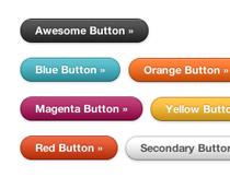
We’ve created the standard buttons you can see above, but another great thing about buttons that don’t use images is that we can create any color we want and with some simple class names generate an entire repertoire of buttons that we can call on any time. This is great for creating a reusable set of buttons that can be adapted to your or your clients’ style guide. Check out the color codes that we are using:
.blue.awesome {
    background-color: #2daebf;
}

.red.awesome {
    background-color: #e33100;
}

.magenta.awesome {
    background-color: #a9014b;
}

.orange.awesome {
    background-color: #ff5c00;
}

.yellow.awesome {
    background-color: #ffb515;
}
These simple classes allow us to quickly call on the button we want to get the action we need users to take. We’ve used similar methods in the buttons we’ll walk through in the next few sections.
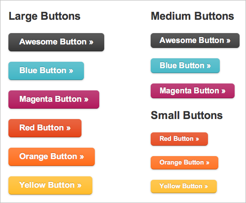
Our last step is sizing. Without a sliding-doors situation our button size is only limited by the size of our overlay image (and in future buttons, not even by that). We’ll use a few classes (small, medium and large) to create sizes that we can call in different situations.

The buttons in various sizes: an overview.
And that’s it! A scalable, easily configured set of buttons that works in all browsers (through graceful degradation) and will get you the impact you want. In the next few sections we’ll build on these buttons to show you how CSS3 can push these even further in some interesting directions.
See the live demo »
We’ve created a live demo page for these buttons; it’s in a playground, where we create small side projects and cool toys. We’ll be linking to the playground examples throughout this post and the rest of our series.
A note about compatibility: true to form, IE8 does not support border-radius. At ZURB, we’ve adopted a “graceful degradation” paradigm, so these corners will be square in IE. In our experience, the additional development cost for elements like this is not worth it, and we rely on these properties to cleanly degrade and not damage the layout or readability. These buttons are no exception: they are still as clickable in IE as anywhere else, just not quite as pretty.
Step 2: Radioactive Buttons
Now that we’ve gotten our feet wet with CSS3, let’s go in a different direction. For a recent client project, we wanted to create a stylized, attractive and eye-catching call to action for the home page. We came up with the idea of a radioactive button, a button that actually pulses on the page for more attention.
Kitschy? Maybe a little. But despite its impracticality, for some websites and clients, the “Wow” factor—that feeling the user gets when they arrive at a website and say, “Oooh, ahhh!“—can’t be ignored. Where we only used to have , thanks to some tricks we’ve already covered (and one we haven’t), we can move beyond that terrifically obnoxious blink tag and explore a whole new range of opportunities to animate using pure CSS.
Animation: No JavaScript Required
The secret to the radioactive button is in a new CSS3 property called animation (or, as it currently exists, -webkit-animation and -moz-animation). Our radioactive buttons are structurally and stylistically identical to the buttons in step 1, but with one important change. In lieu of a static drop-shadow, we’ve used the box-shadow property to create a glow around the button. With “glowing shadow” added, the next step is to use CSS3 animation to dim and brighten it.
Creating the Animation
The first step in our radioactive awesomeness is to create a timed event that modifies existing CSS properties. Check out this odd-looking property:
@-webkit-keyframes greenPulse
{
    from {
        background-color: #749a02;
        -webkit-box-shadow: 0 0 9px #333;
    }
    50% {
        background-color: #91bd09;
        -webkit-box-shadow: 0 0 18px #91bd09;
    }
    to {
        background-color: #749a02;
        -webkit-box-shadow: 0 0 9px #333;
    }
}
Here’s how the code works:
- @-webkit-keyframes tells the browser that we’re defining an animation based on keyframes, or points in the animation to where properties will change. The browser then knows to smoothly transition between those frames.
- greenPulse is the name of the animation. We need this to attach to objects later on.
- from { … } defines the starting point of the animation; in our case, a certain background color for the button and a box-shadow color (particularly, one that disappears into the background).
- 50% { … } means that one change happens halfway through the animation.
- to { … } defines the last frame of the animation. Note that animations always return to their from state—they don’t stop on the last frame. This means that a smooth animation needs to begin and end with the same properties and values.
All right, we’ve created the animation. It takes an object and over a set time changes the box-shadow color to green and then back to gray. Now, we just have to make it active by applying the animation to our buttons.
.green.button {
    …
    -webkit-animation-name: greenPulse
    -webkit-animation-duration: 2s;
    -webkit-animation-iteration-count: infinite;
    …
}
Pretty cool, isn’t it? -webkit-animation has many potential uses and, when combined with some very simple JavaScript (like onclick), you can create very rich effects and interaction without resorting to a JavaScript effects library.
See the live demo »
Check out the live demo of radioactive buttons in our playground. For maximum awesomeness, check it out in Safari 4; radioactive buttons use some Webkit-specific properties that aren’t implemented well in Chrome quite yet.
Nice, Simple, User-Friendly Buttons, Google-Style
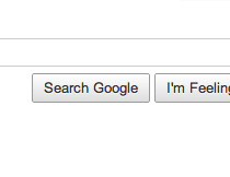
Our last example was inspired by some recent changes made to one of the most trafficked pages on the Web: the Google search page. In addition to enlarging the search field and text size, Google also rolled out some new buttons for Webkit-based browsers (notably its own, Chrome).
These buttons incorporate everything that makes our buttons in this article great, with one cool trick: no images at all. Google has used a new property called -webkit-gradient to generate a gradient using only CSS.
Using CSS Gradients
Gradients in CSS are cool because they are a CSS function, much like url(), which means that we can use gradients anywhere images go, including in the background or in borders (don’t worry, we’ll get to border-image in a later post). Here’s how gradients work:
.g-button {
    …
    background: -webkit-gradient(linear, 0% 0%, 0% 100%, from(rgb(255, 255, 255)), to(rgb(98,202,227)));
    …
}
Let’s break this down:
- linear means this is a linear gradient, as opposed to radial. This changes the color across a single axis, rather than in concentric circles.
- 0% 0%, 0% 100% are coordinates. We’re saying that the gradient begins at 0% X, 0% Y and ends at 0% X, 100% Y: top-left corner to bottom-left corner. We could use top-left, bottom-left just as well.
- from(rgb(255, 255, 255)) is the starting color for the gradient. If the syntax looks familiar, it should be: it’s very similar to the syntax for @-webkit-keyframes.
- to(rgb(221, 221, 221)) is the ending color. While we have only used RGB here, you can see how gradients could get really interesting if we use RGBa and are able to control the opacity of points on the gradient.
The rest of the button is ordinary: padding, border-radius and all the fun things we’ve gone over so far. Gradients is the star here, though, and it has thousands of potential uses. Here, we’ve created (albeit in Google’s footsteps) rich, engaging buttons that are 100% CSS, no images required.
See the live demo »
You can see a live demo of these buttons in the playground, or simply visit the Google search home page in a Webkit browser.
Coming Up: Better, Stronger, Faster Design
This is the first of the articles that take advantages of the powerful new features coming in CSS 3. In the following posts, we’ll show you how CSS3 not only can make implementation faster and easier, but can help you really fly off the rails and push CSS to its breaking point while creating impressive visual effects.
Would you like to see more similar posts on Smashing Magazine in the future?(opinion)
References and Resources
- RGBa Browser Support at CSS-Tricks
- Introduction to CSS Animation at Surfin’ Safari
- CSS3 Animation Tutorial at ZURB
- Introduction to CSS Transitions at CSS3.info
- Safari Visual Effects Documentation
- Using border-radius at The Art of Web


 Get a Free Trial
 Register For Free
 JavaScript Form Builder — Create JSON-driven forms without coding.
 Devs love Storyblok - Learn why!


