How To Support Internet Explorer and Still Be Cutting Edge
But how do we actually do that? How do we create websites that are up to date with the latest coding techniques but that are also usable for people experiencing the Web on Internet Explorer?
In this article, we’ll see what measures we can take to provide a good experience for IE users but keep moving on. We will mainly focus on the CSS part but will also provide some handy tips on dealing with overall markup.
Also consider our previous articles:
- CSS3 Solutions for Internet Explorer
- Taming Advanced CSS Selectors
- Take Your Design To The Next Level With CSS3
- Push Your Web Design Into The Future With CSS3
The Content Is What Matters
Jeffrey Zeldman once said, “content precedes design. Design in the absence of content is not design; it’s decoration.” In fact, the most important thing on your website is the content. This is what everyone should be able to get, no matter which browser they’re using.
Using CSS3 doesn’t mean we should forget about older browsers and lock visitors out of our websites. We should check our websites on browsers as old as maybe IE5 or 5.5 and make sure the content is accessible for every user.
This doesn’t mean we should quit the fight to eradicate IE6 either. We can still follow the example of websites such as Twitter and YouTube and add visible but not dead-end warnings to upgrade.
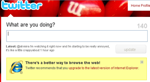
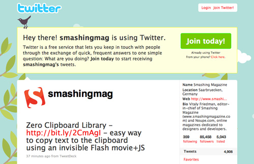
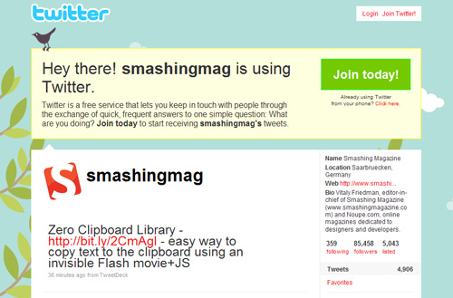
YouTube and Twitter warning messages for IE6 users
And remember: each profession has the duty to educate those who are not familiar with their trade. We must explain how stuff works to our clients without being patronizing. It’s not their job to know this after all.
Basics First: The Three Layers (HTML, CSS and JavaScript)
When we create a new website, we do it in steps. First, the HTML. We will mark up our content in the most semantic way possible: titles should be marked up as headings, lists as lists, etc. The bottom line is that our content should be perfectly readable and its hierarchy understandable with only this part of the coding done. The content has to make sense, and we must never forget that this layer is the foundation on which we will develop all the rest.
Secondly, we add the style, the CSS. In this step, we add the visual elements to our design; we give the website its personality. We also make sure that the content is accessible without the third layer.
And finally, the third layer, the JavaScript, the behavior. Here we add the interactive elements to our website. We make the experience richer using things such as tabs, sliders, lightboxes, etc.
With this path in mind, our content will always be accessible in any browser. We make sure that older browsers get only the basic content and disregard more complex layers that could hamper their users’ access to it.
Adding Basic Style For Old Browsers
So our semantic markup is done, and we know that some browsers cannot render CSS properly or at all, such as browsers before Netscape 4.0 or Internet Explorer 4.0. For those browsers, displaying the bare content—the naked version—is the safest choice.
Some people say that, today, there is no need to do this. But if you’d like to make sure that these people on these browsers don’t run into any problems, just link to a basic version of your CSS with the link tag and then to the more advanced file with the @import declaration:
<link rel="stylesheet" type="text/css" href="basic.css" media="screen" /><style type="text/css">
@import "advanced.css";
</style>You can also skip the link tag altogether and leave them with a text-only version of the website:
<style type="text/css">
    @import "style.css";
</style>
Embracing The Differences
Now let’s deal with the black sheep of commonly used browsers: Internet Explorer 6.
You’ve got two options:
- If only a negligible percentage of your audience is browsing the Web with it and you don’t want to throw your client’s money down the drain, you could create a basic style sheet for IE6.
- Acknowledge that your design will not look the same in IE6, and make decisions on what to leave out: which IE6 quirks will you fix and which will you leave be.
If you choose to feed IE6 a basic style sheet, the best course is to use the Universal IE6 CSS. Your website will have virtually no design, but this style sheet makes sure that the body has a readable width, that heading sizes are reasonable and that the content has some nice white space surrounding it.
In your HTML, you will have to add some conditional comments to link to the style sheet and to hide the other sheets from IE6:
    <link rel="stylesheet" type="text/css" href="styles.css" media="screen" />
<!--

    <link rel="stylesheet" type="text/css"
    href="https://universal-ie6-css.googlecode.com/files/ie6.0.3.css" media="screen" />
In the first conditional comment, we link our main style sheet to all browsers that are not IE6 (hence the “!”). And in the second comment, we link directly to the Universal IE6 style sheet on Google’s repository (and save some bandwidth at that!).
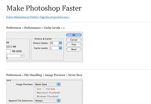
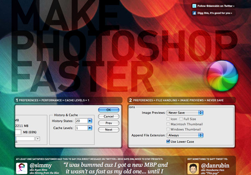
The Make Photoshop Faster website uses the Universal style sheet for IE6
If you prefer the second route, you must be prepared to embrace the differences between browser renderings. Know that some details of your design will not be visible or render as nicely in IE6, or even IE7 and 8. And don’t be upset about it.
Resets
As you know, all browsers have different default styles for the various HTML elements. This is why using a reset style sheet is wise, so that we can start with a clean slate.
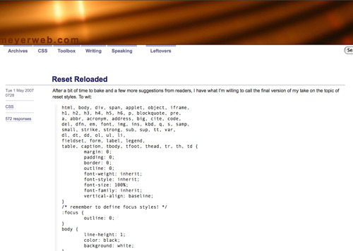
Plenty of style sheets are around on the Internet for anyone’s benefit. The one that is usually considered the standard and most often implemented is Eric Meyer’s reset, or some variation of it.
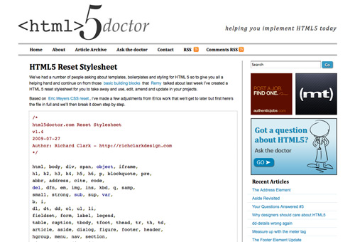
With the advent of HTML5, including the new HTML elements in your CSS reset is also a good idea. html5doctor provides a good update to Eric Meyer’s reset that you can use for free in your projects.
You can use a CSS reset either by embedding it at the top of your own CSS file, or, if you like to keep things tidy, by importing it from your style sheet:
@import url(reset.css);CSS Differences That Could Break Your Layout
If you decide to use the Universal IE6 CSS, you’ve just saved yourself many a headache. But don’t let the shiny logos of IE7 and 8 fool you: if you intend to use the latest CSS techniques, you still have to do a lot to cater to them.
IE6 and PNG support
We all know that PNG images with alpha-channel transparency (i.e. the good-looking ones) don’t play nice on IE6. We’ve all seen that annoying light-blue background on our carefully crafted logos.
You can choose from among a few workarounds to this problem so that IE6 can display PNGs. Each is fairly quick to implement and does make a difference in the overall design.
Here are a few of the best scripts and techniques for dealing with this issue:
- DD_belatedPNG
- Supersleight jQuery Plugin
- PNG 8-bit technique (Fireworks)
- Clever PNG Optimization Techniques
- PNG Optimization Guide: More Clever Techniques
That said, we should mention that more and more Web designers nowadays opt not to fix the PNG issue on IE6:
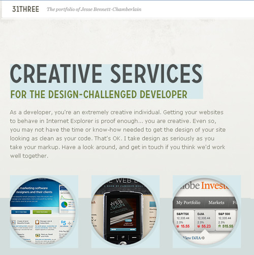
The newly revamped 31three website doesn’t apply any fix for PNGs in IE6.
Advanced Selectors
These selectors are almost the definition of smooth CSS development by themselves, because they hold the true power of CSS and can make our lives as developers so much easier (and our budgets so much lower!).
The decision of whether to make them work on Internet Explorer or not depends largely on what you are using them for.
For example, if you are using them to add extra detail to your designs, such as small icons to represent different file types, it won’t make a lot of difference if the icons don’t display on some browsers. Visitors to your website won’t know what they are missing, and the links will still be perfectly usable.
These selectors are also widely used to enhance typographic detail, and lack of support for them won’t be a big issue for your designs.
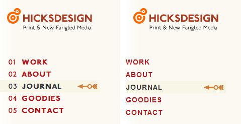
Hicksdesign uses advanced selectors for numbered bullets in its navigation menu, and they simply aren’t visible for IE6 users
Which browsers don’t support this? Internet Explorer 6 will not see styles applied with virtually any advanced selector. It only really understands simple descendant combinators and classes and ID selectors. It even struggles with multiple classes applied to the same element! It’s not to be trusted.
IE7 ignores the :lang selector and pseudo-elements, such as :first-line, :first-letter, :before and :after. But it does understand all attribute selectors.
Also, none of the Internet Explorer releases to date supports the :target pseudo-class, UI element states pseudo-classes (:enabled, :disabled, etc.), structural pseudo-classes (like :nth-child, :nth-of-type or :first-child) or the negation pseudo-element.
Box-Sizing
Box-sizing allows you to tell the browser how you want it to calculate the width and height of an element.
For example, if you set the box-sizing property to border-box, then the paddings and borders will be subtracted from the specified width and height of that element, instead of added to them (as stated in the W3C’s specifications for the standard box model).
This can make it easier to control the size of elements and to make sizes behave the same across different browsers.
If you believe that your website renders in IE in quirks mode (and therefore renders with the non-standard box model), you may want to use this property in your style sheets to make all browsers uniform.
Make sure to add the standard property and the vendor-specific ones:
div {
    -moz-box-sizing: border-box;
    -webkit-box-sizing: border-box;
    box-sizing: border-box;
}
Which browsers don’t support this? If the website is rendered in quirks mode, IE6 will render using the non-standard box model, so it will already be rendering as if it had the “border-box” property on. You can force IE6 to render in quirks mode. There are a few ways of doing this; one way is by adding an HTML comment before the doctype declaration of your HTML pages.
Media Queries
Media queries aren’t fully supported by most browsers, and Internet Explorer doesn’t support them at all.
However, because they are mostly used to call variations of style sheets for handheld devices, such as the iPhone, this fact is almost irrelevant in that case.
If you use media queries mainly to cater to the iPhone, the fact that they are not supported by other browsers makes no difference anyway, and their use is highly encouraged.
If you are using them to create a more flexible website design that adapts to changes in, say, window size, then know that only Safari, Firefox and Opera support them (partially).
Which browsers don’t support this? Internet Explorer and, in some instances, Safari and Firefox.
CSS Differences That Are Mainly Decorative
These are the issues that are best left alone for non-supporting browsers, because the lack of support won’t be a problem for users who want to access your content (i.e. your pages won’t break).
This has to do mainly with some of the new CSS3 properties, such as border-radius, text-shadow and border-image.
Border-radius
This is the first CSS3 property that designers learned to live without on Internet Explorer, because of its clearly decorative nature. With border-radius, you are better off not trying to replicate it on IE at all. Just let it be.


Gowalla uses border-radius on its website, but Internet Explorer users don’t see it.
Which browsers don’t support this? All Internet Explorer browsers. Opera, too.
Font-face
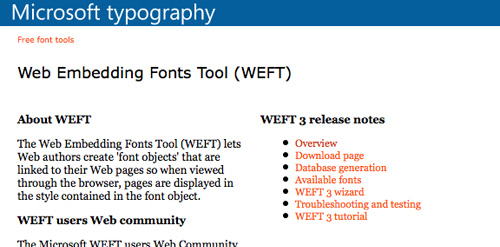
Font-face can be used with IE, but you may need to use Microsoft’s Web Embedding Fonts tool to convert your fonts to EOT.
If you are including both font formats in your website, your CSS will probably follow this structure:
@font-face {
      font-family: "Delicious";
      src: url("Delicious-Roman.eot");
      src: local("Delicious"), url("Delicious-Roman.otf") format("opentype");
}
Usually, a browser not being able to render the first font in a font stack shouldn’t break the website or hamper in any way the user’s access to the content. So, the recommendation here is to carefully ponder which fonts you want the visitor to see if their browser doesn’t support font-face and has to rely on the fonts you have declared in the style sheet.

A browser that doesn’t support font-face simplys show the next available font in the font stack
Which browsers don’t support this? If you use the EOT version for IE, even IE users will see the correct fonts.
Multiple Columns
Rather than create multiple floating DIVs to organize your text into columns, you can create columns automatically by using the multiple column properties in CSS3. But this means that some browsers won’t see them.
Multiple columns are better used for text, not layout. If you use them on your website, the worst thing that will happen is that visitors see a wider line of text.
If you’re dealing only with short text, than why not go ahead and use it and finish the job in two minutes? But if it would seriously impair the readability of your content, then your best option is to stick to the regular DIVs to create columns.

Here, the introductory text is displayed using CSS multiple columns. IE users will see normal single-column text.
Which browsers don’t support this? Internet Explorer and Opera.
RGBa and Opacity
RGBa colors are bliss. Rather than use hard-to-update PNG files for backgrounds, you can create the same transparency effect with CSS. But IE doesn’t get it. IE6 doesn’t even understand the PNGs to begin with.
It’s safe to assume that these transparencies won’t usually be applied to elements that cover important content; in which case, the content shouldn’t be behind another element in the first place.
So, when using RGBa colors, make sure to include a normal color before the RBGa one, so that browsers that don’t understand it will still have a fallback color:
div {
    background-color:  #FFFFFF;
    background-color: rgba(255,255,255,.5);
}
Opacity can be applied to IE using the opacity filter, but IE filters work only on elements that have layout:
div {
    filter: alpha(opacity = 50);
}
Also, remember that opacity works differently than RGBa colors: all of the elements enclosed in this DIV will be rendered transparent.
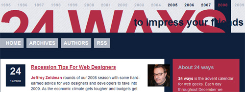
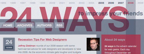
24ways uses RGBa colors and alpha transparency heavily, even though Internet Explorer doesn’t render the transparency.
Which browsers don’t support this? Every browser sees opacity, provided that filters are applied. IE doesn’t see RGBa colors.
Text-shadow
This is an easy call: ignore it. Assuming that the text is still readable, trying to recreate text-shadow any other way than with CSS is a Herculean task. So, unless missing text-shadow would seriously reduce the clarity of a large amount of text, or a small amount (in which case you could use image replacement), you’re better off without it.

The white text-shadow on Brokers Direct’s website is not visible on Internet Explorer.
Which browsers don’t support this? Internet Explorer.
Border-image
The border-image property gives us an easy way to add beautiful borders to our elements that would otherwise be a nightmare to implement (and that in most instances we would probably choose not to implement).
Because the property is almost always decorative, the best option would be to include a fallback for browsers that don’t support it using the normal border property, and adding the enhanced CSS after it for other browsers.

SpoonGraphics uses border-image, but it is not visible in Internet Explorer.
Which browsers don’t support this? Answering the opposite question is easier: for now, only Safari and Firefox support this feature.
Multiple Backgrounds
This feature depends on the design of your website, but in a lot of cases, the lack of a second or even third background will not affect the readability of the page.
Multiple backgrounds in CSS saves us a lot of the development headaches that were caused by having to use different HTML hooks and nested elements to achieve the same effect. So, if you opt to use multiple backgrounds, you are already choosing which browsers to display the results to.
If all users seeing all of the backgrounds is important to you, then do it the old way and apply different backgrounds to different elements.
If not, your best bet is to give a fallback to browsers that don’t support it: pick the background that you feel is most important or that best fits the overall design and add that property before the multiple backgrounds one. Browsers that don’t support it will ignore the second property.
Which browsers don’t support this? Internet Explorer, Opera and Firefox up until version 3.5 (version 3.6 is currently in beta, but it supports multiple backgrounds!).
Tools
Modernizr
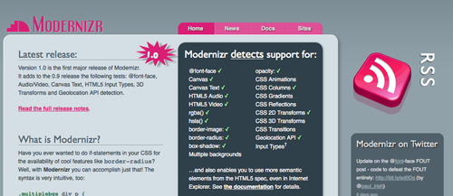
Modernizr is a little JavaScript that is quite useful if you are using advanced CSS properties. It adds some classes to the html tag in your pages, to see whether a browser supports certain CSS features, such as:
@font-facergba()hsla()border-imageborder-radiusbox-shadow- Multiple backgrounds
opacity- CSS animations
- CSS columns
- CSS gradients
- CSS reflections
- CSS 2-D transforms
- CSS 3-D transforms
- CSS transitions
Take border-image. When a page loads in a browser that supports the property, it output borderimage. If the browser doesn’t support it, it outputs no-borderimage.
Modernizr doesn’t enable these features in browsers that don’t support them, but rather gives you important information (in the form of classes) that you can use in your style sheets to apply distinct selectors and properties to elements.
IE-7.js
IE-7.js makes IE5+ behave like IE8, supporting more advanced selectors and fixing some rendering bugs. Here’s an excerpt from the creator’s website:
- Added support for advanced selectors:
>,+and~; attribute selectors;:hover,:active,:focusfor all elements;:first-child,:last-child,:only-child,:nth-child,:nth-last-child;:checked,:disabled,:enabled;:empty,:not;:before,:after,:content;:lang. - It uses the standard box model in standards and quirks mode.
- Supports
min-andmax-widthand-height. - Supports PNG alpha transparency (but doesn’t solve the PNG problem for repeated or positioned backgrounds).
The disadvantage of this technique is that JavaScript has to be enabled for it to work, which is unfortunate. So, you will have to be careful to give users who have disabled JavaScript an acceptable version of your website, especially if some behaviors will not work or, worse, if the lack of JavaScript will break your layout.
Examples
As they say it, this is easier said than done. So, we’ll show that these ideas can actually be put into practice with some nice examples. These are websites we’ve come across that render differently in different browsers. In some cases, the differences are quite noticeable, but the developers have chosen to embrace those differences.
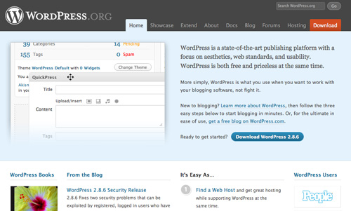
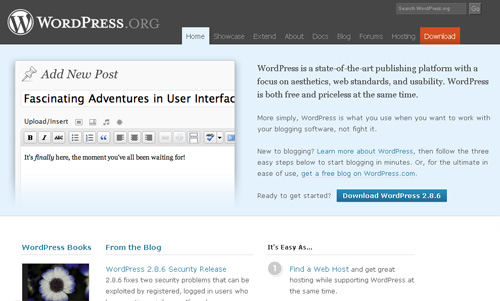
WordPress
WWF
Conclusion
Remember that the purpose of this post is not to teach you how to hack IE or deal with its quirks or even how to achieve effects by resorting to JavaScript. Rather, it is to explain how we can design and build websites knowing that differences will arise between browsers.
You won’t see people rioting over the lack of rounded corners on Twitter or WordPress; they aren’t even upset by it, because those differences don’t fundamentally break the websites. People can still use the websites and have a good experience. In most cases, they won’t even notice it!
All we have to do now is explain this politely but seriously to our clients, so that we can all contribute to the ever-evolving Web.
Further Reading And References
- Quirks Mode and Strict Mode
- On Having Layout
- The IE6 Equation
- Ultimate IE6 Cheatsheet: How to Fix 25+ Internet Explorer 6 Bugs
- Definitive Guide to Taming the IE6 Beast
- How to Use Modernizr
Do your designs have a support for older versions of Internet Explorer (<= 7.0)?
Do your designs have a support for older versions of Internet Explorer (<=7)?(poll)
Related posts
You may be interested in the following related posts:
- Taming Advanced CSS Selectors
- Take Your Design To The Next Level With CSS3
- Push Your Web Design Into The Future With CSS3


 Devs love Storyblok - Learn why!
 JavaScript Form Builder — Create JSON-driven forms without coding.
 Get a Free Trial
 Register For Free
 Enterprise UX Masterclass, with Marko Dugonjic
