What You Need To Know About Behavioral CSS
The Web is an extremely adaptive environment and is surrounded by a collaborative community with a wealth of knowledge to share. If we collectively want to be able to have rounded corners, we make it happen. If we want to have multiple background images, we make it happen. If we want border images, we make that happen, too. So desire is not the issue. If it was, we would all still be using tables to lay out our pages and using heavy over-the-top code. We all know that anything can be done on the Web.
Made for the Web
CSS 3 properties like border-radius, box-shadow, and text-shadow are starting to gain momentum in WebKit (Safari, Chrome, etc.) and Gecko (Firefox) browsers. They are already creating more lightweight pages and richer experiences for users, not to mention that they degrade pretty gracefully; but they are only the tip of the iceberg of what we can do with CSS 3.
In this article, we will take those properties a step further and explore transformations, transitions, and animations. We’ll go over the code itself, available support and some examples to show exactly how these new properties improve not only your designs but the overall user experience.
CSS Transformations
CSS transformations are a W3C oddity. It is the first time I have sat down to read the full specifications on something and didn’t feel like I had a handle on the subject afterward. The specs are written with the level of technical jargon you would expect from the W3C, but it focuses on the graphic (as in graph drawing) element of transformations and matrices. Having not dealt with a matrix since freshman-year Calculus, I had to do a lot of good old-fashioned browser testing and guessing and checking for this section.
After going through every tutorial I could find and too many browser tests to count, I came out with some useful information on CSS transformations that I think we can all benefit from.
transform();
The transform property allows for the kind of functions also allowed by SVG. It can be applied to both inline and block-level elements. It allows us to twist, zoom in on and move elements, all with one line of CSS.
One of the biggest complaints about cutting-edge design is that the text is not selectable. This is no longer a problem when you use the transform property to manipulate text, because it is pure CSS and so any text within the element remains selectable. This is a huge advantage of CSS over using an image (or background image).
Some interesting and useful transform functions (that are supported):
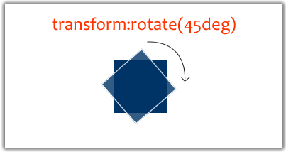
- rotate. Rotate allow you to turn an object by passing a degree value through the function.
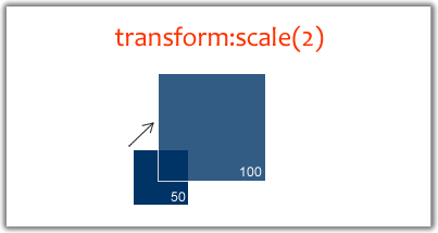
- scale. Scale is a zooming function and can make any element larger. It takes positive and negative values as well as decimals.
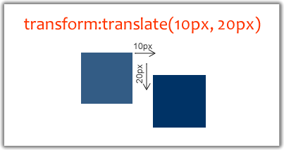
- translate. Translate essentially repositions an element based on X and Y coordinates.
Let’s look at each of these in more detail.
Rotate
The transform property has many uses, one of which is to rotate. Rotation turns an object based on a degree value and can be applied to both inline and block-level elements, It makes for a pretty cool effect.

#nav {
    -webkit-transform: rotate(-90deg);
    -moz-transform: rotate(-90deg);
    filter: progid:DXImageTransform.Microsoft.BasicImage(rotation=3);
    }
Please notice that in IE 8 (when not in standards mode) it’s required that you type “-ms-filter” instead of just “filter” in your CSS.
Support
Support for transform: rotate is surprisingly widespread. In the CSS snippet above, we directly target -webkit- and -moz- and rotate the #nav element by -90 degrees.
Pretty straightforward, right? The only problem is that the rotation is for a pretty important design element, and many designers will be reluctant to use it if Internet Explorer does not recognize it.
Luckily, IE has a filter for this: the image transform filter. It can take four rotation values: 0, 1, 2, and 3. You won’t get the same fine-grained control that comes with Webkit and Gecko, but your design will remain consistent across older browsers (even IE6).
Is it okay to use? Yes, but make sure it is thoroughly tested.
Scale
Scaling does exactly what you think it would do: zoom in and out on an element. The scale function takes both width and height values, and those values can be positive, negative or decimals.
Positive values scale up the element, as you would expect, based on the width and height specified.
Negative values do not shrink the element, but rather reverse it (e.g. text is turned backwards) and then scaled accordingly. You can, however, use decimal values lower than 1 (e.g. .5) to shrink or zoom out of an element.

#nav {
/* The nav element width and height will double in size */
-webkit-transform: scale(2);
-moz-transform: scale(2);
}

#nav {
/* The nav element width will double in size, but the height will remain unchanged*/
-webkit-transform: scale(2, 1);
-moz-transform: scale(2, 1);
}

#nav {
/* The nav element width will double in size and flip horizontally,
but the height will remain unchanged */
-webkit-transform: scale(-2, 1);
-moz-transform: scale(-2, 1);
}
Support
The scale transformation is supported in Firefox, Safari and Chrome, but not any version of Internet Explorer (yet) as far as I could tell. Scaling an object is a fairly significant design choice, but it can be applied with progressive enhancement using :hover, which can add a little pop to your navigation especially.
#nav li a:hover{
/* This should make your navigation links zoom slightly on hover */
-webkit-transform: scale(1.1);
-moz-transform: scale(1.1);
}
Is it okay to use? From time to time, yes. But not with critical design elements.
Translate
The name “translate” is a little misleading. It is actually a method of positioning elements using X and Y values.
It looks much the same as the other kinds of transformation but adds an extra dimension to your website.

#nav{
/* This will move the #nav element left 10 pixels and down 20 pixels. */
-moz-transform: translate(10px, 20px);
-webkit-transform: translate(10px, 20px);
}
Support
Translate is currently supported in Firefox, Safari and Chrome when you use the vender extensions -moz- and -webkit-.
Is it okay to use? Yes, but normal X/Y positioning is just as effective in many situations.
Chaining Transformations
Transformations are great individually, but if you want multiple transformations, the code can pile up pretty quickly, especially with the vendor extensions. Luckily, we have some built-in shortcuts:
#nav{
-moz-transform: translate(10, 25);
-webkit-transform: translate(10, 25);
-moz-transform: rotate(90deg);
-webkit-transform: rotate(90deg);
-moz-transform: scale(2, 1);
-webkit-transform: scale(2, 1);
}
These transformations can be chained together to make your CSS more efficient:
#nav{
-moz-transform: translate(10, 25) rotate(90deg) scale(2, 1);
-webkit-transform: translate(10, 25) rotate(90deg) scale(2, 1);
}
The real power of these properties is in combining and chaining them. You can move, turn, zoom in on and manipulate any inline or block-level element without JavaScript. Once support for these properties becomes widespread, we’ll be able to build and design even richer and more lightweight interfaces and applications.
Transition
A basic transition refers to a CSS property that define and moves an element from its inactive state (e.g. dark-blue background) to its hover or active state (e.g. light-blue background).
Transitions can be coupled with transformations (and trigger events such as :hover or :focus) to create a kind of animation. Fading the background color, sliding a block and spinning an object can all be done with CSS transitions.
#nav a{
background-color:red;
}

#nav a:hover,
#nav a:focus{
background-color:blue;

/* tell the transition to apply to background-color (looks like a CSS variable, doesn't it? #foreshadowing)*/
-webkit-transition-property:background-color;

/* make it 2 seconds long */
-webkit-transition-duration:2s;
}
Support
As cool as the transition property is, support is mostly limited to WebKit browsers. -moz-transition already works in the latest nightly build of Firefox 3.7 (so it’s guaranteed for the future). So it’s safe to assume that it is right behind WebKit on this. So you may as well add -moz-transition to your CSS for future enhancements. And even a version without a vendor extension, just in case.
Is it okay to use? For subtle enhancements, yes, but not for dramatic effects.
Animation
Animations are where the real action in CSS 3 is. You can combine all of the elements we’ve talked about above with animation properties like animation-duration, animation-name and animation-timing-function to create Flash-like animations with pure CSS.
#rotate {
margin: 0 auto;
width: 600px;
height: 400px;

/* Ensures we're in 3-D space */
-webkit-transform-style: preserve-3d;

/*
Make the whole set of rows use the x-axis spin animation
for a duration of 7 seconds, running infinitely and linearly.
*/

-webkit-animation-name: x-spin;
-webkit-animation-duration: 7s;
-webkit-animation-iteration-count: infinite;
-webkit-animation-timing-function: linear;
}

/* Defining the animation to be called. */
@-webkit-keyframes x-spin {
   0%    { -webkit-transform: rotateX(0deg); }
   50%   { -webkit-transform: rotateX(180deg); }
   100%  { -webkit-transform: rotateX(360deg); }
}
All this fantastic CSS animation code and a live example can be found at CSS3.info demo. The demo is viewable in any browser, but the animation works only in the nightly build of WebKit. It looks just like the video above, but it’s worth installing WebKit to see it for yourself (it’s pretty awesome).
SupportThere is, unfortunately, only a limited support for CSS animations yet. 2D CSS animations work in Safari 4 (Leopard), Chrome 3, Safari Mobile, Shira and other Webkit browsers. Safari 4 (Snow Leopard) supports 3D animations.
Conclusion
Right now, JavaScript bridges the gap until CSS 3 comes into full effect. Unfortunately, getting full browser support for these great properties will be a long journey. Until that day comes, we can take advantage of some serious progressive enhancement and rely on JavaScript to enhance our websites and applications. That’s not a bad thing; just how it is at the moment.
With the recent announcement of IE9, I wouldn’t be surprised if the IE team include some of these properties in the new version of the browser especially since talks for CSS3 integration have already begun (border-radius).
The future of the Web is bright, especially with these highly experimental properties such as animation. Although many of the properties are not usable for client or high-level production work, they sure are fun to play with! We can all look forward to the day when we have support across the board to build some really great lightweight applications.
References And Resources
- Adventures In The Third Dimension: CSS 3D Transforms
- Applying Transformations To Responsive Web Design
- The Guide To CSS Animation: Principles and Examples
- An Introduction To CSS3 Keyframe Animations
We express sincere gratitude to Andy Clarke and Hugh Isaacs II for corrections to this article.


 SurveyJS: White-Label Survey Solution for Your JS App
 Agent Ready is the new Headless

