Don’t Touch That Dial — Lessons Web Designers Can Learn From Television Broadcasts
Months, sometimes years of planning, preparation, marketing, shooting, and editing are laid bare on the “tube” for all to see. Some shows fail miserably and are cancelled after a few months. Others thrive, and become the next big thing. They all hope to become the next American Idol.
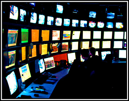
Television broadcasts continue to have a major impact on society — both in positive and negative ways. Whether you have a long-standing love affair with your television set, or you just use it to kill the monotony when you’re taking a break from the internet, I’m sure you’ll agree that, due to the overwhelming impact TV has had on modern society (and on television producers’ pocketbooks), techniques and principles unique to television broadcast production and marketing are worth examining.
Let’s see if there are lessons to be learned from the television broadcasting medium that can be applied to web development, design, and related fields.
Pre-Production
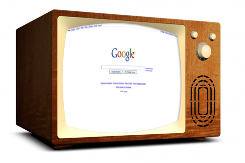
Before a television show is actually produced (that is, filmed and edited), a large amount of pre-production work is done to ensure that the entire process will run smoothly and achieve a desired result. Pre-production work for television might include storyboarding, script writing, budget planning, preparing special effects, casting guest stars, arranging for stunts, as well as creating sets, props, and costumes. Only after such preparation can a polished and interesting product be realized.

Don’t Start Shooting Before You Prepare the Script
How can you apply pre-production methods in web development and design? If you’re designing a site from scratch, you might be tempted to jump into Photoshop without giving any forethought to the design. Have you researched the competition? Have you sketched some ideas on paper? Have you identified the target audience? Have you thought beforehand about particular design principles that would work in the context of the product or service being offered? Preparing answers to such questions can significantly impact the direction the design will ultimately take and the success it achieves.
What if the project is a simple blog post or article? Have you thoroughly researched the topic? Have you ensured that the same topic has not been covered ad nauseam throughout the blogosphere? Have you chosen your main points? In most cases, to create a solid, polished piece, many of those tasks should be completed before opening up your word processor.
Whatever project you’re working on, following the example of television broadcasts by integrating pre-production into your work strategy will likely have a large impact on your project’s final result.
On-Screen Branding
Over the years, television producers have recognized the importance of branding and have taken advantage of opportunities to promote their brand with digital on-screen graphics, while being careful that these don’t interfere with the viewing experience.
The methods of use for on-screen graphics vary from country to country and weren’t used as often prior to the late 1990s. Take a look at the two screen captures below, both from the popular American hospital drama ER.
This 1994 episode of ER has no on-screen branding

In 1994, on-screen branding of logos and other graphics was virtually non-existent. Nowadays, it’s virtually impossible to watch a television station without some kind of on-screen graphical overlay. The screen capture below shows the semi-transparent NBC logo in the bottom-right corner. In North America, this is the customary place for an on-screen logo, whereas in the UK a station logo is commonly found in the top left.
This 2005 episode of ER includes on-screen branding by means of a graphic logo

Television stations have used this technique to increase brand recognition, assert ownership of a video signal, and in some cases attempt to prevent or discourage piracy. Although the use of such technology was not fully utilized until recent years, its benefits were eventually recognized. Networks and television stations have repeatedly tried to innovate in this area in a way that does not greatly affect the viewing experience.
Non-Obtrusive Branding That Makes an Impression
Web developers have many opportunities to establish their brand using elegant, non-obtrusive methods. This might be by means of custom bullets on an unordered list, the subtle color and graphics on a PDF document, or even something as simple as a customized <blockquote> that harmonizes visually with the overall website theme.
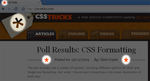
Chris Coyier of CSS-Tricks has recently redesigned his site, however, in the previous version of his design, he beautifully accomplished a type of “on-screen branding” by means of a simple enlarged asterisk character that found its way into every nook and cranny of his site — in a non-obtrusive manner. (Although his new design is much nicer overall, the asterisk is not as prevalent.)
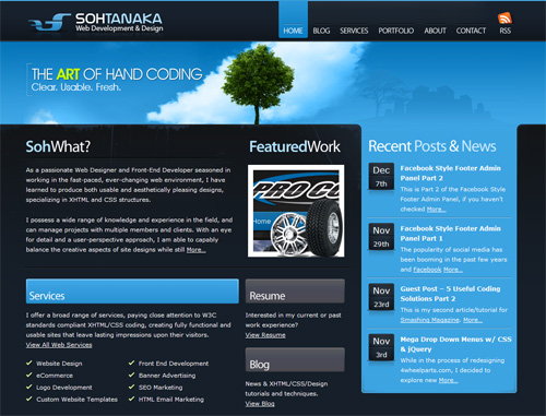
The branding on Soh Tanaka’s website can’t be missed. He beautifully incorporates various subtly-rounded blue elements that give his site character, doing so throughout the site in a non-obtrusive manner.
Soh Tanaka’s Blue Branding
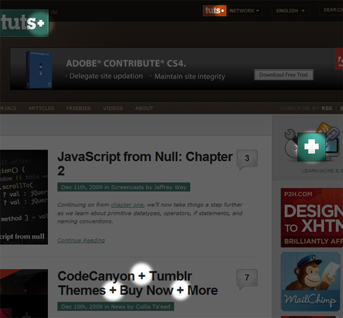
Similarly, Nettuts+ uses a plus symbol that is a primary part of that site’s branding.
The “Plus” Symbol on Nettuts+
Maximizing Screen Real Estate
With technological advances, television broadcasters have realized the advertising potential of screen space during popular programming. Besides the on-screen logo branding mentioned in the previous section, TV producers have for years regularly displayed on-screen advertisements for upcoming shows, usually at the bottom of the viewing area.
This technique in television broadcasting has been widely used during sporting events and especially on 24-hour sports channels that display scores and news updates in “ticker” format. But similar to the logo branding trend, this was not used regularly until the late 1990s and beyond.
Today, every major live sporting event will display the current score, game time, or other informational graphics at the top of the screen. Hockey and basketball broadcasts will commonly display this information even during action, while baseball will usually remove the graphics during action, except when the pitcher-batter view is being shown.
Take a look at the two screen captures below from Major League Baseball’s World Series, depicting the final moments of the 1993 and 2009 World Series, respectively.
Screenshot from the 1993 World Series with no informational graphics

Screenshot from the 2009 World Series with informational graphics

The 2009 World Series image shows the score of the game, the current inning, the number of outs, the current batter’s count, a network logo, and the current score in the series — displayed while action is in progress, without obstructing the view of the game. By contrast, the screenshot from the 1993 World Series has no on-screen graphics during the action.
Television broadcasts have utilized space on the screen that they believe can be sacrificed. During a televised sporting event, much of the broadcast consists of trivial in-between-the-action moments, so the use of informational graphics has proved to be extremely useful and is rarely obtrusive to the viewing experience. In fact, in today’s market, sports fans would be appalled to watch a game for more than two minutes without an on-screen graphical update of the score or current game time.
Don’t Make Them Hunt for Common Functions
Web site users, in certain contexts, will also expect a company’s site to provide information in certain areas. The top right corner of a website’s layout is traditionally reserved for shopping cart functions, search forms, and login/register buttons. The header often holds a horizontal navigation bar that begins and ends with “Home” and “Contact”, respectively. The footer will customarily hold contact info, copyright info, and terms/policy links. On blogs, footers have expanded greatly and might include bio info, twitter feeds, social media links, and more.
Of course, none of these are to be considered hard-and-fast rules, but under certain circumstances (sometimes on information-heavy layouts), users expect certain things. Taking advantage of space in this manner will follow the example of TV industry professionals who have obviously seen great value in displaying all sorts of informative and brand-oriented graphics in a convenient manner in their broadcasts.
Closed Captioning for the Hearing Impaired
Closed Captioning, or “subtitles” (as it’s often called outside of North America) is a system that displays a text transcription of the audio portion of a television broadcast. This system, shown in the photo below, is available on many television sets, DVDs, and even video games. For prerecorded television broadcasts, transcriptions are prepared beforehand, whereas live broadcasts are transcribed by a human operator in real time.
Recognizing the need to provide hearing impaired viewers with a comfortable experience, for more than 30 years television broadcasts have included closed captioning as an option in their programming.
Not Just Screen Readers
Web accessibility is the obvious lesson learned from this television broadcast standard. Making content accessible to a wide range of users, however, is not limited to just focusing on visually impaired users.
Some users may be voluntarily browsing with certain functionality disabled. This might include disabling scripting, images, or animations. In some rare instances, users may be limited to older browsers because of company restrictions on software updates. Content can be made accessible to virtually all users by coding clean semantic markup, implementing progressive enhancement, and performing regular testing on IE6 as well as browsers designed for visually impaired users.
Segues That Keep Viewers Locked In
Over the years, television producers have realized the power of the “clicker”. When a TV ad appears, many viewers will reach for the remote control and see if there isn’t something better to watch. This is inevitably going to occur, and is worsened when you consider that television now competes with the internet for viewing time. To combat the channel-surfing habit, TV stations will often provide virtually seamless segues from one show to the next, without commercial interruption.
In years past, it was customary that a TV program would end about five minutes before the next scheduled show. Then, after two or three minutes of ads, the closing theme and credits would play, sometimes followed by more ads, finally leading into the next show.
Television producers have evidently realized that the old method leaves a window of opportunity for “channel surfers” to escape. Nowadays, it’s common for the final scene of a TV program to run simultaneously with the closing credits, as shown in the screen capture below from the popular American series The Office.
Screenshot from The Office, rolling credits during the final scene

This technique virtually ensures that the viewer will see the introduction of the program that immediately follows. Likewise, the subsequent program will not start with opening credits and theme song, but instead will begin “cold” with the opening scene — a perfect segue to keep the viewer locked in.
There’s No Such Thing as “The End”
This principle can be applied when planning and storyboarding call-to-action processes in web architecture. A simple thank you page after a form submission can be transformed into a smooth gateway to related parts of the website. The completion of an online purchase can close with a “related products” screen. The end of a blog entry can include related links. The expiration of a software trial can promote the purchase of the full version. With the principle of smooth segues in mind, the possibilities are endless.
Web mail providers like Yahoo! Mail and Hotmail have recognized the importance of such a segue — indicated by the fact that, upon logout, the user is quickly redirected to the Yahoo! or MSN home page where there is always plenty to do.
Nielsen Ratings
The Nielsen ratings audience measurement system began with brand advertising and radio market analyses in the 1920s and 1930s, and later moved to television. It eventually became the standard for audience measurement information for television broadcasts around the world.
Nielsen Ratings on Broadcast TV in the U.S.
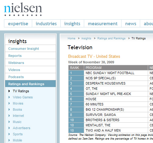
Television professionals that don’t pay close attention to trends and patterns in the weekly Nielsen ratings system, will likely not be able to compete with other regularly scheduled programs. Although the Nielsen system has been criticized, it is generally a trusted source of audience measurement and continues to be the standard for TV viewing statistics.
The Jakob Nielsen Ratings
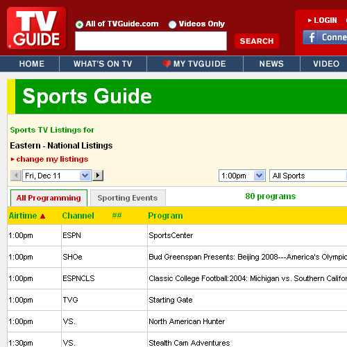
Today, web professionals have access to site analytics, browser- and platform-use statistics, usability trends, A/B testing potential, job skills trends, and other technology-related statistics that could impact how they design, how much time they spend on browser and usability testing, how they plan site architecture, and even what projects they’ll build next. Some of the software and online applications used in obtaining the aforementioned data have become standards that, similar to the Nielsen ratings system, cannot be overlooked.
Regularly Scheduled Programming
In the TV world, in most cases, viewers know exactly when to expect a new episode of their favourite program, and this has served to solidify viewership for many broadcasts. Certain timeslots have come to be known as “prime time” because they fit into the recreational habits of most families — prior to bedtime and shortly after dinner.
It would be counter-productive if television networks decided to air new episodes, at random, whenever they fancied, without a regular schedule. It would be unlikely in such circumstances that a solid user-base would be established.
Maybe We’ll Publish Something, or Maybe We Won’t
Is it any wonder that A List Apart has established one of the most loyal readerships in the web design writing industry? They publish exactly four high-quality articles per month, two at a time, on two separate Tuesdays — now that’s regularly scheduled programming that readers can depend on!
Of course, there’s no need for other bloggers and authors to follow that exact pattern, but it has become generally understood that mid-week releases for articles tend to get higher traffic. This mid-week “time slot” has become recognized as “prime time” in the blogging world.
It should be noted, however, that this method may not work for every type of content. Also, if you decide to regularly schedule a specific kind of blog post on one day of the week or month, you’ll be restricting site content for that day, without the flexibility to change. If you’re prepared for such a commitment, then it may be worth a try. Also, if you ever decide to stop publishing a regularly scheduled topic, you may disappoint readers who subscribed because of that particular type of content. So, while the principle of regularly scheduled programming may have some benefits, it could be a risky endeavor if you’re not prepared for the commitment and it could create potential for reader backlash.
Post-Production
Post-production on television broadcasts occurs after all shooting and recording of the footage has completed, and may include video editing, adding a soundtrack, and integrating computer-generated visual effects. If any of the post-production work is overlooked or neglected, the final product will be affected.
Refine Your Product
Developers, designers, and site architects can follow this example by polishing, fine tuning, and ensuring that the finished product (whether it’s a large-scale application, a brochure site, or a simple blog post) meets the standards and requirements that were set during the planning and wireframing stages.
Spell checking, grammar checking, code quality assurance, usability testing, speed optimization, and dozens more website maintenance tasks may fall under the web development equivalent of “post-production” — and often such tasks go beyond even the launch of the project.
Conclusion
If a medium has existed for a significant amount of time, numerous practices associated with marketing in that medium will become solidly established and refined.
Recommended reading: Keys To Better Communication With Clients
The web is still relatively young, and as designers and developers we have the opportunity to shape and create methods of marketing and production that will define this medium for years to come. The television industry has certainly established methods that can influence us to create a better and more intuitive user experience.


 Register For Free
 JavaScript Form Builder — Create JSON-driven forms without coding.
 How To Measure UX and Design Impact, 8h video + UX training
 Bring your design to life
