You Can Use CSS3 Right Now
CSS3 makes a designer’s work easier because they’re able to spend less time hacking their CSS and HTML code to work in IE and more time crafting their design. It is the future of web design and can be used today.
This article will hopefully show you to care a little less about making everything pixel perfect in IE. It will inspire you to spend more time making your designs exquisite in the rest of the browsers while serving up a working and perfectly accessible website for IE.
From the examples below, you’ll see that CSS3 will make cross-browser support easier to accomplish and help you get websites out the door faster, assuming you’ve accepted that websites do not have to look exactly the same in each browser. The actual use of CSS3 comes down to one word (and I’m pretty sure it’s not even a real word): Modernizr.
You may also want to take a look at the following related posts:
- Push Your Web Design Into The Future With CSS3
- Why We Should Start Using CSS3 And HTML5 Today
- Learning CSS3: A Reference Guide
Box Shadows
View the demo | Final Code
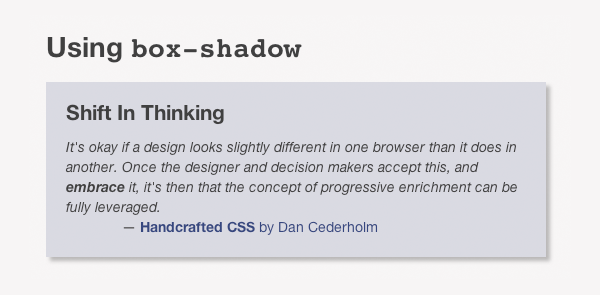
If you want a section to stand out above the rest of the page, you could put a drop shadow behind it. This will give it a 3D look and naturally attract your viewer’s eye.
Drop shadows using images can take some complicated and inflexible code to tame. The box-shadow CSS3 property enables you achieve the same effect in one line of code.
Speaking of code, here is the HTML for this example:
<div id="shift">
  <h4>Shift In Thinking</h4>
  <blockquote>
    <p>It's okay if a design looks slightly different in one browser than it does in another. Once the designer and decision makers accept this, and <strong>embrace</strong> it, it's then that the concept of progressive enrichment can be fully leveraged.</p>
  </blockquote>
  <p class="author"><a href="https://handcraftedcss.com"><strong>Handcrafted CSS</strong> by Dan Cederholm</a></p>
</div>
We want that div to have the box shadow. Let’s flex our CSS3 muscles:
div#shift {
  box-shadow: 4px 4px 4px rgba(0,0,0,0.3);
}
/* Information on the syntax at https://developer.mozilla.org/En/CSS/-moz-box-shadow */
Well that was easy. We’re done right?!
Not quite. In an ideal world, that would be all we need. No current browser supports that rule alone so we need to add a couple more:
div#shift {
  -webkit-box-shadow: 4px 4px 4px rgba(0,0,0,0.3);
  -moz-box-shadow: 4px 4px 4px rgba(0,0,0,0.3);
  box-shadow: 4px 4px 4px rgba(0,0,0,0.3);
}
Those extra rules target the only browsers that currently support box-shadow: Firefox 3.5 and Webkit browsers like Safari and Chrome.
So let me get this straight. You’re targeting only a small number of browsers. What about IE?
That’s where Modernizr steps in. Modernizr is a JavaScript file that, when loaded on your page, adds classes to the html tag in your code. It will add these classes based on what the viewer’s current browser supports and doesn’t support. For example, if the viewer’s browser can use box-shadow, it will add the class ‘boxshadow’ to your page. If it can’t, Modernizr will add the class ‘no-boxshadow’.
How do we make that work in our example?
Modernizr allows us to confidently declare a backup styling for older browsers that don’t support CSS3’s box-shadow. This plays perfectly into the hands of graceful degradation.
We’ll declare an alternate style for lesser browsers:
div#shift {
  border: 4px solid #bbb;
  border-left: 0;
  border-top: 0;
}

.boxshadow div#shift {
    -webkit-box-shadow: 4px 4px 4px rgba(0,0,0,0.3);
    -moz-box-shadow: 4px 4px 4px rgba(0,0,0,0.3);
    box-shadow: 4px 4px 4px rgba(0,0,0,0.3);
    border: 0; /* don't forget to get rid of the border too */
}
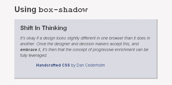
First, we tell the browser to put a light grey border on the right and bottom of the div. This will give the illusion of a drop shadow. We write this rule first because that is the worst case scenario. If the viewer’s browser doesn’t support box-shadow or doesn’t have JavaScript turned on, they’ll get the grey border. If it does support box-shadow, Modernizr will add the ‘boxshadow’ class to the html tag and the second set of styles will be used.
Look at the results:
Webkit

IE6

Is the difference noticeable? Yes.
Do your visitors check your site out in different browsers to see how the designs compare? Not likely. The only one that does that is you.
Rounded Corners
View the demo | Final Code
Rounded corners used to be tricky business. With the CSS3 border-radius property, your design’s need for smooth corners just got easier.
How much easier though?
Try one line of code easier (well almost…). Here’s the HTML:
<div id="cool-kids">
<h4>CSS Is Cool Again!</h4>
<blockquote>
<p>CSS has never been more exciting than it is right now. I’m even prepared to say CSS is “cool” again, both for the more experienced front-end developers as for the new designers discovering CSS every day now.</p>
<p>But…</p>
<p>Remember when Javascript became popular? Remember when Flash became popular? Every time we’re been given new toys, some people aren’t ashamed to use it in a way you can barely call constructive. I’m thinking of Geocities websites, loaded with glowing blocks of text, moving images, bad color usage… In the wise words of Stan Lee: With great power there must also come great responsibility! A sprinkle of CSS animations is better than a bucket load. Apply with care.</p>
</blockquote>
<p class="author"><a href="https://24ways.org/2009/css-animations"><strong>CSS Animations</strong> by Tim Van Damme</a></p>
</div>Now sprinkle on the CSS:
div#cool-kids {
  background-color: #D9DBE6;
  padding: 30px;
  border-radius: 20px;
}
Unfortunately, that doesn’t work quite yet. Only nightly builds of Webkit and Opera pre-alpha support border-radius out of the box. I’ve never seen a client actually use a Webkit nightly build and the only visitors that will use it probably are web designers. We’ll need to add a bit of extra CSS for the rest of us:
div#cool-kids {
  background-color: #D9DBE6;
  padding: 30px;
  -khtml-border-radius: 20px;
  -moz-border-radius: 20px;
  -webkit-border-radius: 20px;
  border-radius: 20px; /* Sam Brown's bulletproof rounded corners https://sam.brown.tc/entry/412/bulletproof-rounded-corners-with-border-radius */
}
Those three extra rules target specific browser rendering engines. Until the CSS3 modules are finalized, we’ll have to use those extensions of the border-radius rule. Don’t worry because they all use the same syntax. It’s inconvenient at worst to duplicate code, but still better than the image-based alternative.
What about IE?
To be frank, nothing in your layout is going to break if IE displays straight corners. The chances of a viewer poking their eye out on one of your sharp corners is very slim, so stop worrying about it. If you really want IE support, be my guest. You’ll need to use images, complicated CSS and extra markup.
RGBA
View the demo | Final Code
RGBA is another way to declare a color in your CSS. The A stands for Alpha transparency. You can make the color partially transparent by adjusting that value, much like how the “opacity” slider works in Photoshop. If you want more information on what an RGBA color is, read through Working With RGBA Colour. (Take notice of how that blog’s design uses RGBA colors too)
How can I use RGBA in my designs?
Let’s start with some HTML code, shockingly similar to our other examples:
<div id="ignorance">
  <h4>Ignorance is Bliss</h4>
  <blockquote>
    <p>That’s because in the real world, people using the Web don’t find a Web site that they like, then open up another browser to check that it looks they same. They simply buy what they came to buy, read what what they came to read, do what they came to do, then get on with their lives in blissful ignorance of what they might be seeing in another browser.</p>
  </blockquote>
  <p class="author"><a href="https://24ways.org/2009/ignorance-is-bliss"><strong>Ignorance is Bliss</strong> by Andy Clarke</a></p>
</div>
We want to make the div’s background color semi-transparent so it shows though a little of what is behind it.
div#ignorance {
  background-color: rgba(76,157,11,0.55);
}
Essentially, the only web browsers that don’t support RGBA color are Opera and Internet Explorer (go figure). We’ll need to add a backup for them:
div#ignorance {
  background: #9BC772; /* A color sample of the RGBA color from the demo with a background pattern*/
  background: rgba(76,157,11,0.55);
}
What we’re saying to the browser is this: use the hex code, and if you understand what RGBA is, use that instead. IE and Opera will safely ignore the RGBA color and display the hex color. We have to use the background shorthand property because IE won’t properly pick up the background color if we just use background-color.
What’s the point in using RGBA if not everyone is going to be able to see it?
As it stands right now, IE and Opera won’t see any of the alpha transparency goodness that makes designs like 24ways stand out. What if we made the background a semi-transparent PNG instead of a flat color?
div#ignorance {
  background-color: #9BC772;
}
.rgba div#ignorance {
  background-color: rgba(76,157,11,0.55);
}
.no-rgba div#ignorance {
  background: url(images/green-55.png);
}
Here’s what’s happening above:
- Every browser starts off with a flat background color. This is the worst case scenario and the design will still look alright with the hex color. This will work even with JavaScript turned off.
- If Modernizr adds the ‘rgba’ class to our page, we’ll use the RGBA version of our color we want.
- If our browser isn’t RGBA compatible, Modernizr will add the ‘no-rgba’ class. We can style the background using a beautifully simple alpha transparent PNG instead of a color so browsers like IE and Opera still get that little extra, or the design equivalent of jazz hands.
What Now?
Using a combination of Modernizr and CSS3 properties, we made the design look beautiful and still remain backwards compatible.
There’s no reason you can’t do the same with your client and personal projects. Design for the best browser available and make the design work for lesser browsers; not the other way around.
I don’t want to hear you say “I’ll use this when it works in IE” one more time. Thanks to Modernizr, that isn’t a valid excuse anymore. What other uses of Modernizr and CSS3 can you think of to make your life easier?


 Register For Free
 Devs love Storyblok - Learn why!
 JavaScript Form Builder — Create JSON-driven forms without coding.


