Best Practices In Modern Web Design: The Ultimate Round-Up
Web design has evolved at such an extreme rate over the past ten to twenty years that it’s often hard to keep up with current trends and best practices. It wasn’t that long ago that table-based designs were considered cutting edge and CSS was unheard of. And to compound the problem, finding up-to-date information on what the “right” way to do things is can be nearly impossible at times.
So we’ve collected more than 100 best practices for designing modern websites, from blogs to portfolios, covering everything from CSS and coding to images, graphics, and typography. Along with the practices themselves are resources for more information and examples of the practices themselves to help you visualize what we’re talking about.
Further Reading on SmashingMag:
- Web Design Showcases From Various Industries
- Typographic Design Patterns
- Web Design Elements: Examples And Best Practices
General Guidelines
There are plenty of general modern web design guidelines that cover more than one category or are just plain useful and shouldn’t be ignored. These span everything from using dummy text to hover effects to minimizing your page load times. And each one can have an enormous impact on your site’s overall impression. Here are 7 general best practices:
1. Use Hover Effects
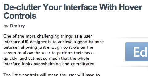
Hover effects can add a lot of functionality to your site, and there are a variety of ways to use them. Whether you simply highlight a link when it’s hovered over or have the object change completely (offering more information, for example), don’t overlook the increased functionality that can be achieved with hover effects.
2. Use Lorem Ipsum or Other Dummy Text
Trying to layout a page design when you have no text to work with can be nearly impossible. Using Lorem Ipsum or other dummy text makes a designer’s life much easier. Just be prepared for the inevitable comments from clients if you show them a mockup using Ipsum (“Why’s there all this Latin on the page? You’re gonna have to get rid of that before we put the site up,” is probably the most common remark I’ve heard).
3. Switch to Using the Real Text as Soon as Possible
While Lorem Ipsum works great for laying out your basic page structure, having the real text is sometimes necessary to fine-tune things. Headings, titles, and and special content are especially important.
4. Use Repetitive Elements to Give Pages a Cohesive Structure
Repeating different design elements, whether it’s an image, a style, or colors, can tie everything on your site together and make it look much more intentional.
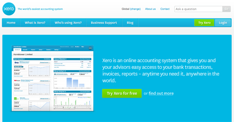
5. Make Sure the Purpose of Your Site is Immediately Apparent
As soon as someone lands on any page of your site, they should immediately be able to tell why your site is there. Taglines are one way to convey this information. You can also use images, short introductory text (in headers is the best way), or other identifying information. Don’t overlook the text contained in your meta title tag either.
6. Optimize Your Page Load Times and Make Them as Fast as Possible
While a large percentage of internet users are now using broadband, there are still a fair number out there using dial-up. And even DSL can get bogged down with graphics- or multimedia-intensive websites. Aim to keep your load times as low as possible to appeal to the widest possible audience.
7. Only Be Innovative When Appropriate
Innovation for innovation’s sake is almost never a good thing. People are accustomed to certain things acting in certain ways. Collective intelligence sets certain guidelines for what different symbols, shapes, colors, and other abstract concepts mean. Deviating from these concepts can have a unintended or even negative impact on how users view your site.
Resources
- Maximize the Use of Hover
- Hover Effects in Web Design: Best Practices and Examples
- De-clutter Your Interface With Hover Controls
- Lipsum Generator
Backgrounds
1. Don’t Be Afraid of Big Backgrounds
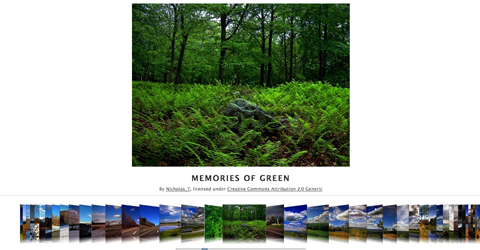
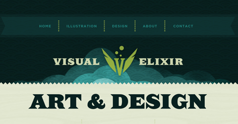
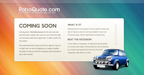
Big background images can add a lot of personality to your site. Many designers shy away from them as being too tricky or complex to implement. But there are plenty of resources out there now for implementing large backgrounds on your site. It’s a technique that can really set your design apart from the crowd.
2. Don’t Resort to Tables for a Large, Complicated Background Image
In the past, Big, complicated backgrounds were implemented with tables in most cases. But tables definitely aren’t the best solution for page layout. There are plenty of ways to layout your image-heavy background using CSS. There’s almost certainly a solution that will work for your particular site. There’s no excuse anymore for using tables for these kinds of sites.
3. Make Sure Your Large Background Image is Large Enough
As monitor sizes increase, it’s becoming more and more important for background images to work on a monitor with a resolution as high as 1920x1080 (the standard resolution for HDTV) or 1920x1200. If you’re only designing on a monitor set at 1024x768, it’s likely at least some of your visitors aren’t seeing what you’re seeing.
4. Make Sure Your Background Image Tiles Properly
There’s nothing worse than a background image that doesn’t match up when tiled. Whether you’re using a background created by someone else or creating your own, make sure it tiles seamlessly.
5. Optimize Your Background Images!
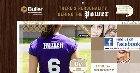
Optimizing your background image so it’s as small as possible while still looking good makes your site load faster. This is especially important when using a large background image. Using an image that’s 1920x1200 pixels can make for very large file sizes if you’re not careful with your settings.
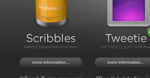
6. Backgrounds Don’t Have to Be Complex
While big backgrounds can add a lot of personality to a site, having a minimalist background can make just as big of an impact. You’ll need to pay more attention to other elements of your site if your background isn’t there to make a big impact, but it can make for a better user experience (depending on the purpose of your site).
Resources
- Large Website Backgrounds Dos and Donts
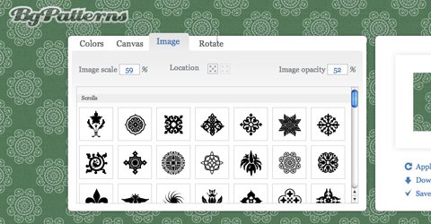
- BG Patterns Tiled Background Creator
- Backgrounds in Web Design: Examples and Best Practices
- How to: CSS Large Background
Blog Design
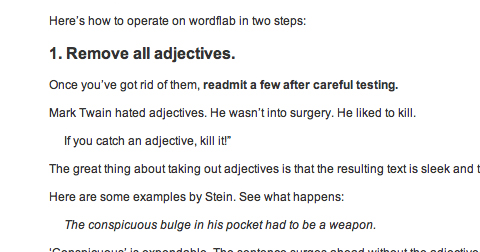
1. Focus on Readability
The majority of people visit blogs for the content. Design is somewhat secondary. While this doesn’t mean you should disregard what your blog looks like, make sure all of the elements on your page are enhancing your content, not distracting from it.
2. Use the h1 Tag for Your Post Titles
Search engines place a lot of weight with heading tags, and the h1 tag carries the most weight. If your post titles are keyword-rich (which they should be), this can make a decent impact on how your posts rank in search engine results.
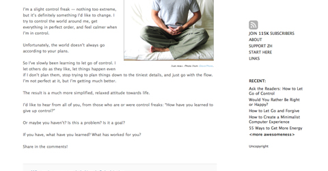
3. Don’t Clutter Your Sidebars
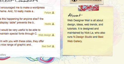
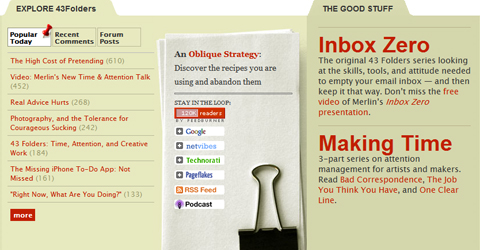
Some sidebars seem to run on forever, even beyond all the other page content. Pair these down. Only include information in your sidebars that’s really relevant. Use two sidebars if that makes things less cluttered. And make sure you keep a consistent visual style throughout all the elements in your sidebar.
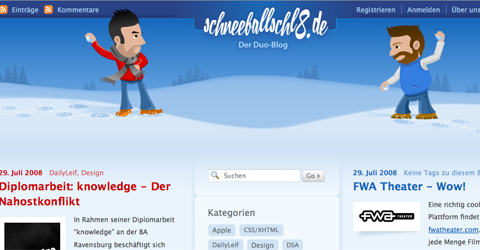
4. Show Off Your Personality
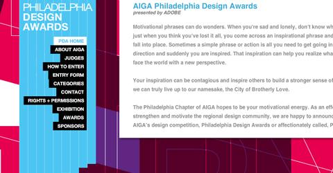
Blogs are often looked at as being less formal than traditional websites, so you can often get away with showing more personality, even on a corporate site. Let your or your company’s personality shine through in your blog’s design.

5. Consider the Design of Every Element
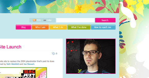
Blogs contain a lot of elements that might not be found on a traditional site: archives, comments, categories, and posts for starters. Don’t forget about these elements when you’re creating styles for the different parts of your site.
6. Properly Integrate Advertising
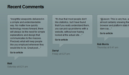
If you’re going to have advertising on your site, make sure it’s integrated with the look and feel of the rest of your site. If you’re using text ads, make sure font colors and link colors are consistent with (or complimentary to) the rest of your site. If you’re including banner ads, make sure they’re styled in some way that ties them into the rest of your site (either with borders, drop shadows, or whatever is appropriate based on your design).
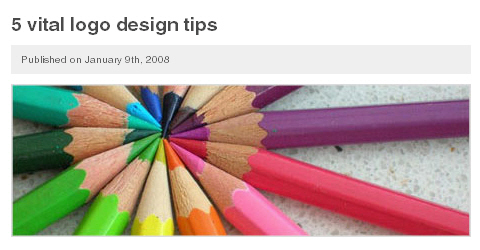
7. Use Styles for Post Images
This is probably one of the most overlooked bits of blog design out there. Applying CSS to images within your posts is no more difficult than adding it to any other part of your site. And it can make a big difference in the appearance of your site. Add a border. Or apply a hover effect. Use a style for the caption associated with the image. Whatever you do, just don’t ignore this important element.
8. Make it Easy to Subscribe
Make sure your RSS feed is easy to subscribe to. Using an oversize RSS icon is one great way to make it easy for people to subscribe. Adding a “subscribe by email” option can also greatly increase your subscription rates. Make sure your RSS icon is in the top portion of your page, above the fold if possible (the top of your sidebar or even in your header are both great locations).
9. Integrate it With Other Social Media
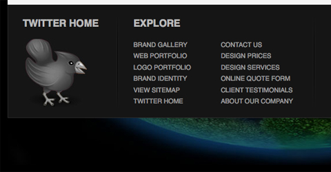
If you use Twitter, integrate your Twitter feed right into your blog. Whether you put it in the sidebar, footer, or even the header, it’s a great way to get more Twitter followers. If you use Flickr or YouTube, why not post your most recent images or videos right in your sidebar or elsewhere on your blog? This is especially important if your other social media feeds are related to your blog’s content. In addition to integrating your feeds with your blog, make sure it’s easy for visitors to your blog to share your content with others through their own social media channels.

10. Keep Load Times Short
As Internet connections get faster, it becomes more and more tempting to disregard how large your pages are and how long they’ll take to load on a slower connection. Even internet users with DSL may see noticeable wait times on very large pages. Don’t let yours be one of them. After all, if the page isn’t loading, that back button looks very tempting.
Resources
- A Small Design Study Of Big Blogs
- 10 Principles for Readable Web Typography
- 13 Characteristics of Outstanding Blog Design
- What Makes Good Blog Design?
- Blog Design: What Should Be Above the Fold?
- 23 Beautiful Examples of Web Site Archives
- 11 Ways to Improve a Blog Theme Without a Complete Re-Design
Buttons and Icons
The use of buttons and icons within your site for navigation or other elements can add tons of character and added usability to your site. But there are a number of things to keep in mind when choosing or designing buttons and icons, from consistency to sizing. Using buttons and icons effectively adds a new dimension to your site’s design, often elevating it to the next level.
1. Use Appropriate and Consistent Icons
There are hundreds of free icon sets out there. And there are probably thousands of paid icon sets. Finding one that meshes with the rest of your site design shouldn’t be too hard. Make sure that whichever one you choose echoes the rest of your design elements and that the icons you use are consistent throughout your site. In other words, don’t mix glossy icons with grungey ones.
![]()
2. Buttons Aren’t the Best Option for General Navigation
Here’s the thing: buttons aren’t great for menus or other general navigation. You don’t press a button to turn the page of a book or magazine. Buttons make things happen in real life, more than just moving from one page to another. Tabs make a lot more sense for general navigation (after all, tabs in a notebook are used to mark new sections of content, like new web pages).
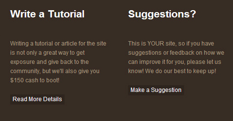
3. Use Buttons to Make Certain Navigation Elements Stand Out
Buttons are not a great solution for general web navigation. But if you want a certain navigation element to stand out, using a button is a great way to do just that. In real life, when you push a button, something happens. The same should be the case on your website. Buttons are great for downloads, adding things to a shopping cart or wishlist, or otherwise taking action. Make sure your button stands out against the surrounding design for added importance and effect.
4. Size Your Buttons and Icons Appropriately
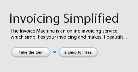
Buttons and icons, like other page elements, should be sized according to their importance. Buttons or icons that represent a call to action (download, buy, etc.) should be larger and stand out more. Buttons or icons that are logically expected (such as a login button or to submit a form) can be smaller and still be effective.
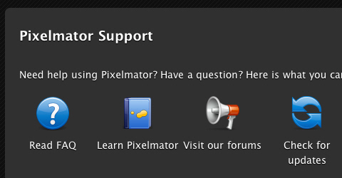
5. Don’t Be Afraid of Metaphoric Icons
Using literal icons works great if you’re not going to include any text near them. But don’t overlook using metaphoric icons if you’re going to be pairing them with text. Just be sure that very common icons (such as those for subscribing to RSS feeds) are kept at least somewhat similar to their well-known images to prevent confusing your visitors.
6. The Best Places to Use Icons are with Headers, as Buttons or on Buttons
Putting an icon in your header is a great way to draw attention to a specific portion of your site (such as an RSS feed). In this case you have to be sure to integrate the icon into your design so it doesn’t look like an afterthought. Using well-known icons as buttons is another great use. Pairing an icon with a hover effect giving a description is a good way to make the more usable when not combined with text. And finally, integrating an icon into a button that also includes text is a nice way to add a bit more flair to your buttons.
Resources
- A Guide to Using Icons in Web Design
- 10 Mistakes in Icon Design
- 7 Principles of Effective Icon Design
- 10 Outstanding Metaphors in Icon Design
- Creating Usable Links and Buttons
- Icon Design: Sizing
- Button Design Showcase
Code
1. Meta Information (Title, Description) Should be Accurate and Explanatory
The most important bits of descriptive meta data are the title and description tags. Both of these are used in SEO (both in rankings and as what actually shows up in search results). Using a key-word rich title and description is a good way to get a little extra weight in search engine results, and a way to get searchers to actually click on your site within the results.
2. Always Close Your Tags
This really shouldn’t have to be said anymore, but you need to make sure you always close your HTML tags. The latest HTML standards require tags to be closed (unlike earlier versions that let programmers get away with being lazy).
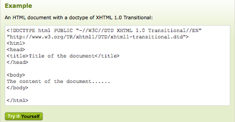
3. Make Sure Your Doctype Declaration is Correct
The doctype declaration in your HTML code can make the difference between your page validating or not. And in some cases, it can make the difference between your page displaying properly or not. Read up on what the different HTML and XHTML declarations require and then choose accordingly.
4. Validate Your Code!!!
Valid code is more likely to be displayed the way you intended across different browsers and platforms. It’s also more likely to continue doing so in newer browser versions. Writing valid code isn’t difficult, and there are plenty of doctype options to choose from to meet your particular needs. Use the W3C code validator often during your markup to prevent having to change a bunch of things later.
5. Always Use UTF-8 Encoding
UTF-8 encoding supports every character out there. By using it, you’ll ensure that special characters don’t show up as code snippets or strings of random characters.
6. Use Semantic Markup to Provide Meaning to Your Code
Using semantic markup uses meaningful names for your classes, ids and other tags. Adding meaning not only helps you remember which classes effect which elements, but also makes it easier for anyone who takes on your code in the future. And at some point, search engines may be able to use semantic information in a meaningful way to improve search results.
7. Comment Like There’s No Tomorrow
Commenting your code makes it much easier to revise later. With good comments, you’ll immediately know which parts of your code effect which parts of your content, without having to spend hours sifting through the code itself. And while many web developers think they’ll remember why the did something six months down the road, the majority of them won’t.
8. Keep Your Code Clean
Keeping your code cleaned up is important for a couple of reasons. First of all, clean code makes for smaller file sizes and faster load times. Second of all, it makes it easier to make changes to your code later, because it won’t be cluttered up with unnecessary elements.
9. Use the Correct Markup for Quotes
Using the correct markup for quotations and other punctuation elements is not that difficult. Using smart quotes, dashes, smart apostrophes and other special punctuation characters makes your content look more polished. Here’s the proper coding for some of the most common:
- – En dash: –
- — Em dash: —
- “ Left double quote (use on the left-hand side of quotations): “
- ” Right double quote (use on the right-hand side of quotations): ”
- ‘ Left single quote: ‘
- ’ Right single quote (also used for apostrophes): ’
Resources
- 30 HTML Best Practices for Beginners
- Tags, Attributes, and Elements
- HTML DOCTYPE Declaration
- HTML: Special Characters
- W3C Markup Validation Service
- 12 Principles for Keeping Your Code Clean
Color
1. Make Sure Colors Stay Consistent Throughout the Site
Keeping a consistent color palette across your site is more professional and gives your site a more cohesive image. If you want to switch colors, have a good reason for doing so and make sure other elements remain consistent.
2. Make Sure There’s Appropriate Contrast Between Colors Used in Different Elements
This mostly applies to text and background colors. Make sure there’s sufficient contrast between the text color and the background it’s against to make reading easy. On the flip side, make sure you don’t have too much contrast (it can be harsh on the eyes, especially when it’s light text against a dark background), and whatever you do, don’t use true contrasting colors (like blue and orange, yellow and violet, red and green, etc.) or your text will be all but impossible to read.
3. Make Use of Gradients
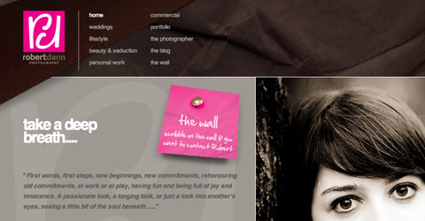
Subtle gradients can give a simple background or other element a lot more emphasis and style. Whether you use a gradient that fades from one color to another or between two shades of the same color, it’s a great way to add some visual interest to your site.

4. Limit the Number of Colors Used Outside of Images
Using ten or twelve colors on a site sometimes sounds like a great idea. But in practice, it rarely works and often makes your site look cluttered and way too busy. Outside of images, try to limit your color palette to only three or four colors, and make sure they’re not clashing with each other. If color isn’t your strong point, there are plenty of color palette generators out there you can take advantage of.
Resources
- Colors in Corporate Branding and Design
- 21 Stimulating Color Palette Tools for Designers
- Colors on the Web
- Color Matters
- 25 Great Examples of Using Gradient Effects in Web Designs
CSS
1. Don’t Use Inline Styles
It’s very tempting as you’re coding something to throw in an inline CSS style. But it makes your code more complicated and can cause problems when you’re trying to change those styles later. After all, you’re going to have to constantly switch back and forth between your HTML and CSS files, when you really should only need to open your CSS files.
2. Compress Your CSS Files
Compressed files make for faster load times. While just compressing one file likely won’t make a noticeable difference, if you keep your code clean and compress where possible, it can all add up to a significant improvement in performance. There are plenty of online utilities for compressing your files; make use of them.
3. Include Dependent CSS Files Within Your CSS Files
Using @import instead of HTTP link declarations makes your CSS file easier to reuse, as it carries its dependencies with it. Otherwise you’ll waste time having to look through your HTML files to find the dependent files.
4. Use Comments Correctly
Use comments within your CSS files to specify which styles apply to which elements. Separating your styles between header, footer, content, and other sections makes it infinitely easier to make adjustments later and makes it easier to identify which styles are effecting which parts of your design.
Resources
eCommerce
1. Use an Effective Call to Action
Make it enticing for visitors to the site to take the desired action. Whether you use a button, an icon, or some other technique, make it so users want to do what you’re requesting.
2. Make Checkout as Streamlined as Possible
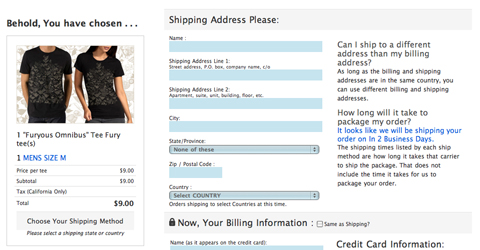
Using a single-page checkout can have a big impact on how many people actually finish the ordering process. People are busy and if it looks like checkout is going to take half an hour, they might just decide to come back later (or go elsewhere entirely). You want to remove anything that might slow a customer down on their way to completing their order.
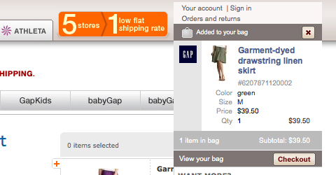
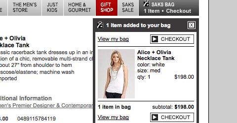
3. Use a Mini Cart
Using an AJAX or other type of mini cart that allows visitors to view the items within their cart without leaving the page they’re on is both helpful and more likely to keep them shopping.
4. Always Use a “Verify Your Order” Page
This is one of those psychological things that makes people feel more comfortable in ordering. If they know they’ll have a chance to verify and edit their order before placing it, they’re less likely to hesitate or cancel their order. And in case the customer did make a mistake in their order, it helps prevent costly returns and customer service issues down the road.
5. Include Contact Information Prominently to Increase Sales
Having a phone number and even a mailing address prominently displayed on your site makes a lot of customers more comfortable. It used to be that people were warned against ordering anything online from a company that didn’t at least provide a phone number, and a lot of people still follow that advice. Putting your phone number right in your header, your sidebar, or your footer, not just on your contact page.
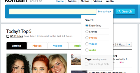
6. Differentiate Between General Site Search and Product Search
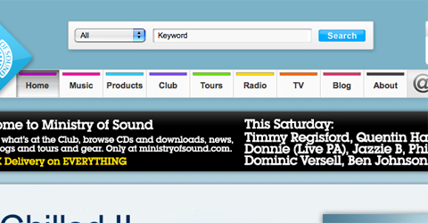
Make sure there’s a way for customers to search your entire site in case they’re looking for information in addition to searching for products. Keeping these two searches separate reduces confusion and search time. A simple drop down next to your search box that allows customers to choose between searching the entire site or just products is a simple solution for this.
7. Add Search Refinements to Product Search
Being able to refine a search based on specific criteria (category, size, color, etc.) is another way to make your store more buyer-friendly. If customers can find what they’re looking for quickly and efficiently, it’s less likely they’ll leave before completing their purchase.
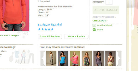
8. Show Related Products
Showing related products increases the likelihood that customers will purchase more than one item. For example, if a customer is looking at jeans, show shirts and belts in the related products area. A good place to display related products is under the product description or “add to cart” button on individual product pages, though there are plenty of other appropriate locations.
9. Don’t Make Shoppers Register for an Account Up Front
This goes back to slowing customers down. You want to make it as fast and simple as possible for customers to place an order. Give them the option to save their information for next time after the order is placed.
10. Add a Wishlist Function
Letting customers save items they’d like to purchase later is a good way to increase future purchases. Allowing them to share their list with others is a great way to get even more orders (people shopping for gifts might just buy something for themselves, too).
11. Prominently Display Security Badges
As strange as it sounds to someone who’s very web-savvy, a lot of people are still wary of shopping online. Displaying security badges and reassuring customers that their information is safe is one more way to putting their minds at ease and helping them to complete their purchase.
Resources
- Ecommerce Registration Usability Tips
- eCommerce and Shopping Cart Usability: 21 Best Practices
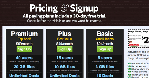
- Pricing Tables: Examples And Best Practices
- Shopping Carts Gallery: Examples and Good Practices
Footer Design
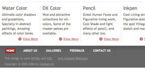
1. Don’t Overlook the Design of Your Footer
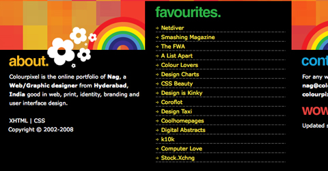
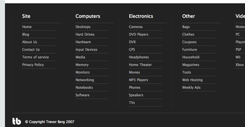
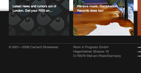
Because the footer of a page is located at the very bottom, it’s often overlooked. But there are a ton of different options for styling and utilizing that space. And the design of your footer should set it apart as its own unique content area, not an afterthought stuck on there to show copyright information.
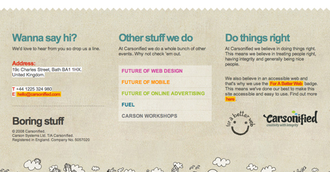
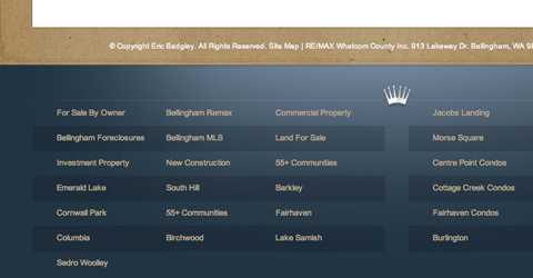
2. Use Your Footer for a Sitemap
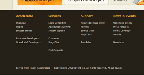
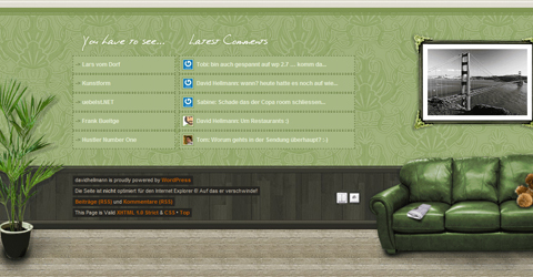
A sitemap makes your site more accessible, especially if your main navigation is image or Flash-based. A sitemap also helps with SEO, as it gives search engines a clear-cut path to your most important pages.
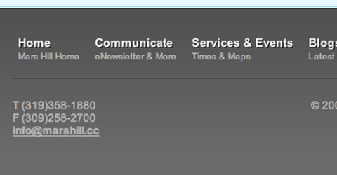
3. A Footer is a Great Place to Include Important Information
Instead of an “about” page, why not place that information in your footer? Including information about your company, site, or anything else in the footer is a good use of space and can help keep your navigation cleaner.
4. Clearly Delineate Your Footer from the Rest of Your Site
Give your footer its own unique design. Whether you echo the style of your header of go for something different, make sure it fits with the design of the rest of your site and doesn’t look like an afterthought.
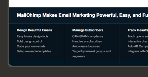
5. Don’t Be Afraid to Put Advanced Functionality in Your Footer
Including things like a contact form, search box, or other advanced functions in your footer is another great use of space. Again, make sure it doesn’t look like an afterthought.
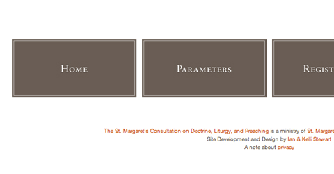
6. It’s Still Okay to Have a Simple Footer, Too
With all this talk of doing something really unique and special with your footer, it seems like having a simple, functional footer isn’t acceptable. But it is. Using a more traditional footer is perfectly fine, as long as you take the time to make it look integrated with the rest of your site.
Resources
- Modern Sitemap and Footer
- 25 Stylish Website Footer Designs
- Footers in Modern Web Design: Creative Examples and Ideas
- 100 Creative Examples of Footers for Web Designers
Forms and Logins
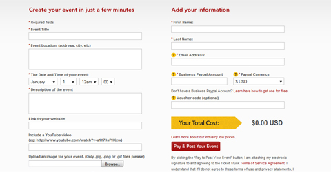
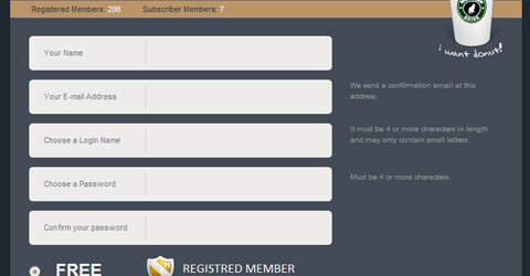
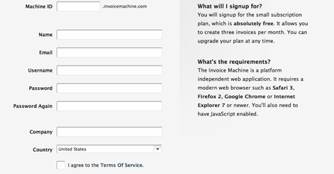
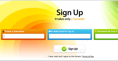
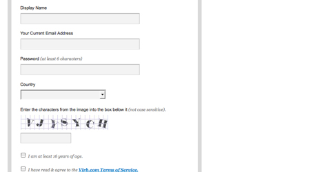
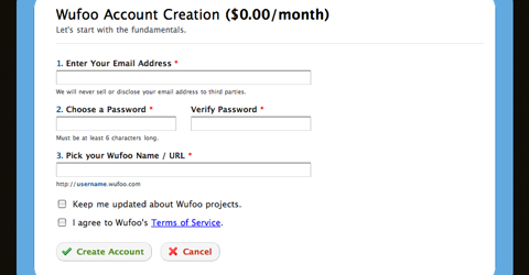
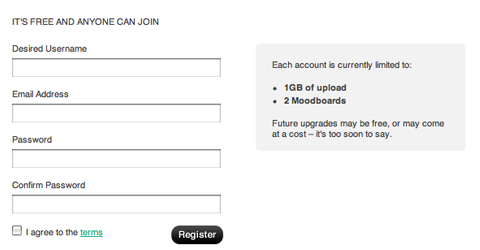
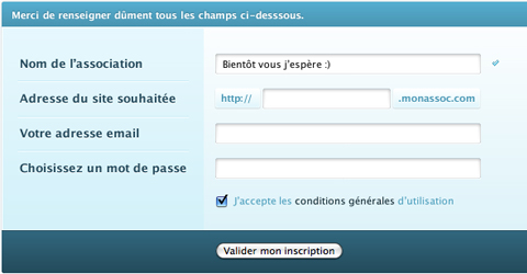
1. Make Registration Forms as Short as Possible
People don’t want to fill out huge, long forms asking for lots of personal information. The best registration forms are the shortest and simplest. Keep your registration forms so they fit on one screen if at all possible.
2. Require as Little Information as Possible
Don’t ask users to give too much information about themselves up front. Many registration forms just require an email address or username and a password. Allow your users to add additional information about themselves after they’ve completed the sign-up process.
3. Clearly Mark Required Fields on All of Your Forms
There’s nothing more annoying than filling out a form, hitting submit, and then getting an error message saying you’ve missed a required field.
4. Make Form Validation Helpful to the User
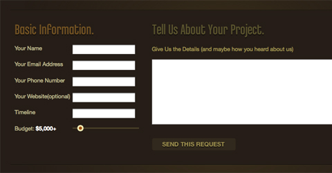
Using real-time form validation (that signals immediately if a user has entered invalid information or skipped a required field) is helpful to those trying to sign up on your site or fill out another form. If a form fails to validate, make sure it doesn’t erase the form contents and make it immediately apparent why it didn’t go through. Otherwise you risk driving users away with a sign-up or contact process that just seems too complex.
5. Make Sure You Confirm Successful Submission to the User
There’s nothing worse than hitting “submit” and then landing on a blank page or another page completely unrelated to what you were doing. It leaves you wondering whether the form went through. Whenever a form is submitted on your site, make sure it tells the user it was successful.
6. Give Detailed Information About Login Failures
While it may seem more secure to use generic statements like “The user ID or password you entered were incorrect,” those kinds of broad statements can be frustrating to users. Many internet users use different IDs and passwords for different sites and remembering which one you used where can be tricky. Tell those trying to log in whether it was the user ID or the password that failed to make it easier for them to successfully login.
Resources
- Best Practices for Form Design
- Best practices for login pages?
- Interface Design: Login/SignUp
- 12 Excellent Examples of “Lazy Registration”
- Registration Usability—87 Registration Forms Tested
Functionality
1. Create a Custom 404 Page
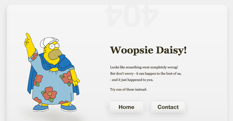
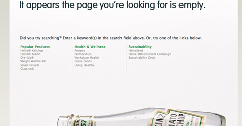
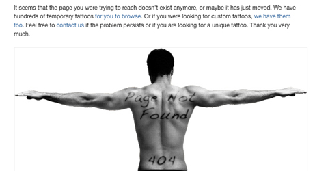
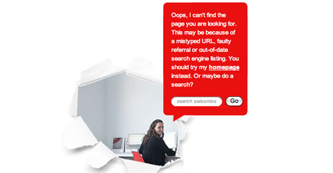
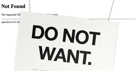
404 pages are often-overlooked in the grand scheme of website designs but can be a great way to keep users on your site even if what they were looking for isn’t there. Whether you opt to be funny, serious, or somewhere in between, give users helpful information when they land on a 404 page, including links to search for the content they were looking for and a link back to the home page of your site.
2. Be Sure to Include a Search Function on Your Site
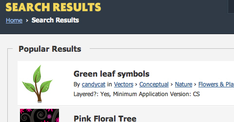
Unless your site is very, very small (one or two pages), include a search box to make it easier for users to find content. Make sure search results are also organized in an easy-to-browse format, too.
3. Make Sure All Your Links Work
This shouldn’t even be something we have to mention, but make sure you don’t have any broken links on your site. This applies to both internal links and to links leading to other sites.
4. Test Your Forms
Make sure your forms work the way they were intended to. This includes submitting properly, sending out any confirmation emails, and delivering the proper message after both successful and unsuccessful submissions (you are testing to see what happens when a form doesn’t go through, right?).
5. Make Sure Elements Function as Expected in Different Browsers
What shows up in Firefox fine might not be showing up the way you intended in Google Chrome, Internet Explorer, Safari, and/or Opera. There are online utilities available that let you see how your site is appearing in different browsers, different versions of those browsers, and on different operating systems.
Resources
- 8 Layout Solutions to Improve Your Designs
- Designing the Holy Search Box: Examples and Best Practices
- Create Effective Search Result Pages
- Common Problems with 404 Error Pages
- Guidelines for an Effective 404 Error Page
- Dead-Links.com—Free Broken Link Checker
- BrowserShots
Graphics and Images
1. Optimize Your Alt Tags
Alt tags serve two purposes. First, if your image doesn’t load for some reason, it lets whoever is browsing your page know what the image was supposed to be. Second, since search engines can’t read images, alt tags tell search spiders what the image is displaying and can greatly improve your search results. It only takes an extra second or two to add an alt tag to each image and the benefits are well worth it.
2. Use Image Title Tags
Title tags can also have a positive impact on SEO. But even more importantly, if you use JavaScript on your site, title tags allow you to call objects easier, with just their title.
3. Look at the Overall Impact Each Graphic or Image Makes on Your Entire Site
Graphics and images can make a huge difference in how your site appears and how users interpret it’s intentions. Make sure you take into account how each graphic or image alters the overall appearance of your site. This includes paying attention to color scheme, negative space within the image, and the image’s actual content.
4. Be Aware of File Sizes and Load Times
Make sure your images are optimized to load quickly. Of course, at the same time don’t compress them to the point of looking distorted or pixelated.
5. Always Specify Image Height
There’s nothing worse than being in the middle of reading something and then suddenly having the page jump down as an image loads. If you specify the height of your images, when the page loads it automatically leaves enough space for the image and prevents those annoying page jumps.
Header Design
1. Link Your Logo to Your Home Page
Users have come to expect that headers, and especially logos within headers, will link back to the home page of a site. Don’t disappoint or confuse them by having yours do something different (or nothing at all).

2. Don’t Be Afraid of Big Headers
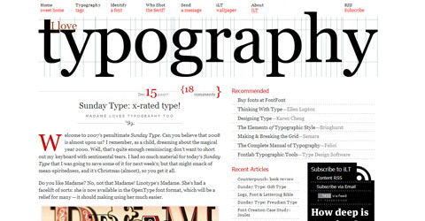
Big headers can add a lot of visual impact to your site. Just keep in mind how much the header will push other content down the screen and the effect this will have on site users. If possible, make sure something is included in your header that immediately lets new visitors know what your site is about.


3. Include Content Other Than Your Logo in Your Header
Headers are a great place to give users other information about your site. Whether it’s a tag line, navigation, a search box, or an icon to download something or subscribe to an RSS feed, don’t overlook the impact of added content in your header.
4. Make Sure It Conveys What You Want
The header of your site is really the first thing new visitors will see. Make sure it grabs their attention, directs them where you want them to go, and makes a positive first impression.
Resources
- 5 More Tips to Make Website Headers More User Friendly
- Five Types of Effective Headers in Web Design
- 30 Creative Website Headers
Intros and Splash Pages
1. Not All Intros are Flash
An intro doesn’t necessarily have to be Flash. A lot of sites use a short splash page to give new visitors a quick peak at what they do or if they have any special content they want to showcase. Other sites use a simple image and an “enter” button. And still other sites include the intro on the home page, often located either in or right under the header. Any of those options are fine, as long as it makes it immediately apparent how to get from that page or section to the actual content.
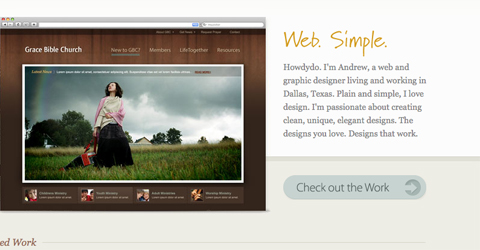
2. Make the “Skip Intro” Button Easy to Find if You’re Using a Flash Intro
Some people just won’t want to watch your intro, no matter how cool you think it is. Make it easy for these people to go straight to the main content of your site or risk them clicking their back button.
3. Use a Progress Bar
No one wants to sit looking at a blank screen waiting for a page to load. Most people won’t stick around for more than a second or two if the page looks like it has nothing on it. A progress bar keeps them satisfied until your actual intro starts.
4. Keep Intros Short
A Flash intro longer than thirty seconds is unlikely to be watched by many people, not matter how great it is. Keep you intro as short as possible to maximize the number of people who actually see it. If you’re not using Flash, but rather a text intro or splash page, keep it to a paragraph or two to get the most impact.
5. Only Use an Intro if You Really, Really Love It
Intros, to some extent, have very little functional purpose. A lot of users hate them and will skip them all together. Plus, they take up bandwidth and slow down the load time of your site. Only use an intro if it’s something you really, really want to do and the intro itself is something you really love and couldn’t bear to part with.
Resources
- 50 Inspirational Website Introductions
- Splash Pages: Do We Really Need Them?
- The Return of the Splash Page?
- Website, Micro Site or Splash Page?
- BrandDoozie: Splash Page Done Right
- Uproar Over Anti-Flash Intro Survey Results
JavaScript, AJAX, and Flash
1. Use JavaScript to Add Functionality, not Content
JavaScript was designed to add functionality to sites, not content. Use HTML or XML for your content, and leave JavaScript for performing functions and actions.
2. For Faster Page Loads, Place JavaScript Files at the Bottom of Your Pages
Because JavaScript is a client-side script, it can take a bit longer to download (depending on its function) than other content on your page. And if it’s sitting above other content in your code, the JavaScript going to have to load first. Putting it at the bottom allows everything else on your page to load so your visitors aren’t staring at a blank or half-loaded screen.
3. Don’t Use Inline JavaScript!
Using separate JavaScript files makes your pages load more quickly and makes your files sizes smaller. Plus, it’s easier to reuse scripts if they’re self-contained.
4. Optimize Your Loops
Optimization of your JavaScript loops makes your script faster and leaner, resulting in quicker responses and load times.
5. Keep Your Code Simple
The simpler your code, the easier it is to modify, adapt, and update. Plus, simpler code generally results in smaller files sizes, faster load times, and fewer opportunities for your code to do something unintended.
6. Make Sure Your Scripts Degrade Gracefully
Graceful degradation is important considering there is still a percentage of internet users out there who don’t have JavaScript enabled on their computers. Make sure your page isn’t unusable for these users.
Resources
- Javascript Best Practices
- JavaScript Best Practices
- 5 JavaScript Best Practices
- jQuery and JavaScript Coding: Examples and Best Practices
- Flash Best Practices Part 1
- Best Practices for Accessible Flash Design
- Flash and HTML Website Integration—Best Practices
- Best Practices: Implementing JavaScript for Rich Internet Applications
- Accessible AJAX Best Practices
Multimedia Content
1. Make Sure Video and Audio Content Don’t Autoplay
Video and especially audio content that autoplays can be really annoying to users. Sometimes it even causes them to close the site without looking any further (especially when that content is in advertising on the site). Instead of having video or audio autoplay, just make the play button stand out so users know where to click. And don’t allow advertisers to have audio content that starts automatically.
2. If You Use Background Audio, Make Sure it’s Easy to Turn Off
If you insist on using some kind of audio as background sound on your site, make sure it’s easy for users to turn the sound on and off. A button to do this in either your header or your footer is probably going to be the easiest to find.
3. Make Sure Video and Audio Content Has a Clear Purpose on the Page
Don’t put video or audio content on your site just for the sake of having multimedia content. Make sure each video and audio file on your site has an important and well-defined purpose and will be useful to your visitors.
4. Don’t Treat Video Content as an Afterthough
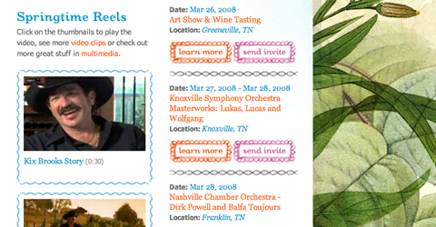
If you want to use video from YouTube or other popular video-sharing sites, make sure the content area you plan to place it in is wide enough for that kind of content and that any added videos will look like they were meant to be there. There’s nothing uglier than a YouTube or other video covering up or pushing over content in your sidebar (or being partially covered by your sidebar) or looking like it was just something you slapped on there at the last minute.
Resources
- Using Video on Your Website—A Case Study
- Using Video on Your Website
- 7 Tips for Using Audio on Your Website
Navigation, Menus, and Pagination
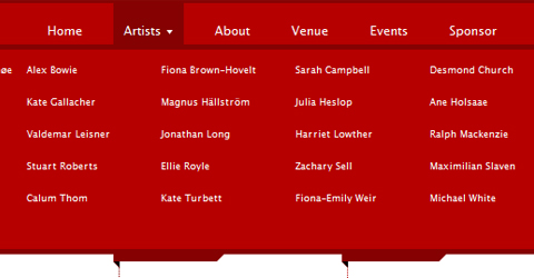
1. Make Sure Navigation is Immediately Recognizable
Don’t make users search for navigation on your site. Navigation elements should be immediately recognizable to new visitors, though that doesn’t necessarily mean you have to use traditional navigation elements like buttons or menus.
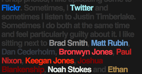
2. Links Should be Easy to Identify
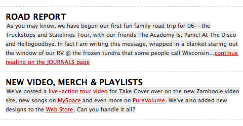
Make links on your pages distinct from other text. Underline isn’t your only option for this. Making links have a different font weight, color, or other style are also acceptable.
3. If Your Navigation is Based on Flash, Images or AJAX, Put Text Links to Pages in the Footer
Using text links as an alternate form of navigation on your site improves its accessibility if your main navigation is based on Flash or images. Your footer just happens to be an ideal place to put these things.
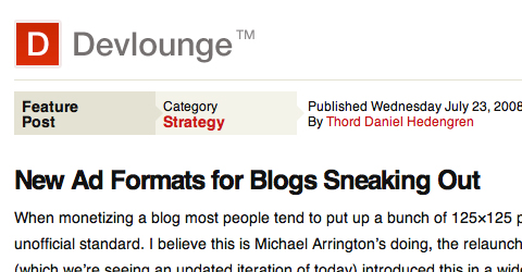
4. Use Breadcrumbs
Breadcrumbs let visitors know exactly where they are on your site, and their probable path of getting there. The improvement in navigation is well worth the extra time it takes to code.

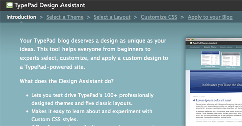
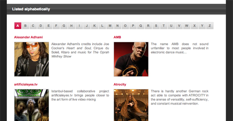
5. Consider Using Tabbed Navigation
Tabbed navigation has a more positive psychological impact on visitors than other menu formats. This is primarily because tabs more accurately reflect the way things work in the real world (a tab in a notebook, for example, brings you to a different page or section). Tabbed navigation subconsciously encourages users to click through to different parts of your site and tells them what’s important.
6. Have a Sitemap Somewhere on Your Site (Even if It’s Just an XML One)
Link-based sitemaps improve the accessibility of your site and has a positive impact on your site’s search engine optimization. If you opt not to include a full text-based sitemap, an XML sitemap will at least give you the same SEO benefits.
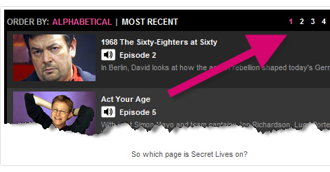
7. Keep Pagination Simple and Straightforward
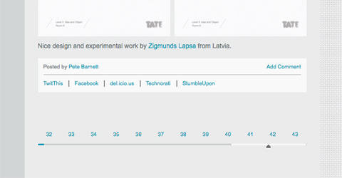
When you split content into multiple pages, make sure it’s easy for users to not only get to the next page, but also to the last page, first page, or any page in between. Make sure it’s clear which icon does which function, too. It’s incredibly annoying when you think you’re clicking the “next page” button and then find yourself suddenly on the last page!
Resources
- Tabbed Navigation, and What Makes it Useful
- Showcase of Well-Designed Tabbed Navigation
- Designing Drop-Down Menus: Examples and Best Practices
- Pagination Gallery: Examples And Good Practices
Page Layout
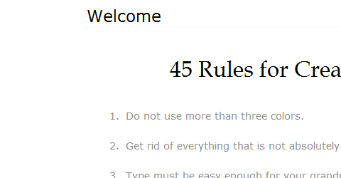
1. Don’t be Afraid of Negative Space
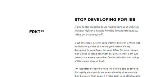
Despite its name, negative space is an important design element. Basically, negative space (also called “white space”) is comprised of areas within your design that have no content (text or images). Negative space keeps your site looking less cluttered.
2. Use a Grid Layout as the Basis of Your Design
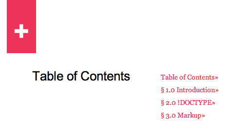
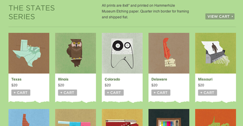
Using a grid as the basis for your design keeps the different elements of your design lined up and balanced. And despite its name, grid-based design doesn’t necessarily look like it’s based on a grid at first glance.
3. Be Aware of What Content will Appear Above the Fold
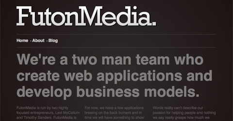
Make sure the content on your site that will appear onscreen at different resolutions when the page first loads are the things you feel are most important to visitors. This generally consists of your header, and at least part of your navigation and main content.
4. Prioritize Information on Your Pages
Different information on your site should have different levels of importance. Your design and the emphasis placed on different elements should reflect their importance in the grand scheme of your site.
5. Strive for Balance in Your Designs
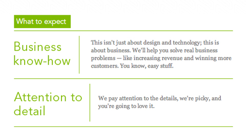
To some extent, balance is a bit subjective. Symmetrical designs are the most obvious examples of balanced sites. But balance doesn’t necessarily equal symmetry. Asymmetrical designs can be well-balanced, too, as long as the different elements are positioned in such a way that one side of your site doesn’t overpower the other.
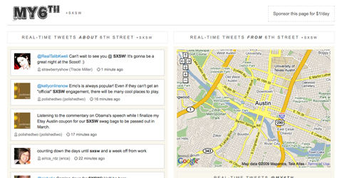
6. Use CSS for Your Layout
This is something that shouldn’t even need to be on this list, but tables were never really meant to be used for the structure and layout of your site. Tables were originally designed to organize data, nothing more. But CSS creates a much cleaner, leaner, and faster-loading site than tables. Plus, current web standards insist on CSS for the layout of a site in order for the HTML to validate.
Resources
- Five Looks, One Layout: How to Develop a Library of Web Design Styles at Your Fingertips
- 40 Beautiful Examples of Minimalism in Web Design
- Grid-Based Design: Six Creative Column Techniques
- Designing with Grid-Based Approach
- Web Page Design
- The Best Page Layout and Design for Content Websites
- Priority Provides Clarity
Portfolio Sites
1. Keep the Purpose of Your Site in Mind
For the majority of portfolio sites, the aim is to gain new clients. Keep this in mind when designing your site, including who your clients are likely to be and what kinds of information they’ll be looking for.
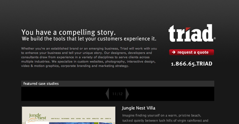
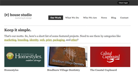
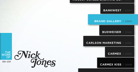
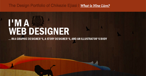
2. This is the Place to Show Off Your Design Skills
To some extent, your portfolio site becomes a part of your portfolio, especially if you’re a web designer. Show off your design abilities and make your portfolio something truly unique.
3. Showcase Only Your Best Work
Don’t include everything you’ve ever designed in your portfolio. Pick out a dozen or two designs in each category in which you work (or whatever number works best with your page layout) and display only those pieces. Most clients won’t want to spend hours combing through a couple hundred examples, anyway.
4. Make it Easy for Prospects to Contact You
Since the goal of most portfolio sites is to get new clients, make sure it’s easy for those new clients to contact you. Including a contact form plus your email address (and maybe even a phone number or Skype ID) gives potential clients options in how they contact you.
5. Include Client Testimonials Right on Project Pages
Instead of having a special testimonials section on your site, why not include client testimonials on their respective project pages? It makes it more likely that prospective clients will actually take the time to look at your testimonials.
6. If You Have a Diverse or Very Large Body of Work, Use Categories
Categorize your work if you have a lot of it or if it spans a lot of different mediums or niches. Categories make it easier for prospective clients to look at work that’s similar to their own project without having to wade through a bunch of unrelated work.
7. Don’t Overlook Search Engine Optimization
Because portfolio sites can be much more image-intensive than many other kinds of sites, it’s easy to overlook SEO. But take the time to use alt tags and titles along with keyword-rich project descriptions on your site. After all, how are you going to get new clients if no one can ever find your work?
8. Keep the Look and Feel of Your Site Consistent
Because portfolios often have to tie together a very diverse body of work, it’s even more important to make sure that the rest of your site stays consistent in both look and feel. Maintain your color scheme, fonts, and general layout site-wide.
9. Include an About Me Section
Prospective clients want to know about the designer behind the work. Include an “about” section either in your sidebar, footer, header, or on its own page.
10. Don’t Get Too Creative
While you want to showcase your creativity, be careful that your creativity doesn’t impact the usability of your site. The goal is to show how competent you are as a designer, not just how creative and talented you are as an artist.
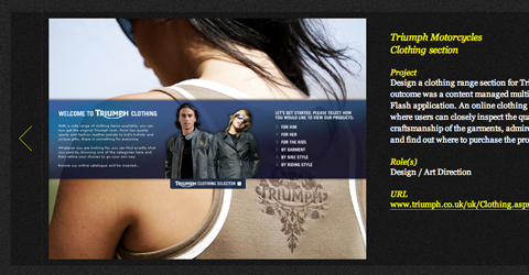
11. Provide Explanations of Your Work
Explaining your work and what role you took in different projects is incredibly helpful to prospective clients. Plus, it makes you appear more honest and reliable if you’re willing to say you only had a small part in a certain design rather than implying you did the entire thing single-handedly. Devote a page to each project and provide basic information about who the project was for, the design, objectives, and your own comments.
Resources
- How to Create A Better Online Portfolio
- 10 Characteristics of Excellent Portfolio Sites
- The Good, the Bad, and the Ugly of Portfolios
- Creating The Perfect Portfolio
- 10 Steps To The Perfect Portfolio Website
- Creating A Successful Online Portfolio
- Five steps to a better design portfolio, by Jeffrey Veen
- Ultimate Guide to Using WordPress for a Portfolio
- 10 Steps to the Perfect Portfolio Website
Social Media Integration
1. If You Use Icons, Make Sure They’re Consistent
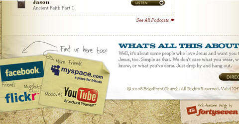
Social media logos are as distinct as the sites they were created for. And there are thousands of social media icon sets out there, each with their own unique look and feel. But if you’re going to include a variety of social media options on your site, make sure the icons you use for each are either from the same icon set or are similar enough in look, size, and design that they feasibly could be.
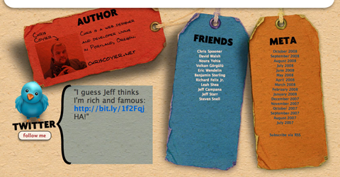
2. Integrate Your Twitter Feed Only if it’s Relevant
Integrating Twitter feeds into sites is a great way to get your visitors to be more involved. But if your Twitter feed has little or nothing to do with your site’s content, don’t bother. Visitors to your website are there for something specific; providing extraneous information is only likely to confuse or distract them.
3. Don’t Include Links to Your Facebook or Other Profiles if You’re Not Willing to Add People to Your Friends
Only include links to your social media profiles if you’re okay with friending anyone who asks. Otherwise, what’s the point of broadcasting that you’re on Facebook, MySpace, or LinkedIn? Denying friend requests from people after you’ve broadcast your presence is akin to sending out an open invitation to a party and then having a doorman and guest list at the event.
4. Style Your Feed Integrations to Mesh with Your Site Design
Your feed should be integrated into your site in a way that makes it look like it belongs there. Just because Twitter, Facebook, or any other site with feed capabilities formats things one way doesn’t mean you have to stick with that particular format (in most cases, anyway).
Resources
- Showcase of Twitter Integration on Blogs
- Showcase of Twitter Integration on Blogs
- How to Successfully Integrate Social Media Into Your Site
Typography
1. Make Sure Your Font Size is Appropriate
Having a font that’s too large or too small can portray the wrong image for your site. Make sure headlines are larger than body text and that all of your font choices are readable.
2. Special Type Styles (bold, italic) Should be Used Sparingly
Don’t make every other word on your site bold or italic. Only use them sparingly when you want to emphasize something important.
3. Pay Attention to the Overall Structure of Your Typography
Look at the way your different type styles interact with one another and look together. Make sure your heading classes are logically sized (with the h3 tag being the largest and the one with the most impact and the H6 being the smallest and least important-looking).
4. Don’t Overlook Typography Details
Details such as the leading, spacing, and other minutiae of typography design can have a huge impact on the overall look of your site. Make sure there’s adequate spacing between your letters, words, and lines, as well as between headings and paragraphs. These little details can make a big difference.
5. Use an Appropriate Text Color
Make sure your text color has sufficient contrast against your background color without being glaring or hard on the eyes. Stark contrasts (especially those with light text on a dark background) can be especially hard to read for large blocks of text.
6. Don’t Use Centered Blocks of Text
Centered text is fine for headlines but avoid it for paragraphs or other large blocks of text. The jagged edges take longer to read and tend to interrupt the flow of the text.
7. Embrace Sans Serif Fonts for Body Copy
As a general rule, sans serif fonts are easier to read on screen than serif fonts. While there are some serif fonts that are fine for large blocks of text(Georgia being the most prominent), serif fonts are usually a safer choice.
8. Use em Units to Size Your Text
Em units allow visitors to your site to adjust the text size according to their own preferences. This makes it easier for those with poor eyesight to enjoy your website as much as those with 20⁄20 vision.
9. Don’t Use Too Many Typeface or Weights
It’s easy to go overboard with typefaces and other type styles. But using too many just makes your site look cluttered and, at worst, unprofessional. Limit your typefaces to two or three and make sure that type weights reflect the relative importance of the elements you’re applying them to.
10. Use a Scale in Your Typography Design
Scales were developed to make typography look balanced and proportional. Whether you use the original type scales developed in the 15th century or develop your own, make sure the relationships between font sizes on your site are consistent and look good together.
11. Style Your Headings Logically
Headings should be styled based on their importance. In other words, the h3 tag should have the most impact of all your heading styles, larger and heavier than the others. Your H6 tag should be the smallest (maybe only a size or two larger than your body font size) and lightest.
12. Make Sure You’re Using Web Safe or Very Common Fonts
Not everyone out there is going to have the same fonts installed on their computers as you. And in many cases, people never install any fonts beyond the basic system fonts that come pre-installed on their computers. Make sure the fonts you choose for your site are either web-safe or pre-installed on the majority of systems. And specify a series of fonts so if your first choice isn’t available, it will load in the next-best-thing.
13. Don’t Underline Anything But Links
People expect underlined text online to be linked to something. If it isn’t, you’ll do nothing but confuse your visitors.
Resources
- The Principles of Beautiful Typography
- 10 Web Typography Rules Every Designer Should Know
- The Principles of Beautiful Typography
- 10 Common Typography Mistakes
- 8 Ways to Improve Your Typography
- 5 Simple Ways to Improve Web Typography
- 12 Examples of Paragraph Typography
- Improve Your Web Typography With Baseline Shift
- Five Tips for Better Typography
- 5 Easy Tips for Web Typography
- 75 Truly Remarkable Typography Resources
- The Irritation of Non-Clickable Links
WordPress
1. Use a Theme Framework
There are more then a dozen good WP theme frameworks out there. You’ll save yourself tons of time by using one, especially if you’re not planning on doing anything too out-of-the-ordinary with your particular WordPress installation.
2. Take Advantage of All the Different Template Files Available
WordPress offers a variety of different templates to style different parts of your site. These include page, comments, post, index, and a variety of other templates. Take advantage of as many of them as you deem appropriate for your site.
3. Widgetize Your Theme
Widgetizing your theme used to be optional. But now, with so many different widgets available to extend the functionality of your site, it’s become a requirement. Widgetizing a theme is incredibly simple and there’s really no reason not to do so.
4. Make Sure Your Theme Handles Pages Well
Make sure pages on your site are displayed the way you want them to be. While formatting pages the same as posts can be tempting, you often end up with a bunch of extraneous information you don’t need (such as category tags and a date stamp). If nothing else, customize your post template to remove this extraneous information and then re-save it as your page template.
5. Verify Your Hooks are Working Properly
WordPress works with a ton of different hooks for dealing with different types of data. Make sure whichever hooks you’re using work the way they’re supposed to under a variety of different circumstances.
6. Use a Mobile Theme for Your Blog, Especially if Your Primary Theme is Graphics-Intensive or Complicated
Graphics-intensive or magazine-style sites can become a mess when viewing a site on a 3” screen. And considering how many people now surf the web with their iPhone or other mobile device, not catering to those people is a huge mistake. There are a number of off-the-shelf mobile themes for WordPress out there so finding one that works with your site shouldn’t be difficult. And you can always use one to customize your own mobile theme.
7. Set Up a Local Installation of WP for Testing
Having a local installation of WP for testing themes and plugins will save you tons of time if you develop themes regularly. And since WP is developed entirely on open source platforms, installing a local version won’t cost you a thing.
8. Consider Customizing a Theme
Theme development can be time consuming. Instead of starting from scratch or even from a basic framework, why not customize an existing theme. Changing the color scheme and graphics of a theme can make a stunning difference, to the point no one would even recognize the two finished themes as being built on the same basic structure. This can be especially time-saving if you know of a theme that already performs some special function you have in mind.
Resources
- 10 Checks to the Perfect WordPress Theme
- Installing WordPress on Your Own Computer
- WordPress Theme Development Frameworks
Further Resources
- 10 Principles of Effective Web Design
- Five More Principles of Effective Web Design
- 10 Usability Tips for Web Designers
- Web Design Practices
- High Performance Web Pages—20 New Best Practices
- The Principles of Beautiful Web Design
- 9 Information Design Tips to Make You a Better Web Designer
- 8 Ideas, Techniques and Tricks for Your Web Design Toolkit
- 6 Interface Design Principles and Tips Every Web Designer Should Know
- 5 Must Know Web Design Polishing Techniques
- 50 Totall Free Lessons in Graphic Design Theory
- Increasing Usability with User Feedback
- Working Within Limitations to Achieve Great Designs
- 4 Principples of Good Design for Websites
- Understanding Conventions: When Being Unique is a Bad Thing
- The Principles of Design
- Five Principles to Design By
- 7 Surefire Web Design Styles That Work


 SurveyJS: White-Label Survey Solution for Your JS App
 Agent Ready is the new Headless
