The Path To Advertising Nirvana
With advertising, a curious thing happens: most people want its benefits but are rarely willing to put up with its hassles. Those who run websites and applications have enough on their plates without having to worry about handling transactions, putting banners across their website or hearing requests from advertisers. Moreover, users have little to no interest in even looking at advertisements that flank a website’s content, some going so far as to block ads before they’re delivered. So, what’s a website owner to do?
Advertising hasn’t always been this way. Some people even enjoy them. Scary thought, I know, but stay with me. You know those previews shown before movies and those signs outside of gas stations announcing fuel prices? Those are rarely seen as advertisements at all. That’s because people find them informative, helpful and engaging. Heck, some people say they watch the Superbowl for the advertisements themselves. So why are websites any different? What has changed online that people (apparently) find less acceptable than offline? Not much, really… well, not much unless you count that whole “Internet” thing.
You might be interested in the following related posts:
- A Never-Ending Story On Ad-Blockers
- Why Web Designers Should Not Use Ad Blockers
- Successful Strategies For Selling Ad Space On Low-Traffic Websites
- Online Advertising And Its Impact On Web Design
As a general rule, when people surf the Web, they’re in control of the experience. If someone wants information about a particular topic, they might query Google or look up an article on Wikipedia. Regardless of what they do, they choose how to obtain the information they want. The traditional advertising model — shout at your audience until it listens (as Groundswell would put it) — is diametrically opposed to this.
So, if advertisers are working against the model, can’t they just leave us alone? The answer is almost universally no; not until we come up with a better solution. Just as user experience designers carefully craft experiences throughout a website, advertisers must pay attention to how they affect the perceived value of the publications in which they appear.
The subject of “advertising experience” itself is too broad to cover in one article, so I wouldn’t suggest that this is final word on it. Instead, I’ll attempt to provide an overview of how our website, the UX Booth (a user experience design publication), has approached advertising in the past 18 months, an approach that has been evolving with our understanding of the advertising model.
First Things First: Why?
A good question to ask yourself when first considering whether to put advertisements on your blog or website is, why are you advertising in the first place? Some of the major reasons that we’ve heard of (at meet-ups, conferences and from other publishers) follow.
1. Quality Content Costs Money.
The most common argument. When a website owner creates and manages content, they’re providing a service; and they have to spend time continually maintaining it. No surprise then that they want to be compensated for that time. Unless the owner is marketing a salable product, this almost inevitably leads them to consider advertising as their chief source of revenue. Erin Kissane recently reflected on this, the content conundrum, after taking part in SXSW’s publishing panel:
Content isn’t free. If it’s good, it’s very expensive to make. We can subsidize its production and maintenance in any number of ways, but we have to start being honest — with ourselves, our clients and sometimes our readers — about its true cost.… Publishing requires resources: planning, big doses of both creativity and disciplined analysis, writing, editing, design, project management, production, ad sales and so on. It doesn’t usually require a separate person for each of those tasks, but it still tends to be a lot of work — more than most readers and clients tend to imagine.
Jeffrey Zeldman, who manages Happy Cog, the consultancy that publishes A List Apart, corroborates this in his post “Content Wants to Be Paid For.”
2. Advertising Builds Credibility.
This point isn’t as straightforward, so let me explain. People like the familiar, and ads are certainly familiar. Not only can the mere presence of ads build trust (as ironic as that may be), the companies that do the advertising can lend credibility to the website. Consider a website that is sponsored by Adobe and that puts Adobe’s logo next to some of its content. The presence of this established brand sends two distinct yet related messages: first, this content is supported by money from Adobe (and all the good or evil that that entails), and secondly (perhaps more importantly), Adobe essentially endorses this website’s content. Having a major brand as a partner gives the website authority.

Although Delve:UI was Fritz Desir’s first event, the support of so many well-known sponsors lent it credibility.
3. Advertising Supports the Community.
Websites aren’t run in a vacuum. They exist in an eco-system, a niche. Relevant advertising beside content can introduce readers to products and services that are of interest to them. If similarly targeted websites follow the same logic, the community as a whole is strengthened. Remember webrings? (… No?)
Whatever your reasons, understand first why you’re advertising. This understanding will inform future decisions that you make throughout the advertising process.
Second Things Second: Who?
Now that you’ve decided that advertising is for you, it’s time to meet the individuals who are a part of the advertising equation. Unlike traditional user–centered design, which involves a complex interplay between two parties (stakeholders and users), advertising is a three-way conversation: between stakeholders, readers and advertisers.
Advertisers
Know them, love them, cherish them. Advertisers are the people who want to show their products to the people who visit your website. To do this, they start at the top, contacting publications that interest their target demographic.
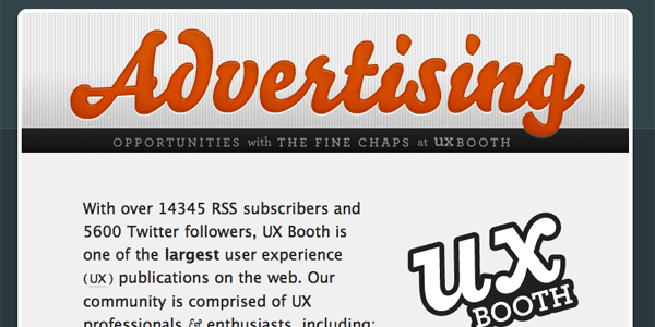
In lieu of a dedicated sales team, UX Booth gives advertisers a sponsorship page as well as a single point of contact on staff.
Anyone interested in advertising on your website will thus need a way to get in touch with you. While you might have a general contact form, does that page contain details about your advertising opportunities? If not, consider making the process easier for interested companies by creating a dedicated page. This is the solution we ended up going with.
If creating an “Advertise with us” page sounds like too much work, consider using a service like BuySellAds.com. BuySellAds.com does something equally effective, putting your website in an advertising database. Advertisers that are interested in buying a spot can quickly compare their options across various websites and make an informed choice in just a few clicks.
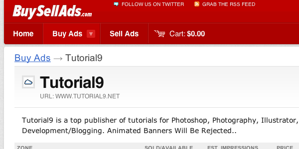
Using BuySellAds.com is a great way to kickstart your blog’s advertising presence.
When a company expresses interest in advertising in your publication, give them a single point of contact with your organization. When it’s time to renew, include a kind note thanking them for their support and asking whether you can adjust anything to improve their stay on your website. A mutually beneficial relationship will emerge over time. Remember that, like readers, advertisers are people, too.
Readers
Because advertising is such a touchy subject for readers, listen to their feedback. If something’s not working and you’re listening closely enough, you’ll know it.
When the UX Booth launched, we attracted advertisers that were used to targeting visual designers. (Note that UX design is commonly mistaken for UI design.) Although this worked well for the first few months, we eventually surmised that readers weren’t engaged with our advertisers’ products. The discussions in our comments section, Twitter stream and Facebook fan page weren’t about PSD-to-HTML services or CSS galleries, so why would we advertise products related to them?
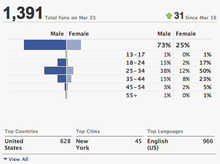
Facebook allows publishers to look at their reader demographics.
If possible, check your Facebook fan page for demographic information. If all else fails, just ask your readers directly. Facebook has seen marked success with its own advertising network because of the context it derives from the profiles and explicit preferences of users. Google, too: it targets advertisements in Gmail based on the contents of email messages.
Okay Then, How?
Once you understand your reasons for advertising and have a basic grasp of the users in your niche, how do you marry the two? Well, with design, of course. But doing this is far from straightforward. Essentially, we’re designing for opposing goals: advertisers want users to give more conscious attention to their products and services, while usability-minded interaction designers want them to give less. (Steve Krug’s popular book is called Don’t Make Me Think for a reason.) Thankfully, UX luminary Karen McGrane spells out all of the idiosyncrasies of this space in her (aptly titled) presentation “Designing For, With and Around Advertising.”
Delivery
As mentioned, the online advertising space is littered with faux pas. What kind? Consider the following behavior:
- Pop-up ads,
- Pop-under ads,
- Overly-busy animated ads,
- Ads with unsolicited sound.
All of these kinds of advertising have a bad reputation for a reason: they distract readers from what they intended to do. Consider carefully whether the reward of displaying these kinds of ads is worth the negative impact it could have on the user experience.
If you do allow animated attention–seeking creatives, then set clear boundaries. Give advertisers a media kit that ensures that everyone agrees on what kinds of advertisements are acceptable and what kinds are not. For example, for ads that hover over the page, what are the requirements on how long they can appear and how users can close them?
The state of online ad delivery methods leaves much to be desired. The only universally well-received options are static text-based ads and static banner advertisements. Banner ads are good because they’re usually discrete, but they’re also bad because readers usually ignore them. This well-documented phenomenon is known as banner blindness. Web usability professional Jakob Neilsen confirms that “Users almost never look at anything that looks like an advertisement.”
So with “loud” advertising out, and banner blindness being so prevalent, how can we make this work? Perhaps not the way you would expect. Simply placing more ads around your website won’t solve it, as Paul Scrivens recently reminded us. We’ve got to try something new.
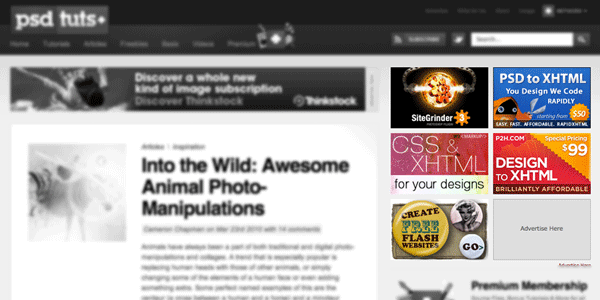
While sidebar banners are the most popular form of advertisement, they’re arguably the least noticed.
Engagement: A Sliver Of Hope
To bring readers back into the conversation, we have to figure out two things: what they interact with and why they do it. The answer to the first question is pretty obvious for a blog with a steady readership: readers interact with the articles; they read them. So, what does this mean for advertising? Should blogs “publish” ads, too? Perhaps. Consider the unique approach taken with the location-based game Gowalla.
And Now for Something Completely Different…
Gowalla is a game that allows players to “check in” at various locations. Checking in is an abstract concept that involves “stamping” your passport and adding an item to your “backpack.” Most items collected in Gowalla are useless: teddy bears, lattes, tour buses. Recently, though, Gowalla added a unique kind of item to the system. Thanks to a partnership with Apple and Apple-accessory manufacturer InCase, players can now pick up special Incase items (and coupons) when they check into an Apple Store location. Checking in becomes much more valuable and exciting in an Apple Store because players might win something. The net effect? Because of the clever delivery mechanism, what might otherwise be seen as blatant advertising becomes a fun, engaging game element.
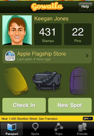
Gowalla introduced in–game advertising in a unique way.
We learn from Gowalla’s approach to advertising that, rather than deliver ad content in a boring, predictable format, everyone wins when the solution is altogether unique. Am I suggesting that each website implement a unique system for delivering ads? Of course not. Custom solutions like Gowalla’s require far more infrastructure and development time than many publications can afford. What I am suggesting is that by taking a slightly different approach to advertising, we can change our audience’s perception (and reception) of advertising entirely.
At UX Booth, for example, instead of displaying a banner ad for a relatively unknown product, we might choose to introduce that product to our readers by way of a blog article. If we think it’s of sufficient interest, we’ll conduct an interview with a potential sponsor to find out how they develop their user experience (which is the subject of our blog). Because these kinds of articles are what UX Booth is all about, everyone wins. Participants view these discussions as being inherently valuable precisely because of their participation. Rein Henrichs echos this sentiment in his article “Conversation Is King.”
Attaining Advertising Nirvana
Now that we’ve covered some of the nuances of advertising, what’s the best way to proceed? Unfortunately for you, after an article as long as this one, I hate to say that “it depends.” The best advertising model for any website is always the one that balances the team’s business objectives with the objectives of advertisers and of readers. In the case of UX Booth, we like to think that we know our audience pretty well, but we’re certainly aware that none of our solutions are perfect. But what I want to know is, how could they be? What would you do in our position?
I’m aware, for example, that inviting would-be advertisers to write blog posts is an extraordinarily fine line to walk; but it’s a path I’m willing to explore. A publication’s credibility comes down to the discretion of its editors. This is my decision to make. It’s up to readers, then, to decide whether or not my decision is a correct one, providing content that they enjoy. Do posts on UX Booth written by product owners come off as information pieces or infomercials? I can’t say. Obviously, I prefer the former to the latter, but the decision isn’t made in a vacuum — I must balance my desire to provide relevant content with my ability to justify (to myself and others) the time we spend maintaining site.
A publisher’s job is to match readers to content they will enjoy (or to interactions they will enjoy, in GoWalla’s case). Our community is capable of caring about content, which is why they show up in the first place. What we need to do is show them why they should care about related content. But wait! Doesn’t introducing people to things they might enjoy sound like marketing? Well, yes… Yes it does.
In this new open-source/cluetrain world, I am a marketer. And so are you. If you’re interested in creating passionate users, or keeping your job, or breathing life into a start-up, or getting others to contribute to your open-source project, or getting your significant other to agree to the vacation you want to go on… congratulations. You’re in marketing. Now go kill yourself.
Even if, upon reflection, we realize that we’re doing the work of marketers, one thing is apparent: the digital advertising industry is mature enough for newcomers to quickly suss out its worst practices… which isn’t a good thing either. The question going forward is, what’s the best way to make marketing more or less invisible? — more like those movie previews we talked about. We need advertising that doesn’t frustrate us. Figure that out, and you’re well on your way to helping us all attain advertising nirvana.
Further Reading
- Why UX Is Really Just Good Marketing
- You ARE a Marketer. Deal With It.
- Karen McGrane’s Designing For, With, and Around Advertising
- The Rise of Conversation Media
- Don’t Let Ads Kill Your Site
- Content Is Not Free
- Content Wants to Be Paid for


 Agent Ready is the new Headless
 SurveyJS: White-Label Survey Solution for Your JS App


