Web Design Trends 2010: Real-Life Metaphors and CSS3 Adaptation
In our earlier article about Web design trends for 2010 we covered the strong influence of print design techniques, keypress navigation, horizontal layouts, rich typography and aesthetically pleasing designs. Web design today is developing rapidly, breaking the limitations of conventional approaches and exploring the possibilites of upcoming technologies. Designers are not only experimenting with new techniques and design approaches, but they are improving the quality of their designs in both technical and conceptual respects.
Modern websites have great strengths, such as flexibility, cross-browser compatibility and personalization, but they are also becoming increasingly simple and intuitive. This is being done through the application of subtle usability enhancements, drawn either from the Web itself or from offline interactive systems. The Web today is increasingly complex, while usage of the Web is becoming increasingly simple.
You may want to take a look at related articles:
- Symptoms Of An Epidemic: Web Design Trends
- Be Careful: Trends Come And Go
- The State Of Responsive Web Design
In this article, we’ll explore some new design approaches and techniques that you may want to develop for your own projects. We’ll present rather unusual or unconventional design approaches and try to understand what’s actually interesting about them and how we can apply them to modern Web design. More specifically, we will discuss the following: real-life metaphors that are applied to the Web, hidden complexity, subtle interactivity, context-sensitive navigation and rapid CSS3 adaptation.
1. Real-Life Metaphors And Hidden Complexity
Probably one of the most striking features of modern Web applications and services is that they provide rich user experiences. User interaction in such systems is becoming very straightforward and intuitive, even “native.” But this sense of intuition does not just come from the application of traditional principles of good visual design or better information architectures. We have observed more Web designs in which design elements either imitate real-life metaphors or hide the complexity of choice by letting users make more limited and simpler decisions.
Buttons are good example of the first development. In Web design today, buttons look and interact with users just like buttons in the real world. Buttons often look very realistic. They stand out, have vibrant colors and are very responsive: when the user hovers over or clicks on a button, they are often given visual feedback. If you compare these buttons with ATM buttons (in terms of shape, color and responsiveness), you will find some striking similarities.
Affordance is a key quality of native design elements. It refers to the aspect of an object or environment that allows a user to perform some action. As Donald Norman states in his book “The Design of Everyday Things,” affordances provide strong clues to the operation of things. When affordances are taken advantage of, the user knows what to do just by looking: no picture, label or instruction required. The more familiar a design element looks on the page, the easier it is for the user to associate some concrete practical application or task with it.
This approach doesn’t relate only to call-to-action buttons: as you will see below, it’s about using appropriate metaphors to convey the meaning and purpose of certain design elements in general. Obviously, this approach reduces the complexity of user interaction. Another way to achieve this is by minimizing the appearance of elements or, to be more precise, giving them a different context or just decreasing their visual weight on the page.
More and more websites are getting rid of outdated, awkward, unusable interfaces with steep learning curves. Look out for intuitive, native metaphors. For example, sliders will sometimes work better than regular selector fields (like to show budgets and time frames); toggle on-off knobs may fit better than check boxes; and complexity can be hidden to simplify user interaction. Modern Web applications are attractive, intuitive and straightforward.
Real-Life Metaphors
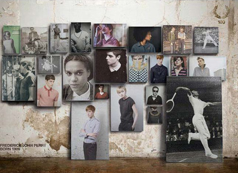
Fred Perry Fred Perry’s e-commerce store has a contemporary and elegant look, conveying key features of the brand very well. Every style is presented as a poster on the wall, not like in common stores, but the atmosphere is quite familiar to the users. An unconventional yet interesting application of a real-life metaphor to an e-commerce website.
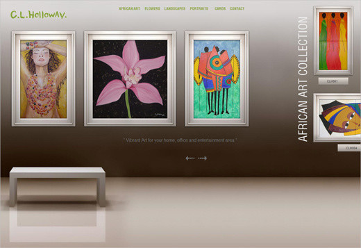
C. L. Holloway A similar approach by Candice Holloway. She places her artwork on a “wall”; horizontal navigation is used as a metaphor for strolling through an art gallery.
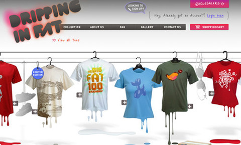
Dripping in Fat This t-shirt store uses the real-life metaphor of clothes on hangars. That’s a nice idea if you don’t have too many items in your store, but difficult if you have hundreds of products.
Gowalla Instead of showing a long list of features in the application or explaining how it works in a video, Gowalla displays an illustration that uses real-life scenarios to explain what the application does. The user gets the idea within a few seconds. The illustrations may not be perfect and may look a bit inconsistent, but they serve the point. For the full view of the illustration, click on the image below.

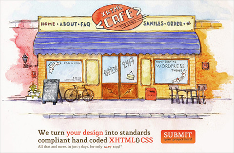
XHTML Cafe XHTML Cafe does not bore its visitors with lifeless promo content blocks: instead, it adapts a nice real-life metaphor to its profile. Attractive and memorable.
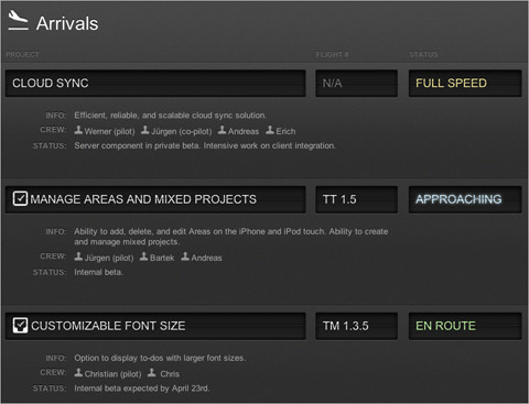
CulturedCode: Status The developers of the Culture Code list their current tasks as Flight Arrivals on their status page. Each item in the list has a description, assigned members and status. The design resembles those classic flight tables one often sees in airports. An interesting way to use a real-life metaphor for a Web design. It wouldn’t work in every context, but it fits well here.
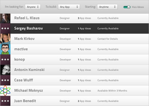
Builditwith.me While this website may look a bit ordinary at first, what is interesting is the toggle switch in the upper-right area. Basically, it is a check box that allows users to select whether the person they are looking for should already have a good idea. But instead of using a traditional check box, the designers decided on a toggle on-off knob. While this may be a good idea in general, it’s not clear if this particular implementation works. It might actually irritate users who assume it is a slider. The interaction experience is different than what you get with a slider, and rather resembles a switch.
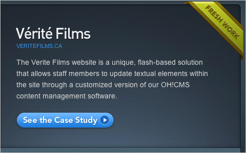
Oh! Media One of the many examples of an attractive, prominent, shiny and clickable button. The small icon to the right of the button is a very subtle metaphor for action or progress; hardly noticeable, but it works. Simple yet eye-catching.
Apple iPhone’s user interface has a simple on-off switch for its preferences. This metaphor is similar to many real-life objects whose buttons and settings are turned on and off with a simple switch. Straightforward.

Hidden Complexity
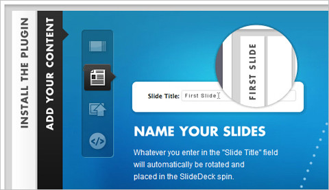
SlideDeck Slideshows are by nature a nice way to hide complexity because they reorganize multiple information points in a compact interactive area. SlideDeck is a good example of a design solution that integrates both horizontal and vertical sliding navigation into one element. The layout is clean and provides a good overview of available features.
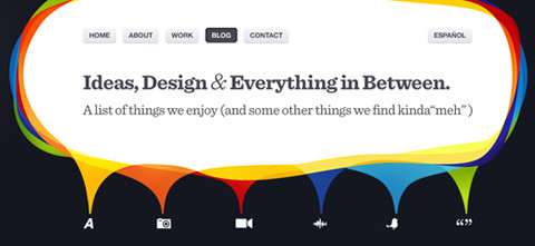
Nosotros Nosotros has an interesting and unconventional navigational approach. It very cleverly minimizes complexity by reducing navigation to only meaningful icons. The blog page has six icons that serve as the navigation options for the blog. Once the user clicks on an icon to select that category, the icons for the other categories fade away. It would be interesting to see whether this approach would work on a larger scale. Calicott takes a similar approach, albeit with a different design.
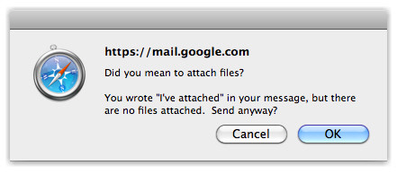
Gmail Paying close attention to the little things can make for a more intuitive and native user experience. If you are writing an email in Google’s mail service and mention that you are attaching a file to your message but forget to attach it, the system points that out to you with a friendly warning message. This is a great example of an application having the user’s best interest at heart; the difference between a good and great Web application. If you would permit a slight exaggeration, you could compare this to a customer walking into a postal office with a package, and after a short distraction the friendly worker reminds the customer to send the package off.
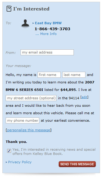
KBB KBB, a resource for finding and selling new and used cars, provides retail owners with an original pre-written email template. If the user is interested, they can just type their first and last name, street address and phone number and send the email in one click. Of course, the message can be customized. It’s a good example of a Web application that carefully takes care of tedious tasks by providing users with a simple one-click solution.
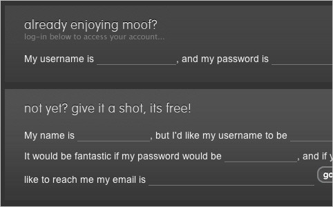
Moof Moof takes a similar approach with its contact form. It’s not clear whether its approach increases or decreases conversion rates; it would be interesting to conduct a usability test on it.
Livestream Many Web applications have a variety of pricing plans and features, as does Livestream. This design, though, clearly communicates which plan would suit a particular category of users best. Notice the help tooltip accompanying the “Streaming” feature and the red ribbons at the bottom of the table. The yellow buttons are responsive, too, providing visual feedback. A simple, attractive design.
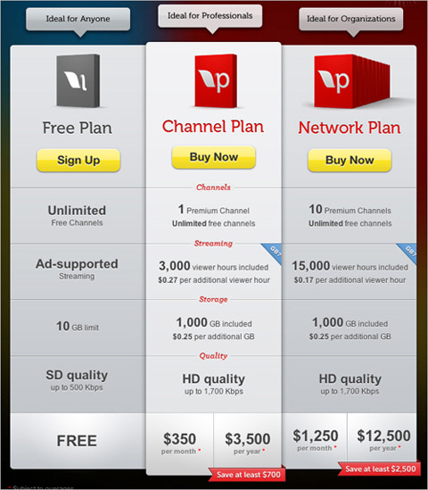
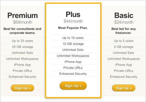
Notable App: Pricing Table Highlighting the most popular plan is a good idea, because it helps users make a decision without having to inspect the whole table. This is a good example of using the metaphor of social validation: when users are in a social situation, they will look to others to see how to behave. It’s not a conscious process, but it helps us to come to grips with difficult decisions.
Mailchimp Why display dozens of plans with dozens of features and not let the user make their decision simply based on the most important feature of the application? Mailchimp allows its users to pick a monthly plan just by selecting the number of their subscribers. All other pricing plans are available, too, but the complexity is hidden for most users behind the small “View All Pricing Plans” link. This was probably an unavoidable move because Mailchimp has literally dozens of pricing plans with a variety of combinations: displaying them all at once would make the choice too difficult and cause decision paralysis for some users.
Single Log-In and Sign-Up A straightforward solution for reducing complexity is to combine multiple related features into one single feature. For instance, instead of having two separate links and pages for logging in and signing up, you could offer users a single “Log in or sign up” button that serves both purposes. The form would update via JavaScript after the user has selected a radio button. For this log-in form, notice that the “Submit” button says “Log in,” and there is a link to retrieve lost passwords. For the sign-up form, the label for the password field prompts users to “Choose a password” and “Sign up” and to accept the terms of service.
An alternative method would be to provide two input fields, labelled “Email” and “Password,” and then put a “Don’t have an account yet? Sign up!” link next to it. Both approaches would work fine for new and returning visitors.
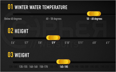
Quiksilver Quiksilver asks its wetsuit customers to provide information on their weight, height, style and features first. Instead of displaying dozens of available options, it filters the search for users, displaying only those items that are currently available and fit the user’s profile. A good example of hiding unnecessary information and focusing on the important stuff.
2. Subtle Interactivity
Although the opposite is often asserted, we believe that Flash has its place in the modern Web design. Today, we observe a clear separation of concerns between HTML/CSS websites and Flash websites. While HTML/CSS has become the de facto standard for text-based websites, focusing on information consumption, Flash is dominating entertainment and multimedia websites with its extensive visual and audio effects and rich user interaction.
But that doesn’t mean that HTML/CSS websites are restricted to plain, unsophisticated user interaction. In fact, the opposite seems to be true. We’re seeing more HTML/CSS websites getting interactive, playful and engaging. More animation is being used for visual feedback (for example, on mouse hovers and clicks), and visual effects are being used for a more responsive user experience. Of course, these effects rely on JavaScript libraries, which fuel the interactive layer in the background.
Still, designers of CSS-based websites tend to avoid extreme interactivity and instead use subtle, refined effects sparingly. Their designs use interactivity to support user interaction and shirk overwhelming users with striking 3D-effects and inconvenient navigation structures.
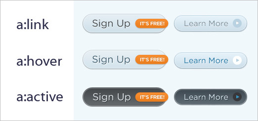
CoTweet CoTweet has a good example of clean, attractive and responsive buttons. While the hover effect is subtle, clicking on the button is striking. Notice the difference in size and text color of the “Sign up” and “Learn more” buttons. Also notice the eye-catching ribbon on the “Sign Up” form, which stands out but isn’t obtrusive. It may be a very subtle change, but adding small icons to the call-to-action button can be very helpful: for instance, think of adding a lock icon (metaphor for security) to communicate that the log in is secure.
WeightShift WeightShift takes an interesting design approach by showcasing its navigation options in a more interactive way. Recent work is displayed in a prominent information box in the center of the layout, with the background having a relevant image. When the user navigates from one item to another, the background changes, too. Notice that the information box is semi-transparent; a nice design technique.
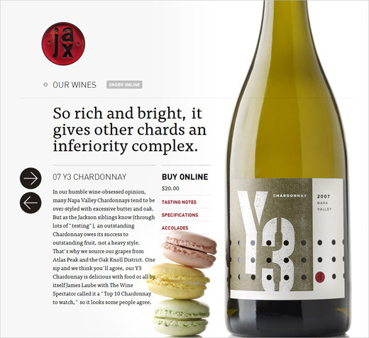
Jax Vineyards We showcased this website in part 1, but it perfectly illustrates the point of this section, too. This wine store website has an interesting and unique horizontal navigation, which is triggered when you start browsing the wine catalogue. Both the background image and description of the wine slide horizontally. Simple CSS and JavaScript are used. A beautiful and impressive design.
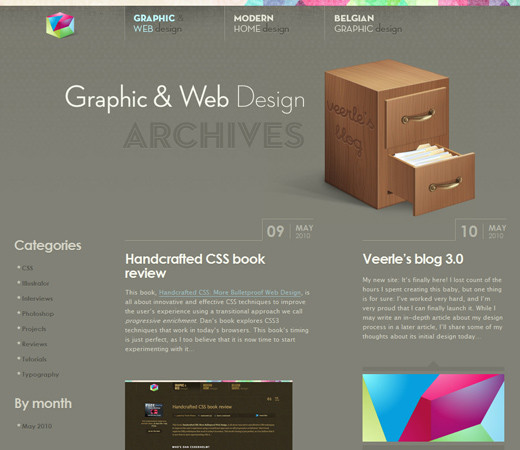
Veerle Pieters Veerle’s recent redesign is very sexy. Links, content blocks and illustrations subtly react to mouse hovers in different ways: varying the transparency, animation, highlighting the link, changing the background image, fading to another color, displaying comments or modifying the navigation. The design is very inviting, engaging and responsive. Veerle’s design also uses keyboard navigation, another common development in the Web design industry that we talked about in part 1. Hands down, a beautiful first-class design.
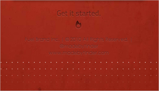
Fuel Brand Inc. The official page of Fuel Brand Inc. has a variety of nifty animations: images increase in size on hover, background images change, slideshows are used for navigation, and interactive tooltips and other effects are apparent. Interactivity seems to be popular with official company websites, too.
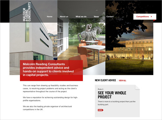
Malcolm Reading Consultants Another interesting design technique for subtle interactivity: the three images displayed at the top automatically slide vertically, updating the background images for the horizontal navigation at the top, too. No Flash is used here.
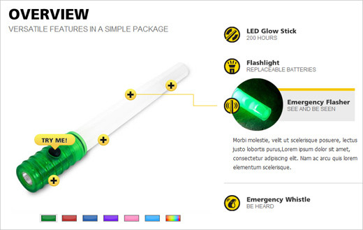
LifeGear Mockup A mock-up for an interactive product page. Many e-commerce pages are being given more interactive product presentations, too; for example, 360-degree views or interactive instructions such as this one.
Carsonified: 100 Things Carsonified integrates a subtle color transition and fade in-out effect to quickly display information about the speakers at this conference.

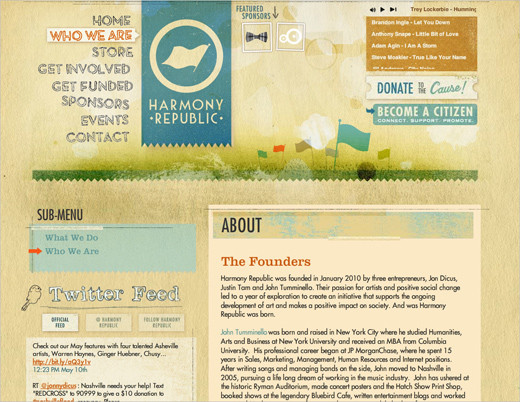
Harmony Republic Here we have interactive hover effects and rich typography, but also clumsy text management and long loading time because of the Flash nature of the website. This site could just as easily have been designed with pure JavaScript, allowing for better copying and pasting of text, flexible font sizing and native mouse interaction (i.e. changing from the pointer to hand-on-link hovering). Sorry, but Flash doesn’t belong here. It rather belongs here, for example.
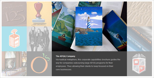
arc 90: Meet the Team Yet another example of an “About” page with interactive design elements. Photos are replaced on hover: but visitors can also easily filter members of the team by their occupation. Images filtered out fade to grayscale.

S P D Another nice subtle hover effect. On this portfolio page, each item fills one cell. The header has 18 cells in all. When the user hovers over one, it expands to fill the area of the six adjacent cells, showing additional information about the selected item. No Flash in use here. And again, the subtle interaction is rather helpful.
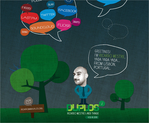
Duplos One can take interactivity a bit further, too. In Ricardo Mestre’s portfolio, the design elements slowly float across the page. Can you spot the dangerous Twitter-birdie monster? And of course, no Flash is used here.
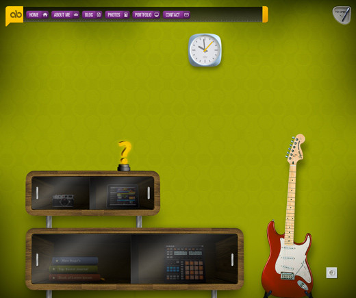
Alex Buga Alex’s design goes to extremes. The website is built with CSS and JavaScript, but it could just as well have been designed with Flash. Nearly all design elements have some sort of animation. Most designers do not go to such extremes to provide interactivity. A very interesting and masterfully executed idea, though. (Going even farther, sometimes even logos are animated with jQuery.)
3. Context-Sensitive Navigation
Context-sensitive navigation is essentially navigation (often additional to the primary navigation) that depends on the context of the user on the page (for example, what they’re doing). Its biggest advantage is that it can remove distractions and controls that are irrelevant to the user’s current context. Context-sensitive navigation displays options only when the user actually needs them. Obviously, this paradigm would be particularly useful to user interface designers: it can help de-clutter interfaces and focus the user’s attention on the task they are performing.
This approach has been used in Web development for years now, but from our observations, it is appearing on more websites and Web applications today. Vimeo is a classic example of context-sensitive navigation: playback controls fade away once the video starts playing and appear again on demand (i.e. when the user hovers over the video area).
When implementing context-sensitive navigation, make sure the navigation is actually available when users need it. Keep in mind various settings and user scenarios, and test it in worst-case scenarios. For video playback controls, users of touch interfaces (e.g. iPhone or iPad users) will not be able to toggle the navigation because the hover effect won’t be available. In this case, you may want to consider touch gestures instead.
Vimeo Vimeo, a video-sharing platform, displays playback controls until the user starts watching a video. Once the video is playing, the controls fade away and appear again only when the user hovers over the video. A classic example of context-sensitive navigation. Such navigation is being used increasingly on other playback websites, too — for example, Blip.fm.
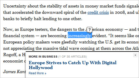
New York Times The New York Times cleverly displays related and featured stories in its articles. Rather than promoting them in the actual content of articles, the designers have moved them to an appropriate context: a block slides in from the bottom-right corner when the user reaches the end of the article: convenient and helpful. Usability studies will determine whether users find this behavior annoying in the long run. Also, notice that whenever you click on a word in an article (except for links), a “?” tooltip appears allowing you to look up the selected word. This service makes much more sense presented in this context than if it was hidden in the navigation menu at the top or in the sidebar. Context-sensitive navigation at its best.
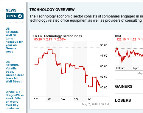
Reuters Drop-down navigation is another common place for context-sensitive navigation. Reuters’ drop-down-navigation is fairly advanced. It doesn’t just provide access to navigation options, but also displays useful information, such as current stocks and hot topics, which are revealed immediately. Also notice the “Open” button in the right sidebar (not displayed in the screenshots below). When it is clicked, a detailed information box (initially hidden but instantly available on demand) overlays the current page and displays the relevant information (see the second screenshot below). Reuters also allows users to follow their favorite topics and save article for later reading. Personalization is indeed coming to the Web.
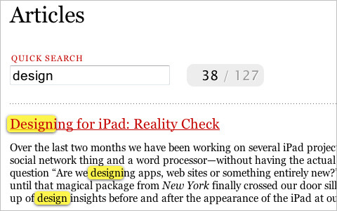
Information Architects Information Architects has an interactive and helpful search function. As the user types a keyword, the system searches and displays the results, highlighting the keyword in the excerpts of the articles. Instead of displaying a selection of keywords in the drop-down menu the way websites such as Google (or, for instance, GetSatisfaction) do, this website gives users the results instantly. A nice shortcut that saves time. By the way, the search box doesn’t simply appear indiscriminately with all of the other links; it is displayed on the “Articles” pages for when users browse the archive and search for recent or specific articles.
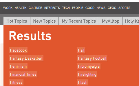
AllTop Instead of displaying dozens of categories by default, Alltop displays them on demand, when a letter in the upper-right corner is triggered. Another example of hiding secondary information in a convenient, user-friendly way.
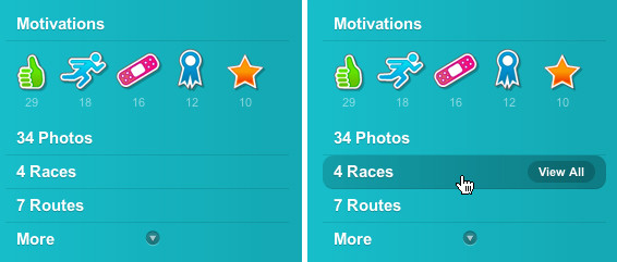
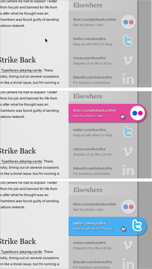
DailyMile DailyMile has a clean and attractive user interface. The major navigation options are displayed in the left sidebar. When the user hovers over one, a hint is displayed, explaining the link. In other Web applications, it may be useful to underline the navigation options and display the secondary options on hover. Also notice the “More” switch at the bottom of the sidebar, offering secondary navigation options; it is available only if the user is actively searching for those options, but is hidden otherwise.
The Black Harbor By default, the images section here doesn’t display any content other than the actual image. But when the user hovers over the image, the title, description and number of comments appear. Notice the “Share” balloon in the upper-right corner? On hover (and only on hover), it slides in links to Twitter, Facebook, Digg and StumbleUpon. All of this information is displayed when the mouse hovers over the specific area (in the specific context), and it fades away automatically when the mouse moves away.
Further Reading and Resources
Seeing how context-sensitive navigation changes in the coming months and years will be very interesting. We can expect cleaner and less cluttered interfaces, where elements appear on demand, depending on the intention and behavior of the user. Clever navigation and task bars and user-centric Web applications will focus more on the actual input of users.
- CSS Hover Controls on the iPhone The iPhone has a touch screen, so you can’t really hover over anything, but the technique covered here still works. Instead of hovering, the user has to click on an area for the controls to show up. This area has to be a link, either inline or block (a block link works better because you can make the clickable area larger).
- Touch Gesture Reference Guide This guide contains a unique set of resources for software designers and developers working with touch-based user interfaces.
4. Rapid CSS3 Adaptation
With improving support of CSS3 features in major modern browsers, the design community seems very excited about the new advancements and possibilities. Everyone seems to be experimenting with CSS3; whether on RGBa transparency, advanced CSS3 selectors, CSS3 transforms or other attributes. The result is truly remarkable: we’re seeing many designs that are more beautiful, advanced, versatile and robust than before, with fewer nasty browser hacks.
The most popular CSS3 features so far seem to be border-radius, animations, multiple backgrounds and box-shadow. This is understandable because these can easily be used to replace quirky earlier solutions that required workarounds and third-party tools to perform the task. Also, @font-face is rapidly gaining popularity, but keep in mind that it is not a CSS3 feature because it was proposed for CSS2 and was luckily implemented in early versions of Internet Explorer (and in other browsers later — FF 3.5+, Safari 3.2+, Chrome 4.0+, Opera 10.1+). This is why it’s actually safe to use @font-face in your designs today.
The bad news with CSS3 is that in order for the features to be easily applied to all major browsers, we will have to wait for Internet Explorer 8 to expire. And it remains to be seen how well the actual Internet Explorer 9 will support the new standard (you can look up the CSS support in Internet Explorer 9 on the page Internet Explorer 9: Testdrive). The most popular browsers today (i.e. the family of Internet Explorer versions) support only the CSS3 box-sizing attribute. Internet Explorer 7⁄8 have broad support for CSS3 attribute selectors ([att$=val], [att^=val], etc.), combinators (E~F), but no support for CSS3 pseudo-classes (:nth-child(), :last-child, etc.). Internet Explorer 9 (which will be released in late 2010 at the earliest) will support at least CSS3 media queries, CSS3 colors (HSL, HSLa, RGBa), CSS3 selectors and border-radius. In the meantime, we will have to use CSS3 for modern browsers and integrate workarounds for IE, and there are plenty of them.
Things that seemed impossible a year ago are being implemented with pure CSS3, fueled by the creative minds of the design community. We may have entered a fertile new era of Web design, when crucial CSS techniques are being born, similar to the 2003 to 2005 period when CSS Sprites and CSS Sliding Doors were developed. In fact, we have a couple of exciting creative years to look forward to.
SxSW Beercamp
For the design of SxSW Beercamp, the creators made some rather bold decisions. For each letter at the top of the page, they used the text-shadow property 49 times. Also, various animations and transformations were applied, as were box-shadow and HSLA. By the way, did you notice the sunrise at the top? Well, the designers use 20 <hr>-tags to achieve this effect.

Tapbots
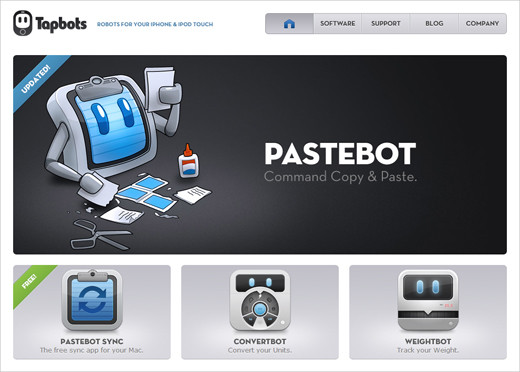
CSS3 features work best when applied subtly, with fine details added to a clean, simple and meaningful design. Tapbots uses CSS3 for rounded corners, hover animations and some transparency effects, which are difficult to find at the first glance. This is a good example of CSS3 features being properly applied: no bold headlines with text-shadow, no exaggerated gradients, no excessive animation — just solid, good design.
full frontal 2009
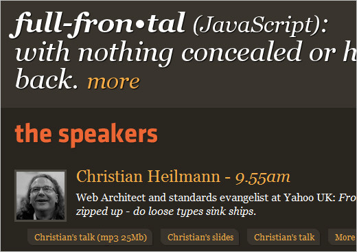
The text-shadow property seems to be particularly effective when a light text shadow is used against a dark background. Here is another simple example of a dark text shadow (a bit darker than the background) used on white headlines. Also, the page uses border-radius and box-shadow for the quick links listed under the description of each speaker.
going steady with stacey
But sometimes applying a dark text-shadow against a light background works well, too. But in such cases you may want to add a “stronger” text shadow.

GigaOM Giga OM users RGBa transparency for its feature blocks.
CSS3 Drop Down Menu
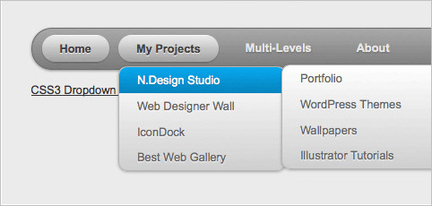
A more practical approach to CSS3 features, using border-radius, box-shadow, gradients and text-shadow on a multi-level drop-down menu to good effect. No images used here.
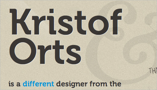
Kristof Orts
Kristof Orts uses the text-shadow property to add depth to his headlines. The embossing effect is clean and sharp and helps the typography stand out.
Canny Bill
Andy Clarke’s design of responsive pricing columns and buttons. He uses box-shadow, -webkit-gradient for the gradients, RGBa for opacity, border-radius for the rounded corners, and Webkit animation for the hover effects

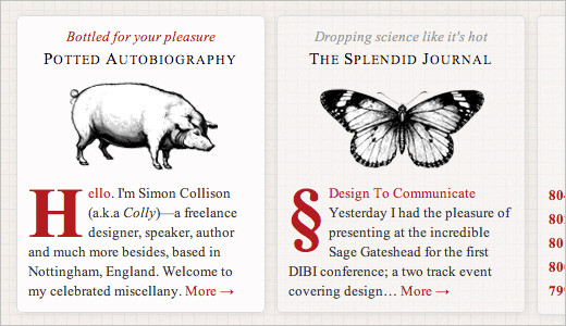
Colly.com
Simon Collison uses the box-shadow property to give greater depth to the columns in his layout.
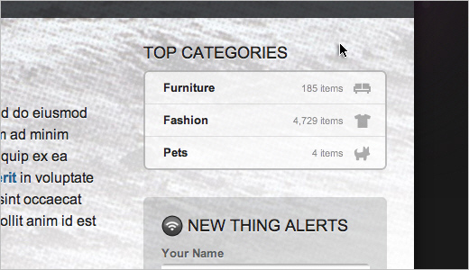
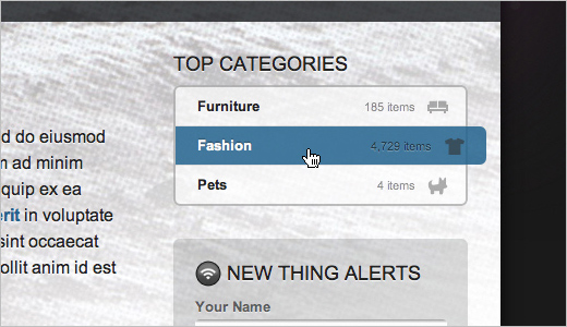
CSS3 Experiments: Moon Dan Cederholm has prepared a nice CSS3 demo to illustrate some of the new features designers can use in their designs today. In particular, notice subtle animations in the sidebar. CSS-transitions and CSS-animations in use. The design provides users with nice visual rewards, creating a more responsive and engaging interaction.
Faruk Ateş
Faruk Ateş’ blog is a practical example of using CSS3 animations and transitions for a nice hover-effect. Notice the effective use of text-shadow on a vibrant blue background.

Carsonified: 100 Things Carsonified integrates a subtle color transition and fade in-out effect to quickly display information about the speakers at this conference.

Harmony Republic Here we have interactive hover effects and rich typography, but also clumsy text management and long loading time because of the Flash nature of the website. This site could just as easily have been designed with pure JavaScript, allowing for better copying and pasting of text, flexible font sizing and native mouse interaction (i.e. changing from the pointer to hand-on-link hovering). Sorry, but Flash doesn’t belong here. It rather belongs here, for example.
arc 90: Meet the Team Yet another example of an “About” page with interactive design elements. Photos are replaced on hover: but visitors can also easily filter members of the team by their occupation. Images filtered out fade to grayscale.

S P D Another nice subtle hover effect. On this portfolio page, each item fills one cell. The header has 18 cells in all. When the user hovers over one, it expands to fill the area of the six adjacent cells, showing additional information about the selected item. No Flash in use here. And again, the subtle interaction is rather helpful.
Duplos One can take interactivity a bit further, too. In Ricardo Mestre’s portfolio, the design elements slowly float across the page. Can you spot the dangerous Twitter-birdie monster? And of course, no Flash is used here.
Alex Buga Alex’s design goes to extremes. The website is built with CSS and JavaScript, but it could just as well have been designed with Flash. Nearly all design elements have some sort of animation. Most designers do not go to such extremes to provide interactivity. A very interesting and masterfully executed idea, though. (Going even farther, sometimes even logos are animated with jQuery.)
3. Context-Sensitive Navigation
Context-sensitive navigation is essentially navigation (often additional to the primary navigation) that depends on the context of the user on the page (for example, what they’re doing). Its biggest advantage is that it can remove distractions and controls that are irrelevant to the user’s current context. Context-sensitive navigation displays options only when the user actually needs them. Obviously, this paradigm would be particularly useful to user interface designers: it can help de-clutter interfaces and focus the user’s attention on the task they are performing.
This approach has been used in Web development for years now, but from our observations, it is appearing on more websites and Web applications today. Vimeo is a classic example of context-sensitive navigation: playback controls fade away once the video starts playing and appear again on demand (i.e. when the user hovers over the video area).
When implementing context-sensitive navigation, make sure the navigation is actually available when users need it. Keep in mind various settings and user scenarios, and test it in worst-case scenarios. For video playback controls, users of touch interfaces (e.g. iPhone or iPad users) will not be able to toggle the navigation because the hover effect won’t be available. In this case, you may want to consider touch gestures instead.
Vimeo Vimeo, a video-sharing platform, displays playback controls until the user starts watching a video. Once the video is playing, the controls fade away and appear again only when the user hovers over the video. A classic example of context-sensitive navigation. Such navigation is being used increasingly on other playback websites, too — for example, Blip.fm.
New York Times The New York Times cleverly displays related and featured stories in its articles. Rather than promoting them in the actual content of articles, the designers have moved them to an appropriate context: a block slides in from the bottom-right corner when the user reaches the end of the article: convenient and helpful. Usability studies will determine whether users find this behavior annoying in the long run. Also, notice that whenever you click on a word in an article (except for links), a “?” tooltip appears allowing you to look up the selected word. This service makes much more sense presented in this context than if it was hidden in the navigation menu at the top or in the sidebar. Context-sensitive navigation at its best.
Reuters Drop-down navigation is another common place for context-sensitive navigation. Reuters’ drop-down-navigation is fairly advanced. It doesn’t just provide access to navigation options, but also displays useful information, such as current stocks and hot topics, which are revealed immediately. Also notice the “Open” button in the right sidebar (not displayed in the screenshots below). When it is clicked, a detailed information box (initially hidden but instantly available on demand) overlays the current page and displays the relevant information (see the second screenshot below). Reuters also allows users to follow their favorite topics and save article for later reading. Personalization is indeed coming to the Web.
Information Architects Information Architects has an interactive and helpful search function. As the user types a keyword, the system searches and displays the results, highlighting the keyword in the excerpts of the articles. Instead of displaying a selection of keywords in the drop-down menu the way websites such as Google (or, for instance, GetSatisfaction) do, this website gives users the results instantly. A nice shortcut that saves time. By the way, the search box doesn’t simply appear indiscriminately with all of the other links; it is displayed on the “Articles” pages for when users browse the archive and search for recent or specific articles.
AllTop Instead of displaying dozens of categories by default, Alltop displays them on demand, when a letter in the upper-right corner is triggered. Another example of hiding secondary information in a convenient, user-friendly way.
DailyMile DailyMile has a clean and attractive user interface. The major navigation options are displayed in the left sidebar. When the user hovers over one, a hint is displayed, explaining the link. In other Web applications, it may be useful to underline the navigation options and display the secondary options on hover. Also notice the “More” switch at the bottom of the sidebar, offering secondary navigation options; it is available only if the user is actively searching for those options, but is hidden otherwise.
The Black Harbor By default, the images section here doesn’t display any content other than the actual image. But when the user hovers over the image, the title, description and number of comments appear. Notice the “Share” balloon in the upper-right corner? On hover (and only on hover), it slides in links to Twitter, Facebook, Digg and StumbleUpon. All of this information is displayed when the mouse hovers over the specific area (in the specific context), and it fades away automatically when the mouse moves away.
Further Reading and Resources
Seeing how context-sensitive navigation changes in the coming months and years will be very interesting. We can expect cleaner and less cluttered interfaces, where elements appear on demand, depending on the intention and behavior of the user. Clever navigation and task bars and user-centric Web applications will focus more on the actual input of users.
- CSS Hover Controls on the iPhone The iPhone has a touch screen, so you can’t really hover over anything, but the technique covered here still works. Instead of hovering, the user has to click on an area for the controls to show up. This area has to be a link, either inline or block (a block link works better because you can make the clickable area larger).
- Touch Gesture Reference Guide This guide contains a unique set of resources for software designers and developers working with touch-based user interfaces.
4. Rapid CSS3 Adaptation
With improving support of CSS3 features in major modern browsers, the design community seems very excited about the new advancements and possibilities. Everyone seems to be experimenting with CSS3; whether on RGBa transparency, advanced CSS3 selectors, CSS3 transforms or other attributes. The result is truly remarkable: we’re seeing many designs that are more beautiful, advanced, versatile and robust than before, with fewer nasty browser hacks.
The most popular CSS3 features so far seem to be border-radius, animations, multiple backgrounds and box-shadow. This is understandable because these can easily be used to replace quirky earlier solutions that required workarounds and third-party tools to perform the task. Also, @font-face is rapidly gaining popularity, but keep in mind that it is not a CSS3 feature because it was proposed for CSS2 and was luckily implemented in early versions of Internet Explorer (and in other browsers later — FF 3.5+, Safari 3.2+, Chrome 4.0+, Opera 10.1+). This is why it’s actually safe to use @font-face in your designs today.
The bad news with CSS3 is that in order for the features to be easily applied to all major browsers, we will have to wait for Internet Explorer 8 to expire. And it remains to be seen how well the actual Internet Explorer 9 will support the new standard (you can look up the CSS support in Internet Explorer 9 on the page Internet Explorer 9: Testdrive). The most popular browsers today (i.e. the family of Internet Explorer versions) support only the CSS3 box-sizing attribute. Internet Explorer 7⁄8 have broad support for CSS3 attribute selectors ([att$=val], [att^=val], etc.), combinators (E~F), but no support for CSS3 pseudo-classes (:nth-child(), :last-child, etc.). Internet Explorer 9 (which will be released in late 2010 at the earliest) will support at least CSS3 media queries, CSS3 colors (HSL, HSLa, RGBa), CSS3 selectors and border-radius. In the meantime, we will have to use CSS3 for modern browsers and integrate workarounds for IE, and there are plenty of them.
Things that seemed impossible a year ago are being implemented with pure CSS3, fueled by the creative minds of the design community. We may have entered a fertile new era of Web design, when crucial CSS techniques are being born, similar to the 2003 to 2005 period when CSS Sprites and CSS Sliding Doors were developed. In fact, we have a couple of exciting creative years to look forward to.
SxSW Beercamp
For the design of SxSW Beercamp, the creators made some rather bold decisions. For each letter at the top of the page, they used the text-shadow property 49 times. Also, various animations and transformations were applied, as were box-shadow and HSLA. By the way, did you notice the sunrise at the top? Well, the designers use 20 <hr>-tags to achieve this effect.

Tapbots
CSS3 features work best when applied subtly, with fine details added to a clean, simple and meaningful design. Tapbots uses CSS3 for rounded corners, hover animations and some transparency effects, which are difficult to find at the first glance. This is a good example of CSS3 features being properly applied: no bold headlines with text-shadow, no exaggerated gradients, no excessive animation — just solid, good design.
full frontal 2009
The text-shadow property seems to be particularly effective when a light text shadow is used against a dark background. Here is another simple example of a dark text shadow (a bit darker than the background) used on white headlines. Also, the page uses border-radius and box-shadow for the quick links listed under the description of each speaker.
going steady with stacey
But sometimes applying a dark text-shadow against a light background works well, too. But in such cases you may want to add a “stronger” text shadow.

GigaOM Giga OM users RGBa transparency for its feature blocks.
CSS3 Drop Down Menu
A more practical approach to CSS3 features, using border-radius, box-shadow, gradients and text-shadow on a multi-level drop-down menu to good effect. No images used here.
Kristof Orts
Kristof Orts uses the text-shadow property to add depth to his headlines. The embossing effect is clean and sharp and helps the typography stand out.
Canny Bill
Andy Clarke’s design of responsive pricing columns and buttons. He uses box-shadow, -webkit-gradient for the gradients, RGBa for opacity, border-radius for the rounded corners, and Webkit animation for the hover effects

Colly.com
Simon Collison uses the box-shadow property to give greater depth to the columns in his layout.
CSS3 Experiments: Moon Dan Cederholm has prepared a nice CSS3 demo to illustrate some of the new features designers can use in their designs today. In particular, notice subtle animations in the sidebar. CSS-transitions and CSS-animations in use. The design provides users with nice visual rewards, creating a more responsive and engaging interaction.
Faruk Ateş
Faruk Ateş’ blog is a practical example of using CSS3 animations and transitions for a nice hover-effect. Notice the effective use of text-shadow on a vibrant blue background.
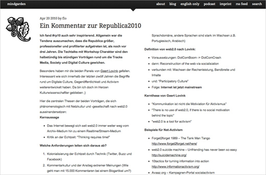
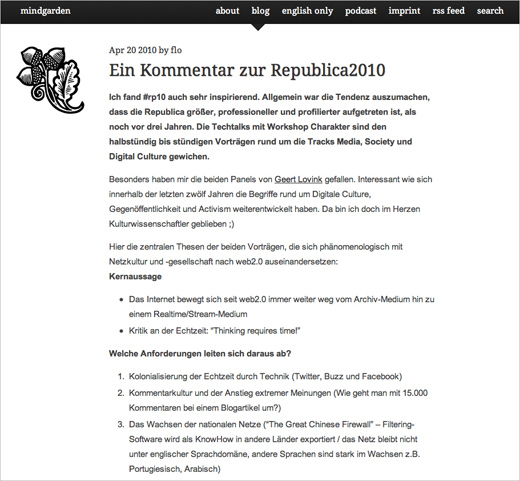
Mindgarden Mindgarden uses CSS3 media queries to display the layout differently in different resolutions. Users with a wide browser window size get a multi-columns layout (two or three columns, see the first screenshot), and users with a smaller browser window size see only one column (second screenshot). Also, the dimensions of images are scaled automatically depending on user’s screen size. Web designers have been using JavaScript for the same purpose for years, but now we can create adaptive layouts using pure CSS-based solutions. Media queries are a CSS3 extension to media types that gives designers more control over rendering of the site layout. They are currently supported in Firefox 3.6+, Safari 4+, Opera 10+ and Chrome. Internet Explorer 8 does not support them. For a workaround and further information about CSS3 media queries, head over to Russ Weakley’s presentation “CSS3 Media Queries”.
Chirp The Chirp conference website uses CSS animation for the rotation and animation of the images of speakers.
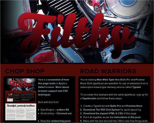
Bello and Proxima Nova: Type Experiment For his experiment, Tim Brown uses gradients, masking, rounded corners, transitions and multiple background images. On hover, the heading at the top seems to stand out.
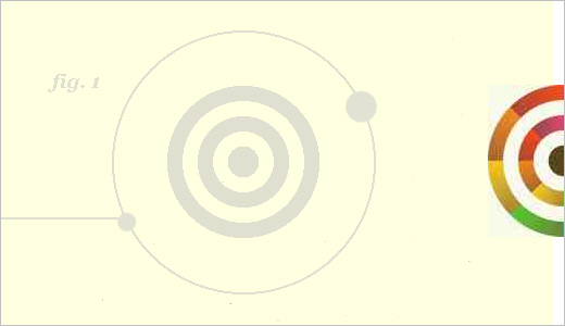
NeutronCreations Beautiful CSS3 typography and transforms at work here. The circles spin, as the company’s name would suggest.
Neography CSS3 Type Experiment No images are used here. Pure CSS3 transitions, rotations, shadows and other tweaks.
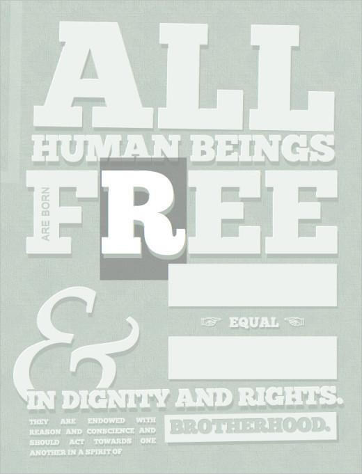
CSS Posters Designers are experimenting with different layout techniques and CSS3 techniques. Here is an example of a CSS poster, designed with simple CSS rules. Actually, a very simple technique that uses @font-face for font embedding. But it just looks great and serves its purpose, too.
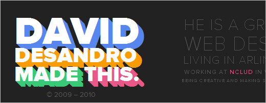
David Desandro: Footer CSS3 gone mad: David Desandro uses various CSS3 rules in the footer of his website. Shadows, animations and transitions are very vivid, colorful and appealing. This is the opposite to subtle CSS3 effects used on most sites with CSS3-snippets. However, it works perfectly fine in this case as it sets the design apart from other portfolio websites.
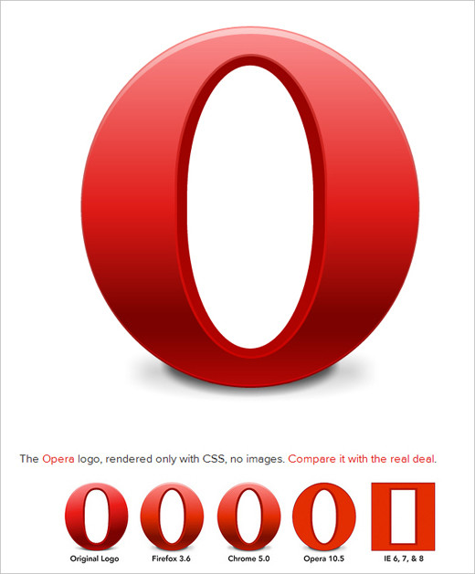
Opera Logo with CSS3
Various visual effects are possible with CSS3. With a bit of artistic creativity, you can create truly extraordinary things. For example, the Opera logo here is designed purely with CSS3: gradients, box-shadow and border-radius. Are CSS shapes something that we should be expecting to come soon?
Rain Drop Another interesting example of a visual effect achieved purely with CSS3.
A Sad Note About the Text-Shadow Property
A general problem we have observed with CSS3 adoption today is the emergence of designs crafted merely for the sake of CSS3. A perfect illustration of this is the overuse of the text-shadow property, which is sometimes heavily applied to headings and body copy. Bear in mind that CSS3 is a powerful tool, and as effective as it can be, it can also be easily misused, leading to a new round of usability problems and legibility issues. It seems like a very obvious advice, but it is still worth mentioning: before adding a CSS3 feature to your website, make sure it is actually an enhancement, added for the purpose of aesthetics and usability, and not aesthetics at the cost of usability.
An obvious yet important rule relates to this: your design shouldn’t rely on CSS3 improvements, but should rather integrate them as a rich additional layer for users with modern browsers. The drawback of advanced CSS3 properties is that, because they are not yet standardized, and because Gecko and Webkit require proprietary attributes to implement certain ones, in a couple of years we may end up with quite bloated style sheets that contain useless styles. So, you may want to extract all proprietary CSS3 enhancements to a separate style sheet in order to simplify maintenance later on. Also, keep in mind that your CSS3 stack should always end with the standardized CSS3 rule (e.g. border-radius, not -moz-border-radius). By doing this, you make sure that in the next years, with a better support for CSS3 rules in newer versions of web browsers, your rules will actually still apply and work in major browsers.
Media Twitter
On some Windows machines, the navigation, headlines and body copy set with text-shadow can be quite difficult to read with the default text settings. Sometimes it is really not necessary to use text-shadow for body copy and navigation, thus compromising the quality of the design for users with older browsers.
Tinder
Tinder uses the text-shadow property for text. Some users (even those with good eyesight) may experience difficulties reading this text on their screen.
Brandon Cash
Brandon Cash uses the text-shadow property for his body copy. While the text is legible, it is more difficult to read than if it were plain copy. Compare the view in Chrome (left) and Safari (right): the difference is remarkable. It is very likely to assume that many users do not use ClearType or any other kind of font-smoothing for text. As a designer and advocate of user’s needs, you have to keep that in mind.
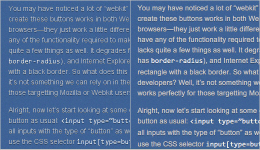
Sramekdesign
Light-blue text on a light-gray background is rarely legible. With a white text-shadow added to the text, it gets even worse. Sorry, but this is not where text-shadow should be applied.
Further Resources
- CSS3 Generator This online tool generates cross-browser CSS3 snippets that you can use right away on your website. You can also preview the code in a sandbox.
- CSS 3, Please! Another generator and tester of CSS3 rules on the fly.
- Linear Gradients CSS3 Generator This little helper generates the code for CSS3 linear gradients online. Handy.
- We are ready for CSS3. But are we ready for CSS3?
- When can I use? A detailed reference table outlining which browsers support which features and attributes of CSS3 and HTML5, with recommendations on which properties and rules you can use today.
- The Basics of CSS3 A good introduction to the basics of CSS3. Useful for those interested in the possibilities of the new spec.
- CSS 3 Click Chart A compact overview of CSS3 features and properties, by Louis Lazaris.
- Why CSS3 is worse than IE6 Debugging A thought-provoking, compelling article recounting the nightmare of maintaining a style sheet with many proprietary CSS3 rules.
- CSS3 Solutions for Internet Explorer
- Internet Explorer’s Support of CSS A detailed and extensive reference document showing the support level of every CSS property (including all CSS3 properties) in various versions of Internet Explorer.
- CSS3: Examples and Best Practices A great overview of popular CSS3 rules, with examples and sound tips on implementing them in professional designs.
Conclusion
New possibilities are always implemented creatively, but being so trendy, they are also abused. While good design practices are being incorporated into Web designs rapidly (through real-life metaphors, responsive interfaces and context-sensitive navigation), we have observed many “over-designed” websites that use new CSS3 features for their own sake.
Design trends do not exist to be followed. They exist to be broken, reshaped and abolished by the spirit of creativity rippling through the design community. By nature, trends are anything but good: they distract from the main purpose of communication design and disrupt the balance between aesthetics and function. Rather than follow trends, use the appropriate tools in the appropriate context for the right purpose. That’s where the beauty of information design lies, and it makes the huge difference between a nice design and a nice and usable design.
Stay Tuned!
This article is one in our series on the current state of Web design. To make sure you don’t miss the next part, subscribe to our RSS feed and follow us on Twitter.


 Bring your design to life
 Register For Free
 How To Measure UX and Design Impact, 8h video + UX training
 JavaScript Form Builder — Create JSON-driven forms without coding.