The Process Behind Good Illustration (Part 3)
Good Process and Good Design (Continued)
In Part II I started a list of some personal process-oriented thoughts on illustration—more specifically about some ways to help broaden the creative process and make its execution more effective. In this Part III, I’ll wrap up the list in the same vein as Part II’s, with a few more of my thoughts on the subject.
Once again, while I hope these tips strike the right chord with readers from all creative fields and levels, I share them partially because many of them are still so freshly new in my head, and I can recall vividly their having planted themselves there during my time as a student. That said, there’s plenty more learning to be done on my end as well, and I invite you to share your responses and your own additions to the list in the comments, no matter what corner of the creative world you are from.
Enjoy, and a special thanks to returning readers from Parts One and Two!
Part III: A Few More Tips and Tricks
Don’t be in a hurry to use the computer.
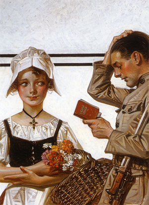
Detail of illustration by J.C. Leyendecker.
A finished and good illustration doesn’t at all mean it was done in Photoshop or Illustrator and polished to pixel-perfection! Take a look at J. C. Leyendecker (illustration on left) and Norman Rockwell’s work and all those greats earlier in the centuries when we didn’t have Adobe or Google — (…what?). They didn’t have the convenience of unlimited colors a click away and the ability to mask and smudge and whatnot. They had more limitations, and when you design/draw under limitation, your design is usually stronger because you have to do more with what you have.
Also, digital tools give you too much control — like going out into the world, many of your best ideas are unreachable unless you stumble upon them through experimentation. And, it is much easier to experiment when you let yourself feel out of control with some hands-on media, and not RGB values and digital brushes where you know exactly what you will get and can Ctrl/Cmd+Z out of everything at any time.
So! Pull out your acrylics/colored pencils/watercolors/stencil/pencil/cardboard debris/copic markers and just pretend that’s all you had (pssst… you can always scan it in and touch it up in Photoshop later ;) ). There’s something you will get out of those tools that you could never get out of working digitally, and that just might be what your image would work really freaking good with.
Note: If/when you transition to digital work, I strongly recommend to invest in a tablet and stylus, if you do not have one already. It might at first seem like just a fancy toy for those with fat wallets, but it is nothing of the sort (at least to me!). Even if your prime thing is vertex-by-vertex vectoring, it’ll help remarkably to bridge that gap between your brain and your software — the way you interact with a tablet/stylus is much more intuitive than the way you interact with a mouse or a keyboard.
…As one last vote for traditional media, it has so much more heart. There’s a reason mankind’s appreciation of fine art emerged in it!
Ask for feedback — all the time.
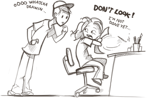
Is this you (the girl, that is)? I know it’s certainly me sometimes, though thankfully it’s gotten better lately. But if I could go back in time, I’d beat myself over the head for missing out on such a tremendous untapped resource every time I did this!
Of course you know what you’re drawing, and that the orb-like thing in the corner symbolizes a microcosmic Earth, and that the colors on the guy’s glove and the pattern on the scarf are supposed to reference the Croatian flag. That could very well be the staple of your illustration, and that’s good that you know what you have in mind — but does it come through? Would someone who was not in your head when you conceived this idea know it from looking at it?
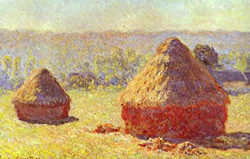
In fine art, this is sometimes not a necessary step — for instance, Monet didn’t need anyone to attest to the fact that his haystacks were indeed his visual impression of them. The effect that a piece of fine art has on its viewer is of course certainly a factor, but in illustration this communication is an absolute necessity.
So gather your friends and take them seriously, even if they don’t have an artistic bone in their body! Because what they do have are eyes, and they’re eyes that aren’t yours, at that, and that’s all you need. Show them what you’re working on, and — don’t tell them first! — ask them what they think the picture is about. What they notice first. What part is most evocative to them. If their answers don’t match up with your intentions, figure out what it was that led them to draw the wrong conclusions, and what adjustments you should make to your picture so the hierarchy and message is corrected.
Having artsy-inclined friends here is helpful, since unlike non-artists, they very often can quite literally point you in a direction for what to fix!
Use references.
Cartooning is about abstraction; illustration is about information.
— My professor John Hendrix
Ever wonder how those graphically-realistic graphic novels look so… realistic? And yet stylized? It’s not that the artist just naturally knows how to draw everything and know where all the shadows fall and where every line on every character’s face goes (though they sure make it look like they do, and sometimes they actually know a very impressive amount). It’s that they’ve studied and used extensive references and consciously appropriated and communicated the visual information.
Remember, an illustration doesn’t have to be hard-core realistic — accurate visual information can be delivered even through a stylized drawing. But, incorrect information can be very distracting, and, as we already know, the less distracting material, the better. (Which is where experience and artistic skill are incredibly important.)
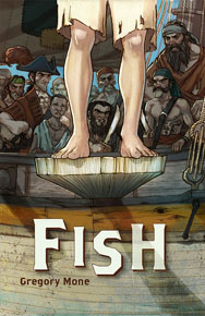
“Fish” by Gregory Mone; Cover illustration by Jake Parker.
A case study, as an example: there is this great blog post by illustrator Jake Parker which describes in words (and excellent pictures!) his process of creating book cover art. He started with a thumbnail, and ended up with a gorgeous digital illustration, but not without consulting real life for guidance. Studying a model ship for details on its form and moving parts (feel free to forgo this step if you’re a ship construction wiz), taking a picture of his son standing on a chair to get the boy’s legs and feet just right, etc. Not even the pros know nature, the physics of light, etc. so intimately that they can reproduce it on call! (Though, the more you know the better.)
…Well, except maybe Leonardo Da Vinci, I take off my hat to him. But he was so excellent at his art precisely because he respected nature enough to spend his life studying it and drawing his inspiration from it. And if Leonardo isn’t too cool for nature, none of us are. ;)
Take breaks.
I know I’m the kind of person who’ll sit down and grind away at a drawing for 15-20 hours straight, and let me tell you, that’s not the way to go. I will hang my head in shame that I am still guilty of this on occasion.
- You will actually save yourself time by taking breaks, since your eye will get drastically less perceptive the more you stare at your work. The keenness of your visual attention will drop by a huge margin, and thus, your drawing will take longer, or turn out worse. (Ever gone back to an old doodle that you thought looked fine only to cringe and think, Crikey, how did I draw that so deformedly?)
- You run a high risk of getting discouraged or running into artist’s block as your brain gets less acute (obtuse?) as you work, too!
- The artistic process happens everywhere — and often not being visually accosted with what you’re working on is what will generate a really revolutionary idea in you.
So. I know you’re excited about your drawing, but take a breather! Put your stylus/pencil/whatever down and go for a walk. …Don’t forget your camera/sketchbook, though. ;)
Think big — small will come.
It’s very hard to see the whole picture while you’re scribbling lines here and there, and it’s the whole picture that’s going to be doing the work later. So, put down your pencil occasionally and just take a few minutes to look at what you did — evaluate the hierarchy, the mood, the balance, the composition, etc.
Some tips that I found helpful:
- Always mock up thumbnails first. Even if you’re in the coloring stage, make “color thumbnails.” (thumbnails of your drawing with rough colors blotted in) Your eye can see things much easier when it has everything in its field of vision.
- This may be a strange personal regimen, but before you start thinking about color, show your pencil sketch some love. Get visual references, use a ruler, get a nice clean sheet of paper (if you have to), go over the lines in Photoshop, etc. — do whatever you have to do make a nice clean drawing. Spending time on getting the sketch clean and right has saved me inordinate time and frustration later so many times I can’t ever bring myself to move on unless I have completed this stage in its entirety. Even if you don’t think the line work will be a prominent element in your final piece, do this anyway. It’ll force you define a lot of what your piece will have in it before you go any further, and point out potential problem areas before you get too deep into your process.
- Remember how smart your eye is — it will fill in information, correct imperfections, etc. and you won’t even notice that the guy you’re drawing has his head skewed 30 degrees northeast. So, if you’re working digitally, take advantage of those Transform functions and just try flipping your drawing horizontally. It will immediately point out bad angles, odd skews of lines, asymmetries you never noticed before, etc. You’ll be amazed! If you’re working traditionally, just hold up your drawing to a mirror. If neither of those are available, remember to take breaks so you can look at it with a fresh eye.
- Blow up the size and work larger than you want the final product to be (just pretend you had to make it that big!) When you scale it down later, you’ll hide imperfections but keep the high resolution of detail you ended up creating in there.
Save new versions of your files periodically.
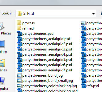
One of my own process trails, for one illustration.
…And by “periodically” I mean all the time. (If you have a document open in Photoshop right now, stop reading this article and go save a backup copy of it.) Even if you just do a quick Save As “Birdhouse_2.psd” and then “Birdhouse_3.psd” later, etc. Right now. This way you’ll have something to fall back to if something goes wrong with your file (which will happen when you least want it to) or you discovered you ran off in a direction that wasn’t that great and want to backtrack a bit.
The screenshot of my own process trail on the left might be a slightly over-the-top example, but I was terrified of losing what I had done…
Another bonus to this is that you’ll also automatically generate a process trail to easily look back through the versions of the work you saved.
Oh, speaking of…
Keep a paper trail of your process.
This is 100% for you, unless you care to share it, and I can’t stress its importance enough. I severely underestimated process-documenting until very recently, and I never realized how much you can learn just from examining how you work.
- Look at it critically and try to identify common rut points in your process
- … and things you tend to do the same way (good places to experiment later)
- Note techniques that worked and that didn’t work, and how you resolved them.
- Study how you get from one step to the next.
- Study your strengths but also your limitations. That last one is unbelievably important—the design world is so heavily focused on selling oneself that we often forget how important it is to verbalize our weaknesses, too! How else would we know where to get better, how to evaluate our work, or know when we might not be the best person for the job?
Plus, it’s kind of like watching a time-lapse video of a building being built — looking back on your process is just really fun!
Build up skills.
This might sound a bit out of place for an article that’s all about democratizing illustration, but I thought it would be a nice (if more serious) closing note.
The image carries the bulk of the communicative burden in illustration, whereas in “design” the burden can be split up between image, typography, abstract elements, etc. Bad design decisions will hurt the illustration in almost all cases, and certainly not all illustrations need a skilled figure painter to pull them off. But some will. And, especially if you’re just starting out, the best favor you can do yourself right now is build up those skills so you have no barriers later.
I read an article recently by the Dungeons & Dragons art director Jon Schindehette, titled What do I look for in a portfolio. In it, he summarized what skills he looks for illustration portfolios to demonstrate, and it moved me to ponder just how important strong artistic skills are to the field. Even in this article series, I’ve seemingly written so much about how design skills are so much more important to illustration than “art skills” and how “art” is a big no-no, so what gives?
Design Informer reader Adit Gupta left a comment on Part II of this series, regarding the importance of understanding the nature and direction of light in illustration. I did not include an individual discussion of light, perspective, etc. in these articles until now because they’re part of a whole separate beast: the mechanics of art and artistic skill that, while usually cannot be effective illustration in and of themselves, are inordinately important to the success of the best ones out there.
So what are these skills?
General skills required to provide consistent quality.
…wrote Jon. That’s all that stuff you learn in drawing class that many of us students swore we’d never need again once we’d get Adobe Illustrator under our fingers, and vectors, and… digital, and stuff!
It’s understanding the basics of anatomy, light, perspective, motion, artistic mediums, et cetera. Visual research (as discussed above) will of course be necessary to make sure you have everything accurate for your piece, but the more you know right off the bat, the less of a barrier you will have between your idea in your head and putting it down on paper.
And it’s not to say that each illustration must show a mastery of perspective, light, anatomy, various mediums and other visual knowledge, else it’s not impressive (illustration, like design, must have content). It’s just that some illustrations WILL need them and will suffer without them. Whether the mood and message is hurt because the colors and light aren’t right, or the story isn’t conveyed because poor understanding of anatomy affects the body language of the figure, the list can go on and on.
You can find a niche in illustration without having these skills, but if you have them, you’ll be a stronger illustrator for it.
You could say, perhaps, this is where illustration separates from good ol’ basic design principles a little bit and joins right back up with “art.” Since image is king here and images are inherently made by incarnating an idea in an artistic medium, illustration embraces some of the same things that make even the finest of fine art tick.But that’s beyond the scope of this article.


 Get a Free Trial
 Register For Free
 How To Measure UX and Design Impact, 8h video + UX training
 Devs love Storyblok - Learn why!
 JavaScript Form Builder — Create JSON-driven forms without coding.


