The World Of Signage Photo Contest: Join In and Win a Digital SLR Camera!
Update: the results of the contest are published now.
Typography and icons are everywhere: they surround us, guide us, help us find the right path every day. As Web designers and graphic artists, we can learn from observing the type and public signage around us. How do designers of those graphics combine type, visual design and pictograms? How do they guide us through our day? More importantly, how do they design their graphics to meaningfully serve their purpose in particular settings?
What Are We Looking For?
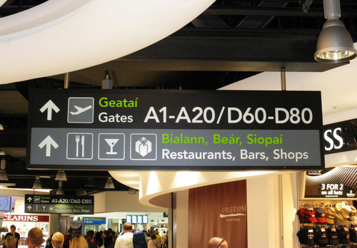
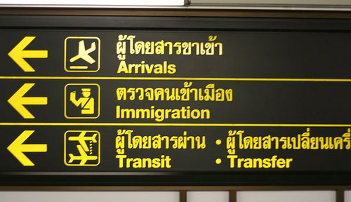
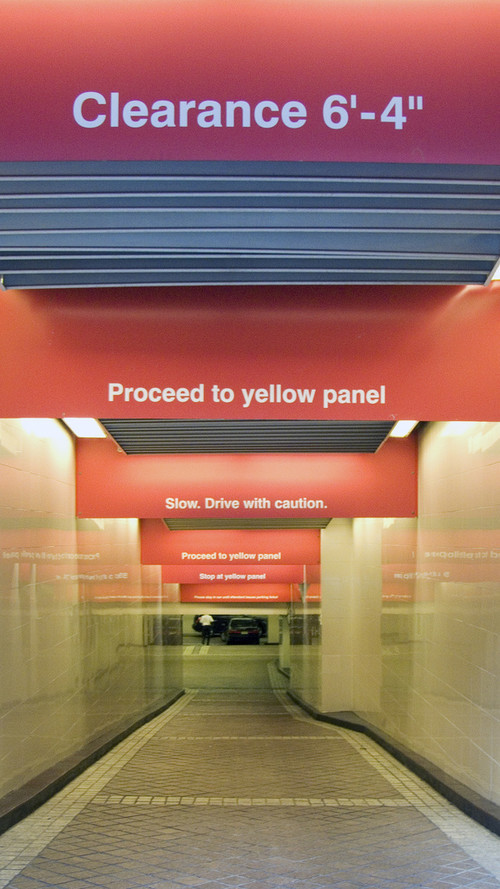
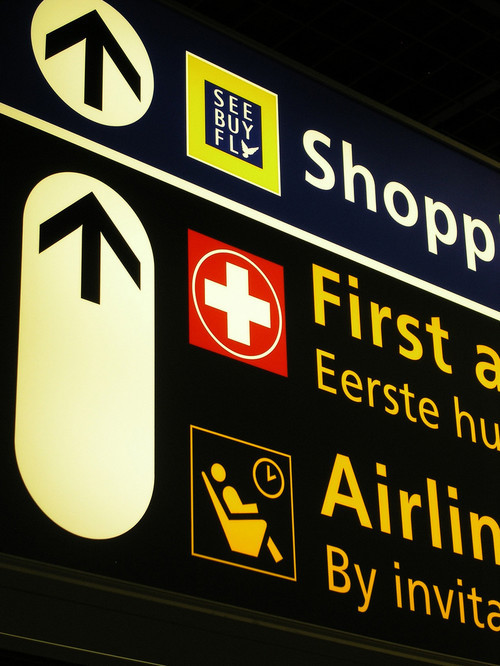
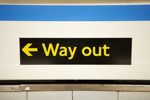
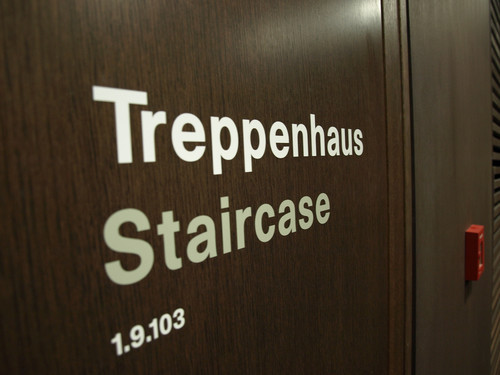
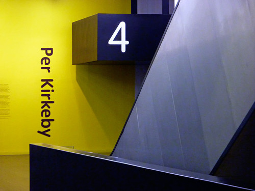
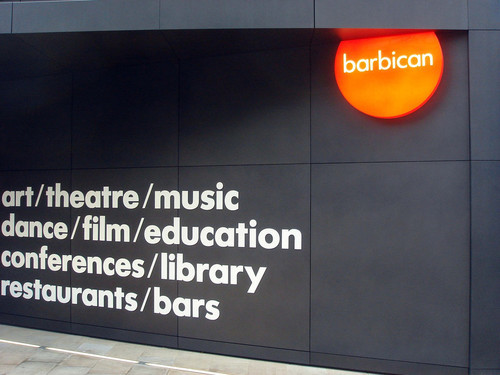
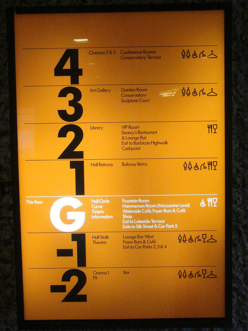
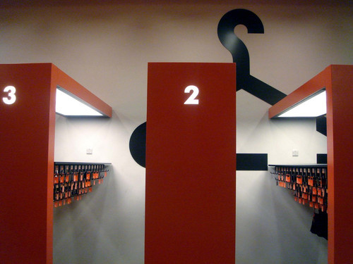
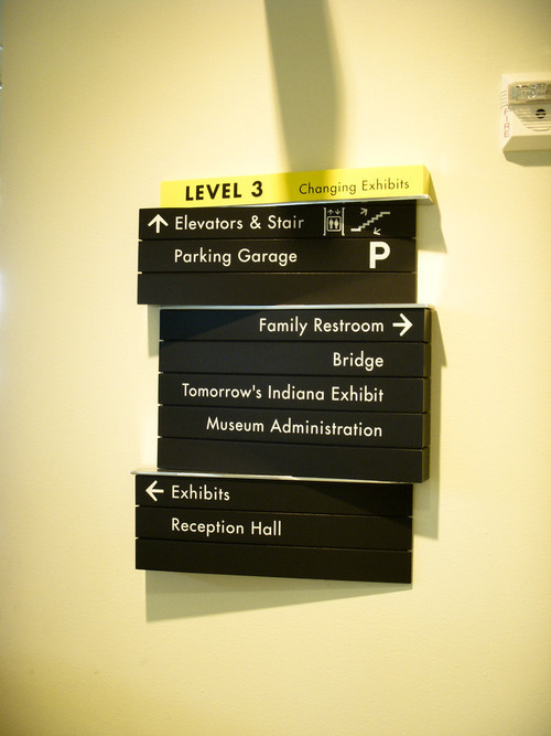
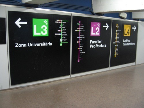
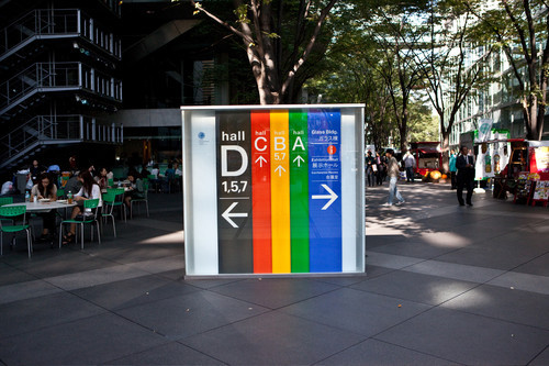
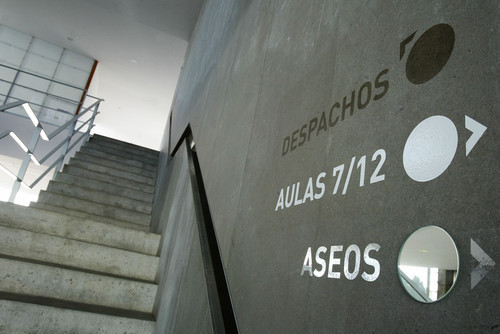
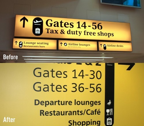
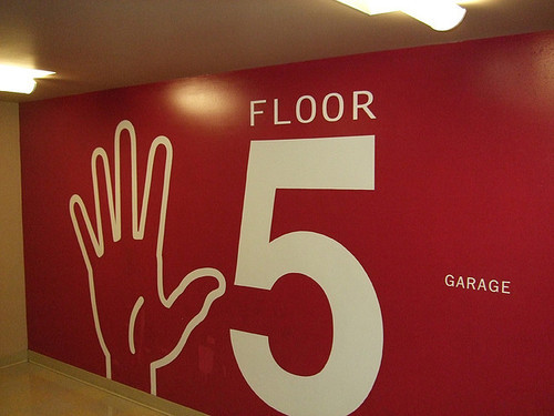
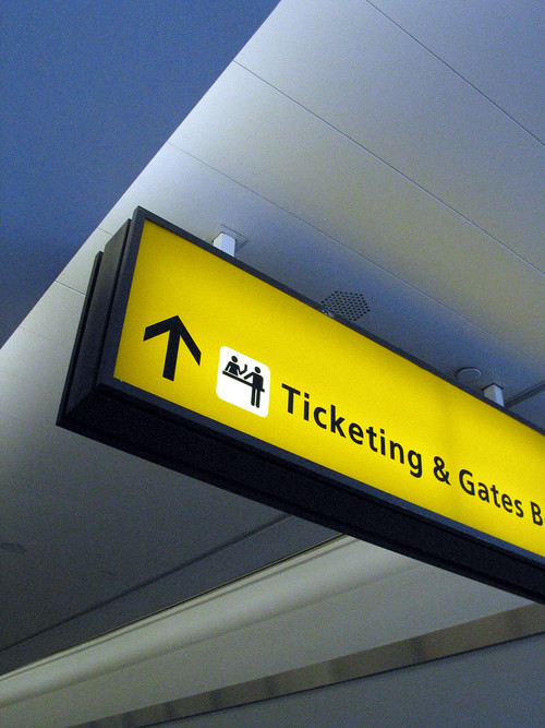
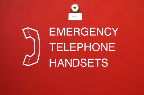
We are looking for original, manually shot photographs of typography and public signage. The most obvious elements that come to mind are street signs, building facades, highway markers and road signs, as well as wayfinding graphics (i.e. directional signage) in public venues such as stadiums, malls, museums, cinemas, theaters and cafés. Bus stop signs, underground signs, park signs, metro signage, hospital room signs, conference, hotel and office signs, emergency and exit signs and signs in shops and stores would work, too. Look around, pay attention and have a camera ready. That’s really all you need!
Further Reading on SmashingMag:
- 60 Rare and Unusual Vintage Signs
- Showcase Of Beautiful Vintage and Retro Signage
- The Beauty Of Public Signage
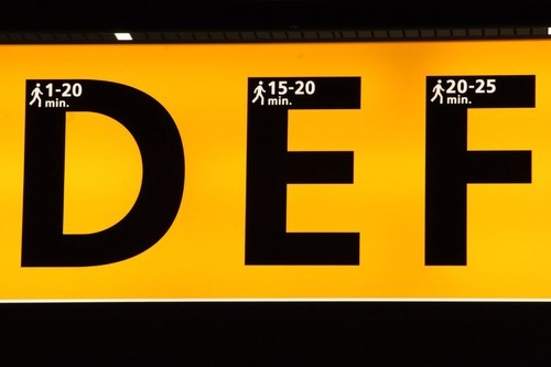
At Amsterdam Schiphol Airport, numbers in each terminal’s letter indicate the walking time. Simple yet beautiful. (Image credit.)
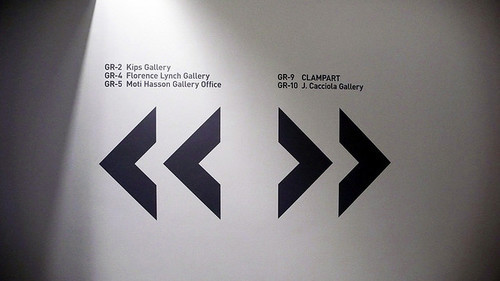
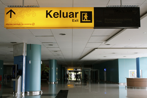
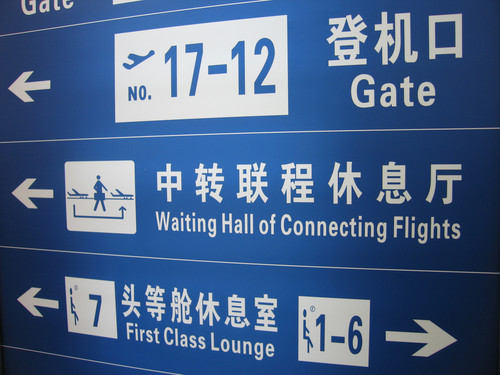
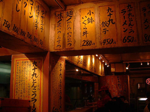
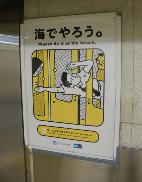
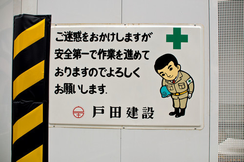
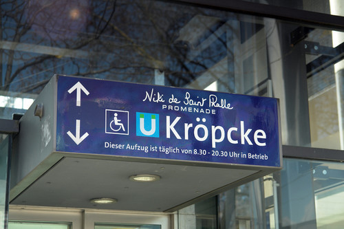
It would be nice to see signage in a variety of languages and in globally diverse locations. We’re hoping to find similarities that communicate visually across cultures. Please feel free to submit unusual and humorous signs as well! Check out examples of what we’re looking for to get your creative juices flowing.
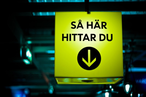
“This Is How You Find ↓.” A wayfinding sign in IKEA in Sweden. (Image credit.)
Examples
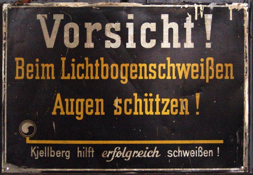
This contest is all about creativity, so get out your camera and start shooting. Good signage doesn’t necessarily have to be “clean.” On the contrary, some beautiful and original examples can be found where nobody bothers to look. Just be curious, and take a closer look around you. You may want to look at these articles for ideas: Vintage and Retro Typography Showcase and Showcase Of Beautiful Vintage and Retro Signage.
Update: the results of the contest are published now.


 SurveyJS: White-Label Survey Solution for Your JS App
 Agent Ready is the new Headless
![Bar, this way [sign]](https://archive.smashing.media/assets/344dbf88-fdf9-42bb-adb4-46f01eedd629/59b04703-16b1-4f88-a88f-453086306f99/sign-132.jpg)
