Users Are Not Idiots
Websites are designed to be used by people of varying backgrounds, educations and technical levels. One of the challenges we face when designing for the Web is finding a way to create sites and applications that can be accessed by a widely disparate audience while avoiding the pitfall of sacrificing the quality of our work to cater to the dreaded ‘lowest common denominator.’
Further Reading on SmashingMag:
- What You Need To Know About Anticipatory Design
- Improving Customer Service with UX
- Improving Customer Service with UX – Idiots & Drama Queens
- How To Successfully Educate Your Clients On Web Development
Giving Users Some Credit
Even though it happens to me with some frequency, being told by a client that one of the requirements for their project is that it must be ‘idiot proof’ never fails to give me pause. The sentiment itself is offensive enough, but the concept also seems somewhat misguided to me. Do we really want to begin a project by assuming our site’s users are idiots?

Creating designs that are intuitive and easy to use is something we should continually strive for if we want our sites and applications to be visited and used by as many people as possible. Ultimately, making those sites easy, as well as enjoyable, to use is a critical part of helping them be successful and it starts by abandoning outdated opinions on what users can, and cannot, understand. It starts by giving our users some credit and realizing that they are not ‘idiots.’
When Best Practices Go Bad
Anyone who has designed for the Web for a period of time has amassed a bank of best practices and favored solutions that they use in their work. In and of itself, this is a good thing, but the ever-changing nature of the Internet means that we have to continually evaluate these best practices to ensure they are still relevant. As Web users’ proficiency and technical comfort levels grow, we must abandon solutions that no longer help visitors use our sites, but instead may actually start to hinder their experience.
As a communication medium, the Web may still be the ‘new kid on the block,’ but let’s face it – the Internet isn’t new anymore. Web users are more advanced today then they were even a few years ago. This is great news for those of us who work on the Web! It means that we can continually push our work forward, but it also means that we not only have to be willing to embrace change, but that we need to be proactive in identifying when that change is necessary.
User Testing is Not Always the Answer

There is no question that user testing is an invaluable part of the web design process, but any user testing we do for a project has limitations. Oftentimes, those limitations are due to budgetary and time constraints. This being the case, we focus our tests on key aspects of our projects where user input will help shape our decisions and positively impact the success of our design.
Since we often can’t evaluate and test every aspect of our project, some decisions will inevitably be driven by our best practices and favored solutions. If those practices are up to date and relevant, this isn’t a problem, but if they are outdated – well, I’m sure you can follow the line of reasoning here.
Out with the Old
While every Web designer’s collection of favored solutions will be different, here are a few examples of solutions whose time of relevancy has passed.

These specific examples were chosen because they are ones that I personally have purged from my own toolbox in the not so distant past, but also because they are practices I still see implemented on many newly-launched sites today. It makes me wonder if they were put in place as a conscious choice or if they are instead the product of once relevant best practices left unchecked for too long?
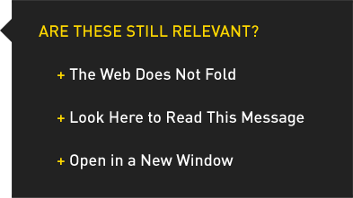
The Web Does Not Fold
Taken from newspapers’ practice of ensuring that lead stories and catchy headlines appear on the top half of the paper’s front page, this preoccupation with requiring Web content to appear ‘above the fold’ for all site visitors has been the enemy of whitespace and well organized layouts for far too long. Do not fear the scroll bar, browsers have them for a reason.

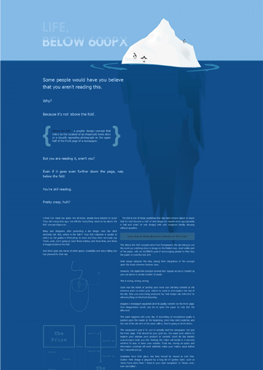
Paddy Donnelly’s article entitled Life Below 600px battles and debunks the long time web design myth that there is such thing as “above the fold.”
Content is king on the Web. The quality and usefulness of our site’s content will determine the success of our site, but the way we visually lay out that content and present it to our users also plays a major role in its effectiveness. Cramming lots of content into a too-small space, solely to ensure that users on even the smallest resolutions can see it without scrolling, damages not only the visual integrity of our design, but also our users’ ability to easily consume and process our site’s content.
Would you rather be on a site whose content is well laid out with appropriate whitespace and formatting, but which requires you to scroll down to access some of that content, or would you choose a site that eliminates the need to scroll at the expense of readability and appropriate spacing?
We would never force the entire text of a book onto a single page just to eliminate the need to flip pages, so why do we worry about users having to scroll to access content that appears lower on our Web pages? Books have pages that must be turned in order to read the story and Web sites have content that must be scrolled to be seen. This is how these mediums work; let’s give our users some credit and realize that even if content doesn’t appear ‘above the fold,’ they will still be able to find it.
Look Here to Read This Message
In my office, we have a Keuring coffee machine. Right on the front of the machine is a shiny, silver button that says ‘Brew.’ It doesn’t say ‘Press Here to Brew a Cup of Coffee,’ yet despite this lack of incredibly specific directions, it’s pretty easy to figure out what that button does and what I need to do to get myself a cup of Joe in the morning.

This same principal applies to the phrasing we use on anchors and buttons in our projects. At the end of a short teaser for a blog article or a news item, there is no need to have anchor text that reads: ‘Click here to read this full blog article.’ Something as simple as ‘Read more’ or perhaps, if you’re really in the mood to edit aggressively, just the word ‘More’ would be just as effective. Read also: Why Your Links Should Never Say “Click Here
Open in a New Window
A common fear I hear from clients is that their customers will be unable to find their way back to their site if links to external sites or resources are clicked on. This fear inevitably prompts clients to request that those links be popped in new windows.
Thinking of the browsing experience as a linear timeline is a very simple concept to grasp. You start on one page, you click to another, and another and another. The ‘back’ and ‘forward’ buttons allow you to go in those respective directions on that linear timeline. You want to go back to the page you started from? Just click the back button until you get there!

Most users know about the “Forward” and “Back” buttons. Take advantage of them!
The belief that this linear browsing experience is more difficult for users to understand than the ability to manage multiple windows or tabs is misguided. I’ve sat and watched users who are fairly comfortable with the Web struggle to understand multiple windows. I’ve seen them use the ‘back’ button, only to hit a wall when they get to the initial page that was opened in that new window/tab. What do they do next? In most cases, they type the original site’s URL into the address bar, opening up a second instance of the site, completely unaware that the original instance is still open in another window/tab.
Give users some credit. If they want to return to your website, they’ll find their way back to it and the easiest way for them to do that is to use the ‘back’ button.
Treat Others Like You Would Want to be Treated
This bit of advice is something that parents have been telling their children for many years and this piece of parental wisdom is perfectly relevant to how we deal with our site’s visitors.
No one wants to be treated like an ‘idiot,’ our site’s users included. The minute those users visit our site, our relationship with them begins. Let’s start that relationship off on the right note by designing sites and applications that make the user experience enjoyable. Let’s do this, in part, by treating those users with the respect they are due and giving them the credit they deserve. Their user experience, and the projects we design and develop, will be the better off for it.


 Agent Ready is the new Headless
 SurveyJS: White-Label Survey Solution for Your JS App


