The Art Of Film Title Design Throughout Cinema History
Have you ever thought of what makes you remember a certain movie or TV show? Of course, it’s the story being told, you’ll say. But what about movies such as Goldfinger, Seven and Snatch? What’s the first thing that comes to mind? We are pretty sure their opening title sequences stick out for many of you.
Today we’ll take a closer look at that short space of time between the moment the lights go down and the first scene of a film, the part that so often sets our expectations of a movie, that sequence that speaks to our creative side: the art of the film title. We’ll look at the evolution of title design and some particularly interesting titles from various periods in the history of cinema and animation.
Further Reading on SmashingMag:
- 100 Years of Movie Title Stills
- 30 Unforgettable Movie Opening Sequences
- 40 Exquisite Independent Film Posters
Film titles can be great fun. In them we see the bond between the art of filmmaking and graphic design — and perhaps visual culture as a whole. They have always served a greater purpose than themselves: to move the overarching story forward. Whether you are a motion graphic designer, a digital artist or a connoisseur of design, we hope you are inspired by these film titles and the ideas they suggest to your own creative endeavors. At the end of this post, you’ll find a listing of relevant typefaces and Web resources.
For this post, we reached out to David Peters, a San Francisco-based designer and media historian who, more than a decade ago, began a project called Design Films to research the subject. David generously contributed to this article.
Titles In Silent Film
Words and lettering played an enormous role in films of the silent era. Film titles made their appearance in the earliest silent films, along with letter cards (or inter-titles), which provided context. These cards were the responsibility of the lettering artist, who collaborated with the scriptwriter and director to create narrative continuity so that audiences could follow what they were seeing. Distinct from these inter-titles was the film’s main title, a vehicle of particular concern to film producers because of the legal, copyright and marketing information this footage had to bear.
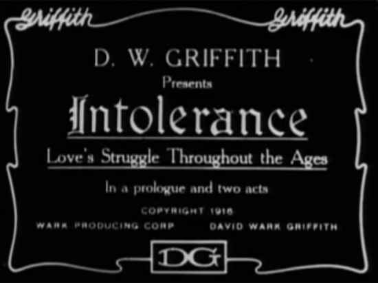
Here is the main title from D.W. Griffith’s “Intolerance” (1916), which many reviewers and historians consider the greatest film of the silent era. Note that variations of the director’s name are featured in five ways:
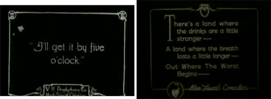
Film titles and letter cards had to provide essential information to the viewer. For reasons such as ease of production and clarity, artists favored mono-stroke letterforms or characters with small serifs. White lettering on a black background is another characteristic of this era, because titles simply looked better this way when projected with live-action B&W film.
The following inter-titles are typical of silent movies. A shot from the comedy The New Janitor (1914) featuring Charlie Chaplin is on the right, and the silent western West of Hot Dog (1924) is on the left:
In addition to hiring lettering artists, the biggest film studios began to employ typesetters in the production of title cards. Among the fonts often adopted for titles and inter-title cards were Pastel (BB&S, 1892), National Old Style (ATF, 1916) and Photoplay (Samuel Welo’s Studio, 1927).
Regardless of the method followed, we see the emergence of typography that seeks to match letterforms with the subject matter and even the zeitgeist — including typefaces inspired by art movements such as art nouveau, art deco and expressionism — as well as the commercial vocabulary of packaging design and advertising.
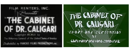
The main title from the American release of “The Cabinet of Dr. Calligari” (1920) is much less expressive than the title from the influential original German film (restored original version):
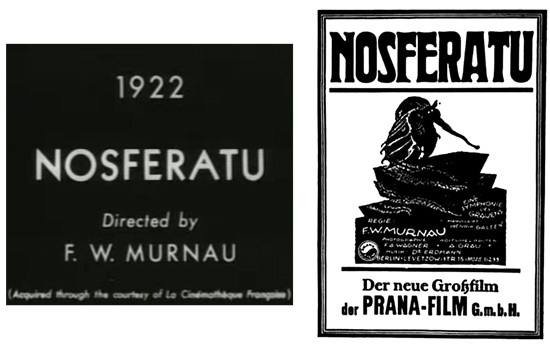
The sans-serif title (for a later restored version) of the classic horror film “Nosferatu” contrasts with the art-nouveau treatment of the film’s promotional poster of the time. The font, Berthold Herold Reklameschrift BQ (digitized version) was created by German typesetter Heinz Hoffman in 1904. You can see the original German version of the title still from Nosferatu here.
Animation effects like the ones you see in rotoscopes actually pre-date film. But the power of filmmaking was enormous, and it tempted thousands, including many artists, to try their hand at this new medium. One of the earliest known title animations is seen in the work of J. Stuart Blackton.
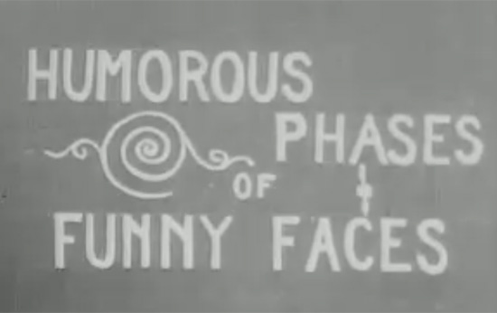
“Humorous Phases of Funny Faces” (1906) — video on YouTube — was directed by J. Stuart Blackton, who many consider to be the father of American animation. Not only is it one of the first animated films, it is among the first to feature an animated opening title, making it a precursor of the modern title sequence:
Other important early filmmakers such as Emil Cohl and Winsor McCay were accomplished draftsmen who dedicated years of their lives to discovering the dramatic potential and practical techniques of animation. Their focus was more on character development and story visualization than on title animation per se. So, while we see innumerable novelties in main titles and inter-titles during this period, the big innovations of title animation and motion typography don’t really emerge until well after the Second World War.
The Silence Is Broken
As movies grew more popular, their titles evolved. Movie producers invested considerable sums in film production and sometimes resorted to fixing a dog of a film by rewriting the inter-titles. For a time, “film doctor” Ralph Spence (1890–1949) was the highest-paid title writer in the industry, earning $10,000 a picture for his one-liners.
During the 1920s and ’30s, European cinema was deeply influenced by modernism, and aspects of this visual sensibility were brought to the US by filmmakers who were fleeing the Nazis. Meanwhile, the studio systems operating in Europe and Hollywood also delighted in creating titles that featured vernacular graphic novelties. As much as possible, they liked to convey the tone of a movie through the “dressage” of its main title. Thus, blackletter fonts in the opening credits were used to evoke horror, ribbons and flowery lettering suggested love, and typography that would have been used on “Wanted” posters connoted a western flick.
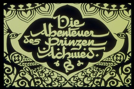
Here is a title still from the oldest surviving feature-length animated film “The Adventures of Prince Achmed” (Die Abenteuer des Prinzen Achmed) by German animator Lotte Reiniger:
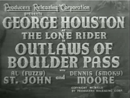
And here is the opening title in the talkie “B” Western Outlaws of Boulder Pass:
Hollywood animation studios, including Warner Brothers and MGM, did give some license to their artists to indulge in title antics. But one can also see that life for the titling crew at Disney was strained by the weight of its foreign-language versions and that film exports rarely encouraged innovation in titling.
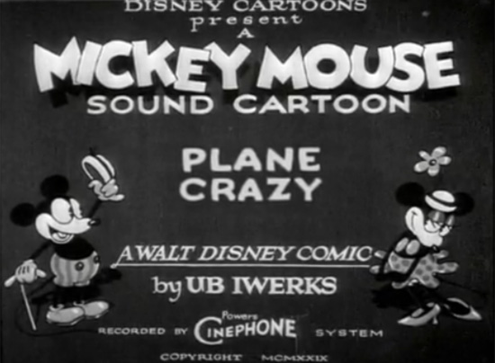
The first Mickey Mouse cartoon, circa 1929, features both Mickey and Minnie, but its main title, “Plane Crazy,” is lackluster:
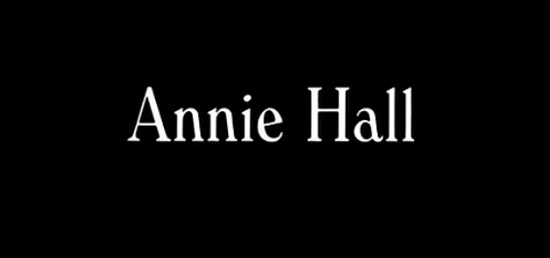
Over time, the very appearance of white-on-black title lettering became a visual trope, recurring as it does in practically every Woody Allen film. Allen relies on the device primarily to build a visual identity, although its economy is a practical advantage, too.
Allen uses the Windsor font for most of his films, as illustrated below in “Annie Hall” (1977). Read more about typography in Allen’s films and also an interesting story about how the renowned director chose this typeface:
The incorporation of audio into movies — making them “talkies” — didn’t revolutionize how film titles were handled, at least not immediately. However, we do see one avant-garde animator and painter of German origin, Oskar Fischinger, give serious thought to the relationship between visual effects and music. Fischinger’s practice of subordinating the visual rhythm to the audio was repeated often in motion graphics and title design.
The concept of score visualization first conceived by Oskar Fischinger in his film “Studies” anticipates the effects created by Saul Bass in “The Man With the Golden Arm” (1955) and later by Susan Bradley in “Monsters, Inc” (2001):
The (True) Birth Of The Title Sequence
Breakthrough ideas in titling, such as timing the typography to interact with metaphorical imagery or to create its own world, were largely innovations that came from outsiders to the Hollywood studio system. Figures such as Saul Bass, Pablo Ferro, Maurice Binder and Richard Williams arrived on the scene in the 1950s, at a time when the studios were starting to flounder in their fight with TV. At that time, independent filmmakers made commercial headway by doing things differently, spreading utterly fresh ideas about the possibilities of title sequences. This is the era in which the discipline of film title sequence design was actually born.
Maurice Binder worked on the title designs of 14 films about Agent 007, including the first episode, “Dr. No” (1962). Binder created the famous gun-barrel sequence, which became a signature for the Bond series:
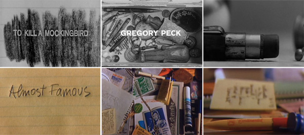
If there were a hall of fame for film title design, Stephen Frankfurt’s sequence for the 1962 film “To Kill A Mocking Bird” (below, upper row) would have a seat of honor. Cameron Crowe referenced it in “Almost Famous” (lower row):
Experimentation on the fringes, where title sequences really thrive, have led to all kinds of innovation in what a title can be and how it can serve the story and the director’s intent. Perceptive directors like Otto Preminger, Alfred Hitchcock, Blake Edwards and Stanley Donen embraced these innovators and gave them the reign to surprise audiences from the opening shots. The Bond films, the Pink Panther series, Barbarella: the sequences for such films became enticing and often sexy popular amusements. By the mid-1960s the top title designers were celebrities in their own right, people who could be relied on to deal with the messy business of credits with playful panache.
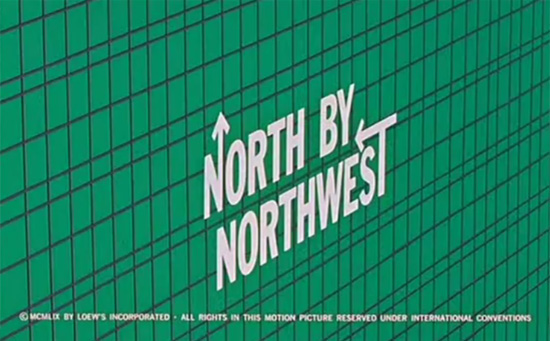
Here is a still from the Saul Bass’ title sequence for “North by Northwest,” his first project with director Alfred Hitchcock:
A great draftsman and visual storyteller, Saul Bass ran the gamut of techniques for his title sequences: montage, live action, cut-out paper animation, typography in motion, to name a few. Whatever technique he used, Bass summarized the film as a metaphor that often shone with creativity. (In January 2010, David Peters, Kai Christmann and Dav Rauch, all of Design Films, gave two presentations on the work of Saul Bass at the 12th Future Film Festival in Bologna, Italy.)
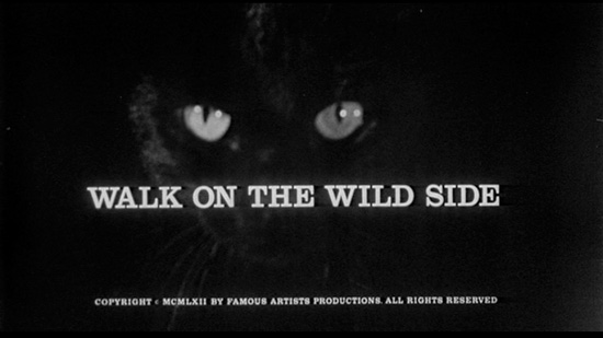
In an interview, Kyle Cooper listed three opening sequences that made a big impression on him. Saul Bass’ title sequence for the 1962 film “Walk on the Wild Side” (watch on MySpace) was among them:
It could be argued that typography lost importance in this era of title design. The imagery behind the credits received a lot more attention. Still, the interplay of typography and images was by no means ignored. Popular trends of the 1950s were using three-dimensional lettering and embedding type in physical artifacts such as embroidery and signage. In contrast, Saul Bass often approached the lettering of a main title as he would a logo, making it function as the core element in a full marketing campaign. While the variety of solutions increased considerably, their anchor was always the relationship of on-screen typography to the movie itself.
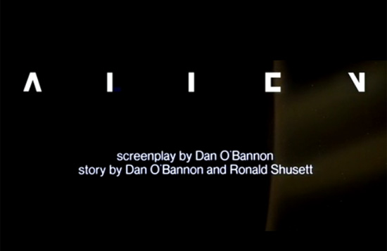
The power of minimalism is shown in the opening sequence for Ridley Scott’s “Alien” (1979). Credit for this design goes to Richard Greenberg, with creative direction from Stephen Frankfurt:
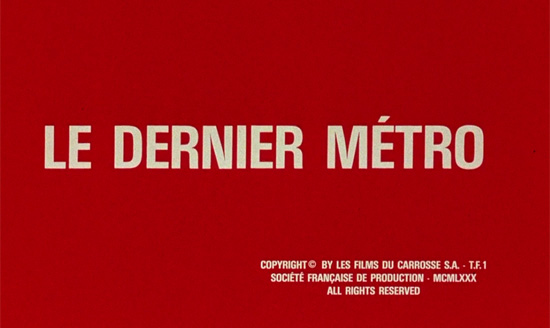
The main title for the French film classic “Le Dernier Metro” (1980), directed by Francois Truffaut, is austere and modern but has a generic quality not so different from a Woody Allen title:
The Digital Era, And Modern Trends In Film Title Design
Every sphere of contemporary life — and especially the film business — has been affected by computers. For designers, creating film titles meant participating in the apprenticeship tradition — learning by doing, on the job; that continued unabated into the mid-1990s. At that time, dynamic openers by Kyle Cooper and others showed what the next generation of design-educated, film-literate, tech-savvy creatives could do. That apprenticeship tradition has largely been overshadowed by the rise of popular technology, the Internet-enabled archiving of everything and the plethora of schools that propagate countless design disciplines. Most significantly, we see designers working like filmmakers and filmmakers working like designers.
The revolutionary title sequence for “Se7en” (1995) by Kyle Cooper was named by New York Times Magazine as “one of the most important design innovations of the 1990s”:
A consequence of this digital era seems to be that modern title design will forever rely on progressive technologies. Yet, in one of his interviews, Kyle Cooper states that while the power of computer graphics is obvious, he still likes experimenting with live action, because there is something special about the imperfection of making things by hand.
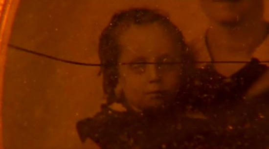
While Cooper was working on the sequence for “Darkness Falls” (2003), some glass he was using suddenly split, and the crack cut across the eyes of a girl in an old picture. The incident added suspense to the effect:
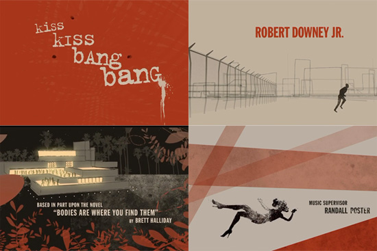
In his title sequence for the 2005 crime-comedy “Kiss Kiss Bang Bang” (watch on YouTube), designer Danny Yount made use of Saul Bass-style graphics to recreate the atmosphere of 1960s detective stories:
The potential of digital graphics and typography has attracted some of the most creative minds to motion design. Pixar and Disney have reserved crucial parts in the branding of their films for the title sequences. Using animated characters to introduce viewers to the story became a popular trend. Such talented graphic designers as Susan Bradley (Toy Story, Monsters, Inc., WALL-E, Ratatouille), Jaimi Caliri (Lemony Snicket’s A Series of Unfortunate Events), Dave Nalle (Corpse Bride), Michael Riley (The Back-Up Plan, Kung Fu Panda) and Michael Curtis (Brother Bear) use all manner of tools to test different approaches to designing titles. One thing these individuals have in common is a drive to find a strong metaphor and tell an exciting story with their sequences.
For the end sequence of “Ratatouille”, Susan Bradley (read an interview with her) drew the typography, inspired by the slab-serif typeface Rockwell. For the opening titles, she used a hand-drawn cursive intended to evoke Paris.
The title sequence for “Thank You for Smoking” (2005) is a modern manifesto on typographic style in title design. The idea for using cigarette packaging for the opening sequence was suggested by the film’s director, Jason Reitman, and implemented by Shadowplay Studios. Typographica goes through the trouble of pointing out the fonts in the sequence:
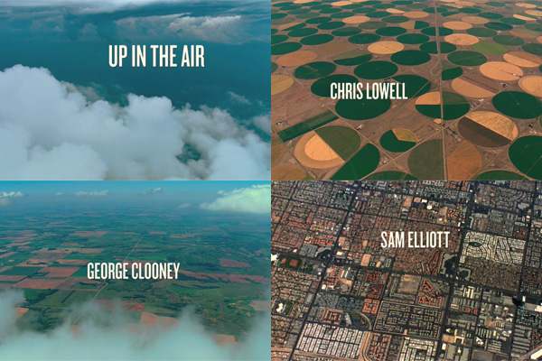
In the title sequence for “Up in the Air” (2009), the designers at Shadowplay Studios rely on aerial photography:
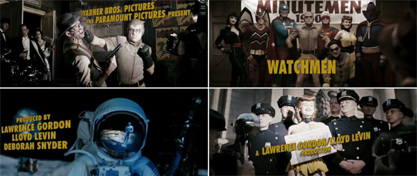
The title sequence for the 2009 adaptation of the comic book “Watchmen” drew a loud response from the public. It creates an alternate history, depicting the involvement of superheroes in all major events of post-World War II America. The sequence was shot by the film’s director Zach Snyder, while credit for the title’s integration goes to yU+Co:
Conclusion
Throughout the history of cinema, film titles have evolved with the film industry, as well as with social trends and fashion movements. But the measure of a title design’s quality is the same now as it was in the silent era. Whatever function they perform, titles remain an essential part of film.
Granted, in recent years the business of film titling has been terribly strained by the control of producers over commissions and their persistence in demanding speculative work as the price of admission. Creatively speaking, though, as filmmaking consolidates into the most powerful international cultural phenomenon of the 21st century, ingenuity in titling is a certainty. As designers have always known, the opening moments can make a deeply satisfying contribution to any film.
Typography Resources
Below you’ll find links to some downloadable typefaces that were used in or inspired by film titles from cinema history. Please read the legacy notes before downloading.
HPHLS Vintage Prop Fonts An amazing collection of revived vintage fonts, many of which were used in early cinema. Among them are faces based on the National Old Style, Colwell Handletter and Post Monotone no. 2. Only some fonts can be downloaded for free, although the entire collection is available on CD at an affordable price.
Silentina The Silentina font family is a great modern take on typography from silent film inter-titles. Designed by Ray Larabie in 2004.
Hitchcock Hitchcock was created by designer Matt Terich as an homage to the lettering style of the iconic Saul Bass. The font is available as a free download, and you’ll find a selection of other typefaces in the same vein.
Movie/TV Related Fonts Here is a collection of free fonts styled after the main titles of famous films and TV shows.
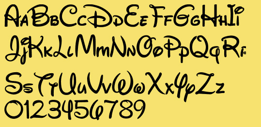
Waltograph Waltograph was created by Justin Callaghan in an attempt to capture the spirit of the familiar Walt Disney signage.
The Disney Font List On MickeyAvenue.com, Justin Callaghan shares a definitive list of typefaces seen in Walt Disney movies and places.
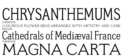
Meyer 2 Meyer 2, originally drawn in 1926 as one of the five fonts cut by linotype to Louis B. Meyer’s personal specifications, was revived in 1994 by type designer David Berlow.
ITC Korinna The Korinna font family has an art nouveau heritage and looks similar to the Pastel font, which was often used for title cards in silent films.
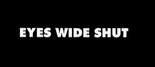
Futura Extra Bold Stanley Kubrick’s favorite typeface.
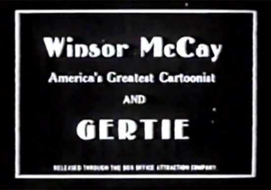
Gisele This font looks similar to the one used by Winsor McCay for his 1914 animation Gertie the Dinosaur.
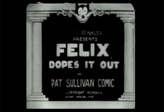
CCMR Mamoulian Blather A font that recalls the typography in the title of the 1924 animated movie Felix Dopes It Out.
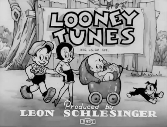
That’s All Folks Here’s a cheerful Looney Tunes-inspired font family called That’s All Folks.
Futura Extra Bold Stanley Kubrick’s favorite typeface.

Gisele This font looks similar to the one used by Winsor McCay for his 1914 animation Gertie the Dinosaur.
CCMR Mamoulian Blather A font that recalls the typography in the title of the 1924 animated movie Felix Dopes It Out.
That’s All Folks Here’s a cheerful Looney Tunes-inspired font family called That’s All Folks.
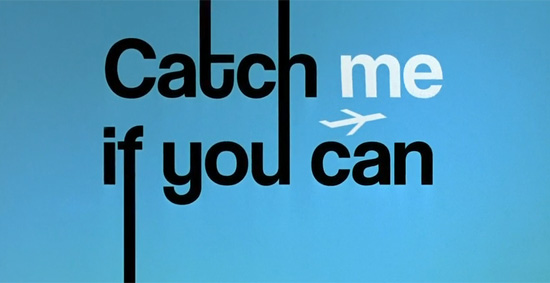
Coolvetica Coolvetica looks like the sans-serif typeface in the title sequence for Catch Me If You Can (2002).
Resources And Reference Material
The Art of the Title Sequence A comprehensive and authoritative resource on film and television title design from around the world. Plenty of excellent designs and material available.
Forget the Film, Watch the Titles One of the first online resources dedicated to film title design. You’ll find a lot of amazing examples, reviews and interviews with the experts.
Title Design Project In this showcase gallery are title sequences from both classic and recent movies.
Movie Title Stills Collection A large and diverse collection of film title stills from between 1920 to the present.
Taking Credit: Film Title Sequences, 1955–1965 An essay by a London-based writer and curator with an interest in graphic design, Emily King.
Letters of Introduction: Film Credits and City Scapes This essay covers the textuality of film credit sequences and their relationship to the expressiveness of urban life.
Credits
I’d like to thank David Peters, who kindly agreed to contribute content as well as references to this article. David is the founder and director of DESIGN FILMS, a team of creatives committed to researching, collecting and presenting film programs about design, typography and film history. David is also a principal and design strategist at the communication design firm EXBROOK.


 JavaScript Form Builder — Create JSON-driven forms without coding.
 Register For Free
 Devs love Storyblok - Learn why!
 How To Measure UX and Design Impact, 8h video + UX training
