Designing For Content Management Systems
Designing and indeed front-end development for a website that will have content edited by non-technical users poses some problems over and above those you will encounter when developing a site where you have full control over the output mark-up. However, most clients these days want to be able to manage their own content, so most designers will find that some, if not all, of their designs end up as templates in some kind of CMS.
By considering the CMS as you design, you can maintain far more control over the final output. If your designs will be implemented and integrated into the CMS by a developer, then taking control at the design phase will help you to keep control over the design as opposed to leaving decisions to the developer or the content editors.
Further Reading on SmashingMag:
- Getting Started With Content Management Systems
- 10 Things To Consider When Choosing The Perfect CMS
- Why Static Website Generators Are The Next Big Thing
- Content Management System (CMS) Icon Set (12 Free Icons)
Know your enemy
Content Management Systems vary greatly in how much control they give the designer and the content editors. As a designer, you should first find out how much control over the templating system of your chosen CMS you have. Control may vary from simply being able to edit the existing templates to being able to shape the CMS completely around your designs. In some older CMS products you may find that you have little control over the mark-up that is inserted into the pages.
Where the content editors are concerned you should find out:
- Will the editors be able to insert any HTML tags into content areas, either by way of a WYSIWYG editor or directly?
- Is content simply large blocks of marked up content inserted by the editor or does the CMS use any kind of structured content?
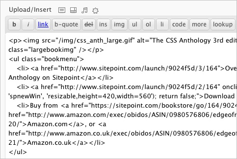
Many people use WordPress as a CMS. In WordPress, users can add any mark-up to the Page content area
If users of the CMS will be able to insert their own HTML, then you need to consider how your design will hold up when that happens. The ideal situation for a designer is where the user has limited ability to enter their own mark-up and the CMS uses blocks of structured content to guide them into adding content in the right way that can then be marked up correctly by the templates. The more freedom a user has, the more defensively you need to design.
Keep it consistent
However flexible your CMS is, it is important to consider the consistency in your design templates. Training content editors is far easier if the elements that they have to work with are consistent across all pages of the site.
If working with any kind of structured content in your design (for example an article listing that displays a list of titles and excerpts from articles on the website), think of each section as a repeating block. With CSS3 we can more easily target every other item, or the last item, but this is not available for older browsers and it may not be possible to edit the back-end code of the CMS to add a class to every other item or the last item. Ensure that the design will hold up if each repeating block is the same — you can always add extra finesse for those browsers that do support CSS3.
When dealing with areas that are essentially large blocks of content where the user has control over the mark-up, don’t assume the user will remember to add lots of different classes to the mark-up to trigger the CSS effects you envisaged. Either keep things simple or use CSS3 selectors to target areas of the design.
Do not assume content length or height of blocks
On the web it is never a good idea to assume you know how tall something will be — as even where you have control of the content, text resizing can blow your assumed heights right out of the water and cause overlaps or text running off background images.
When designing for a CMS, you have the additional issue of more or less text being added to an area that you envisaged. If creating the initial designs in Photoshop or similar, consider how each box and the surrounding content will react to a greater or lesser amount of content. If providing PSD files to someone else to build, ensure that any background images on these boxes are provided with instructions on what happens if the box is taller. For example do we show more background or matt onto a flat color?
Grid type layouts of boxes can be a particular problem in this situation. A common design might have several boxes with header areas. They look lovely and neat in the PSD comp with regular lengths of lorem ipsum. However, once the content editors have added content, we find that some headings are on one line, some on two and the boxes are wildly differing heights leaving the neat grid looking rather messy. Considering this at the design phase may have dictated a different layout here.
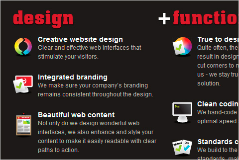
The lists on the homepage of the Dubbed Creative website do not depend on height of content: some points have more text than others. This type of layout looks tidier than attempting to create equal height boxes with non-equal lengths of content.
If you are handing over to a front-end developer, thinking through these scenarios keeps the control on your side. Decide how you want it to look and explain to the developer how it should react to text resizing, additional content and so on and you don’t run the risk of leaving these decisions to people without an eye for design.
Avoid using image replacement for text
It is possible to generate images on the server side using PHP and other languages, however your CMS is unlikely to offer this capability as a standard feature. Therefore you should consider how any non-standard fonts will be included in your designs if that text needs to be managed by the CMS.
The situation with fonts is becoming far easier as there are now a number of services that allow you to use fonts that are not installed on your user’s computer but that would otherwise be difficult or impossible to license to include on your website. If you need a specific font you may be lucky and find that one of the below services have it available, or they may have something available which is close enough to get the visual effect you want.
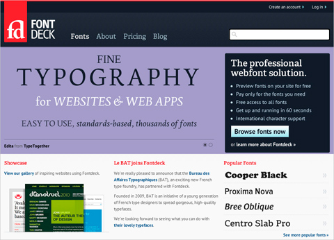
Services such as Fontdeck and Typekit mean that using images for text is not neccessary to use a specific font.
- Fontdeck
- Typekit
- Fonts.com Web Fonts
- Font Squirrel
- Review of Popular Web Font Embedding Services (here, on Smashing Magazine)
Consider the CMS when designing navigation
The CMS that you are using is likely to dictate the navigation to some extent, so find out by checking the documentation or speaking with the developers what will be possible. It is useful to know what control content editors have over navigation. If they can add elements to the main navigation for example, it may be that you are best to avoid a neat row of tabs at the top of the site as additional tabs added by users may wrap.
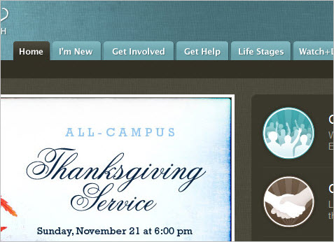
An attractive row of tabs such as these on the Long Hollow Church Website may look untidy if editors have access to add new top level navigation elements.
Questions you should get answers to include:
- How many levels of navigation will be displayed? Is this configurable?
- Can content editors add to or change the main top-level navigation?
- Can you highlight the current page or section?
- Does the CMS offer breadcrumb style navigation?
- What mark-up will the CMS output for the navigation? Can we change it or add classes?
Design and create CSS rules for all possible HTML elements
In your design and dummy content you may only use two levels of heading and never add an ordered list or blockquote, However, if these elements can be added in the CMS, then at some point someone will use them. If you have used a CSS reset stylesheet you may not have styles defined for these elements at all — which will mean they look rather strange when used. Ensure that you have created CSS for all HTML elements in the content areas of your site.
I find it helpful to start my stylesheet with the default styling for all elements as this then acts as a fallback if I don’t add specific rules for styles later on in the document. I can always overwrite this CSS to make level 2 headings look different when they are in the main content area to when they are the heading of a sidebar box, but if I don’t add any specific CSS and then the user adds these elements, they do have some thought put into them.
Assume HTML elements can be stacked in any order
When creating your design, it is easy to assume that the content will look very much like your structured sample content. The h1 will be followed by a couple of paragraphs, never stacking headings and so on. The reality will be different once content editors get their hands on the design, so test the elements in different combinations.
Ask yourself questions such as:
- Does the design still hold together well with stacked headings? Is there appropriate spacing between them?
- What happens if a heading is used inside a list item?
- What happens if different list types are nested? Is the spacing correct at the bottom of each list?
- If the user can insert and align an image, what will then happen to the text around that image? Will there be a margin or will the text run right up against it? What happens if they put an image inside a list item?
Use CSS to enforce the style guide and semantics
This is something we tend to see once users become comfortable with their CMS: they begin to realize that, for example, an h1 heading gives them large bold text. You then start to find h1 headings in all kinds of strange places — wherever the user thinks something should be marked as very important. This can include half of the content of some pages. In the first instance we all need to try and educate our users and provide them with a style guide to help them understand the importance of semantics and correct usage of mark-up but the person you originally train will probably not be the person who manages the content forever and ultimately you will find users being creative with their mark-up.
A considered use of CSS can prevent this from happening. For example, we generally only want one h1 per page. If the main page heading is in a container, then you can use CSS selectors only to target that h1 with the main heading styling and reset the browser defaults on all other h1 headings to the same as the main body copy. This means the user has no benefit to using h1 in a non-semantic manner. The advanced selectors found in CSS3 can be very useful here.
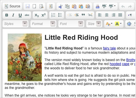
CMS Editors may want to get creative when given a “WYSIWYG” editor such as CKEditor - use CSS to protect your design as much as possible.
Test with real content
Once your design has been developed into (X)HTML and CSS, test your assumptions in terms of how the content will behave. I find it helpful to do this before the templates are incorporated into the CMS. Points to test:
- Take each headline or small box in the design. Put in three times the amount of content you would expect it to have. How does it look? Does the box expand nicely or do you run off the background image or overlap another element?
- Grab a chunk of HTML from anywhere — just View Source on some site and grab a bunch of content complete with HTML tags. Paste it into your main content area in the template. How does it look?
- If using structured mark-up to display an event or similar — does the design hold up if certain items are removed or do you end up with obviously empty areas such as the word “Tel:” with no phone number after it if a phone number was not entered for a contact?
Help your content editors to maintain the design
If you hand over the CMS with little instruction for your users, then you can’t really expect them to read your mind and maintain the design as you would like. Even if your initial content editor is thoroughly trained on how to edit the site, as time passes by they may forget, or decide to get a little bit creative, or the initial editor may leave and someone else takes over with little training. At the end of the project, keep control over the design by helping your editor to do things the right way.
Remove functionality from the editor
The WYSIWYG editor in your CMS may by default give the user the ability to add all kinds of styling, even adding inline CSS. However, with many editors it is possible to trim down the toolbars to just offer a limited subset of icons and therefore functionality that is exposed to the user. If you can trim down the editor to only offer the ability to add basic HTML elements, you will have far fewer problems to deal with.
Add CSS to the WYSIWYG editor
If content editors have access to a WYSIWYG editor when editing content, add the CSS rules used on the site to the editor CSS. That way, editors can see how their changes to the content will actually look. In combination with using CSS to enforce the style guide, this can help users to maintain the consistency on the site.
Create a style guide that also includes semantics
Include a style guide for the site as part of your handover documentation. It is easy to just handover documentation on how the CMS functions and forget to also explain to content editors which elements they should be using when adding their content. This is particularly important if editors have a lot of control over the mark-up which they enter.
By considering how content will be edited on your site and the possible ways in which, over time, that content will grow and change, you can maintain far more control over a CMS website than you might think. If you have any additional tips or would like to discuss problems you have encountered when designing for Content Management Systems, leave a few lines in the comments below.
Further resources
Here are some additional resources that might help with your own CMS based projects:
- 24ways: Cleaner code with CSS3 Selectors Use CSS3 selectors instead of expecting your users to add classes to content.
- A List Apart: Strategic Content Management An in depth article about selecting and customizing a CMS.
- Design for CMS-Powered web sites An in-depth article explaining specific design techniques for use in CMS powered sites.
- cmsdesigns.org A showcase site for designs using Open Source CMS systems; a good place to see how flexible different systems are and how other designers are working with them.
- Getting Real: Use Real Words This tip is especially important when you are designing for CMS.
(vf) (ik)


 Devs love Storyblok - Learn why!
 Register For Free
 JavaScript Form Builder — Create JSON-driven forms without coding.
 How To Measure UX and Design Impact, 8h video + UX training


