Dear Web Design Community, Where Have You Gone?
Our established set of design and coding practices is more comprehensive than it has ever been before. Our designs are becoming more usable, our code more scalable, our layouts more responsive. In fact, just by comparing our design processes to those from a decade ago, it’s remarkable to observe how quickly we’ve developed and honed our craft over all these years.
However, the maturity of our industry is far from being complete. While producing a myriad of technological advancements, we have outpaced other developments along the way. These developments aren’t related to the lack of cross-browser standards support or technical downsides of the tools we are using. No, they have a different nature. They have emerged within our design community — a community which is now so fertile and diverse that it is becoming increasingly difficult to ensure its professional maturity.
In fact, there are many issues that require a thorough, profound discussion within our industry, yet they are not properly discussed for one reason or the other. This article is based on my recent, often unrelated, observations of our community. It features my personal opinion on the problems we need to tackle and conversations we need to start to ensure its healthy evolution.
Further Reading on SmashingMag:
- The Smashing Guide To Moving The Web Forward
- The Web Design Community Offers Advice To Beginners
- The Design Community Offers Its Favorite Bits of Advice
- The Sad State Of The Web Design Community
Where Did The Community Spirit Go?
I was very lucky to have experienced the development of the Web design community from its early days on. As a passionate newcomer to the industry, I was captivated by the sense of enthusiasm that seemed to be flourishing everywhere and spurring everyone. It was a strong and genuine feeling that was sparkled among dozens of sites and magazines and fueled by the motivation of experienced and non-experienced designers. The community was reasonably small and therefore very welcoming and supportive, so everybody was perfectly fine with asking lengthy questions and providing detailed answers.
I clearly remember in-depth discussions with hundreds of meaningful, engaged comments, in which designers would thoroughly analyze the techniques presented and suggest improvements or alternatives. I remember having experienced print and digital designers writing articles and teaching inexperienced designers the obscure details of and practical tips about the new craft. I remember vivid debates spreading from one site to another, connecting designers and building professional relationships in the community.
These discussions still take place today. There are many more designers and developers out there encouraging these discussions. The remarkable work of people like Paul Boag, Dan Mall, Jeffrey Zeldman, Francisco Inchauste, Chris Coyier, Simon Collison, Andy Clarke, Paul Irish, Chris Heilmann, Jeffrey Way, Trent Walton and many others is a vivid manifestation of the tremendous care and dedication of designers and developers to our industry. There are literally thousands of talented folks out there who are writing articles and releasing wonderful new tools and resources for all of us to use. That’s great. That’s great because all of these contributions bring our community much further.
However, every now and again I can’t help but realize that the number of active contributors with knowledge and experience hasn’t increased proportionally to the overall magnitude of our growing community. Way too often I find it extremely difficult to find meaningful debates spanning over the whole community — debates that would create a strong echo and prompt us all to revise, extend or adjust our practices and hence become better professionals.
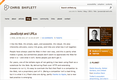
The recent hashbang debate is an excellent example of community-wide discussions that our community could use.
Way too often do I come to the conclusion that this remarkable, inspiring enthusiasm we once had is now gone. What remained are stranded cliques of passionate designers who lead design discussions privately and separately, often unnoticed by the vast majority of the community.
The tragic irony is that although we are probably one of the most connected professional communities out there, it seems that we are increasingly not connecting. It’s not that we’ve become just a bit too comfortable with the processes we’ve developed over the years nor that we don’t care about improving our design and coding skills. In dialogue with our readers and colleagues at conferences or even online, I’ve become confident that this development has entirely different roots.
Finding Time to Contribute
Since there is so much going on the Web these days, it seems only reasonable that many of us might experience difficulties finding time to actively engage in professional discussions. Personally, I am just as guilty as the next guy, as I find it extremely difficult to read more than 5–7 design pieces a day — not to mention commenting on any of them. I’m trying to challenge myself to be more responsive and engaging. Sometimes it works, sometimes it doesn’t, but I have firmly committed to this change and maybe — just maybe — so could you.
I believe that the lack of time is one of the reasons for our changed behavior online. Our emails have become shorter, and so are our blog posts and comments. Our interest has become much more difficult to enrapture, and so we’ve become more passive and less critical. We way too easily consume and accept ideas, designs, concepts out there, sometimes without even questioning their validity and correctness. Instead of debating, we agree; instead of criticizing, we accept — or simply click away and ignore the discussion altogether. And this is the reason why many conversations in the community do not get a critical mass of interest.
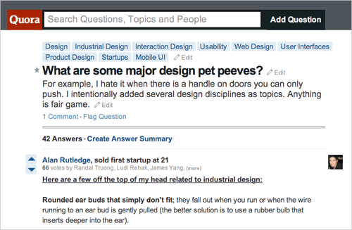 Web design discussions on Quora and StackExchange sites are wonderful examples of websites that we have already started using to exchange ideas, ask questions and conduct valuable design discussions.
The worrying part is that the number of the less experienced active contributors has increased exponentially. Due to that, I am afraid that the community is not led in the right direction. The true leaders — professional, knowledgeable designers and coders — are busy. Busy with their work or perhaps they feel that it’s no longer worthwhile for them to spend much time contributing. I hope this attitude can change. We need more professionals to find time to contribute and help to teach others. After all, so many of us are self-taught. And where would we be today without the contributions of others?
We need more meaningful and helpful discussions within our community. Finding time is difficult, but we don’t have to jump into writing or commenting with both feet. An occasional comment, tweet, reply or short blog post about whatever it is we’ve learned or thought would already help; it might just as well invoke thought-provoking discussions by other members of the community. As artisans of the Web, we love to discuss things that are important to us — be it design, coding, writing or anything else. We might have no time for profound writing, but we certainly have enough time to suggest an idea and encourage our friends to join in the discussions. Taking just a couple of minutes every day to think about the craft we love will bring us further and accumulate the wisdom within our community.
Francisco Inchauste summarized this point nicely in one of our recent conversations: “Everyone has a perspective and experience to share. Without more perspectives, we’ll become limited in our growth. The community is only as strong as our weakest people. To improve, we need to lift others up by helping to educate and guide.”
We Need to Curate Valuable, Meaningful Resources
Probably the easiest way to jump into design discussions would be by observing and replying to the tweets marked with the hashtag #design. Well, that’s what I thought before adding the #design column on my Tweetdeck a couple of weeks ago. After a couple of days of occasional scanning of tweets in that stream, I did find a couple of interesting discussions; however, more often than not I stumbled upon loud, inaccurate and promotional tweets which led to tutorials, freebies or inspirational websites.
Don’t get me wrong: I have nothing against these resources per se, but I don’t quite understand why we, multi-talented, versatile craftsmen of the Web, are restricting the use of such a powerful medium as Twitter primarily to these resources. Why don’t we use it for meaningful discussions as well? Have we somehow become blindfolded by pure eye-candy or tremendous technological opportunities we have now with jQuery, CSS3 and HTML5? We are experimenting with visual and interactive enhancements in our tutorials and our designs, yet we tend to forget about the fundamentals of our work — our design principles, the quality of our processes and the integrity of our creations. We could all benefit from writing and talking about the ways we work, the decisions we make and the solutions we come up with.
Just compare finding a jQuery slideshow plugin against finding a practical resource on UX design patterns. Or finding a social media icon set against finding detailed case-studies written by experienced designers. Valuable, useful resources are becoming rarities and unfortunately many of them just do not get the attention they well deserve.
We need to support and curate the creators of thought-provoking and valuable resources and help them maintain and support these resources. We need to support them because they are the ones that raise questions and seek for answers; they are the ones that support the maturity of our profession; they are the ones that are not afraid to question status quo and encourage experimentation, sharing and innovation — the so needed attributes of our exploding industry.
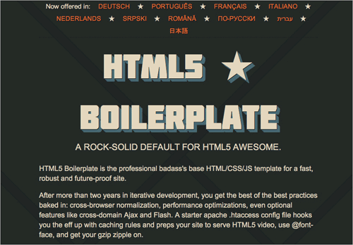
HTML5 Boilerplate is a remarkable example of a cooperation of dozens of Web designers who share their thoughts and insights to create something useful for all of us to use. Unfortunately, many useful projects on Github do not manage to get such strong community-wide support.
We can use our communication channels wisely and invite our colleagues and friends to join in the discussions, sharing opinions and spreading the word about those of us who truly dedicate their time and effort to produce useful, valuable resources. I am certain that by doing so, we’ll be able to unleash the remarkable potential for a strong and supportive exchange of ideas and expertise.
The emerging conferences like Fronteers, Brooklyn Beta and New Adventures in Web Design show very well which benefits a strong community has: it is inspiring, helpful, forward-thinking, challenging. I will never forget the moment when I was sitting among the attendees during one of the conference’s talks and my neighbor turned to her colleague and whispered, almost mindlessly: “I feel that these talks are going to change my views of design forever”. I’d love to experience this feeling in our online discussions, too.
Community-Wide Discussions and Polls
There is so much content out there so that our focus is distributed among dozens of resources and discussions every day; it’s not easy to see how exactly we could lead large community-wide discussions. A blog’s audience is usually limited by its RSS-subscribers, random visitors and social reach of the blog owner. Spreading the word in social circles outside this audience might work to some extent, but it usually won’t help reach the vast majority of the community, especially if the blog is relatively small or obscure.
We need to have some sort of a mechanism that would connect like-minded designers and developers which are not already connected via other media. Twitter’s hashtags are a good example of ways how we are already trying to solidify exchange of ideas and thoughts. But we can make it better.
So what if we had a consistent standard in place? We could strengthen these exchanges through hashtags by developing and having the community adapt some common tags to use en mass. For instance, #design_type, #design_layout, #design_js and others. We could even conduct community-wide polls (#design_poll) that could be easily recognized and retweeted by users with smaller as well as larger followship, thus spreading the word and strengthening the active participation within the community. We could have a website tracking these hashtags, presenting the most popular discussions and filtering spam and other malicious activities.
The same mechanism could be used for supporting valuable design resources and their creators as well as passionate designers who write insightful articles or produce useful resources. When elaborated properly, this approach will make it easier for us to connect and participate in large, community-wide discussions. These discussions might even spread beyond the limits of our community, providing a different perspective on our conversations by professionals from other industries.
So What Exactly Should We Be Discussing?
As Web designers, we’ve come a long way. We’ve shaped a new, strong industry and developed professional design processes. We also have learned a lot on our journey — be it some bits of psychology, copywriting, marketing or other related disciplines. If you think about it, that’s already a massive achievement, and so we have a damn good reason to be proud of what we have contributed to all these years altogether.
However, like in any other industry, we need to permanently revise our practices, innovate and improve our design processes. In fact, there are a number of things that might need to be extended and reconsidered. Let’s cover the not-so-obvious ones.
Our Professional Vocabulary
As mentioned above, when it comes to Web design, there are always so many different disciplines and professions involved, that it is becoming increasingly difficult to make sure that everybody involved is on the same page in terms of vocabulary used in our discussions.
Misunderstandings between designers, developers and stakeholders are the running joke in our community. And there is a reason behind it: the vocabulary we are using has dramatically evolved over years — it was primarily expanded, sometimes with abbreviations and concept titles which are counter-intuitive or misleading. We have applied terms from print design to Web design; we have coined new terms for new concepts and methodologies; we have introduced terms that might have become outdated today (think of the outdated floppy disk symbol for the “Save” icon). The result is a quite sloppy and inconsistent vocabulary — we often have various terms describing one concept, or one term describing various concepts.
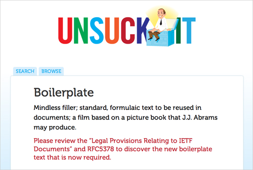
Unsuck It explains terrible business jargon in plain words. Hopefully, we won’t need something like this for the design community as well.
For instance, there are design attributes that we call ‘responsive’, ‘adaptive’ or ‘flexible’, but what exactly do we mean when we apply them? Different designers might even have a different idea on what they mean with the word “design”; is it visual design, design as a concept or maybe UX design? And what is UX exactly anyway? The same problem occurs when we discuss terms such as “HTML5”, “page”, “fold”, “navigation” and others. Just imagine how devastating the results would be if any other professional industry, e.g. medicine, wouldn’t have a common vocabulary for its technical terms?
At the New Adventures in Web Design Conference last month, Dan Rubin talked about this very issue, saying that the industry as a whole needs a common grammar and vocabulary. He asserts that the ones we have now, were perhaps somewhat hastily chosen. And that with some careful thought and planning, we can design a much more accurate vocabulary to help avoid the confusion which can stem from the existing one.
We could use more precise and intuitive terms which would be based on certain concepts that are familiar to us and other professionals. As Dan noticed, “responsive design”, coined by Ethan Marcotte, is an excellent example of such a term. It derived from the concept of “responsive architecture” which explores how physical spaces can respond to the presence of people passing through them. So instead of creating unchanging spaces that define a particular experience, they create spaces in which inhabitants and structure can — and should — mutually influence each other.
Applied to Web design, it means that we could treat our designs (very much like these spaces) as facets of the same experience. The concept can be easily explained and understood. It’s not too technical, it’s not too abstract and it’s not chosen randomly. It is rational, visual and memorable which are all excellent qualities for a term describing a new design approach.
Perhaps we could create a standardized design language which would accumulate our vocabulary and provide us and our stakeholders with a consistent and unambiguous terminology for our discussions. Finding a common vocabulary is a challenging task and it’s an ongoing process that would need permanent revisions and updates.
Our Design and Coding Practices
Actually, we need to refine more than our design vocabulary: our design and coding practices require regular revisions as well. Faced with new design requirements in our regular work, we keep conquering design problems and exploring appropriate solutions for them. These activities are the driving force behind learning; they heavily influence the decisions we make once we approach similar design problems in the future. This is what makes us experienced professionals.
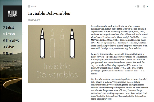
Method and Craft is an excellent website where professional designers and developers are sharing tips about their workflow and design processes. This is a goldmine for newcomers to the industry.
We learn something new every single day. We discover a new CSS trick or a new UX tweak. An obscure Photoshop technique or a beautiful font pairing. Our convenient coding techniques are gradually dating as browsers become more capable and so we discover that certain browser hacks are no longer necessary. We find new ways of how certain common conventions could or should be adjusted. All these small things we discover in our daily routine help us improve our skills and workflow. Actively exchanging thoughts and methodologies with your colleagues will mutually benefit and improve the overall design and coding practices.
We shouldn’t be afraid of asking challenging questions or posing bold statements. If you feel that we should all stop using CAPTCHAs, then say so and explain your rationale behind the argument. If you think that there is a way to reinvent scrollbar, say so and explain how exactly you imagine this technique to work and why it’s better. And if you are struggling with a personal problem and would like to hear how the community members managed to solve it, say it, too — it’s very likely that other members of the community have had similar problems and will be glad to join the discussion and help out.
Our Professional Ethics
Saying “no” can be extremely difficult sometimes, especially when personal or financial incentives are at play. However, as professionals, we owe it to ourselves and to our projects to not get enticed by offers and suggestions that do not wholeheartedly coincide with our intentions and objectives. The former can bring temporary benefits, but if applied consistently, the latter will bring long-term benefits.
We need to become more aware of the ethics that we should be following while designing, coding, writing, editing and publishing on the Web. The times when soulless copy-pasted press releases were used “as-is” across online publications are long gone, so let’s stop doing that. Cheap generic stock photos neither visualize nor support the article, so let’s stop using them, too. Professional publications often use “nofollow” attribute to block link-droppers from gaining Google’s link juice; and most users will not click on links titled “Milestone Professional Web Design Agency”, so let’s stop doing it as well. There are many similar examples which we can use to adapt, and optimize our online behavior accordingly.
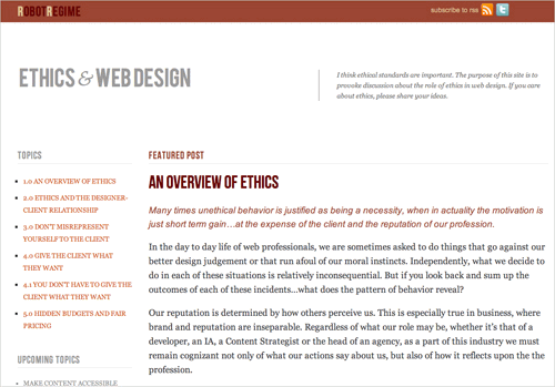
The website Ethics and Web Design is a valuable resource which covers the fundamentals of professional ethics in our industry.
As content creators, we often depend on advertising, and that’s sometimes the necessary evil that we need to accept to be able to monetize our dedicated writing efforts. And there is nothing wrong about it. However, we need to set clear limits to how the advertising can and how it cannot be presented on our websites. For example, text link advertising and sponsored posts should always be clearly marked as such. We should have a strict separation between content and advertising. Each of us could design a set of personal principles for his or her websites (publishing policy), publish these rules online and stick to them no matter what. This way the readers will respect you and appreciate the simple fact that you are strongly committed to quality work.
We could benefit from being more critical about our content and the way we present it online. It means paying more attention to copy, consistency of our writing style, quality of images and image captions, design of code snippets etc. These details give our writing a different tone; they empower our thoughts and make the content more trustworthy and reliable. Why don’t we make our work more challenging by trying to make every article we publish at least a tiny bit better than the previous one? We could try not to just “put stuff out there”, but curate our delicate ramblings, making sure that every published article has the highest level of quality that we can afford for it. A style guide can be helpful in this case, especially for larger websites.
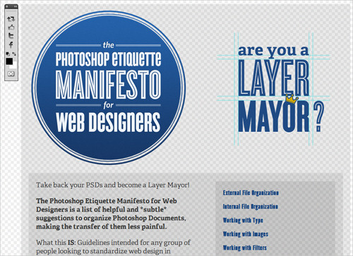
Photoshop Etiquette Manifesto is a website listing helpful and subtle suggestions to organize your Photoshop documents — making the transfer of them less painful.
In Web design it means to stop using anti-patterns — design patterns which are created specifically to trick our users. Instead, we should respect and advocate for our audience and protect their interests. Think about building loyal, honest, authentic user base for your own project or your client’s brand and think about the quality of relationships you create with each user.
Not only should our designs be usable for our visitors, but also our code should be maintainable for developers. Just like with content, you could come up with your set of standards which you’d like to follow in your work, make it public and stick to it. Make it your final checklist item before you hit that “Publish” or “Commit” button. That’s what will make people look up to you and respect your work.
Bottom line: we should strive for responsible Web design that not only embraces best design and coding practices, but also respects our publishing policies, protects the interests of our users and supports the professional work of our colleagues.
Our View of Web Design Trends
As professionals who care about producing beautiful, top-notch products for the Web, we love to explore innovative design and coding techniques. We love to take them apart and put them together again, learning about their potential during the process. We love to discuss them with our colleagues and keep them in mind for upcoming projects. The more other designers use these techniques, the more important they become to us. Among ourselves, we start to respectfully call them trends.
Nevertheless, trends can be dangerous and misleading beasts. They give us an exciting feeling of having a valuable insight that most of our colleagues don’t have yet. We feel fortunate to have discovered one early enough to use it effectively before it becomes common practice. Trends are precursors of the “next big thing,” and so we pay attention to them.
I can’t help but think that trends seem to be spectacularly overrated in our industry. Often they are regarded as bulletproof solutions, respected and universally accepted for the simple reason that they are innovative and widely used (think of drop shadows or text shadows, for example). I believe that we tend to adopt trends too quickly, often getting carried away by their originality rather than understanding their purpose. This should not be the case. Trends are not a panacea for all of the problems we encounter, and often they don’t even provide an optimal solution for the situation in which they were used in the first place.
Not to say that trends are unimportant, though. They are important, especially when they foster innovation and make us reconsider our design decisions. They can challenge us to be more effective and more thoughtful in our designs. Yet they inevitably fail in one particular regard.
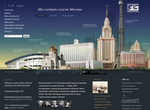
We can learn a lot simply by examining obscure websites out there, such as Mospromstroy, the website of an industrial construction company in Moscow. The code is far from optimal, but the website itself reveals some interesting design decisions.
One thing I’ve learned to love over the last year is thoroughly examining unfamiliar foreign websites; Russian and Korean websites, to be specific. I feel inspired and empowered just going through them, creating wireframes from them, exploring their interaction patterns and analyzing the source code. I love wondering about the decisions that the designers must have made and the rationales behind those decisions. However, I can only speculate about them; ultimately, I cannot know the context in which these decisions were made.
This lack of context is the main reason why design trends should be approached cautiously. If we don’t know why a certain technique was used, then we need to properly test and validate it before applying it into our own designs. This is the part of the process that I find is often missing in discussions about trends.
We should observe and analyze trends but not consider them as finished “off the shelf” solutions. Instead of following them, we should be confronting them, improving on them and replacing them with our own. Adding elements to our designs merely for the sake of visual or functional interest is counter-productive. We should rather aim for designs that serve their purpose independent of volatile trends. Why not focus on approaching trends responsibly; building on them when they add meaning to a design and ignoring them when they do not fit the contextual scope of the design problem. This would make our websites original, well-formed and timeless.
Learning From The Past
While trends tell us what designers are doing now, we could expand our skills by drawing on our heritage, too. As designers, we are essentially problem-solvers. We analyze existing problems, learn the given objectives and requirements and then start searching for meaningful solutions. However, initially, it is not a clever visual nor technical approach that we are looking for. We are looking for an idea.
At this stage, what helps us most is our experience and creative thinking. And this is exactly where our rich history of visual communication is particularly useful. By studying lessons from the past, we can better understand how ideas and techniques have emerged and evolved over time. We can learn what approaches other professionals have taken to solve the problems facing them — problems that we still might be struggling with today or will in the near future.
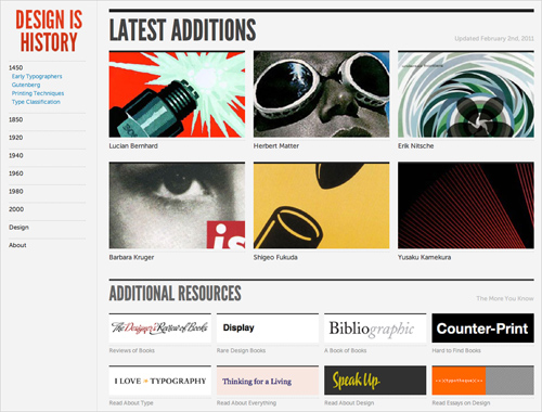
Websites like Design Is History, Smart History and Graphics Atlas are all excellent resources on the history of graphic design, visual communication and the evolution of design processes. We can learn a lot about our craft by exploring them thoroughly.
Andy Clarke’s talk at the New Adventures in Web Design conference was intriguing and pointed out the need for designers to learn about the importance of storytelling in Web design. Andy shared a unique perspective in his presentation, saying that we can shape how users not only interact with content, but consume it in general. He drew a comparison to comic books and Western movies from the 1960s, which used various techniques to dictate the pace of how their information was consumed — be it through a stretch of silence in a movie or the shapes of panels in comic strips.
We could use this technique in our designs to keep readers in the grip of our content just a little longer. Instead of letting users not have to think, we could do the opposite and engage as well as intrigue them (a good example would be of the Ben the Bodyguard website).
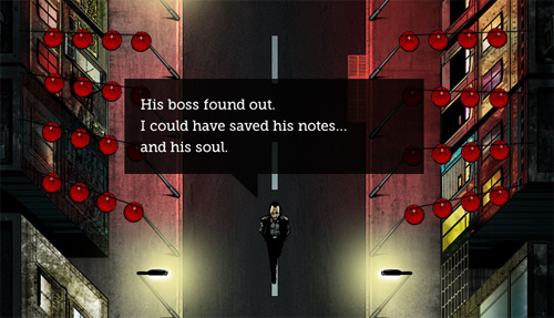
Ben The Bodyguard keeps you on the site longer than you expect.
We shouldn’t hesitate to apply concepts from other time periods or other media into our designs. The concepts actually don’t even have to be design-related. Instead of thinking in terms of shadows, gradients and rounded corners, maybe we should be thinking in terms of tension, timing and narrative.
Next time you’re looking for an idea, pick up that book you’ve always enjoyed reading and read it with a different perspective. Then, search for any unusual points of view that might be worth bringing to the forefront in your next project. Once you’ve found one, grasp this moment, as this is the very second when a unique, innovative design is born.
In Conclusion
As our industry matures, so will our practices and the quality of our work. We may have successfully solved many important problems in our short history, yet there is still much to be done. Writing and talking about the ways we work, the decisions we make and the solutions we come up with will benefit each of us. We could explore the connections between our discipline and other established industries as well as revise and reinforce our professional vocabulary and our ethics.
Perhaps we could all dedicate 10 to 15 minutes of our time to the community every day. We could (and should) make this a firm personal commitment and encourage each other to take part. Find some time to leave a meaningful comment, support a valuable resource, write a short article about what you’ve learned. All of these contributions matter and will prompt meaningful and inspiring discussions. For starters, we could start raising awareness of our commitments by using the hash tag #wdcommunity.
I strongly believe that if we keep doing this every single day, we’ll wake up one day marvelling at how remarkable our community has become. I, for one, am eagerly looking forward to this day.
Huge thanks to Francisco Inchauste, Chris Shiflett, Nishant Kothary, Paul Scrivens, Andy Clarke, Dan Rubin and others for their valuable contributions and suggestions for this article.


 JavaScript Form Builder — Create JSON-driven forms without coding.
 Get a Free Trial
 Enterprise UX Masterclass, with Marko Dugonjic
 Devs love Storyblok - Learn why!
 Register For Free

