A Web Developer’s Guide To Adobe InDesign
Over the past several years, there has been a big divide between designers: those who work in print distribution and those in digital distribution. The irony is that, despite the disputes, name-calling and flat-out arguments between the two camps, their techniques and methods are far more common than many believe. Both sides of this communications field are heavily influenced by each other. Grid systems and typography now play a strong role in Web-based design, and usability and user experience play a big part in developing print material.
Adobe InDesign is the primary application of print designers for laying out multiple pages and assembling print documents. This article gives you, the Web-based developer, a look at some of the tools in InDesign that translate directly into what you currently use. We’ll look at how the terminology in the two fields compare and how to apply your expertise to this other industry.
Jumping Right In
Folder Structure
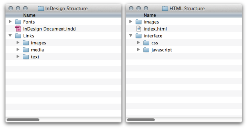
As with any Web development project, organizing from the start ensures that you will have minimal problems with the files later on. Similar to many website root folders, InDesign gives you a main document folder and a resources folder:

Above on the left is my folder structure for InDesign, and on the right the folder structure for my website. They are so similar that, if not for the different file extensions (.indd and .html), they would be practically the same.
Setting Up The Document
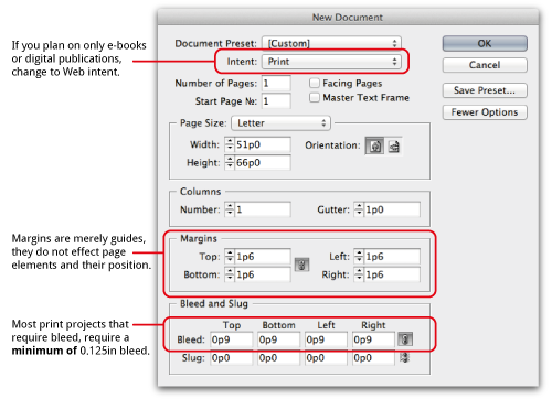
Setting up an InDesign document is similar to setting up a mobile website. You specify the height, width and purpose of the document. For print-based items, set the “Intent” to “Print.” If you will be using the file for an eBook or digital publication, then specify “Web.” If you will be using the document for both, then specify “Print” to ensure that the colors are maintained properly.

The margins in InDesign are guidelines that are positioned on the page and are not like Web margins that affect objects on the page.
Your Main Tools
If you’re familiar with Photoshop and Illustrator, then you are used to finding the main group of tools on the left side of the workspace, at least by default. InDesign is the same. The way you interact with and build objects on the page, though, works slightly different than Adobe’s other design software. Containers are needed in order to place images, vector objects and textual content on the page.
You can import vector objects directly into the document, but you will usually be importing files into content boxes that you position in the layout. This should come easily to you because Web design operates on the same principle: creating DOMs that contain images or text, and then positioning them in the layout. The one major difference is that, while objects are positioned in a Web document relative to their structure (unless otherwise styled), objects on an InDesign layout are always given an x and y position based on the overall page (by default, the top-left corner, similar to absolute positioning).
Because we are working with a vector- and object-based layout, one of the main tools you will use for the majority of your editing is the Selection tool ![]() , which gives you control of position and size. It also is used to select an object in order to change its properties. This is quite different from Photoshop, in which you edit individual layers. To change the color of an object, you need to select it first using the Selection tool, and then adjust it using one of the various ways to change color.
, which gives you control of position and size. It also is used to select an object in order to change its properties. This is quite different from Photoshop, in which you edit individual layers. To change the color of an object, you need to select it first using the Selection tool, and then adjust it using one of the various ways to change color.
These content boxes can be created with various tools. The Type tool ![]() enables you to create a box for text. The Rectangle Frame tool
enables you to create a box for text. The Rectangle Frame tool ![]() creates a box to add an image or linked resource. The Rectangle tool
creates a box to add an image or linked resource. The Rectangle tool ![]() is not assigned to any particular kind of content. These three frame types allow you to build the layout any way you want.
is not assigned to any particular kind of content. These three frame types allow you to build the layout any way you want.
In spite of both the Rectangle and Rectangle Frame tools, many designers who were trained on older software use only the Frame tool. The one difference between them is that the Frame tool shows a placeholder (an x). The Rectangle tool merely allows for a cleaner workspace but does not affect the final output.

The context bars and option panes help you style the content. As in Photoshop, various objects will open up a context-sensitive toolbar at the top, allowing for quick editing based on the type of object(s) selected and the tool selected.
Also like in Photoshop and Illustrator, a multitude of panes are available to control the values associated with an object. Again, they apply only to selected objects. Selecting an option from a pane when an object is not selected will not cause any objects to change.
Style Sheets And Their Origins
CSS did not originate with the Web. The model of defining a set of instructions in order to style content was originally built for desktop publishing applications. In InDesign, this takes the form of object styles, paragraph styles and character styles. There are also table styles, row styles and cell styles for designing table objects, but we’ll stay away from these in this lesson.
Styles in InDesign work similar to Web-based CSS but have one major difference: you cannot group multiple style sheets of the same type. For example, you cannot apply multiple paragraph styles to one paragraph. However, you can apply a character style sheet to content in a paragraph that already has a style sheet applied to it.
Shortcuts and menu locations for the panes are given below. But the panes will already be open on the right side of your workspace if you have selected Window → Workspace → Advanced or have selected the “Typography” option. These function exactly like the panes in Illustrator and Photoshop: you can snap them together and arrange them to your liking, and they contract to icon format.
Object Style Sheets
Draw a content box on the page using the Rectangle tool. With the box selected, you can modify the content box — including the border, background and corner effects — as you would a div object. If you give it, say, a background color, a drop shadow and rounded corners, you can save that style by selecting a new “Object Style” in the Object Style pane when the object is selected (Window → Styles → Object Styles, or Command/Control + F7). You can give the style a name (much like a class name) and modify any of the style properties you’ve assigned.
After saving this new style, you’ll still need to apply it to the object. This may sound redundant; however, you’ve only created a new style based on the properties of the selected object. By clicking on the new style with the object selected, you will apply that style. Think of it like adding class=“object_style” to an HTML element after you’ve set up the CSS.
Paragraph Style Sheets
Select the Text tool, and click in the newly styled box. Add a few paragraphs of content (you can cheat by going to Type → Fill With Placeholder Text). With your cursor in the first paragraph, you can start changing some of the properties of what, in Web terms, would be the <p> tag by using the Paragraph pane (Window → Type & Tables → Paragraph, or Command/Control + Alt + T).
Notice that options for modifying font size, letter spacing and weight are not available. This is because these aspects relate to the characters of the paragraph. While a paragraph style can and most likely will include instructions for these values, the Paragraph pane does not provide access to them.
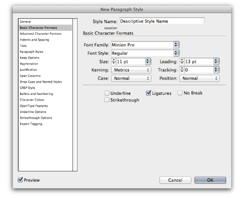
Let’s create a paragraph style via the Paragraph Style pane (Window → Styles → Paragraph Styles, or Command/Control + F11). This opens a new window that gives you God-like control over all aspects of the text. Name your style, and jump to the “Basic Character Formats” option on the left.

This is what I meant when I said that character properties could be defined in the paragraph style. Change the font size, weight and spacing here, and click “OK.” As you did with the object styles, you will still need to apply it to the paragraph you are working with. To do this, put your cursor in the paragraph text or select a portion of it, and then click on the paragraph style’s name. If you have selected the entire object using the Selection tool, then the paragraph style will be applied to all of the content.
Character Style Sheets
With the Type tool still selected and your cursor in the paragraph, highlight a portion of the text. Using the Character pane (Window → Type & Tables → Character, or Command/Control + T), adjust the properties of the characters. You can add italics or bold or change the font family.
Once more, let’s create a style that incorporates these modifications. In the Character Styles pane (Window → Styles → Character Styles), create a new “class.” Name it something relevant, save it, and then apply it to the highlighted text. This would be akin to adding a little <span> tag to some text in a paragraph, which allows you to apply styles to that text independent of the parent element.
CSS vs. Style Sheets
We’ve just gone over a lot here. The reason we went over these three things is to illustrate that, unlike CSS styling, I cannot add a second style sheet of the same type to an element. In CSS, I can do something like this:
<div class="orange_box rounded"></div>This would apply two styles to the same object (the orange box). InDesign attributes of a given type (whether object, paragraph or character) must be contained in a single style. Higher-level styles are overwritten by child items. For example, character styles overwrite paragraph styles, which in turn overwrite object styles; but you cannot apply multiple styles to a single object, etc.
As in CSS, I could overwrite an object manually. For instance, I could apply a style sheet that gives a paragraph a font size of 11 points and a leading (line height) of 14 points, but then manually change the leading to 16 points by adjusting it in the Character pane. This would result in Web code like:
<p class="standard_body" style="line-height: 16px;"></p>As you can see, we end up with code that would be considered poor practice by most people. However, it does allow us to customize as issues arise.
Play Around With The Tools
Now that you’ve been introduced to how set up a document, start playing around with the tools, using what you already know of Photoshop or Flash. Position elements on the page, modify their color and font face, and create the layout for a product that you’ve already built.
In the next lesson, we’ll dive head first into learning how to create consistent layouts with some advanced style sheet options, and we’ll examine how to build a page structure from scratch. So, don’t forget your towel.
Further Reading
- Adobe InDesign Tips I Wish I’d Known When Starting Out
- Useful InDesign Scripts And Plugins To Speed Up Your Work
- 10 Pre-Press Tips For Perfect Print Publishing
- Creating Wireframes And Prototypes With InDesign


 Agent Ready is the new Headless
 SurveyJS: White-Label Survey Solution for Your JS App


