The Dangers Of Designing For Context
In case you haven’t noticed, there is a growing excitement around mobile or device oriented web design. This excitement is fueled mostly by the high adoption rates of devices that come equipped with full scale browser capabilities but that’s not the only reason. A lot of talk lately has been centered around designing for context. So what does it mean to design for a user’s context?
Basically the idea here is that we have the ability to understand something about our user base as they enter our website. We can gather this information through browser sniffing or simply by the size of the browser window. So being the group of critical and creative thinkers that we are, we naturally want to use our gained knowledge to provide a better experience for our users; after all it’s what a good web designer would do.
Something about this process has always irked me. I think delivering an “enhanced” experience based on bits of gathered information is a dangerous game to play, and there are a few reasons for it.
Assumptions
Any designer who has been around for a day can probably tell you that if you deliver a product or service based on an assumption it will come back and bite you. We see this all of the time with undiagnosed browser bugs that we don’t think anyone will notice or inflexible portions of a website that need to be updated even though the original designer assumed no one would be changing it. At the moment, the whole idea of designing for a context is creating an entire design based on assumptions. Not only are we assuming what type of device people are using but we also try to predict how they are using it.
We assume that our phone users are “on the go” but this is proving to be far from the truth. The fact is that people do all sorts of things on their devices and by making assumptions about what they are doing we invest extra time to deliver a design that only alienates part of our user base. This goes against the grain we have already began to adopt of generating content once and publishing it everywhere.
Lack Of Information
The information that devices can share with our websites is evolving and in the future it will provide us with a multitude of data points we can take advantage of. For now though, we don’t really know all that much about our user. Even if we know our user is browsing on their phone we don’t really know if they are at home, at the airport, riding in a car (passengers only, don’t browse and drive), or sitting on a toilet. It may be a first reaction to think that a mobile browser should be fed the location and hours of your store or tonight’s special for your restaurant but this is all going back to making assumptions about our users.
We can just as easily imagine a scenario where our user is at a competing store and wants to see your price on a specific product, or perhaps they just left your restaurant and want to write a glowing review of the great food and service. It is reasonable to believe that we can narrow down which tasks are more important for our user base in general so some of these rare scenarios won’t be the easiest processes on your site in any device but often times this stuff is left out of a “mobile” design entirely. We simply are not even close to gathering enough information about our users to deliver a design that skips out on functionality in areas for the greater good of quick rendering and concise content. In many of these device specific solutions, content becomes the victim.
Still The King
Perhaps we have been plagued by the evolution of the phone. What was once primarily a communication device is now very much a consumption device. Despite the amount of time users spend consuming content on these devices, a lot of designers still seem to believe device oriented layouts should be stripped of content and delivered with a narrow focus. Often times the content removed from one portion of a page for the sake of real estate never makes its way back into the device specific design.

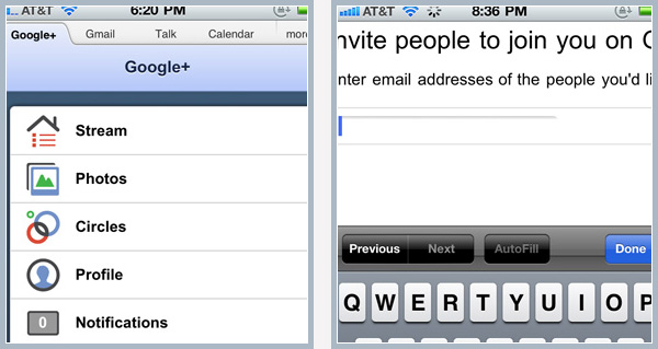
Of course content isn’t the only one suffering here. Functionality also tends to take a heavy blow when designs move off of the perceived safety of the desktop environment. I ran into a great example of this in my first few days of using Google+. Before the iOS app was released, I received a request from a friend for an invite to the network. Seeing as how I am always up to being a social ambassador and a great friend, I wanted to appease this request as soon as possible. Unfortunately my computer was shut down for the night, so I figured it would be quicker for me to complete this simple task on my phone. A mere 20 minutes later I had the task accomplished.
After searching around the entire mobile browsing experience automatically delivered to me by Google I found no method for letting my friends in on the fun. I finally resorted to browsing to the full web version of the site. The full web version is pretty clunky on a phone and not the easiest to use, clearly Google had assumed that I would be able to take care of pretty much everything I needed to on the mobile version. Unfortunately for them the only task I have ever tried to complete on their mobile site was apparently impossible.

In situations where we limit the functionality and content of our device centered designs our users are being restricted by the design of the site more than the capabilities of their device, a truly backwards process. As a sweet redemption, it may indeed be a deeper look at the design process that saves our device agnostic designs.
The Mobile First Approach
It’s been almost 2 years since Luke Wroblewski introduced the concept of designing mobile first but with the explosion of enthusiasm behind responsive design coupled with the growing device market it is as important now as ever. But does everything add up here? This whole article I have been preaching the inclusion of a full range of content and capability yet now I ask you to start on a screen that may be 400 pixels wide, what gives?
Well when I say mobile first I mean it. When you start the design of a web project that will include a mobile version or adapt to any device the creation of content and consideration of functionality should always begin in your most restrictive format. Using this method we build our content in a way that works with the smallest devices and since this is our starting point we aren’t excluding anything. As our device screens grow and our area for design expands we take advantage by adding to the user experience where it makes sense.
By turning this problem on its head, we start to get away from the bad practice of starting with everything we can stuff into a design and stripping away things that may or may not be valuable as our resolution shrinks.
What About All Those Mobile Sites?
In reading all of this you may be thinking about some of the mobile websites you have used recently that would have been a huge hassle had they not been formatted for your device. It is true that there are a lot of sites out there that have mobile versions of their site that are entirely different from the full scale version. While I would argue that not all of these provide a real advantage for the user it is clear that the execution of a mobile site is working for some people. Let’s take a deeper look into these scenarios.
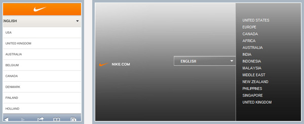
Nike has produced a mobile site that is attractive, easy to use and most importantly for this article, completely different from their full scale site. A quick look at a few different areas of the site reveals a noticeable difference not only between the designs but also between the functionality of the two sites.


There are several things to note about the Nike site and many large scale commercial sites like it.
- First, brands that have a high level of consumer loyalty and exposure like Nike get to play by a different set of rules. When we undertake projects that involve either device agnostic or device specific designs it is important to keep scale in mind. For small or mid-sized projects it is unrealistic to compare needs with a large scale company.
- Second, it is important to note that Nike has not created their mobile site around a context at all. There is a huge difference between designing for context and designing for layout. While the lists of large buttons and concise content may seem to imply a “user on the go” feeling, digging into this site will reveal quite the opposite. This mobile experience not only contains a full range of products but also news stories and interactive elements like the “Gear Up” application that takes athletes through a filtering process to reveal suggested equipment.
Mobile Or Responsive?
So you want to ensure your site renders beautifully on mobile devices and you promise to design mobile first, you even promise to consider screen sizes and “context” as a tool for presentation and not content or functionality. So how do you know if your project is better suited for a mobile site or a responsive design? I think the most important thing to note here is that there is no “best” solution here. Sure, responsive design is a newer trend but that doesn’t make mobile or adaptive websites the new table-based layouts, all of these options are perfectly viable ways to reach your device driven audience. Much like there is no inherent right or wrong here, there is no correct method for any given project and the designer needs to explore their best options.
A lot of projects will provide you with an easy way out in the form of a budget. Taking an approach of designing out a mobile specific site and maybe a tablet specific site can often involve what amounts to several different projects and almost always a higher price tag. Money has a talent of making a lot of decisions for you, so laying out the effort involved in your different options for approach is a good place to start. Aside from budget restrictions there are a few things the designer or design team should take into consideration when choosing a direction for device design.
“Start with your content, find the essential pieces and explore how well they scale.”
If you anticipate a graphic heavy project like the Nike site you may find difficulty scaling photography and graphics while maintaining the same focus. In this scenario, you may start to lean towards a separate mobile approach. If your project is information rich and typography heavy then you will likely have an easier time scaling the layout without losing the message, making for a better responsive or adaptive candidate. Again, it’s worth noting these are some pretty faint lines in the sand. Every project needs to be addressed on its own and approached with a fresh perspective.
Maintaining Perspective
Before you embark on your next responsive, mobile, or future friendly web adventure make sure you keep your priorities in line. No matter what you are trying to sell, promote or share with your website your users come for the content. Don’t let the lure of designing a special experience due to an assumed context spoil the content for your users. Designing experiences for the mobile or tablet environment is a lot of fun. Unfortunately this clouds the reality that people aren’t visiting your mobile site for fun and they aren’t all there just to complete that one task you think a cell phone is great for.
We still don’t know a lot about our users when the load up our website. If our only basis of information is the size of our users screen we can probably make more assumptions about those with 1800 pixels of real estate than those with 400.
So boldly and creatively tackle the hundreds of devices that populate our pockets but do it completely and proceed with caution!
Further Reading
- Does The Future Of The Internet Have Room For Web Designers?
- Designing For The Future Web
- Why Responsive Web Design Has To Win Out


 How To Measure UX and Design Impact, 8h video + UX training
 Register For Free
 JavaScript Form Builder — Create JSON-driven forms without coding.
 Get a Free Trial
 Devs love Storyblok - Learn why!

