Give Your Website Soul With Emotionally Intelligent Interactions
What is it that makes us loyal fans of the websites and apps we love? When we sat down to answer this question for ourselves, we found that the websites and apps we truly love have one thing in common: soul. They’re humanized. They have emotional intelligence designed into the user experience. And this emotional intelligence is crafted through thoughtful interaction design and feedback mechanisms built into the website.
These elements give the website or app personality and earn a spot in our hearts. In our opinion, it’s not going too far to say that giving your website or app soul is the key to earning loyal fans. In this article, we’ll look at some of the best examples of these emotionally intelligent interactions and how they infuse personality and soul into the websites and apps where they’re found.
Further Reading on SmashingMag:
- The Personality Layer
- Isn’t it sweet? Mascots in Web Design
- How To Add A Personal Touch To Your Web Design
- Designing For Emotion With Hover Effects
What Are Emotionally Intelligent Interactions?
An emotionally intelligent interaction is any state (or change in state) of a website/app where the messaging or functionality includes attention to details that create a user experience that feels organic and human. These interactions can be a big experience (like when an entire website is down), or a very small experience (such as when an error state on a form element appears). They can be derived from different elements, including messaging and copy, color and design, and responsiveness to user inputs and system outputs.
Combining each of these crafted experiences creates soul and personality for a website. And it’s that emotional connection with users that builds lasting loyalty, and raving fans.
Examples Of Emotionally Intelligent Interactions
Note: Several of the examples and images are from this brilliant website: Little Big Details. It’s one of the many must-reads and I recommend adding it to your favorites if you haven’t done so already.
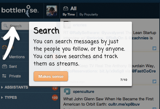
Bottlenose A new Web-based Twitter client that gives users a new way to explore and use Twitter. The app does a great job of walking users through the first run with the application, explaining the features in a way that is clear and humorous. The confirmation buttons use phrases like “Makes sense” and “Got it” which create a sense of personality and confidence with the user, a far better choice than the typical “Next.”
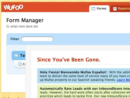
Wufoo Wufoo uses a combination of smart messaging and subtle touches on UI elements to create a more friendly and personable experience when creating Web forms. Here are just a few:
- Each page title is accompanied by a line of poetry. While it may seem random, the poetry actually reinforces the elegance of the Wufoo solution. It’s a unique way to bring personality to an otherwise tedious task (creating forms).
- The new report button’s punctuation. Think of the word “report”, and you’re next thought is most likely “TPS.” But Wufoo adds an exclamation point to the button. This gives it an element of energy and fun, reinforcing its value as a reporting feature.

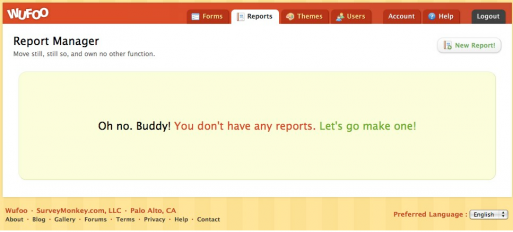
- The reports screen with no reports. Instead of a blank screen, Wufoo takes the opportunity to deliver some true personality through its messaging, and gets you on your way towards building your first report.
MailChimp As one of the best examples of emotional intelligence baked into a user experience, MailChimp takes every opportunity to infuse soul into its application, as well as giving you a pitch-perfect way to make it all disappear.
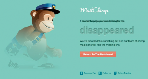
- 404 Page: MailChimp’s 404 page is brilliant: excellent copy, empathetic design, and a prominent call to action to get users on their way. It’s clever, functional, and takes the sting out of 404’ing. Current MailChimp 404 Page.
- Send Campaign: MailChimp celebrates and encourages the user just as they send out an email campaign. The copy “This is your moment of glory” is a perfect encapsulation of the fear and anticipation that goes into deploying this.

- Twitter Page: Recently when MailChimp went down, they deployed a special background on their Twitter page that showed a sad chimp working furiously to fix the problem. Because people naturally turn to Twitter to learn about why things are broken, the background extended the personality of that service to their Twitter account, creating an emotionally intelligent experience for the user.
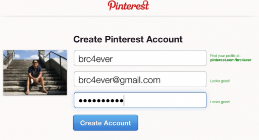
Pinterest This red-hot social network infuses personality into its website with a thoughtful interaction during account creation. Instead of using the typical password confirmation patterns, the app responds with “Looks good!” as passwords meet their requirements and match. It’s a small touch, but one that humanizes the sign-up experience, and empathizes with the user who is creating their account.
Path On Path’s original website, the icon for the sign-up button arrow changed to a smiley face when it was clicked on. This small change created a personal and welcoming moment during one of the first interactions a user had with the application. It’s a thoughtful detail added to a step that is often overlooked by designers and users alike, and it set the tone for the rest of the user’s onboarding experience.
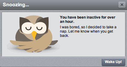
Hootsuite The friendly owl mascot for Hootsuite is more than a cute face—the mascot is the representation of the service itself, much like the chimp from MailChimp. Hootsuite taps the Twitter API to pull data into its app, and because Twitter has API limits, Hootsuite intelligently stops making requests after long periods of user inactivity. When this occurs, the Owl lets you know that he has taken a nap, and will wake up when you need him again. It’s a clever way to turn a potential negative experience (non-continuous updates) into a positive one that brands the company, while providing the app with personality and soul.
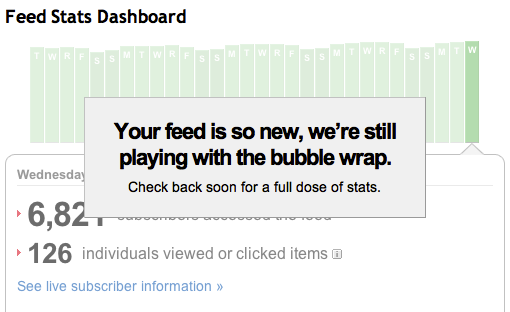
Feedburner For newly created RSS feeds in Feedburner, the stats page takes the lack of stats to create a personal interaction with the user. Many websites miss these opportunities because they feel this state isn’t core to the experience. But Feedburner knows that most new users are interested in seeing their stats right off the bat—stats that don’t exist yet. So when a user visits the page Feedburner has fun letting them know that stats aren’t quite ready yet, while creating an emotional connection with the user in this process. It’s a huge win for the company in light of the alternative: a lifeless, blank page with no data.
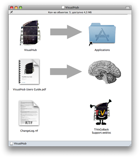
VisualHub VisualHub takes advantage of the Mac installation screen for user interaction, encouraging users to get acquainted with their user manual. Move the app to the Applications folder, and move the manual to your brain. So often this install process is written, a necessary evil to get to the application. But as we’ve seen, smart developers leverage these initial interactions to set the tone with the user experience moving things forward.
OS X Apple has long been about attention to details, but typically the details are in refinement (not necessarily emotional intelligence). But the Text Edit icon contains a small Easter Egg for Apple fans—the words of the “Think Different” manifesto are inscribed on the notepad. It pays homage to their legendary founder, and reminds people why they love Apple. It’s a small touch that makes Apple what it is.

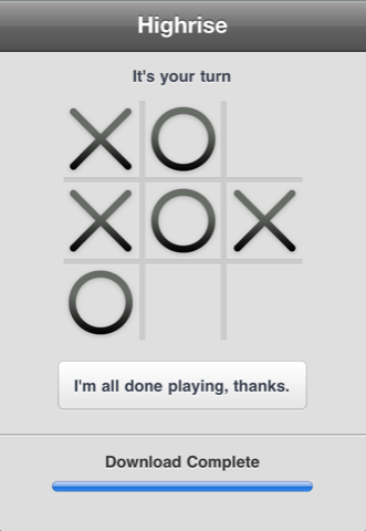
Highrise iOS During the install of 37Signals Highrise iOS app, you can play a game of Tic Tac Toe against the computer. Not only is this a thoughtful way to give users something to do while the app undergoes the necessary evil of being installed, but it’s also an homage to the film War Games, a hacker classic. It’s a simple and effective way to display emotional intelligence during a typically “dead” point of an app’s user experience.
Mint.com Mint’s website maintenance page creates a charming experience for users during what could be a stressful time. Not being able to access your finances can create anxiety, and Mint uses that opportunity to create a fun yet effective notice that lets you know that your money and information is safe, even if the website isn’t accessible.
 Image via Sean Percival.
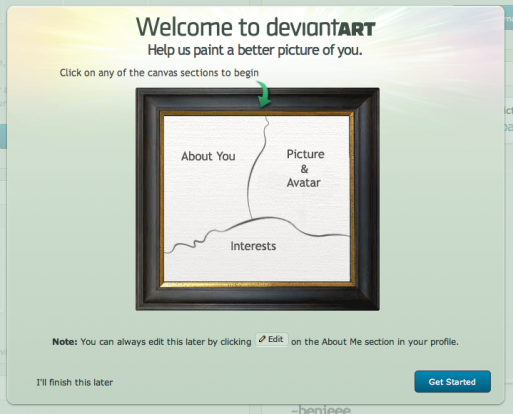
Deviant Art Deviant Art uses the portrait metaphor as part of the interaction in setting up your Deviant Art profile. Not only does it tie in with the theme of the website (and connect with its artist community), but it also is a compelling metaphor and mechanic that encourages new users to complete their profile.
Tumblr When listening to an audio file on Tumblr, the URL is appended with an appeal to its users not to download the audio file, so that they can continue to offer this type of content on their website. It’s a clever way for communicating to its users without the typical JavaScript pop-up warning.
Adding Soul To Your Website
Giving your website soul comes down to the interactions and the intentional craft you put into the design of those interactions. By being intentional about user experience in those small moments that are typically neglected, you can showcase the personality of your app, as well as building loyalty among users. Taking cues from websites and applications like those mentioned above will help you look for ways to infuse your project with emotional intelligence.
These services and developers have created loyal user bases due to their willingness to sweat out the details, and infuse their projects with emotional intelligence. The small things can really make a difference in the success of your website or application. Taking the time to create these well-crafted experiences is one of the most potent ways we know of to create fans, and bring your website to life with soul.
Feel free to share your thoughts in the comments section below.
Image used on frontpage: opensourceway
(il) (jvb)


 SurveyJS: White-Label Survey Solution for Your JS App
 Agent Ready is the new Headless