Designing Engaging And Enjoyable Long-Form Reading Experiences
Finally, some good news from the media industry: digital subscriptions are growing. We’re seeing positive reports from newspapers such as the New York Times and magazine publishers such as Conde Nast: announcements about increases in their digital content sales and paywall members.
When you have fantastic and original content, ensuring the best possible reading experience is critical to keeping and building your audience. The following practices will help you design your content in a way that improves the experience for readers.
Further Reading on SmashingMag:
- Designing For The Reading Experience
- 16 Pixels: For Body Copy. Anything Less Is A Costly Mistake
- 55 Wonderful Free High-Quality Fonts To Jazz Up Your Designs
- What Font Should I Use?
Navigation Methods
We often think that having many methods for finding things is easier for users. Unfortunately, the result can be mess of unhelpful and unrelated links, menus, widgets and ads. Many news websites place lists of “most-read articles” or “articles that your Facebook friends are reading” on their websites because they can. Analytics will tell you whether these methods are useful for your particular website. If no one is clicking on them, why are they taking up valuable space?
One way to quickly see the effect of slimmed-down navigation is to use Ochs, a Chrome browser extension specifically for the New York Times, written by Michael Donohoe. Open the New York Times in a different browser, then install Ochs and look at the website in Chrome. Ochs provides the massive benefit of a cleaner layout and clutter-free navigation. Things like reading tools and extra modules are removed from articles. The increased white space and removal of the New York Times’ dense navigation bars are a breath of fresh air.
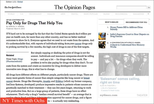
The Ochs extension cleans up the UI of the New York Times.
There is a difference between having a reasonable way to navigate a website versus having one-click access to all of the website’s content. How do your users typically find what they want? Do they use the navigation links or jump straight to the search box?
Changing the navigation methods may be as straightforward as removing redundant menu bars or as involved as conducting user research to see which methods people use and don’t use.
Another thing to consider when looking at navigation usage patterns is that people rarely click on things that appear hard to read or cluttered. If that’s the case with your website, perhaps it’s time to look at your typography and spacing.
Experimenting With Type And Spacing
Not every typeface was designed to be read on a digital screen. Typefaces can have a huge effect on both the appeal of content and its readability. The typefaces for headlines may be beautiful and attention-grabbing, but if the ones for the copy are difficult to read, you could be turning away readers.
Not everyone will read your content exactly as it was designed. Some people set their own default font size, while others change their screen’s resolution. Still others use assistive technology, such as screen readers, to peruse content. During the course of a day, I read blogs on my iPad, pan and zoom through news on my mobile phone, edit documents on an enormous desktop monitor and browse the Web from my television screen (at low resolution). For this same reason, tools such as Instapaper, Readability and Evernote are growing massively. The ability to control the format of what you read — and where you read it — is becoming increasingly useful.
The Boston Globe’s recent overhaul of its website received a lot of well-deserved praise, and two of the nicest things about it are the use of white space and the typography. The fonts chosen are central to the Boston Globe’s Web style, and they feel relevant to its almost 240-year-old print identity. Compare the new design to the original one, and the contrast is staggering. The Boston Globe’s new look is a great case study for news websites and readability in general. Definitely have a look if you haven’t yet.
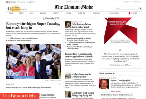
The Boston Globe’s new interface has carefully chosen fonts plus more white space.
While some fonts were created specifically for digital reading, there is no magical formula for selecting type. To find out what works, do some testing. User testing, A/B testing and even testing within your own team can yield insights. Have everyone on your team read through a handful of long-form content on various devices. If people can’t make it through more than a few paragraphs, try different fonts, sizes or spacing. Or maybe rethink some of those distracting ads.
Respectful Advertising
How often do you see people rush to turn the page of a magazine just to skip an ad? Probably rarely. But people do it on websites all the time, panicking to find the small “Close” icon on a pop-up ad, or flummoxed as to which browser tab is playing an audio ad. I hope the people who create these creepy auto-play ads will one day experience the terror of being alone at the office late at night as a rogue audio clip begins speaking to them.
As an avid reader of both print and digital magazines, I’m overwhelmed by the stark difference in advertisements between them. Print magazine ads regularly hold my interest and engage me — I do not tear out pages of magazines, nor do I cover the ads. Magazines select advertisements that are relevant to their audience and that are attractive and well designed. Advertisers usually do not spend big money on print ads only to create unattractive content for them.
For some reason, all of this goes out the window when it comes to online ads. Companies are told that no one notices ads unless they grab attention, and so they create loud, garish ads — ads that do nothing for the product and that most likely diminish the viewer’s interest. It doesn’t have to be this way.
The advertising network The Deck prides itself on tasteful, targeted ads for an influential audience of creative professionals. Its ads are uniform in size and amount of text. The Deck does not pay for or run ads unless it has used the products themselves, so it vouches for all of its advertisers. The emphasis on small graphics forces advertisers to be creative, and advertisers get a return of 3% of all page views in The Deck’s current network.
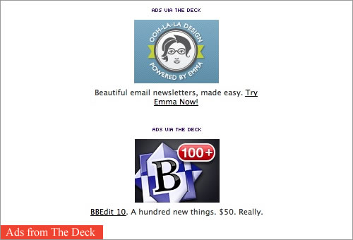
The Deck’s ads are tasteful and subtle.
Both advertisers and audiences have something to gain when ads are relevant and attractive. The growing shift towards responsive and respectful advertising has been written about at length by people such as Mark Boulton and Roger Black (see the related links at the bottom of this article). It’s worth reading their takes on these new Web ads, and you might even want to have an internal discussion at your company about how the advertising on your website could be made more valuable for everyone.
Moreover, if the ads on your website are respectful and relevant, people might check out the advertisers’ products, increasing both visited metrics and click-through rates, thus allowing you to charge more for advertising. So, do dive into your website’s analytics.
Check Your Analytics
We want to do the right thing: build websites that are responsive and that adapt to devices. But we have to be reasonable, too. What is achievable given your budget and time frame? Analytics are one of the best ways to hone in on what to prioritize. Even a simple free tool like Google Analytics can yield important insight into who is viewing your website and how. Google Analytics can also track readers’ paths through the website, showing you what content and sections are being avoided or ignored.
The Financial Times keeps a close eye on its visitor analytics. It has over 1 million registered users. In November, it announced that its Web app (which launched in June 2011) was replacing its native mobile app. The Financial Times also released data indicating the types of devices that are being used to access its website and the times of day. And it recently launched a native Android app — perhaps because the number of people accessing its website on Android devices is growing.
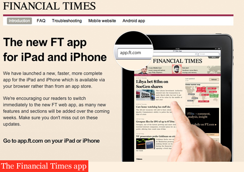
The Financial Times ditched the App Store for its own Web apps.
If you notice that most of your traffic is coming from people on tablets, you can optimize for that experience first. Management at your company may be pushing hard for a native app, but you should determine a couple of things before writing the design specifications for a native app:
- Does the audience for such an app exist, or is one growing?
- Is that audience not getting a good enough experience from your website.
If your current audience barely has any iOS users but has a significant chunk of Android users, why not start there instead? Additionally, what are those Android users doing on your website? Are they sticking around and enjoying your mobile experience, or do they bounce quickly? The latter could indicate that the experience on your website isn’t ideal.
But if you want to know for sure, ask them.
Has Anyone Asked Your Users?
It saddens me how often content and experience decisions are made without consulting the people who those decisions will affect. Facebook users are familiar with the pandemonium that occurs every time a new interface goes live — people often struggle to find what was once familiar and obvious.
The Sunday Times’ iPad app was updated in August based on user feedback. Users requested to be able to download all sections with the click of a button. The Sunday Times added the ability to download all or individual sections, improved the functionality for deleting sections and editions, and bundled sections more usefully. These changes were the result of direct comments and feedback from users.
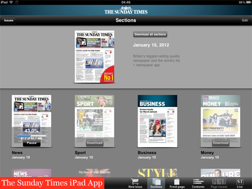
The Sunday Times listened to users and changed its downloading options.
Short in-person interviews or widespread surveys are fast and easy ways to get feedback directly from readers about what they like and don’t like about your content. Find out about their reading habits. Learn when and where they read articles — the answers may surprise you. Perhaps the section you were considering cutting has a growing audience. Maybe a feature that gets very good engagement in print doesn’t translate so well online and needs to be rethought.
And if users tell you they’re frustrated by trying to read anything on your website, consider offering them a quiet room.
“A Quiet Room”
Walking from the cacophony of New York’s Times Square into a tiny, quiet office can bring a feeling of relief. All of a sudden, no one is in your face trying to get you to buy something or take a tour or give them money. You can just relax and focus.
Finding a website or app that lets you read and enjoy its content is just like this. The experience is not stressful, and you can take your time and enjoy the writing, which seems to have been created just for you. As a designer, you can create this “quiet room” for readers, a place where they can fully absorb the content without having to close pop-ups or be confronted by an animation that screams that they are the 1,238,901st visitor that day. A quiet room is why applications like Instapaper and Readability get effusive praise.
A List Apart does a good job of avoiding clutter and letting the reader focus. Articles have minimal sidebar navigation and only a couple of small, tasteful advertisements. The majority of the page has a simple format: easy-to-read text (peppered with images), a conclusion that points you to related material, and a chance to discuss the article.
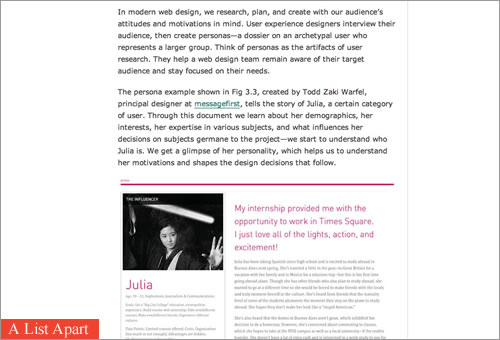
A List Apart creates room for readers to enjoy the content.
When Doesn’t This Work?
These approaches will not work for every group of content or every website. Some content is meant to be skimmed for quick comprehension. Other websites contain no narrative content. And many websites rely too much on advertising revenue to be able to change their ad strategy.
If your content changes rapidly, is short and to the point, contains little analysis or has any combination of these, then it’s likely not a good fit for this approach. But if you have done your research and you have content that is well written and that your audience likes to get lost in, then perhaps some of the ideas mentioned above are worth a try.
Regardless of the length and type of your content, here’s a useful exercise: go through each of the issues covered above and think of one thing you could change to make your content more readable. Some of the revisions might be long term and big picture, but you might be surprised by the easy opportunities to make a big impact. Give your readers a reason to enjoy your website as it is, instead of a reason to reformat the content and turn the page as fast as possible.
Resources
- “Business Class: Freemium for News?,” Oliver Reichenstein
- “The Holy Grail,” Part 1 and Part 2, Roger Black
- “So, You Need a Typeface?” (flowchart), Julian Hansen, Behance Network
- Interview with the BostonGlobe.com redesign team, Fonts In Use
- “The Pummeling Pages,” Brent Simmons
- “Please Let This Not Be the Future of Reading on the Web,” Rian van der Merwe, Elezea
(jvb) (fi) (al)


 SurveyJS: White-Label Survey Solution for Your JS App
 Agent Ready is the new Headless

