A Good User Interface Means Something Completely Different On Mobile Devices
Responsive design is the hottest topic in front-end Web development right now. It’s going to transform the Web into an all-singing, all-dancing, all-devices party, where we can access any information located anywhere in the world. But does responsive design translate well from the text-heavy Web design blogosphere to the cold hard reality of commercial systems?
Rumors came through our office grapevine that management was looking to revamp our mobile presence. There was talk of multiple apps being built externally that could be used on some of the major mobile devices. Our team had been getting familiar with responsive design and put forward a proposal of doing away with device-specific apps and developing a single responsive website that could be served to both desktop and mobile users. After a few hasty demos and prototypes, the idea was accepted and we began work.
Further Reading on SmashingMag:
- Creating A Complete Web App In Foundation For Apps
- Diverse Test-Automation Frameworks For React Native Apps
- The Basics Of Test Automation For Apps, Games And The Mobile Web
The brief: make our current website, Airport-Hotels.uk, responsive while retaining the existing layout for users on browsers of 1000 pixels and up.
The following is what we picked up along the way.
Starting With Desktop Is OK
The general consensus now seems to be “mobile first.” I agree. Starting with a single(ish)-column mobile website is the easiest way to get your CSS off to a great start. However, we use an external design agency, so the time and cost of a new mobile-first design was not feasible. It was left to the front-end developer to translate the existing design onto screens of smaller dimensions.
The solution was to break up the website into smaller blocks (or nuggets), which could then be positioned differently as the browser’s width increased. This led to our first base media query, which contained the main branding elements, with minimal layout information. Because the nuggets were of a fairly fixed size, we had a foundation for creating a grid for each of our major media queries. Anything that wasn’t deemed to be a “nugget,” such as a larger block of text, would be responsive and fill in the gaps that the nuggets couldn’t.
While this method is not as good a practice as “mobile first,” it does have the advantage of being faster and cheaper than a full redesign. And you pick up great knowledge along the way for when resources do become available for something more substantial.
Less Is More
When getting your feet wet with media queries, you’re tempted to go all out, but do you need to? Theoretically, you could serve a completely different design to each “major” screen resolution. While this would be spectacular and self-satisfying, maintaining it would be a nightmare. We ended up using the default media queries in Andy Clarke’s 320 and Up framework, containing four breakpoints (1382 pixels was not in the brief). Looking back now, we could have removed at least one of those queries, possibly two.
We’ve been gathering statistics in the weeks since the website’s release, and by far the majority of our customers are running browsers either of 320 × 480 pixels or on full desktops. We could hit over 85% of our user base by focusing on these resolutions, while cutting down on development time and maintenance.
This was especially evident on our availability page, which easily contains the most information of any of the pages in our booking flow. In the end, rather than try to serve the perfect design to each device width, we moved much of the CSS for the largest media query to the size below: less maintenance, less fuss, and more time to work on the UX (and, importantly to the business, to make bookings).
Ability Sniffing Is Not Enough
When I first saw tools like Modernizr, I thought they would change everything. I suppose they have, but don’t rely on them too much. Mobile browsers have more inconsistencies than any desktop I have ever seen. Even WebKit-based browsers can render things completely differently. With debugging tools at a minimum, it’s like we’ve been thrust back into the pre-developer toolbar era of IE bug fixing. Luckily, that’s one of my favorite things.
Exploring this strange new world of bugs became one of the major aspects of the project. A few of my favorites are highlighted below. Hopefully, they won’t trip you up.
CSS Columns
I love CSS columns. I had been wanting to use them for a while; but, other than small personal projects, nothing with appropriate content came up. While trying to work out the best layout for our website on a 320-pixel device, I realized that, rather than generating columns using floats or inline blocks, we could reduce the layout CSS to just a few lines by creating CSS columns. With most major mobile Web browsers being based on WebKit and Opera, this seemed to be a fairly reasonable solution and appeared to lay out everything perfectly. Great!
Here is the original code for the 320-pixel media query:
.product {
    -moz-column-count: 2;
    -moz-column-gap: 5px;
    -webkit-column-count: 2;
    -webkit-column-gap: 5px;
    column-count: 2;
    column-gap: 5px;
}
And here is the updated solution (roughly speaking — the actual code was much longer):
.product>div {
    width: 49%;
    float: left;
    margin: 0.5%;
}
Unfortunately, the column specification isn’t quite ready yet. On BlackBerrys and some HTC Android phones, our form elements (specifically, the buttons) became unclickable. The layout was perfect — we checked that the CSS was accepted with Modernizr, and all the links worked — and yet you couldn’t click the “Book” button. Back to the drawing board with that one.
We ended up using a more standard float-based column layout.
CSS Gradients
Gradients were another excellent instance of browser idiosyncrasies. We used a lot of CSS gradients in this redevelopment to replace some images. This should have saved the user’s bandwidth and made redesigns and maintenance faster.
On WebOS (with a WebKit-based browser), though, CSS gradients would render as completely black unless used on a form input element. It was baffling. In the end, we figured out that it was a bug in the implementation of -webkit-linear-gradient. We’ve learned that the bug has been fixed in the upcoming version, so this might not be an issue in the future.
Here is the offending CSS:
.ppcHeader {
    background: #73bff1; /* Old browsers */
    background: -moz-linear-gradient(left, #73bff1 0%, #009ff7 100%); /* FF3.6+ */
    background: -webkit-gradient(linear, left top, right top, color-stop(0%,#73bff1), color-stop(100%,#009ff7)); /* Chrome,Safari4+ */
    background: -webkit-linear-gradient(left, #73bff1 0%,#009ff7 100%); /* Chrome10+,Safari5.1+ */
    background: -o-linear-gradient(left, #73bff1 0%,#009ff7 100%); /* Opera11.10+ */
    background: -ms-linear-gradient(left, #73bff1 0%,#009ff7 100%); /* IE10+ */
    background: linear-gradient(left, #73bff1 0%,#009ff7 100%); /* W3C */
    margin-bottom: 20px;
}
(Bear in mind that CSS gradients add a heavy load to the browser’s rendering engine, so if you are using a lot of them, switching them off for mobile might be wise.)
JavaScript on BlackBerry 5.0 and Opera Mini
Basically, JavaScript does not work on Blackberry 5.0. BlackBerry tries, but it’s so inconsistent and buggy that it’s not worth it. We were reliably advised by Peter-Paul Kochs to just resort to device sniffing and to turn off any JavaScript. This is another reason to make sure your websites are progressively enhanced by falling back to non-JavaScript versions.
Meanwhile, Opera Mini works fine with JavaScript, but each of a website’s pages is rendered on Opera’s servers and then essentially compressed into a big image before being sent to the mobile device. This is great for the user because it can reduce bandwidth to 10% of the normal browsing experience. On the other hand, if you have onkeyup validation in your forms, this can be a problem because each call to the JavaScript would require refreshing the entire page from the server.
Forms Drop Users
This was and still is one of the major problems with mobile browsing on our e-commerce website. In order to make a purchase on an average website, the user has to fill in a lot of information: names, addresses, credit-card details, the list goes on and on. While typing on mobile has gotten much easier, navigating large forms is a frustrating and laborious process.
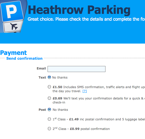
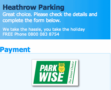
Our mockup payment page had 22 form inputs that needed some kind of interaction. These were required either to make a successful booking, to provide information to the product supplier after booking or for our own sales and data purposes.

Airport hotels payment form, a large screen view. Large version.

Airport hotel’s payment form, a small screen view. Large version.
The question became (as it always seems to be with mobile), what could we remove and what did we have to keep? Well, we tried to take the middle path, which is currently in development or might even be live by the time you read this.
We chose to split our payment process into two stages. Because our users can save more on their purchase by booking early, our first payment stage asks for the very minimum of information required in order to confirm a booking: name, car registration and credit-card details. This gives the user the best price available and chalks up another booking for us. Part two of the payment process is to gather the rest of the information required to “complete” the booking. This second stage can be filled out at the user’s convenience, either immediately or later on using our online booking management system. This eases any frustration caused by having to fill out a large form.
Good UI != Good UI
A good user interface means something completely different on mobile devices — and even tablets for that matter. Many of the user-friendly features we have implemented on our desktop website would just be bad ideas on these smaller mouse-less devices.
Lightboxes
Lightboxes were all the rage a few years ago. They were a convenient and pretty way to display a small amount of content or something that wasn’t worth loading a new page for. In IE 7 and up, you can position lightboxes using position: fixed, which is great. On mobile devices, though, browsers do not implement position: fixed, or they implement it in an odd way to prevent non-mobile-ready websites from not working at all. This will ruin any lightboxes.
We recommend just loading a new page for lightbox content: less JavaScript, easier and fast. A new tab would also be fine, but due to the infancy of tabbed browsing on mobile devices, maintaining the flow is probably a better idea for now.
Hovers
Content that is only visible via hovering obviously doesn’t work on touchscreens. What used to be an easy way to hide content while keeping it accessible has become a bit of a nightmare to deal with. We tried just removing the hover and showing the content, to see what would happen. The iPhone actually handles hovers fairly well, translating them into tap events. On Android, you need to click and hold for a little while to prevent the default action of clicking the link (our links are anchor-tag-based).
In the end, modifying the code that handles the hovers (assuming it’s JavaScript) and adding a tap event seemed to be the best solution. This allowed us to preserve the design’s aesthetic, while keeping as much functionality as possible for mobile users.
if( document.createTouch ) {
    this.addEvent(c[j],'tap',this.tipOver,false);
} else {
    this.addEvent(c[j],'mouseover',this.tipOver,false);
    this.addEvent(c[j],'mouseout',this.tipOut,false);
}
Date Picker
Our date-picker calendar was one of the biggest hurdles to overcome in the UI. We have a text input that allows the user to enter a date. Prior to the date-picker, our solution was a dynamically generated select box, but that caused confusion among many users because they might have remembered the day of the week they were flying on but not the date. So, we added the jQuery UI Datepicker to make filling in the search form one step easier.
However, what was one step forward for convenience on the desktop was one step back on mobile. Focusing the text input would open both the date picker and the phone’s keyboard, thus obscuring the date picker.
Our next option was to use the HTML5 date input. Because this element became available so recently, browsers are still playing catch up, and implementations vary wildly. It’s just as rough on desktop, with Firefox still rendering it as a text input, Chrome adds an up/down selector and forces the date format, while Opera actually renders a calendar just like the jQuery UI Datepicker. This solution still requires the date-picker JavaScript, but it forces the format, which can actually make it less user-friendly. While the concept is great and the solution will be great once the bugs are ironed out, we found that the date type input is not yet ready for commercial use in this fashion.
Our eventual solution (not yet live) was to use a JavaScript “touch event” query to generate a more mobile-friendly date picker than the standard jQuery UI one. This creates an iOS-styled triple drop-down menu for day, month and year and is user-friendly on mobile devices. The no-JavaScript backup can be either a text input or a select drop-down menu. Have a look at the code for yourself.
Fix IE First
The final point, which reflects the complexity of mobile development, is how to fit old versions of IE into this new technology. IE 8 and below ignores media queries, which presents a rather sticky problem when your entire website is based on them. There are several solutions to this, which we’ll explore below.
JavaScript Polyfills
I can think of two great JavaScript polyfill options for media queries. The first is Respond.js, which continually monitors the browser’s width, parses the CSS and then serves the correct styles for that width. This is a great solution if you need the website to respond on IE 8 and below. The main issue is the time between the document loading and the JavaScript kicking in; the website is initially displayed using the base style sheet, usually the mobile view, before it “jumps” to the full desktop version. Obviously, this doesn’t look great on a desktop monitor, and if the user is on an old browser, then their computer and Internet connection will probably be slow, too, which means that the jump time could be even longer.
The other JavaScript option here is the Chrome frame, which achieves the same end and has the same disadvantages. This solution isn’t bad, but just not right for our implementation.
Include All Media Queries
This is one of my favorite options for responsive websites and is also used in the latest version of the 320 and Up boilerplate. Create a separate CSS file for each device width; and for IE, serve them all to the user, with no media queries. With a mobile-first approach and a couple of fixed widths in your IE style sheet, this will serve the full-sized version of the website to users of outdated browsers. This solution is fast, simple and easy to maintain.
A Separate IE Style Sheet Entirely
Finally, given the right conditions, you could just write a completely separate IE style sheet, full of conditional comments to load the full desktop version of the website. Theoretically, this need only contain small amounts of layout information; but given that many of these styles will be reproduced in your media queries for wider widths, it can cause maintenance issues down the line. Duplicating code is never a good idea, which makes me wary of this solution.
Interestingly, we used this solution in the end, but with a twist. We used a PHP plugin in our template files to combine, compress and cache our CSS files. Due to some issues with the cache in IE, we were already generating a separate cached CSS file for IE users. We added a couple of lines to the PHP file to strip out media queries entirely as it combines and compresses the CSS. This method delivers the results of the “include all media queries” solution, while allowing the option for inline media queries in the style sheet. Because of the way we organized the CSS, this turned out to be the best solution for the project.
Conclusion
After all that, we finally have the first version of our responsive booking flow. I like to think that this epitomizes “mobile-ready.” We aren’t necessarily mobile-optimized, but our feet are on the bottom rung of a tall ladder that climbs to a great system that works perfectly on all devices. This is the starting point, if you will.
Was it worth it? It’s been a long journey, with a lot of head scratching and learning on our feet fast, but that’s what Web development is about, and I wouldn’t have it any other way. You can’t be perfect the first time round, and you don’t have to be. The point is that this technology is ready now, and the sooner you start using it, the better prepared you’ll be for the mobile market as it comes running at you. In the next few years, we’re hoping to see JavaScript network APIs that will allow Web users to add purchases directly to their monthly phone bill. I expect the mobile e-commerce market will explode at that point. Will you be ready?
(al) (da) (il)


 SurveyJS: White-Label Survey Solution for Your JS App
 Agent Ready is the new Headless


