Classes? Where We’re Going, We Don’t Need Classes!
It would be no revelation to you to say that HTML elements can be styled without recourse to the class attribute, but have you considered the multitude of benefits that come from forgoing classes altogether?
In the article, I’ll demonstrate that the class is as antiquated and inappropriate for styling as the table is for layout, and that omitting them can discipline us to create more usable, reusable content. I appreciate that this is a contentious subject; I’ll meet you in the comments.
(For those who aren’t “of a certain age,” the title of this article is a play on a famous line from the 1980s film Back to the Future.)
Further Reading on SmashingMag:
- An Introduction To Object Oriented CSS (OOCSS)
- An Ultimate Guide To CSS Pseudo-Classes And Pseudo-Elements
- CSS Inheritance, The Cascade And Global Scope
- 53 CSS-Techniques You Couldn’t Live Without
It’s Not About Maintainability
In her recent presentation “Our Best Practices Are Killing Us,” Nicole Sullivan addresses the horrors of maintaining inefficient style sheets. Sullivan offers some helpful ideas and observations, especially for dealing with the convoluted code of major longstanding clients. My approach is more cavalier; if the style sheet schema I’m dealing with is so convoluted that it could affect the website’s performance all by itself, then I’ll do one of three things:
- Consider a different client,
- Consider a different career,
- Stop using Drupal.
Maintainability is a problem, but it’s a problem for coders by coders, and CSS classes, as Sullivan points out, aren’t even the main culprit. The class attribute is implicated in a much graver crime, and usability—not maintainability—is ultimately at stake. Rather than the overuse of classes, I question the efficacy of the class attribute per se.
The Class As Imposter
A few years back, a girlfriend of mine gave me the pet name Stinky. I appreciate that this might seem off topic; please bear with me. She assured me that the name was actually not due to any malodor, but rather had some cryptic link with a fond childhood memory. Nonetheless, it was not a moniker that I wished anyone else to know about. Well, until now—but it’s important for my argument.
CSS classes are a lot like pet names. They are coined in private, where they belong and usually remain, and on the rare occasion that they are aired in public, they’re frequently a source of great embarrassment. While I’m embarrassed to have disclosed my own pet name of Stinky (there it is again), I feel equally red-faced about the .nudge-right class that I once used to deal with an awkward div.
Not all classes are ugly hacks. Many frameworks employ sensibly named classes, sometimes even in an “object-oriented” fashion. The question is, why have classes at all? We already have the names of elements (<p>, <small>, <address>, <ul>, etc.). Better still, like my legal name of Heydon Pickering, they actually have some currency: they can be interpreted by more than one or two people.
Parity And Disparity
The reason we “mark up” Web content is to create parity between the way it is perceived by human readers and the way it is read and archived by machines. This parity has many benefits, some of which are discussed in an excellent post by Dr. Mike. Perhaps the greatest benefit is that when someone searches for some content, the engine that carries out the search request has a better chance of identifying and finding it. The machine and the human have “an understanding.” Parity is extremely important because, without it, the mechanisms of data storage and retrieval would get out of sync.
Aside from microformats (which, like tag names, have been endowed with agreed meanings), no class is able to affect the actual meaning of the marked-up content as read by an indexing bot or screen reader. Classes can only affect the visual appearance of the content. That’s right: all classes are “decorator classes.” You knew that already, but is it a moot point? I think not.
An Example
Please consider the following code and corresponding illustration. Think of the tags as pseudo-HTML.
// HTML:

<sea>
<crustacean class="crab">Shane</crustacean>
<crustacean class="lobster">Martin</crustacean>
</sea>
// CSS:
sea {
background:blue;
}
crustacean {
width:200px;
height:200px;
border:2px solid;
text-align:center;
color:white;
}
.crab {
background-image:url(../images/crab.jpg);
}
.lobster {
background-image:url(../images/lobster.jpg);
}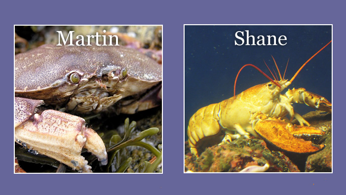
(Images: Patrick Tanguay and ajmexico)
- What the human sees. An angry-looking crab and a yellow lobster next to each other in a watery blue box, bearing the unlikely names of Martin and Shane, respectively.
- What the bot sees. Two adjacent bits of text that both belong to
seaand should be treated ascrustacean-related.
Both the human and the bot are correct. However, they are both missing some information. The bot is not aware that the two crustaceans are, specifically, a crab and a lobster. The human, meanwhile, has not been told that the crab and the lobster both belong to the crustacea family. Despite a correct use of semantic HTML and a judicious application of CSS classes, there is a disparity between the way the machine and the human interpret the information.
We can’t expect the specification to contain a tag for every conceivable concept. It will be no surprise that <slippery>, <disappointing> and <airborne> are not so far being considered for HTML5. Neither could we expect parsers to be able to meaningfully interpret each and every individually authored class name. In this case, what else can we do to supply both the human and the bot with as much of the same information as possible? That is, what tool can accurately explicate the intended “lobsterness” of the second element without alienating either party?
The answer is something called content. So far, our “content” consists of a spurious label (much like your typical class attribute). I think we can do a lot better:
<crustacean>
   <hgroup>
      <h1>Shane</h1>
      <h2>The Lobster</h2>
   </hgroup>
   <p>Shane is a <a href="lobsters.html">lobster</a>, which is a type of <a href="crustacea.html">crustacean</a>. He is <em>big</em> and <em>yellow</em>.</p>
   <img src="images/shane.jpg" alt="Shane sitting on the sea bed">
   <p>
      <small>Photo by ajmexico</small>
   </p>
</crustacean>
The mistake we made in the first snippet was to make two items that are similar appear different. As a general rule, if two elements are of the same type and appear in the same context, then they are alike—in which case, they should appear alike. The job of styling is to make items presentable, not to define them. Only the content should be definitive, and only the tags should be used to define the content’s taxonomy.
By depriving ourselves of the class attribute, we are forced to rely on content to add meaning to our design. In our example, the background images invoked via the classes have been replaced by image tags—i.e. actual content tags that can be interpreted by both bots and screen readers (via the alt attribute). This makes the machine’s experience of the resulting design much closer to our own.
The Document Outline
In the example above, we showed that, even when used sensibly and sparsely, classes can undermine the parity that should be maintained between the essence and appearance of content. However, nothing is to stop us from going completely mad: we could create as many classes as we wanted, place them in whichever elements we wanted as many times as we wanted, and name them whatever we wanted.
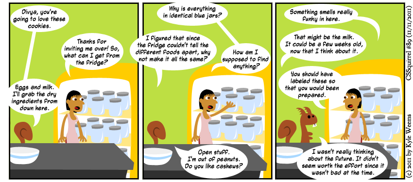
Homogeneous code like the sort referred to in this strip would not be practical if we couldn’t visually differentiate between the same elements via classes. (Strip by Kyle Weems)
This kind of freedom allows us to break with conventions that make HTML documents apprehensible and, therefore, useful. Heeding Mark Boulton’s advice about icon design would be better:
Leave “creativity” to the bad designers.
Classes enable us to represent differences that don’t really exist, but nothing is wrong with reflecting differences that do exist. In HTML5, the document-outlining algorithm more than ever seeks to enforce structure in an HTML document. By harnessing this structure, we can use CSS to reflect legitimate differences between the parts of our page. This requires a basic understanding of semiotics and will be the subject of the next section.
(While not necessary to understand the following section, I highly recommend Derek Johnson’s introduction to the document outline as background reading.)
Semiotic Style

View image of Ferdinand de Saussure.
It would be difficult to overestimate the impact that Ferdinand de Saussure had on the way we understand language—and, for that matter, anything we use to elicit meaning. To Saussure, how we choose to define things is not important. Rather, their relationship to one another is truly what makes them what they are. As Saussure’s translator Roy Harris put it, Saussure’s contribution to linguistics was to cease viewing words as “mere vocal labels or communicational adjuncts superimposed upon an already given order of things.” If you’ve been following closely so far, you’ll appreciate why I’m a big fan of Saussure: he sees no value in extraneous classification.
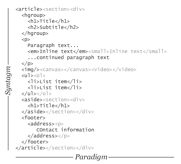
Saussure’s understanding of language as a system is based on two basic relationships; the paradigmatic and the syntagmatic. The illustration below transposes these concepts to an example of some semantic HTML.
Paradigm
A paradigm is a set of words—or, in our case, tags—with functional similarities but subtle or radical differences in meaning. In the sentence, “The crab sat next to the lobster,” the word “sat” belongs to a paradigm of alternative words that include “rested” and “crouched” as well as “stood.” It is a relationship of substitution.
There are certain rules. In English, a verb cannot be substituted with a noun, just as in HTML an inline element cannot always be substituted with a block-level one. In the diagram above, omitted members of paradigms are shown in light gray.
Syntagm
A syntagm is essentially a structure composed of paradigmatic choices. In English, sentences, paragraphs, chapters and books are all syntagms. In HTML, a block of code made from your choice of elements could be considered a syntagm.
Each syntagm is its own semantic system, and smaller syntagms can belong to larger ones. Just as a paragraph can belong to a chapter, so can an <hgroup> belong to an <article> and an <article> belong to a <section>.
What Am I Getting At?
This is all pretty straightforward stuff, so what’s the point? The point is this: The Saussurian model of language recognizes that terabytes of poems, novels, essays and plays can all be written (and have all been written) without having to invent new words or redefine old ones. If this model is good enough for natural languages such as English, then it is more than good enough for a simple metalanguage such as HTML. Of course, new words are coined over time, just as new elements are slowly introduced to the HTML specification, but this is done with careful deliberation and consensus. Classes have no such mandate.
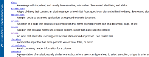
If you really need to add a styling hook, choose something that pertains to a function, such as the role attribute. Roles are standardized and machine-readable. (View image.)
Meanwhile, the Saussurian model gives us more than enough scope for elegance and invention, as well as prohibits us from making bad choices. By styling the elements that make up our documents according only to what and where they are, then misleading or confusing the user becomes extremely difficult—without conscious effort. All you are doing is using CSS to expose the inherent structure of your page.
Paradigmatic styling is really just about choosing the right element for the job. There are many ways to traverse “syntagms,” so let’s look at a few examples. You’ll already be familiar with most or all of these; just imagine using this kind of styling exclusively:
aside h1A simple descendant selector that styles top-level headings that belong to asides.body > divStyles divs that directly descend from<body>exclusively (helpful for unsemantic layout such as “wrapper” blocks).p + pTargets all paragraphs that directly follow other paragraphs.* + h2Styles second-level headings that do not appear at the head of their parent section.section ~ article h2Targets all second-level headings in articles that are together preceded by a section.li:nth-child(odd)Targets every other (i.e. odd) list item in eitherolorulelements.ol li:first-child h3:beforeStyles the pseudo-content that precedes the third-level heading in the first item of an ordered list.
You will realize that any content styled using these methods will change in appearance upon being moved to another part of the page. Never fear: that is supposed to happen. Unfortunately, the employment of classes can all too easily undo this legitimate influence of context.
An Example
To provide an example to accompany this article, I took the step of removing all class attributes from my own blog. The style sheet isn’t as neat as I’d like it to be, but that’s my fault, not Saussure’s. Note that my design is responsive and relies on a single id attribute to enable smartphone users to jump to the main navigation; however, it is not used as a styling hook.
The Importance Of Context
Previously, we explored how classes can be used to illustrate differences that don’t exist. By the same token, they can be used to gloss over differences that do exist.
From a semiotic perspective, perhaps the only real difference between two things that are otherwise alike is their context: the circumstances in which they are found. An English native and a French native are genetically similar but culturally different. The context of their nationality makes them, in many noteworthy ways, unalike.
Please consider the following code example:
// HTML:

<article>
   <h1 class="main-title">Article Title</h1>
   <aside>
      <h1 class="main-title">Aside Title</h1>
   </aside>
</article>
// CSS:
.main-title {
font-size:30px;
}By coining the class .main-title, we have created a cypher to help us easily style all top-level headings similarly. However, the two headings in our example are not similar. Any parser that understands HTML5 will know that the h1 in the aside is, in fact, less important than the one that belongs directly to the article. How does it know this? Well, the specification mandates that asides are for tangentially related content, not important stuff like that found in the main body of the article. Also, the parser’s understanding of the document-outlining algorithm means that it will consider the aside’s heading as a mere subheading, belonging to the h1 that precedes it.

Google is aware that the word “context” has more than one meaning… depending on the context.View image.)
If this is all being read and understood by the parser, then shouldn’t it also be disclosed to the user? In truth, the class in this example is redundant anyway: we could just style the h1 element with the property of font-size: 30px. The point is that if we differentiate the two elements according to context (say, by using the descendent selector aside h1), then the CSS will be bound to the HTML’s structure and the appearance of the element will fall in line with its computed meaning. In practice, by moving from an aside into the main article, an h1 would automatically look more important — which would reflect its greater importance. The aside h1.main-title selector would work, too, but the class is absolutely redundant.
Seems obvious, doesn’t it? However, popular frameworks such as OOCSS specifically sanction the use of classes in a way that denies the influence of context. To quote OOCSS’ GitHub page, “An object should look the same no matter where you put it.” In fact, we’re told to avoid the descendent selector altogether, thus largely negating the “cascading” part of the technology.
The innovators of OOCSS are not the only ones who discourage the use of the descendent selector either. An article on CSS Wizardry reads, “As soon as an element begins to rely on its parent, and their parent, and their parent’s parent then you are doing it wrong. Your styles should never rely too heavily on where they live as this makes them incredibly unportable.”
In the next section, I’ll make the case that only content, not styles, should be portable.
Modularity And Mobility
An element that insists on looking the same wherever it appears is a bit like a Briton who travels from country to country refusing to speak the native language and burping the English national anthem. It’s aggressive and inappropriate.
I don’t see CSS as being object-oriented; I see it as being interface-oriented. The purpose of CSS is not to make individual items look the way we want them, but to make the interfaces that we build by styling HTML documents cogent and readable. For an interface to be optimally apprehensible, all of its components should work together politely and should respect the overall visual structure, no matter where the components come from.
Get your content ready to go anywhere because it’s going to go everywhere.
With the advent of elements such as article, which are intended to carry content to be dispersed between documents, we should consider an approach to styling that does not permit externally sourced content to spoil the coherence of the context into which it is introduced. Once again, classes get in the way.
Unsemantic pieces of content that are styled with classes depend on the style sheets that give their particular content visual form. The class acts as a key, pairing the HTML with a specific CSS file. This has two undesirable outcomes:
- The document that hosts the third party’s content has to load an additional resource (i.e. the third party’s style sheet);
- The third party’s content defies the aesthetic conventions of the page and sticks out like an obnoxious advert.
By agreeing to basic semantic conventions and refusing to superimpose our own styling rules, we can instead manufacture content nodes that travel seamlessly from document to document. This approach to styling creates a scenario that allows our HTML to be interoperable, like RSS. Website owners will maintain CSS files that style elements according only to the elements’ ownership by and proximity to other elements. Content manufacturers, meanwhile, will produce content that (by virtue of its semantic conventionality) is ready to take on the styling of any context it may enter, integrating itself with a minimum of effort.
In short, we should aim to truly separate style and content, allowing content to travel between interfaces but with the interfaces remaining unmoved. As within any properly formatted document, attribution — not aesthetics — should be what discloses the source of a piece of content.
Conclusion
“Roads? Where we’re going, we don’t need roads!” exclaims the inventor, Doc Brown, as his Delorean-based time machine’s wheels fold under its chasis and the car takes off, headed for 2020. It’s a great line for its defiance: Roads, which have literally paved the way for automobile travel and made it viable, are no longer even needed. At all.
<abbr=“Extensible HTML”>XHTML, which sought to enforce well-formed code, did little to enforce or cater to well-formed content. CSS classes, like the roads in Doc Brown’s line, were a costly and substandard necessity. We wouldn’t have gotten very far as UI designers without them. However, classes were only ever a polyfill. Now that the new technology has arrived, they have become obsolete.
(al) (km)


 Register For Free
 Devs love Storyblok - Learn why!
 Enterprise UX Masterclass, with Marko Dugonjic
 JavaScript Form Builder — Create JSON-driven forms without coding.
