User Experience Takeaways From Online Car Shopping
Emergency car shopping is no fun. This past month was the second time I had to shop for a car in a short timeframe without advance warning. Like most informed shoppers, I went online to get a feel for my options, armed with knowledge of what I was looking for: apart from safety, gas mileage and reliability, it had to comfortably seat six and not require me to take out a second mortgage.
I felt like a persona out of a scenario that I had role-played a few years ago when our UX team at Capgemini conducted a global UX benchmarking project for General Motors. That year, a JD Power consumer satisfaction study revealed that 68% of GM’s US websites were below the industry average, with two in the bottom 10%. Heuristic evaluations were one method we used to identify the causes of dissatisfaction while evaluating over 50 of GM’s B2C websites, along with 75 competitor websites, across various countries and brands.
Further Reading on SmashingMag:
- The Realities Of User Experience Design Within The Luxury Industry
- Conversational Interfaces: Where Are We Today?
- Improving The Online Shopping Experience
- Usability Study: Shopping For Bedsheets – How Hard Could It Be?
Each website evaluation captured over 600 points of data across 16 automobile website features that affect the online car research and shopping user experience, including vehicle information, comparison and configuration. This time, though, the experience was personal and made me think about the lessons to be learned from the experience of shopping for a car online that could be applied to any website.
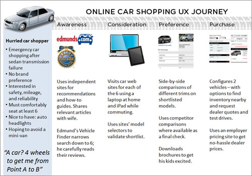
“Online Car Shopping UX Journey” (Large version)
Awareness
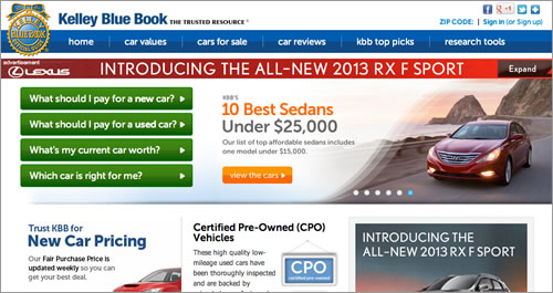
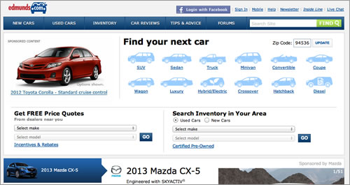
Without a preferred vehicle or brand, I started my search on independent websites such as Kelley Blue Book (KBB) and Edmunds. KBB greeted me with a featured article that hit the spot, showcasing “10 Best 3-Row Vehicles Under $30,000,” while Edmunds’ “Car Finder” tool offered common filters to narrow my search and compare shortlisted results. Some of the links in the research process deep-linked to pages on car manufacturers’ websites that were no longer available.
Takeaways
Don’t expect users to always start on your home page; deep links from search engines and third-party websites can drop them many levels deep onto your website. Design for these out-of-your-control scenarios with the following:
- Clear navigation, breadcrumbs and search to help them get their bearings,
- Useful 404 pages to guide them to the main areas of the website,
- Standard and intuitive ways to go to the home page.
Consideration
Back to car shopping. With the search narrowed down to a handful of vehicles, it was time to visit the brand websites of the shortlisted vehicles for additional research and planning the next steps.
While broadband speeds have increased, car website home pages have also bloated, many taking over 10 seconds to crawl from zero to done. Websites such as the one for Kia made the wait seem longer with static screens and slow transitions. Downloading times for most websites on personal computers average about 6 seconds worldwide and about 3.5 seconds on average in the US. While car manufacturers are selling a lifestyle decision and are expected to market their brand and their cars, a few broke a golden rule by auto-playing video and animation with sound.
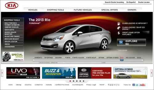
Kia greets the users with several animations right away.
Most car websites showcase their models by body style (sedan, SUV, crossover), but that can be confusing because one brand’s SUV can be another’s crossover. Mazda guides users to the appropriate shopping tools depending on where they are in the process; for example, if you are trying to find the right model, Mazda has a model selector with feature-based filters.
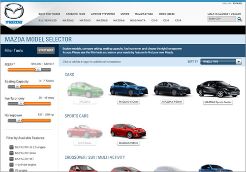
Mazda USA’s model selector has feature-based filters to help users find the right model.
Takeaways
- Make it easy for customers to find your website, using a combination of online and offline marketing techniques. Search engine optimization (SEO) becomes more important when you don’t own the domain name that users would expect to find you at (as is the case with Nissan.com).
- Load the home page quickly.
- Give users control of the user experience, especially if they have not explicitly asked for multimedia. Do not auto-play video, and give users the option to turn audio on and off.
- Provide users with the tools to find the right product, especially when dealing with a large product catalog or products with multiple variations. These tools include search, filters and wizards.
- Search results should offer an appropriate summary of key product information. Apart from the name, thumbnail image and price, briefly summarize a couple of distinguishing features (No, “far-reaching fun” for a car does not count).
Preference
All car websites presented detailed model information, including features, specifications, pricing and incentives. However, jargon and marketing terminology were not always clarified (what exactly is included in “anti-theft features”?), which could drive users away from the website in search of an explanation.
Comparing trims within a model and against competitors was not always apparent (why should I spend more on a grand trim instead of a sports trim?). Dodge’s comparison seemed a nonstarter, not intuitive and without clear next steps.
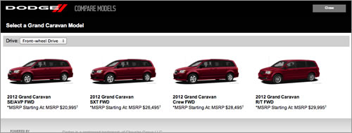
Dodge’s vehicle comparison lacked prominent next steps and call to actions.
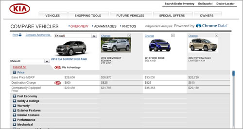
Kia was one of the few websites to highlight its competitive advantages
Takeaways
- Support users’ tasks and goals on your website, including product research. Provide appropriately detailed information for the product category. While not required for commodities such as paper and books, 360-degree views and video are appropriate for cars.
- Products that are complex, expensive, configurable or high-touch in nature should be accompanied by additional guidance to help users select the right product, ranging from educational guides (e.g. what to look for in a diamond) to recommendation engines.
- Comparisons between competitors are best offered with a preconfigured set of comparison options (with the ability to change them), supported by content from a neutral and independent third party. A related best practice is to highlight the differences and benefits of the primary product.
Purchase
A few years ago, vehicle configurators were not common or sophisticated, but that has changed. Websites now have wizards guiding users through the steps of customizing a vehicle, followed by concrete steps such as finding nearby inventory, scheduling a test drive and requesting a quote. Some websites did better than others (for example, offering one click to get quotes from multiple dealers), while some websites, like the one for Dodge, were a letdown after building expectations (seven matches within a 10-mile radius turned into no exact match but 112 low matches within a 25-mile radius). Dealer websites themselves were less sophisticated than manufacturer websites and were often difficult to navigate and lacked crucial inventory information such as what trims were in stock.
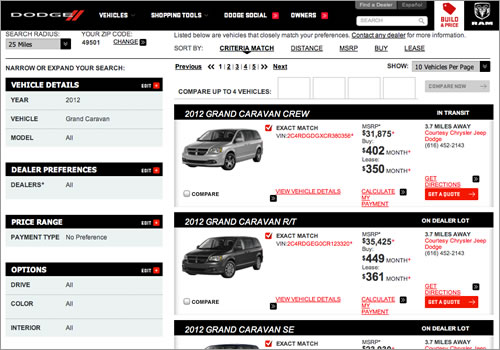
Dodge did not return the promised results in its inventory search.
Most websites offered collateral with clear labeling for downloading or delivery by mail. Interactive online brochures like Kia’s were the exception, but most downloadable brochures were PDF files.
Takeaways
- Make call-to-action options prominent and clear. For most online shopping websites, this means an “Add to cart” button, but in other cases it could mean bringing the user to another channel such as a store or showroom or getting them to fill out a form for more information.
- Don’t overpromise and underdeliver. As seen with Dodge’s dealer inventory tool above, some websites allow users to add a product to their shopping cart, only to inform them during checkout that it is not available.
Loyalty
Special sections on websites for car owners are now commonplace, unlike a few years ago, but websites could do a better job of giving users a taste of the features in store, as well as the benefits of registering after buying a vehicle.
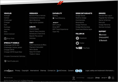
The benefits of Dodge’s website for owners are hidden below the fold, and the FAQs linked to above the fold are not relevant.
Takeaways
- Sustain an ongoing relationship with your users. For retail websites, this could include features such as order status, tracking information and easy reordering.
- Support buyers with tools and features to manage their purchase while building loyalty. These could include product updates, alerts, reminders, guides and manuals.
Then And Now: Business To Personal
Our heuristic analysis from the study a few years ago drove improvements to the user experience on GM’s websites. This significantly increased customer satisfaction and was reflected in JD Power’s subsequent ranking: GM was number one in customer satisfaction, all of its US websites ranked above the industry average, and three of the top five spots belonged to GM brands.
The overall online car-shopping experience is much better now than it was a few years ago, but there is still room for improvement, as shown here. This time around, the websites helped lower the stress of shopping for a car, and I am enjoying my new car smell as I write this. Now for the final user experience test: seeing how easy it is to get off the phone, email and mailing lists of the dozen or so persistent dealers who think I am still in the market for a vehicle.


 Register For Free
 Get a Free Trial
 Devs love Storyblok - Learn why!

