Adopting A Responsive WordPress Theme Is More Than Install-And-Go
Responsive Web designs present different formatting and layout to suit the device on which their pages are displayed. Browsers choose the appropriate styles on page load, freeing website owners from having to maintain different sets of pages for different display scenarios.
The most common responsive method is to use CSS media queries to serve different style sheets (or parts of style sheets) based on the number of pixels available. Most often, this is applied to handheld devices such as smartphones, but it could be applied to 13-inch laptops, 30-inch TVs or Kindle-sized readers. Responsive designs respond to their environment.
Further Reading on SmashingMag:
- How To Become A Top WordPress Developer
- Common WordPress Malware Infections
- Writing Unit Tests For WordPress Plugins
- Inside The WordPress Toolbar
No Shortage Of Quick Fixes
The term “responsive design” is only two years old, but website owners can choose today from many mobile and widescreen themes for popular content management systems. Third-party developers have created paid and free themes that adapt based on browser width for WordPress, Drupal, Joomla and ExpressionEngine.
Recommended reading: What To Consider When Choosing WordPress Themes
Designers handy with CSS can also find a few do-it-yourself frameworks. But responsive themes are as varied as the problems they are meant to solve. Not all are created with the same technique, features or attention to detail. Aesthetics aside, how should someone choose a theme?
How Do Responsive Themes Perform?
Large themes cause delays for both the Web server and the end user. Servers require more time to fetch each additional file, and the milliseconds add up. For users, though, sluggishness comes from the number of kilobytes total, not just the number of files.
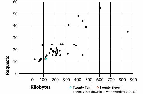
Aside from using media queries, many themes use variations of techniques to respond to browsers. I’ve tested 40 responsive themes on WordPress.com, comparing them to the stock Twenty Eleven and Twenty Ten themes.

The weight of each theme and supporting files in kilobytes.
The chart above shows that:
- The number of files that a theme loads and the theme’s weight in kilobytes have no direct relationship;
- With few exceptions, most themes make 25 requests or fewer;
- WordPress’ stock themes perform very well, but a few other themes provide responsive capability and better performance.
Bear in mind that these are empty themes, measured before any content or modifications have increased their load. Because data costs money for people who are accessing the Web through cellular networks, themes that require fewer downloads per page load are more likely to earn repeat visits. Of the themes sampled:
- Only one theme did not use CSS media queries. This theme’s unusual method was to detect page width with jQuery and then change the
bodyclass, which in turn would change the layout with animated transitions. The extra time taken to load and implement JavaScript compromised the goal of responsiveness. - More than half had three break points: mobile (480 pixels or less), medium (481 to 1024 pixels) and wide (1025 pixels or more). The medium-sized layouts were most often measured with percentages, ems or
min-andmax-width, rather than strictly by number of pixels. - Left-to-right layouts on wide screens always became top-to-bottom layouts on mobile. That is, the left-most column in a widescreen layout would always appear at the top of the page in a mobile layout, regardless of its width or the type of content. Likewise, right-hand columns would become footers in mobile layouts. This means that the content in your left-most column should not discourage users from scrolling down when it’s formatted for mobile devices.
- All mobile designs had 10 to 20 pixels of horizontal margin. None deliberately allowed horizontal scrolling or used app-simulating frameworks such as jQuery Mobile.
- None provided in-page navigation.
- Two themes used
selectlists for navigation in their mobile layouts. None used multi-level navigation. - Loading a page with three paragraphs of placeholder text, the themes averaged 306.57 KB per page load and 25.4 resources retrieved (including images, CSS files, JavaScript files and the like).
- The lightest theme weighed only 57.11 KB before the content itself (text and images) loaded. The largest weighed 1382.4 KB before the content loaded.
Recommended reading: Are You Getting Cheated When Buying A WordPress Theme?
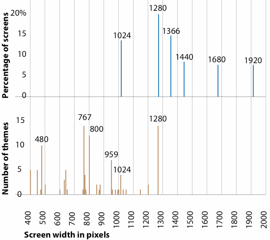
Remember that screen width does not necessarily equal browser width. Most themes are not built on the assumption that users will have their browser windows open as big as possible; rather, their layouts are designed for screen widths well under common sizes.

Most themes are well under the most common screen widths. The wider the screen, the less likely a user will expand their browser to fill it.
As seen in the graph above, most themes will use max-width media queries to resize layouts when browsers reach 1280, 800, 767 and 480 pixels wide. But most screens surveyed by Lifehacker, StatCounter and W3 Counter start at 1280 pixels wide.
Picking A Theme That Reflects Your Priorities
Making a website responsive is more than about varying the number of columns on a page. The same critical questions emerge for all mobile-friendly websites, regardless of CMS.
- Does the project merit a mobile layout? Increasingly, the answer is yes. But the march towards mobile doesn’t mean that every website should follow suit. Pages that contain complicated tables, multi-month calendars, detailed images, complex navigation and other content unsuitable for small screens could negate any benefit offered by responsive designs. “Can I?” and “should I?” are two different questions.
- Would the website benefit from mobile-first thinking? Designing a website to be mobile forces the content editors to answer hard questions. A screen measuring 320 pixels wide has no room for excess. This brings the design into focus, forcing you to eliminate distractions from whatever the website is meant to convey.
- How many steps do we need? Responsively designed websites often rely on the width of the device on which they’re being viewed. But there’s more to it than asking “Mobile or not?” Responsive designs must address not only how a website handles on narrow screens, but also when wide becomes too wide. But a better option would be to consider using a device-agnostic approach to Web design focusing on content rather than device properties.
- How do the layout and formatting change? Deciding which elements on a given page users should see first, second and third will affect how the widescreen layout functions. For example, the font in headings in the widescreen layouts could be three, four or five times larger than the body copy, whereas giant headings are cumbersome on tiny screens.
- What should a mobile page not show? Multiple columns encourage a hierarchy of information: primary content that is unique to each page, and secondary content (often relegated to sidebars) that appears on more than one page. But mobile design makes multiple columns difficult to pull off. If the secondary content is unnecessary, how should it disappear? If it’s important, how does one design it without letting pages run longer than users are willing to scroll? (A good rule of thumb is that if an element does not support the page’s title, then it is not primary content.)
Recommended reading: A Guide To The Options For WordPress Theme Development
Think Beyond The Theme
Having a responsive theme does not guarantee a good mobile user experience.
Designing for mobile is not just about cutting material, but also about planning for limited attention. By nature of the medium, mobile users absorb information in limited chunks. Long pages can work if they’re divided into phone screen-sized sections. Unlike widescreen users, mobile users are more inclined to scroll down “below the fold” (i.e. below what they first see when the page loads).
Consider higher-contrast colors for mobile — particularly, the contrast between the body text and the background — for improved legibility outdoors.
Extensive navigation bars with sublevels and sub-sublevels are impractical on mobile devices. Offering search functionality, creating pages dedicated to navigation, and flattening the website’s structure are common solutions; anything that reduces the number of taps between pages helps.
When To Consider A Separate Mobile Website
Responsive designs do more than make a website work well on a variety of screen sizes; they also force the owner to make their website easier, more focused and faster. But they’re a tool, not a requirement. Adaptive layouts and media queries aren’t always the best answer for mobile design problems. When big content simply doesn’t fit on small screens, maintaining a supplemental website would outweigh the benefit of having one website that serves many audiences. The key is to create a companion website that carries essential information organized for mobile use — and then find out what mobile users are missing.
Your website could warrant a separate mobile version if:
- You find yourself creating duplicate pages for mobile users on the same website;
- Short pages that look great on mobile phones don’t take advantage of large screens;
- You plan to phase out the widescreen layout in favor of a more streamlined user experience.
Recommended reading: Why We Shouldn’t Make Separate Mobile Websites
Other Resources
You may be interested in the following articles and related resources:


 Devs love Storyblok - Learn why!
 JavaScript Form Builder — Create JSON-driven forms without coding.
 Get a Free Trial
 Register For Free


