Guidelines For Mobile Web Development
This overview features a hand-picked and organized selection of the most useful and popular Smashing Magazine’s articles related to design and development for mobile devices and published here over all the years.
Quick Overview
- Why We Shouldn’t Make Separate Mobile Websites
- Sketching A New Mobile Web
- How To Build A Mobile Website
- How To Use CSS3 Media Queries To Create A Mobile Version Of Your Website
- A User-Centered Approach To Web Design For Mobile Devices
- Seven Guidelines For Designing High-Performance Mobile User Experiences
- Not Your Parent’s Mobile Phone: UX Design Guidelines For Smartphones
- Responsive Menus: Enhancing Navigation On Mobile Websites
- Finger-Friendly Design: Ideal Mobile Touchscreen Target Sizes
- Mobile Auto-Suggest On Steroids: Tap-Ahead Design Pattern
- A Study Of Trends In Mobile Design
- How To Market Your Mobile Application
- Picking A Mobile Support Strategy For Your Website
- Forms On Mobile Devices: Modern Solutions
- Removing Stumbling Blocks In Mobile Forms
From Monitor To Mobile: Optimizing Email Newsletters With CSS
Getting To Know The Android Platform: Building, Testing And Distributing Apps
Designing For iPhone 4 Retina Display: Techniques And Workflow
Why We Shouldn’t Make Separate Mobile Websites
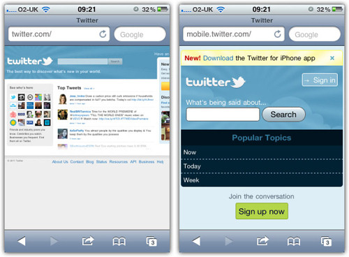
There has been a long-running war going on over the mobile Web: it can be summarized with the following question: “Is there a mobile Web?” That is, is the mobile device so fundamentally different that you should make different websites for it, or is there only one Web that we access using a variety of different devices? Acclaimed usability pundit Jakob Nielsen thinks that you should make separate mobile websites. I disagree.
Sketching A New Mobile Web
The mobile Web has gotten a bum rap. It spends most of its time either in the shadow of the desktop or playing the role of the native app’s frumpy friend. Luckily, we’ve got the tools to change that. Progressive enhancement, mobile-first and responsive design can help lead us towards a more unified, future-friendly Web. That’s the good news. The bad news? These tools are worthless if you don’t have license to use them.

What’s holding us back, in many cases, is our clients and the conceptual models they cling to. If our clients are to embrace the potential of the mobile Web, then we need to get them thinking beyond desktops and apps.
How To Build A Mobile Website
Over the past few years, mobile web usage has considerably increased to the point that web developers and designers can no longer afford to ignore it. In wealthy countries, the shift is being fueled by faster mobile broadband connections and cheaper data service. However, a large increase has also been seen in developing nations where people have skipped over buying PCs and gone straight to mobile.
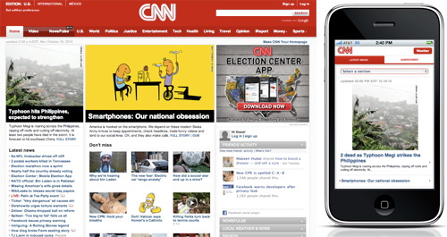
Unfortunately, the mobile arena introduces a layer of complexity that can be difficult for developers to accommodate. Mobile development is more than cross-browser, it should be cross-platform. The vast number of mobile devices makes thorough testing a practical impossibility, leaving developers nostalgic for the days when they only had to support legacy browsers.
How To Use CSS3 Media Queries To Create A Mobile Version Of Your Website
CSS3 continues to both excite and frustrate web designers and developers. We are excited about the possibilities that CSS3 brings, and the problems it will solve, but also frustrated by the lack of support in Internet Explorer 8. This article will demonstrate a technique that uses part of CSS3 that is also unsupported by Internet Explorer 8. However, it doesn’t matter as one of the most useful places for this module is somewhere that does have a lot of support - small devices such as the iPhone, and Android devices.

In this article I’ll explain how, with a few CSS rules, you can create an iPhone version of your site using CSS3, that will work now. We’ll have a look at a very simple example and I’ll also discuss the process of adding a small screen device stylesheet to my own site to show how easily we can add stylesheets for mobile devices to existing websites.
A User-Centered Approach To Web Design For Mobile Devices
For the past few years, we’ve heard pundits declaring each year as “year of the mobile Web”; each year trying to sound more convincing than the previous. Whether 2011 will be the real “year of the mobile” remains to be seen, but what is indisputable is the fact that the mobile usage of the Web is growing and evolving. As it evolves, so does the mobile user experience, driven by advances in mobile device technology — from better browsers on basic mobile phones (or feature phones — remember the Motorola RAZR?) to the increased adoption of smartphones and tablets.
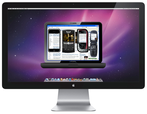
The term “Mobile Web” (although often criticized) is commonly used to describe accessing the internet using a mobile device. This definition is broad enough to cover everything from using a browser on a feature phone, to using highly customized apps on smartphones or tablets.
Seven Guidelines For Designing High-Performance Mobile User Experiences
A positive first impression is essential to relationships. People look for trust and integrity, and they expect subsequent encounters to reflect and reinforce their first impression. The same principles apply to brands and their products. Design plays an important role in building lasting relationships with end users and, thus, in supporting the brand’s promise.
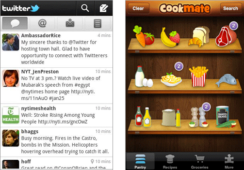
Users expect mobile services to be relevant and user-friendly and to perform well. The limitations of the medium, however, impose significant challenges to designing products that meet all of those expectations. While often underestimated, performance is a crucial contributor to a trustworthy mobile user experience. Therefore, it should be considered a key driver in the design process.
In this article, we’ll discuss performance in relation to design and present seven guidelines that can help shape design decisions related to performance while accounting for the needs of end users and businesses. These guidelines are based on the experiences of our teams in designing native mobile apps for a broad product portfolio and on multiple mobile platforms.
Not Your Parent’s Mobile Phone: UX Design Guidelines For Smartphones
In your pocket right now is the most powerful “remote control” (as Drew Diskin put it) that has ever existed. It is no ordinary remote control. It can harness everything that all of the previous mass media (television, radio, Internet, etc.) can do. People aren’t using them just for simple entertainment or for phone calls. They have become the hub of our personal lives.
Smartphones are what younger generations know as just phones. The iPad (aka the tablet) is giving your grandma’s PC a run for its money. You certainly are holding some amazing futuristic technology in your hands. It will be even better tomorrow, though, so why does it matter to us or to users? Moore’s Law tells us, in effect, that these things will continue to become capable of more than anything our minds can think up.

It’s no longer just about the evolving power and capabilities of these devices. It’s about us and how we, too, are changing. The user’s expectation of a great experience is the new standard. It falls to us as UX professionals to apply our skills to make this happen on the vast array of devices out there. It’s not always easy, though. The mobile realm has some unique constraints and offers some interesting opportunities. While covering all of the nuances of mobile UX in one article would be impossible, we’ll cover some fundamentals and concepts that should move you in the right direction with your projects.
Responsive Menus: Enhancing Navigation On Mobile Websites
Most of us are pretty familiar with responsive Web design by now. Basically, it uses a combination of a fluid layout and media queries to alter the design and layout of a website to fit different screen sizes. There are other considerations, too. For example, a lot of work has been done on responsive images, ensuring not only that images fit in a small-screen layout, but that the files downloaded to mobile devices are smaller, too.

But mobile design isn’t just about layout and speed: it’s also about user experience. In this article, we’ll focus on one aspect of the user experience — navigation menus — and detail a few approaches to making them work better on mobile devices.
Finger-Friendly Design: Ideal Mobile Touchscreen Target Sizes
In darts, hitting the bulls-eye is harder to do than hitting any other part of the dartboard. This is because the bullseye is the smallest target. This same principle can also apply to touch targets on mobile devices.

Smaller touch targets are harder for users to hit than larger ones. When you’re designing mobile interfaces, it’s best to make your targets big so that they’re easy for users to tap. But exactly how big should you make them to give the best ease of use to the majority of your users? Many mobile developers have wondered this, and most have turned to the user interface guidelines provided by the platform developer for the answer.
Mobile Auto-Suggest On Steroids: Tap-Ahead Design Pattern
In contrast to desktop Web search, auto-suggest on mobile devices is subject to two additional limitations: typing avoidance and slower bandwidth. The new patent-pending design pattern, Tap-Ahead, uses continuous refinement to create an intuitive, authentically mobile auto-suggest solution. This helps dramatically reduce the amount of typing needed to enter queries, and utilizes slower mobile bandwidth in the most efficient manner. Using this novel design pattern, your customers can quickly access thousands of popular search term combinations by typing just a few initial characters.
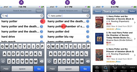
As John Ferrara wrote in his November 2010 UXMagazine article, “Psychic Search: a quick primer on search suggestions”, today auto-suggest is practically ubiquitous in desktop Web search. In contrast to desktop Web, auto-suggest on mobile is (at least for now) fairly rare. The only mobile Website that currently implements auto-suggest is Google.com, and a handful of mobile auto-suggest implementations that currently exist come from native mobile apps built by leading online retailers like Amazon and Booking.com.
A Study Of Trends In Mobile Design
The industry has evolved in many ways, but one particular area has affected how we build websites to a greater extent than any other. The surge in Web-enabled mobile devices has forged a subculture of visitors who require the adaptation of our websites to meet their needs. While mobile design is still in its infancy (and little primary research on mobile trends exist), we need to observe how this now-critical element of our industry is evolving, and the patterns which exist from current development efforts.
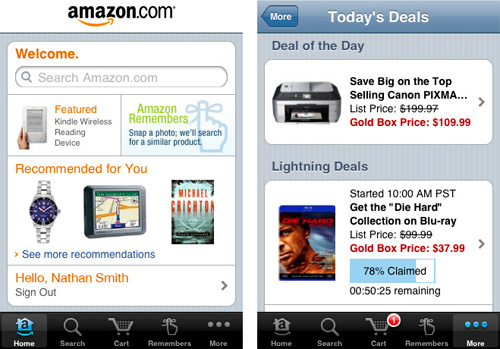
The aim of this article is to showcase the variety of methods in which some of today’s most popular websites provide an interactive and (hopefully) useful mobile experience for their end users. There are plenty of big names which were analyzed, such as Facebook and Amazon, and you’ll see plenty of useful graphs to draw some inspiration from. With statistics and some really interesting revelations on the diversity of modern design, you can be excited about the future of mobile Web design!
How To Market Your Mobile Application
App Store is a competitive environment. Against more than 140,000 apps, all screaming for attention, how do you make sure your app gets its time in the spotlight? What does it take to get good media coverage? How do you get people to talk about your app—and, ideally, how do you get them to buy it and show it to their friends?
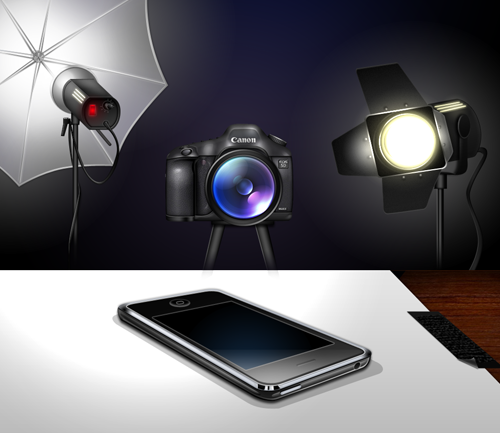
Following the simple rules laid out below, you will increase your chances in the battle for fame and glory. These tips might seem rudimentary or in-your-face obvious, but they are so often neglected in the heat of the moment.
Picking A Mobile Support Strategy For Your Website
The number of people browsing the Web from a mobile device has more than tripled since 2009, and it is sure to continue growing, with browser platforms such as iOS and Android offering mobile browser support that is almost identical to what we have come to expect from a desktop experience. As the mobile consumer market continues to grow, so will the aspirations of individuals and companies who look to embrace what the mobile Web has to offer.
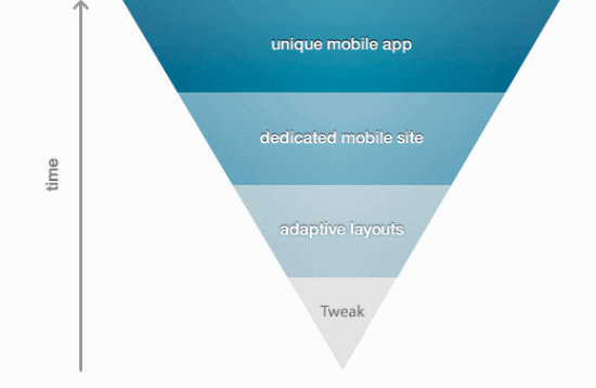
With this in mind, many website owners have begun to develop a strategy for providing information and services to their mobile visitors. However, mobile strategies can vary massively from website to website, depending on what the company wants to offer visitors. For example, eBay’s strategy will be very different from an individual’s strategy for a portfolio website, which might simply be to improve readability for those viewing on a mobile device.
Forms On Mobile Devices: Modern Solutions
Mobile forms tend to have significantly more constraints than their desktop cousins: screens are smaller; connections are slower; text entry is trickier; the list goes on. So, limiting the number of forms in your mobile applications and websites is generally a good idea. When you do want input from users on mobile devices, radio buttons, checkboxes, select menus and lists tend to work much better than open text fields.
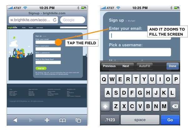
But constraints breed innovation, and mobile forms are no different. The limitations of mobile devices have forced developers and designers to find new ways to allow users to input data faster and more easily. Thanks to the modern solutions covered in this article, the mobile space may not be a place to avoid forms much longer. Instead, it may become the place to encourage them.
Removing Stumbling Blocks In Mobile Forms
A few weeks ago, I was quite surprised when I saw the pavement quickly approaching while I was out for a walk. Laying there stunned, I soon realized what had happened: I fell. Ouch. B-minus. I normally try to be as attentive as possible, but this time a big crack in the pavement caught my shoe and threw me completely off balance.
After reporting my clumsy accident to friends and family, I instantly received comments like: “be more careful” or “better watch out next time”. In the end, I started to defend myself—if that crack would not have been there, I most likely would not have been face-planted.

When it comes to filling out forms on a mobile phone, I have observed many users running into a similar experience, merely less painful in its physical aspect. Many elements within a mobile form affect how smoothly users will get to a service or product hiding behind a form of any kind.
There are several factors that can be considered to be stumbling blocks throughout the journey of filling out a form. Specifically on a portable device, this journey is complicated by the fact that we have to consider contextual parameters such as time, location, or limited input options, in comparison to a firm desktop experience. In this post we will look at the most common stumbling blocks for mobile devices. Moreover, I will discuss design strategies to avoid stumbling blocks and to facilitate a safe and quick stroll through forms for mobile users.
From Monitor To Mobile: Optimizing Email Newsletters With CSS
HTML email has a reputation for being a particularly tough design medium. So tough, in fact, that many designers regard coding and testing even the simplest email design to be almost as bad as fixing display quirks in Internet Explorer 6, and only slightly better than a tooth extraction. So, it’s with much courage that I tell you today about using CSS in email newsletters: what works, where it’s going and what you should do next.
After reading this article, you will hopefully come away with a few ideas on how to start coding email designs with improved readability and usability when viewed in Web, mobile and email desktop clients alike. Also included are a variety of resources to get you on the right path with using CSS in email.
Then again, the shaky state of email standards today may convince you that plain-text email is the way to go. The choice is yours.
UI Patterns For Mobile Apps: Search, Sort And Filter
As I was waiting for a table at a local restaurant the other day, I flipped through a couple of the free classified papers. I was shocked to realize how dependent I’ve grown on three simple features that just aren’t available in the analog world: search, sort and filter.
AutoDirect and some of the other freebies are organized by category (like trucks, vans, SUVs) but others, like Greensheet, just list page after page of items for sale. I would actually have to read every single ad in the paper to find what I wanted. No thank you, I’ll use Craigslist on my phone instead.
But after taking a look at Craigslist mobile, it became obvious we could all benefit from some best practices around mobile search, sort and filter UI design. This article explores a dozen different ways to surface and refine the data your customers want.
Create An HTML/CSS Mobile Web App Using Sencha Touch
The world of mobile app development is quickly becoming a crowded and complicated space, especially for those outside of the development niche. “Which development platform should I use?” “Do I go native or Web-based?” “Which devices should I plan for?” “Can I build my mobile website by hand or should I use a pre-built package?” The questions are endless.
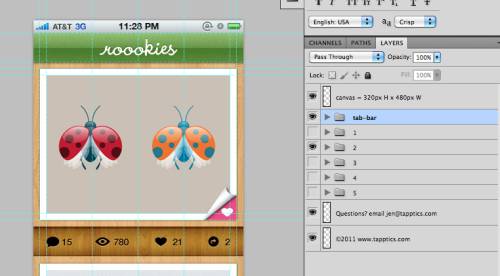
As a designer, my job is to help my clients answer these questions. I try to stay in the category of “knowing enough to be dangerous,” and I keep tabs on the latest mobile development trends, one being the growing popularity of mobile Web apps.
Making It A Mobile Web App
Ask any interactive agency nowadays what their clients are asking for when they need a mobile experience — the answer will inevitably be “an iPhone and/or an iPad app.” Native Apple apps are a hot commodity, and in today’s mobile application ecosystem, mobile web apps are not sexy. In fact, many people don’t even realize they are even an option. In certain cases, an iPhone/iPad app will be the right solution for their needs.
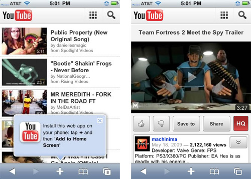
However, there are some situations where it may become a short-term win, but eventually a long-term loss. Mobile web apps offer a good number of advantages over native apps; and though they face some design, development and deployment challenges, they are a powerful cross platform, scalable and affordable solution.
The Art Of Launching An App: A Case Study
Anyone in the app business knows that marketing an app is tough. And according to a recent article on TechCrunch, “Getting a mobile app noticed in the increasingly crowded mobile app market is more difficult than ever.” Some titles and concepts are truly unique. Angry Birds? Its title and screenshot alone were enough to catapult it to number one in Finland, according to Mikael Hed 1, CEO of Finnish game studio Rovio, which develops the game. Some apps are downright genius. Who doesn’t loath maintaining a to-do list? But now with Clear 2, it’s astonishingly fun! Who in the media wouldn’t cover something this clever? These two special cases were a shoe-in for the coveted feature page.

Many developers fall into the trap of allocating tight budget dollars to quick “tech” fixes in a desperate attempt to lift their app above the crowd. However, in this age of digital distraction, one mechanism to help that tree stand out is a tried-and-true PR marketing campaign. And the best initiatives are those that involve choosing strategic partners, creating clever story angles that dovetail with newsworthy occasions, and running a cause marketing campaign and contest. This case study will cover some of these tactics and offer some of the lessons we learned along the way.
Getting To Know The Android Platform: Building, Testing And Distributing Apps
When iOS started to gain momentum, soon after the first iPhone launched, many businesses started to pay attention to apps. The number of apps for iOS grew exponentially, and every company, big and small, rushed to create their own app to support their business.

In this article, we’ll explain parts of the application-building process and ecosystem for Android that could cause problems if misunderstood. We’ll talk about an approach to building a scalable app that looks and feels right at home on Android, and we’ll cover how to test it and your options for distributing it. The following topics would each need a full article to be explained fully, but this article should provide a good overview. After reading this article, you should have a good understanding of what kinds of decisions and challenges you will face when creating an Android app.
Get Started Developing for Android with Eclipse
There’s a lot to get excited about in mobile application development today. With increasingly sophisticated hardware, tablet PCs and a variety of software platforms (Symbian OS, iOS, WebOS, Windows Phone 7…), the landscape for mobile developers is full of opportunities — and a little complex as well.
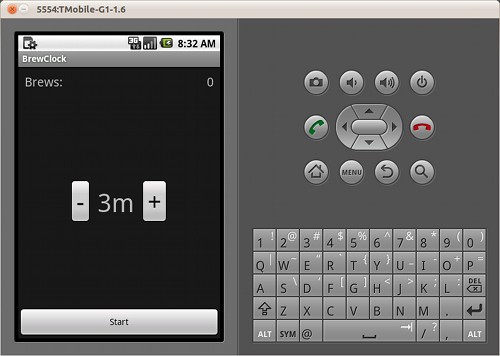
So much choice can be overwhelming when you just want to get started building mobile applications. Which platform should you choose? What programming language should you learn? What kit do you need for your planned project? In this tutorial, you’ll learn how to start writing applications for Android, the open-source mobile operating system popularized by Google.
Get Started Developing For Android With Eclipse, Reloaded
In the first part of this tutorial series, we built a simple brew timer application using Android and Eclipse. In this second part, we’ll continue developing the application by adding extra functionality. In doing this, you’ll be introduced to some important and powerful features of the Android SDK, including Persistent data storage, Activities and Intent as well as Shared user preferences.
Designing For Android
For designers, Android is the elephant in the room when it comes to app design. As much as designers would like to think it’s an iOS world in which all anyones cares about are iPhones, iPads and the App Store, nobody can ignore that Android currently has the majority of smartphone market share and that it is being used on everything from tablets to e-readers. In short, the Google Android platform is quickly becoming ubiquitous, and brands are starting to notice.
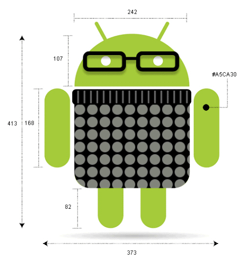
But let’s face it. Android’s multiple devices and form factors make it feel like designing for it is an uphill battle. And its cryptic documentation is hardly a starting point for designing and producing great apps. Surf the Web for resources on Android design and you’ll find little there to guide you.
Designing For Android Tablets
More than ever, designers are being asked to create experiences for a variety of mobile devices. As tablet adoption increases and we move into the post-PC world, companies will compete for users’ attention with the quality of their experience. Designing successful apps for Android tablets requires not only a great concept that will encourage downloads, usage and retention, but also an experience that Android users will find intuitive and native to the environment.

The following will help designers become familiar with Android tablet app design by understanding the differences between the iPad iOS user interface and Android 3.x “Honeycomb” UI conventions and elements. We will also look at Honeycomb design patterns and layout strategies, and then review some of the best Android tablet apps out there.
Web Development For The iPhone And iPad: Getting Started
According to AdMob, the iPhone operating system makes up 50% of the worldwide smartphone market, with the next-highest OS being Android at 24%. Sales projections for the Apple iPad run anywhere from one to four million units in the first year. Like it or not, the iPhone OS, and Safari in particular, have become a force to be reckoned with for Web developers. If you haven’t already, it’s time to dive in and familiarize yourself with the tools required to optimize websites and Web applications for this OS.
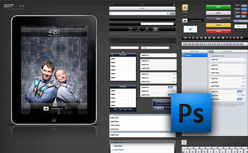
Thankfully, Safari on iPhone OS is a really great browser. Just like Safari 4 for the desktop, it has great CSS3 and HTML5 support. It also has some slick interface elements right out of the box, which sometimes vary between the iPhone and iPad. Lastly, because the iPhone OS has been around for quite some time now, a lot of resources are available.
Ten Things To Think About When Designing Your iPad App
Like most well-designed things, the magic of an iPad app comes from a union of usefulness, usability and meaning. Games aside, the app must be useful by solving a problem that people actually have through the right set of functionality at the right time. It must be easy to use and, just as importantly, easy to get started using, without a lot of pesky setup and learning steps. And it must hold meaning for the user through visual beauty, an emotional connection, personal insights, etc. In this article, we won’t outline the entire design process for creating an iPad app, but we will explore 10 of the key things to think about when designing your app (and planning the design process).
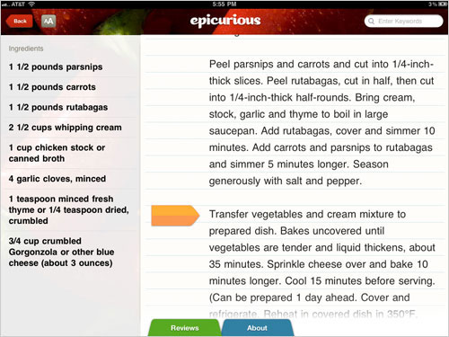
We’ve excluded tips that have already been mentioned in every single iPad design article ever written (such as, “Invite users to touch by presenting real-world metaphors in a skeuomorphic interface” —look it up!). Instead, we’ll focus on what to really think about when doing design work. By reviewing these considerations in the context of your own application, you can assess whether you’re making good decisions about your design.
How To Create Your First iPhone Application
What if you had a nickle for every time you heard: “I have the perfect idea for a great application!”? It’s the buzz on the street. The iPhone has created unprecedented excitement and innovation from people both inside and outside the software development community. Still for those outside the development world, the process is a bit of a mystery.
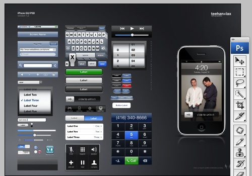
This how-to guide is supposed to walk you through the steps to make your idea for an iPhone app a reality. This post presents various ideas, techniques, tips, and resources that may come in handy if you are planning on creating your first iPhone application.
Designing For iPhone 4 Retina Display: Techniques And Workflow
The iPhone 4 features a vastly superior display resolution (614400 pixels) over previous iPhone models, containing quadruple the 153600-pixel display of the iPhone 3GS. The screen is the same physical size, so those extra dots are used for additional detail — twice the detail horizontally, and twice vertically. For developers only using Apple’s user interface elements, most of the work is already done for you.
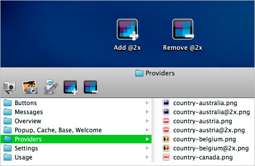
For those with highly custom, image-based interfaces, a fair amount of work will be required in scaling up elements to take full advantage of the iPhone 4 Retina display. Scaling user interfaces for higher detail displays — or increasing size on the same display — isn’t a new problem. Interfaces that can scale are said to have resolution independence.
A Dad’s Plea To Developers Of iPad Apps For Children
I spend a lot of time buying and testing iPad apps for kids. To be more specific, I lovingly do this for a certain two-year-old girl who is currently on a very successful #OccupyiPad mission in my house. Through extensive observational research, I’ve discovered what works and doesn’t work for my daughter, so I’m going to shamelessly generalize my findings to all children and propose four essential guidelines for developers who work on iPad apps for children.

Introduction To Designing For Windows Phone 7 And Metro
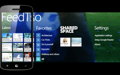
Microsoft’s new mobile operating system, Windows Phone 7 (WP7), introduces a fresh approach to content organization and a different UX, based on the Metro design language and principles that will be incorporated into Windows 8. It also targets a different market than its predecessor: instead of being designed mainly for business and technology workers, WP7 is targeted at active people with a busy life, both offline and online, and who use social networks every day, whatever their background.


 Get a Free Trial
 Register For Free


 JavaScript Form Builder — Create JSON-driven forms without coding.
 Devs love Storyblok - Learn why!

