The Creative Way To Maximize Design Ideas With Type
As with most designers, being sure that we explore and select the most successful, memorable and stimulating designs is a vital aspect that underpins every project we undertake. For us, the beginning of a new challenge has never been as simple as asking ourselves what might be the best avenue to take and then sitting down at a computer and attempting to fulfill that idea.
After researching the subject matter, we will almost always begin with a sheet of paper and pencil and draw out a variety of design options to help bring together and develop the breadth of ideas that are maturing in our minds. In this article, we will explore the use of drawing and mark-making as an integral part of the creative process.
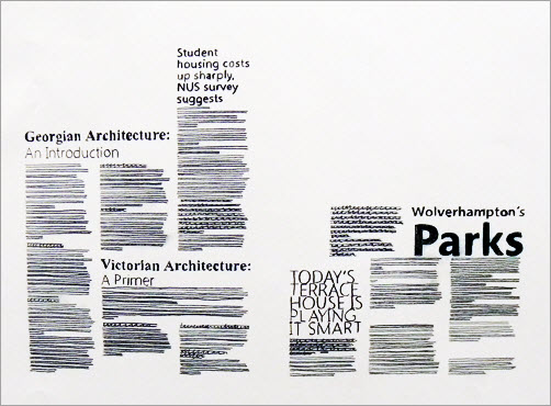
We have found that exploring design options on paper using drawing and mark-making is a great way to ensure that we are moving in the right direction with a project; plus, we don’t think this working process can be beaten for stimulating unexpected solutions that would otherwise have been very unlikely to see the daylight. We‘ll focus on different types of drawing and mark-making as problem-solving tools and skills; they form a vital part of visualizing and exploring design alternatives that involve quantities of type, with or without images.
Why Textural And Tonal Qualities Of Type Should Be Addressed In Drawing
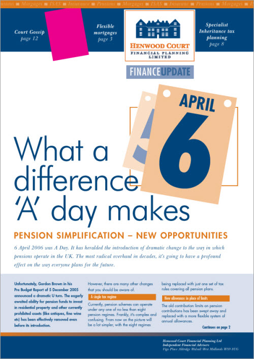
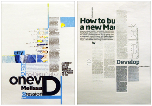
Letterforms, lines of type and words come together with different tonal values as well as varying characteristics of patterning; depending on the darkness of tone generated, together with the scale and nature of texture, a viewer is attracted to a greater or lesser degree. Some great examples of this can be found by looking at the newspaper and magazine designs of Jacek Utko. Looking at all of the sample pages below, we are struck by the number of dynamic levels of text created by different typefaces, point sizes, weights and measures, as well as the imagery. The changing tonal values especially tempt and guide the reader through the pages in a particular sequence.
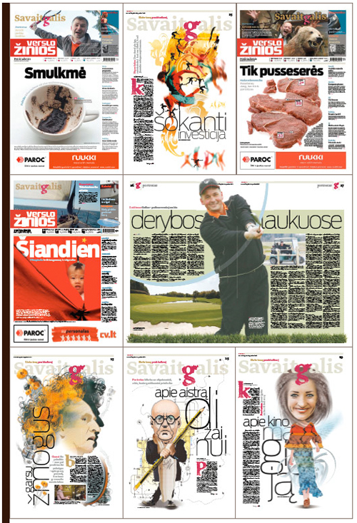
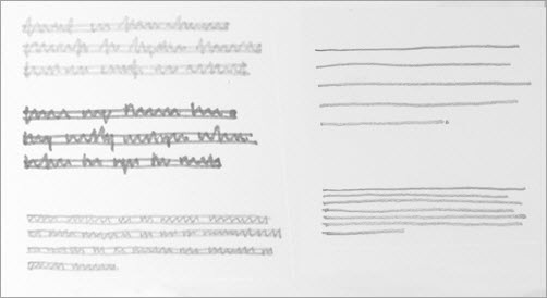
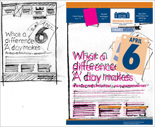
The textural and tonal qualities in layouts are used as much to help guide the audience in a particular order as for aesthetics. These qualities should be effectively captured through drawing and mark-making if the visual of a concept is to be sufficiently realistic to enable adequate design judgments to be made. This can be fairly easily achieved by using a relatively speedy design shorthand practiced by and familiar to many designers. Larger type is lettered in, capturing the stylistic essence, weight and proportions of the desired letterforms; text can be lined, or “greeked,” in using a mix of mark-making techniques, pens, pencils and/or varied pressure to indicate textural and tonal differences.
The examples featured in this article go only some of the way to demonstrating and capturing the infinite rhythms and varieties of typographic alternatives and combinations, but they do still demonstrate that even during early-stage drawing of visuals, capturing subtleties and changes of pace is essential. Drawing and mark-making styles can be developed to indicate and capture the textural and tonal difference that are present when working, for example, with all-caps sans-serif letterforms, as opposed to the very different visual “beat” that comes from uppercase and lowercase characters.
Finding The Right Marking Tools And Paper
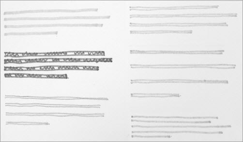
In highlighting the refinement of this type of design drawing, we should also briefly comment on the tools that can be used to express these subtle typographic nuances. We work with a smooth lightweight paper that in the UK is called layout paper; the semi-transparent properties of this inexpensive material are great for tracing through from one sheet to another, making for speedy refinement of drawings. Many of the designers we speak to use a mix of mark-making tools, depending on the characteristics they wish to create; some work with marker pens, others prefer fiber-tipped fine-line pens, and some draw with soft pencils. The one aspect that these choices seem to have in common is that they enable the designer to vary the quality of the mark simply by varying the pressure: press hard to create a thicker, darker mark, and press more gently to create a lighter, finer tone.
Developing Your Own Design Shorthand
Returning to the description of this style of visualizing as being “relatively speedy,” in reality, this process can be time-consuming, and while the results are not necessarily great in detail, this is thoughtful work that we certainly find to be the most time-efficient and creative way to work, particularly when confronted by completely new design challenges.
The drawing and mark-making in visuals that we are discussing here function on a number of levels. They capture alternatives of the textural and tonal details of layout; they are also a great way to explore different compositional alternatives; and they can be really helpful when used as templates or patterns to help streamline the process from marking to final design.
Typographic texture and tone will make different facets of a design more or less prominent. Choices of face, color, type size, tint, weight, inter-character spacing, line spacing and overall spatial distribution will affect the density of type and, consequently, the lightness or dark of the work. All of these aspects can be captured well with drawings and mark-making, affecting not only tonal values, but also the subtle textural qualities of type. Too often, visuals capture only the scale and position of type, without showing more detailed characteristics.
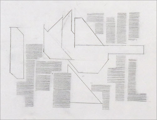
The examples below demonstrate that we are not suggesting hugely time-consuming mark-making, but rather merely sufficient variety to convey a realistic and satisfying impression.
Why Is Visualizing So Helpful To Designing With Type?
We take the view that using drawing and mark-making to produce visuals is an excellent way to develop ideas and extend design in order to explore creative possibilities. Drawing often pushes us into unexpected and exciting avenues of design that we might not have otherwise considered. An amazing link is forged between the brain and hand, effectively enabling the translation and visualization of even the most subtle design ideas, including textural and tonal variations. The act of drawing is an expression of this link. There are plenty of well-known quotes about the connections between the head, the heart and the hand. John Ruskin, the British artist and writer, said in the late-19th century, “The education of a young artist should always be a matter of the head and heart and the hand.” Art and design, Ruskin said, “must be produced by the subtlest of all machines, which is the human hand.”
In 1950, Richard Guyatt, the British designer and academic, described the three interrelated elements of design as the combined action of head, heart and hand. The head provides logic; the heart, emotional stimuli; and the skill that gives form to design concepts is executed by the hand.
As part of our work with students and in our own design practice, we often use two levels of drawing to visualize. These two forms we describe as micro and macro. Micro-visualizing within more complex design challenges explores the alternatives of detail “close in”; for example, how a heading, subheading and paragraph of text come together or how an image and caption unite.
When the most effective combination is decided upon, the relationships and combinations can then be developed and applied across other micro aspects of the design challenge. Taking a number of these effectively resolved micro-visuals, we would progress to our second level of visualization: macro-visualizing. By using the semi-transparent properties of layout paper, we would speedily trace through and bring together a group of micro-visuals to form an entire “page” grouping. It is at this stage that we would draw in the page’s parameters and try out different relationships of scale and varied compositional possibilities.
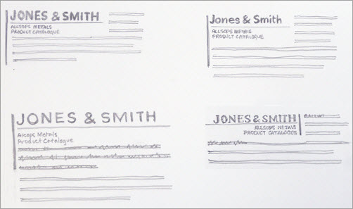
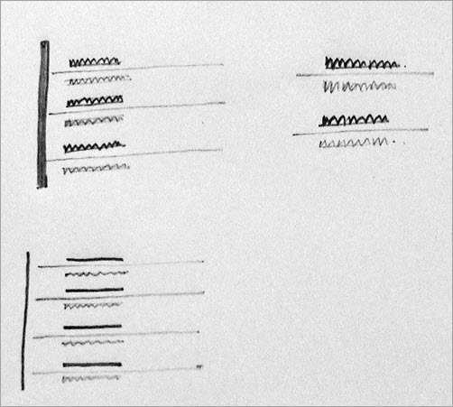
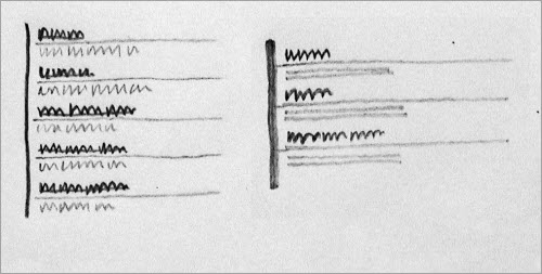
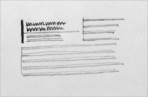
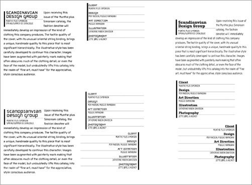
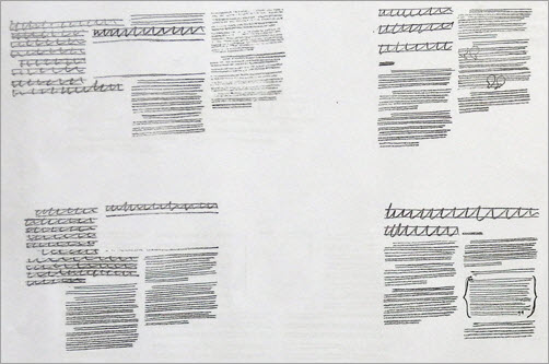
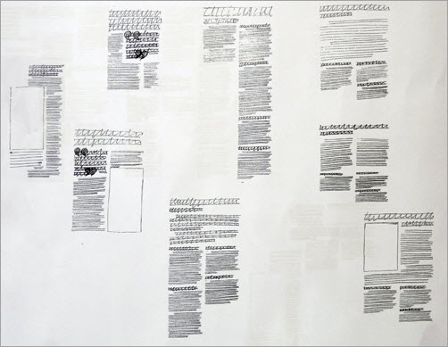
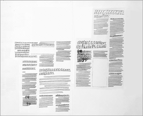
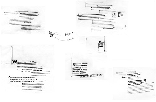
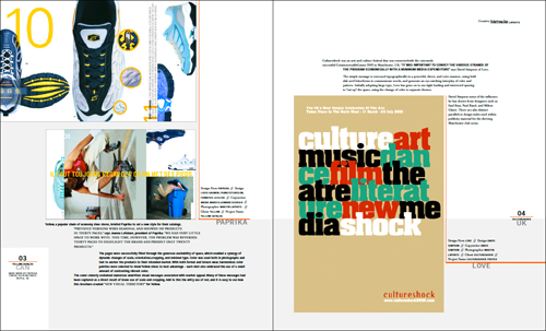
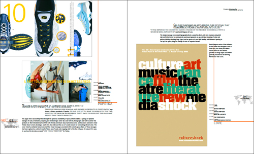
Starting a new design in this way, we would always begin by searching out the most complex aspect of the project. Figuring out a design system to tackle the most difficult scenario first makes it easier to apply the resulting design systems and relationships to simpler aspects of the project. There are no hard and fast rules to sequencing the various aspects of visualization. We have found that the order in which we draw by hand and work on the computer varies, and the two methods are sometimes merged. However done, using these two methods of development in partnership is an excellent way to maximize design ideas.
If You’re An Experienced Designer, Is Visualizing Really Necessary?
In a completely new design project, the methodology outlined above helps to ensure that our result is not in any way restricted by the starting point on the computer or by the relatively simple manipulations that are often tempting to pursue but not necessarily the most appropriate or stimulating. Drawing helps to put our most effective design concepts squarely at center stage and forces us to then find the best way to achieve the desired result. If we start with a blank sheet of layout paper and pencil and, of course, undertake research to get inspiration, then design-wise, the sky’s the limit.
Were ever inclined to simply reuse a palette of typographic styles that worked in a previous project, simply for ease and speed? We know we were, but taking the time and effort to try out alternatives and to develop completely different options would have improved the result and, for that matter, increased our satisfaction. We had our eyes on the clock and produced solutions that were satisfactory but definitely not the most effective, stimulating or satisfying.
Translating Drawing Into Design
A vital aspect of this process is being able to translate the nuances of mark-making into the final work. This requires making a detailed and precise evaluation of the drawings. The subtle contrasts of tone and texture in your visuals should help to build a valuable picture of the type and imagery and, for that matter, every other aspect of the design. Look carefully at the subtleties in the visuals, and use them as a starting point in selecting the nuances of typeface, weight, tracking, kerning and even leading.
Making the transition from smaller paper visuals to Web or print design can be difficult, and we discuss this issue often with our students. One system that seems to work well for now — albeit, one that relies totally on the visuals being proportional in size to the final design — is to scan or carefully photograph the visuals and then drop them into the background of a digital file to be used as a template for the final artwork. When the design is sufficiently rendered, the template can be deleted.
Another Reason To Draw: As Inspiration For Working With Type And Image
Another reason to do mark-making is to develop ideas for type, which we have done very effectively and included as an exercise in our book Create Impact with Type Image and Color. The method involves finding samples of type and then cutting and pasting them to form new layouts. The copy does not have to make sense, but the abstract results can be a surprising and inspiring way into a design project that involves type.
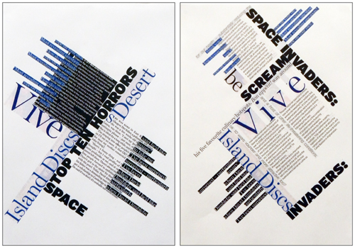
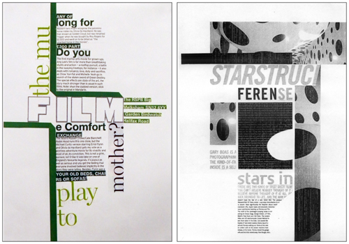
The ease and instant gratification of rapidly generating a design right on the computer screen is very tempting. Acceptable concepts can be and are generated this way. But if a designer aspires to a wider spectrum of interesting and usable visual concepts, then achieving this by working solely on the computer is unlikely.
In no way are we belittling the computer; the asset is invaluable to the designer. But we firmly believe that it should not replace the intuitive pathways between the head, heart and hand. Drawing by hand first and then by computer is not set in stone; either may come first if we use them in tandem to explore and develop the most effective solutions for audiences and designers alike.
Paper and pencil concepts must be a part of the design process if ideas are to be maximized. There are no rules or precise styles that designers need to follow, although sufficient accuracy and detail is needed in order to be able to make informed judgments. Our cut-and-paste way of working with found samples of type and putting together unusual combinations can also be an inspiring starting point. While there are no set do’s and don’ts in the design process, an appropriate amount of drawing, mark-making and experimentation is bound to improve the final result.
This article has been a wonderful opportunity to examine the role that drawing and mark-making can play when generating ideas with type. Previously, we had only briefly touched on this topic when writing more extensively about the textural and tonal qualities of designing with type and imagery in a number of our books, including Create Impact with Type Image and Color and The Graphic Design Exercise Book. Both of these practical guides are useful reminders of the fundamentals of graphics and of designing with type.
Useful Ressources
- Graphic: Inside the Sketchbooks of the World’s Great Graphic Designers, Steven Heller and Lita Talarico
- Typography Sketchbooks, Steven Heller and Lita Talarico
- Create Impact with Type Image and Color, Jessica Glaser and Carolyn Knight
- The Graphic Design Exercise Book, Jessica Glaser and Carolyn Knight
- Jacek Utko
- “Jacek Utko Designs to Save Newspapers,” TED
- Portfolio, Vilmas Narecionis
- “Chapter 5: Head, Heart and Hand,”Basics Illustration: Global Contexts, Mark Wigan Discusses professor Richard Guyatt
Further Reading
- 8 Simple Ways to Improve Typography In Your Designs
- 30 Brilliant Typefaces For Corporate Design
- Examining The Design Process: Clichés And Idea Generation
- Type Makes A Difference: An Exploration Of Type-Focused Websites


 Agent Ready is the new Headless
 SurveyJS: White-Label Survey Solution for Your JS App


