’The Semantic, Responsive Navicon’
Icons are scattered throughout our history as a species; early man painted pictures onto stone depicting their triumphs over their hunted prey, Egyptians had an icon-based writing system in their hieroglyphics, and in the early church the symbol of a fish represented a Christian meeting place or tomb. Icons have always served a definitive purpose throughout mankind’s history on this planet: to inform and instruct.
Icons are still prominent today in our everyday lives, as they serve the same purpose as they always have. As the craftsmen of the Web industry, we must ensure that we use correct representations of actions to inform users of their consequences.
As the Web has evolved over the years, we have established a (fairly) standard set of icons — a trash can or a cross has come to represent deleting or removing something; an envelope has become the indicator for a message or mail. These are little visual cues to help people along their way. Some icons have established such strong associations that they can exist on their own without supporting text, meaning, they can remove language barriers to form their own universal language. We need to use the right icons to communicate the right things.
Today’s Web is in a transitional phase, probably the most groundbreaking phase since the Web standards movement — I would go as far as suggesting that we are in the middle of the Responsive Web Design movement. As we build responsively, our websites will appear differently on different devices and often behave differently too. Navigation menus in particular are elements that can change dramatically in responsive websites. The change from a large context to a small context often requires changing the navigation pattern to something rarely seen on the Web until the arrival of responsive design. As more and more responsive websites enter the public domain, the more people will see these newfangled navigation solutions, so they shouldn’t need to ask “What does that button do?”.
There have been calls recently from Andy Clarke and Jeremy Keith to have a standard icon for revealing navigation in small contexts, and rightly so — this is a new technique and we need to set users’ expectations about the consequence of the reveal action.
Three Horizontal Lines
The majority of responsive websites that use an icon to represent a hidden menu opt for the three horizontal stripes — these include some high-profile websites like Starbucks and also popular apps like Facebook and Path. Part of its power lies in its versatility, as the icon itself doesn’t clearly represent a precise object nor method, which means it can be applied to a variety of navigation-based design patterns without showing a preference to a particular pattern. Its vagueness in shape doesn’t detract from its message as the icon is becoming an emerging standard. Like a new term appearing in our everyday language, we know what it means. And with high-profile websites throwing their weight behind it, so will average users over time.
Let’s take a look at some examples if the horizontal lines being used in some responsive websites.
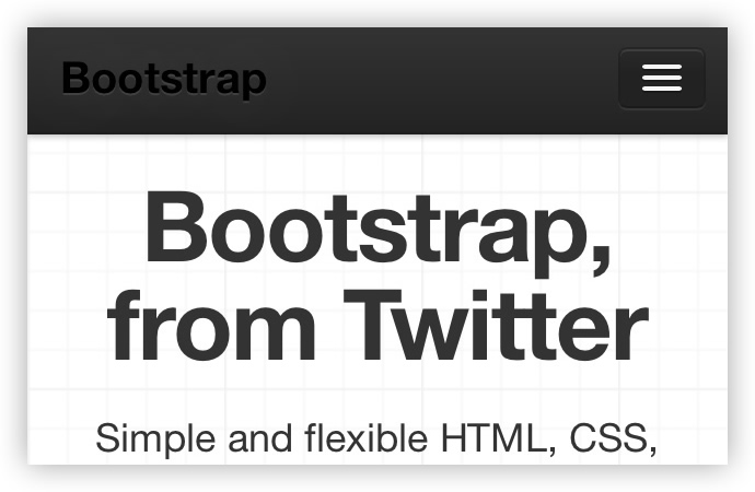
Twitter BootstrapTwitter’s bootstrap framework shows three horizontal lines as a visual cue for a sliding menu, revealing the main menu links which anchor to the various sections of the page.
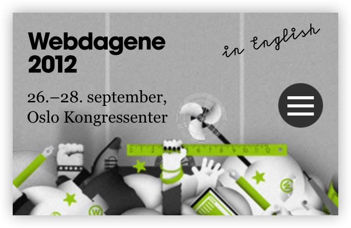
WebdageneThe Webdagene conference website also uses the same pattern for a similar reveal, but unlike Twitter’s Bootstrap the links open a new page instead of anchoring to sections. Two different approaches to navigation encompassed by the same icon.
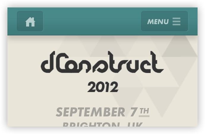
dConstruct 2012dConstruct uses the three horizontal lines to represent the menu revealed in an upward sliding transition. Note that even though the revealed items here are square in shape, they still use the horizontal lines to represent the menu.
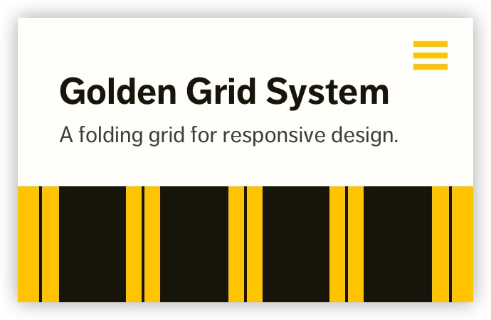
Golden Grid SystemJoni Korpi’s Golden Grid System uses the same icon but for a different purpose — pressing the button shows the gridlines for the currently active grid.
The three lines icon isn’t the only indicator people are using in the wild — like the alternatives, it has its drawbacks. In iOS, three horizontal lines are used to signify the ability to re-arrange full-width list items. So perhaps this part of our icon language is still finding its feet.
Alternative Patterns
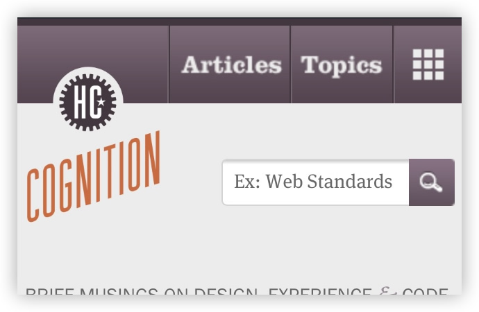
Cognition by Happy CogThere are alternative patterns in the wild that aren’t as common as Happy Cog’s grid icon. This could perhaps indicate something similar to a speed dial or home screen — a springboard to other destinations. On the other hand, it could mislead less experienced users to think they are leaving the website to go somewhere else.
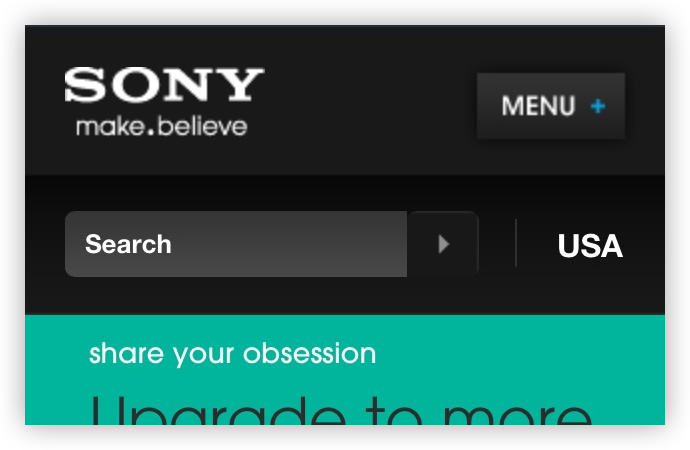
SonySony also deviates from the three horizontal lines icon and opts for a plus icon to show their menu. While visually pleasing, the plus symbol signifies adding something and as such it might be sending out the wrong message to users, and not clearly articulate the resulting action.
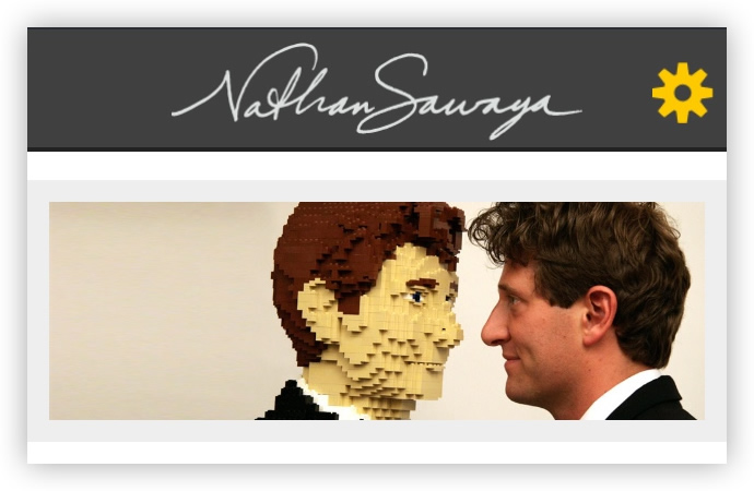
Nathan SawayaNathan Sawaya’s hidden menu is represented by a cog which also could cause confusion. In digital products, the cog icon has become the universal indicator for settings, options or for customization. It feels like it’s misrepresenting the action and consequence, and may only be pressed as a last resort or out of curiosity.
MSN Olympics CoverageGovernor Technology produced the MSN’s Olympics Coverage website which boasts a series of creative pattern translations that include the main navigation — represented by a downward arrow. The downward arrow is a safe bet, specifically in slide-down menus. It hints towards the consequence in the same way a <select> menu would.

MicrosoftMicrosoft recently launched a new responsive home for their products which was expertly designed and developed by Paravel using Microsoft’s new design language. The icon used to represent the menu in small contexts is a good example of “table of contents” metaphor which communicates that the click on the icon would lead to an overview of available navigation options.

All these examples produce the same end result — you push a button, a menu appears. But there is a disparity in the way the action is presented. If icons are a language, then we are sending mixed messages where responsive navigation is concerned. We are dealing with new patterns, new techniques but so are the people on the other side of our products — they are closer to our interfaces than ever before. Today we are dealing with both those devices as well as touch-based interfaces where there is nothing between the user and the interface. The message we deliver needs to be consistent and clear, the icon is part of this message, part of the greater language. As Andy Clarke has already said: “We need a standard show icon for Responsive Web Design”.
“Unless our navigation is arranged in a grid (and so we should use a grid icon), I’m putting my weight behind three lines because I think it’s most recognizable as navigation to the average person.”— Andy Clarke, We need a standard show navigation icon for Responsive Web Design.
I would wager that the vast majority of users faced with a hidden menu in small contexts have already used the three lines pattern to navigate rather than the alternatives. With the sheer amount of users using apps like Facebook and Path, it’s safe to say that it’s an intuitive indicator. If we are to use this effectively in resolution independent responsive designs, then it needs to be represented in a scalable way, ensuring it stays legible regardless of the device where it is being displayed on. There are a number of ways we can do this.
Pictographic Web Fonts
“Don’t get hung up on ‘Retina’, worry about hi-res.” — Adam Bradley, Responding to the New High-Resolution Web.
With different pixel densities cropping up, resolution independence is crucial to achieving a consistent experience regardless of the user’s context. It’s impossible to design for device dimensions and specific screen properties and stay future friendly at the same time. Scalable assets are key to staying ahead of the game, and one way to create them is to use pictographic Web fonts.
In theory, you could create a font containing only one glyph to represent the menu indicator. It would be a light resource to load, but you would still be imposing an additional HTTP request on the user, which isn’t ideal (it would essentially be a hack). Additionally, if the user is on a very slow connection, then the icon may take time to load. During that time they may miss the menu option — we are talking about mere seconds and potentially fractions of seconds here — but this level of care and attention to detail is what defines you as a craftsman of the Web. After all, each decision you make directly affects the user on the other side of the screen.
You could get around this by embedding the Web font using a data:URI which would save the additional HTTP request. This is fine in isolation, but if you are loading multiple data (URIs in different places), you run into issues regarding maintainability. Multiple font variations can also produce a page weight overhead that would render this approach pointless. So it all depends on the case for your individual use.
In general, we should avoid loading a Web font solely for one glyph for use in displaying our responsive navigation icon. The page weight today is as important as it was when we were designing and building for dial-up connections, and latency is the new Web performance bottleneck, so keeping the webpage size small is still very important. The contrast in connection capabilities is larger than it has ever been and any unnecessary burdens on the user’s connection can have a negative impact on the user’s experience.
However, it’s likely that you may be loading pictographic icons for other purposes in your project. If that is the case, then I see no harm in loading the set containing the three horizontal lines icon and making use of the range of glyphs at your disposal. Josh Emerson takes this a step further and has produced a fantastic walkthrough showing you how to create a font fit for purpose, containing only the glyphs that you need for your project (which consequently keeps resources light and page weight down). IcoMoon is a browser-based app that lets you do something similar by offering a library of pre-selected icons and the option to import SVGs to build your own font.
Unicode Characters
Standard system fonts provided us with a false glimmer of hope. The character entity “Chinese Trigram for Sky (Heaven)” (☰ (U+2630)) is exactly what we are looking for, only it doesn’t render correctly on Android devices. Jeremy Keith has done some research into platform and browser compatibility in his Navicon article, which concludes that the downward arrow character entity has better cross-platform and cross-browser compatibility for indicating a reveal menu. There are similarly suitable unicode characters like the character entity “Identical to”. This has much better support than the Trigram for Sky entity (although the geometric shapes aren’t quite in proportion with the icons we have become familiar with).
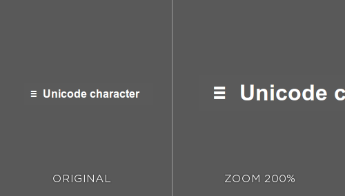
You can see that the icon retains its sharpness when the user’s browser is zoomed, as a pictographic Web font would. Proportionally it isn’t ideal, although it may provide a good fallback to a more suitable technique.
CSS
Tim Kadlec and Stu Robson have produced the navicon icon in CSS by making clever use of mixing border styles and the :before pseudo selector which works in all major device browsers. While this seems ideal, it isn’t exactly best practice, as we are using CSS to draw a graphic which resides somewhere in that blurred line of whether CSS generated “graphics” are presentational or not.
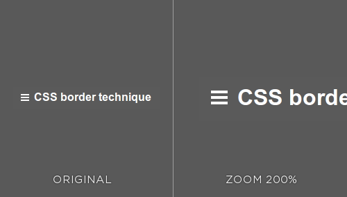
When the browser zoom level is set to something other than a multiple of 100, the proportions between the generated lines become uneven, which wouldn’t happen in the other solutions presented here. I wouldn’t rule this approach out completely, however, as it serves as a solid workaround when the following approach fails.
The SVG Approach
Without doubt, SVG is a good fit for the purpose of crafting the icon. By definition, an icon is a picture or symbol to represent such an action, therefore a scalable vector graphic is the right tool for the job. The browser draws the SVG based on mathematical parameters, meaning that it is resolution independent. So it will look crisp on whatever pixel resolution or density it is presented on, making it a future friendly solution. Support for SVG is pretty good across the contexts we need it for (mainly mobile devices, although some versions of Android don’t support it).
We can cater for browsers that don’t support SVGs by using feature detection. A custom build of Modernizr that only checks for SVG provides a lightweight way of testing support for the SVG — if the browser can serve SVGs, then the user should be shown the SVG image. And if the browser can’t, then it should revert to using a bitmap image. After loading Modernizr, checking for SVG support is simple:
if (!Modernizr.svg) {
    $("#svg-icon").css("background-image", "url(fallback.png)");
}
SVG isn’t widely utilized yet, not as much as it should be. Perhaps it is the lack of mainstream tools to create them. The tools do exist though, and we just need to look a bit harder to find them and grow accustomed to them — crafting SVGs should become second nature to us as we enter a new high-definition Web.
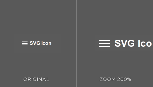
The SVG icon stays sharp when loaded at any resolution, however when the page is zoomed after the initial load, the graphic can begin to blur in certain browsers at irregular zoom levels. The drawbacks in using SVG for retina graphics are found in its limitations for customization in the browser — for example, changing the color of the icon. What seems like a straightforward property change cannot be achieved without JavaScript intervention (or by loading an additional image) which means triggering another HTTP request. Furthermore, if HTTP requests are a concern and you want to load the SVG inline, you will have limited browser support — just be sure to use feature detection to cover all eventualities so the user’s experience isn’t affected. You can download the SVG icon and the PNG fallback.
To Conclude
After reading this you may feel like I’m over-analyzing something so small, and on the surface it may look insignificant when in fact it’s quite the opposite. Building responsively requires more care and attention than we have ever given to our craft. A mobile-first approach invites opportunities for the butterfly effect in our work, in which a bad decision that could impact page weight (or loading redundant resources) for small contexts could be detrimental to the user experience in small contexts and beyond. We, as craftsmen of the Web, have a duty to sensibly inform, instruct and exercise responsible Web design.
Further Resources
- “The Icon Handbook” by Jon Hicks
- “Implementing Responsive Design” by Tim Kadlec
- IcoMoon, a font-building tool that allows you to import SVGs for responsive designs.
Further Reading
- Wayfinding For The Mobile Web
- Icons As Part Of A Great User Experience
- Efficiently Simplifying Navigation, Part 3: Interaction Design


 Agent Ready is the new Headless

 SurveyJS: White-Label Survey Solution for Your JS App

