Adaptive Vs. Responsive Layouts And Optimal Form Field Labels
Editor’s note: Welcome to a new column in the UX Design section on Smashing Magazine! Each month we’ll pick a handful of popular questions asked by our readers around good practices in designing smart and usable experiences. They will be answered by Christian Holst, a regular author here on Smashing and founder of Baymard Institute. Prior to co-founding Baymard Institute in 2009, he worked as a usability engineer in the hearing aid, credit card and consulting industries.
Adaptive Layout Vs. Responsive Layout
“In which kinds of sites/projects is it better to use an adaptive layout (fixed break points)? In which kinds of sites is it better to use a responsive layout (fluid grids)?”
A responsive layout[1] is in theory always better than an adaptive layout, but in some cases an adaptive layout is a more pragmatic solution.
An adaptive layout will give you more control over the design because you only have a handful of states to consider. In a responsive layout you easily have hundreds of states — sure, most of them with very minor differences, but they are different nonetheless — which makes it harder to know exactly how your design will look.
This makes a responsive layout more difficult to test and predict with absolute certainty. That said, this is also the beauty of a responsive layout. By allowing some uncertainty on a superficial level, you gain certainty on more fundamental levels. Sure, you can’t predict with pixel-perfection how the design will work in a 943 × 684 pixel viewport, but you can rest assured that it works well — that the fundamental features and layout structures are meaningfully deployed.
An adaptive layout has its merits because it can be a more pragmatic solution that is cheaper to implement and easier to test. An adaptive layout can be considered the cheaper sibling of a responsive layout and can thus be appealing if resources are tight. This is especially true when dealing with an existing website, where a complete rewrite is not always feasible. In such cases, an adaptive layout can be a good (and more manageable) start. Dan Cederholm argues this case well in his article “Adapted”.

One argument often brought up in favor of an adaptive layout when compared to a responsive layout is that of typography — in particular better control over line lengths and avoiding orphaned header text. Trent Walton has jotted down some good thoughts on the matter. In essence, by changing font sizes (this is easy when using em), you can ensure readable line lengths (50-75 characters per line) in your responsive layout. This leaves the issue of potentially orphaning header text. While one may argue that this is the nature of the web, there are cases where seeking maximum control over a page headline makes sense. In these cases, using a plugin like FitText comes to our rescue, allowing us to avoid orphans.
[1] The definitions of responsive design and adaptive design are manyfold. Jeffrey Zeldman argues that restricting the term responsive design to a technological approach may prove too limiting and that the overall goal is device agnosticism, and we should thus include fixed breakpoint designs in our definition of responsive (web) design. Moreover, Aaron Gustafson defines adaptive design as “creating interfaces that adapt to the user’s capabilities (in terms of both form and function)” with responsive design as a subset meaning “fluid grids, fluid images/media & media queries.” In this answer I’ve intentionally limited the scope of discussion to layout, hence the use of responsive layout and adaptive layout. The definitions presented in the question are used throughout the answer, namely that responsive layout equals fluid grids, and adaptive layout equals fixed breakpoints.
User Interface (UI) Consistency Across Devices Vs. Device-Specific UI Conventions
“In designing a product that will span various devices (i.e. Netflix or Pandora), what’s more important: consistency of the brand and UI, or designing to appropriately follow the guidelines of that specific device (i.e. designing a common experience on the iPhone, Android, television, Xbox)?”
There are three important factors you need to consider: your focus (as a business), how familiar your users are with your UI, and how different your UI and functionality are on different platforms.
- Focus: There may be branding reasons to keep a consistent UI across your platforms, perhaps especially for lesser-known brands that are still fighting to establish an identity in the minds of their customers. However, users are typically more familiar with the device-specific UI conventions than those of a brand. Jakob Nielsen often states, “Users spend most of their time on other sites,” and while we’re not just talking about websites here, it is much the same principle (on a smartphone, simply replace “sites” with “apps”).
- Familiarity: Are most of your users spending hours a day using your service? Have they used it for a long time? Or are the majority of your users infrequent or newly acquired? Let’s say you have a business or productivity service and you know the majority of your users spend lots of time in it all year long. In this case, familiarity across the applications trumps device UI conventions, because the user has invested a significant amount of time learning your unique UI. On the other hand, if users haven’t spend that much time with your services and haven’t built strong cognitive and emotional ties to your designs and features, then device-specific UI conventions will generally result in better usability.
- Functionality: This has two aspects: a) Is your service only solving a single problem with a single feature, or is it more advanced? and b) Is there a difference in functionality and features across the various devices? If the features you offer on different platforms vary greatly, then adhere to device UI conventions, since cross-platform consistency will yield little benefit in terms of usability (using the same branding and general aesthetic design won’t help the user if the features are widely different — in fact, they could potentially cause harm as the user will think there’s overlap when in fact there isn’t). On the other hand, if you’re solving a single, simple problem, then diverging from device UI conventions is okay since users will very quickly learn your unique UI and you’ll potentially be able to solve the UI problems specific to your feature more readily than the generic device conventions afford.
In short: sticking to device-specific UI conventions where appropriate is a good, if slightly simplistic, rule of thumb.
Balancing Usability Research With Unique And Creative Concepts
“How should I balance research, user feedback and usability testing with personal experience, instinct and trying to create a creative, unique, compelling experience? Basically, how much should users influence or guide the solution I am designing? It is “user” experience after all.”
The concept of your product, service, app or website is at the core of your user experience. It’s where you differentiate yourself from the competition and where you create true value to the customer. So develop your concept as creatively as possible and make it as original as possible. Then, when it comes to the real-life implementation, read up on user research, study UI conventions and perform usability testing as much as your concept allows.
Usability research and testing are what make your services easier and more seamless to use (which are truly important qualities in a competitive landscape), but they are not the reason people choose to use a service in the first place — they do that to solve a problem or fulfill a need. So first come up with that ingenious new concept, and then draw heavily on user research when implementing the service.
Usability tools are there to test and validate your designs, allowing you to continuously iterate your design based on user behavior and perceptions — an optimization process that should continue throughout the product’s life cycle.
Optimal Positioning Of Form Field Labels
“What’s the best way to position form labels for an input field? Above the field, to the left, to the right? What about inline labels?”
In short: for most input forms found on the web, such as contact forms, account creation and e-commerce, optimal form usability would be to place the label above the form field. Matteo Penzo’s eye tracking test on form label placement from 2006 confirms this.

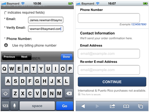
Placing the label above the field is even more important if the form will also be accessed on mobile devices in portrait mode, due to the narrow screen. The user might otherwise have to deal with form fields that aren’t long enough to display the entire input, or end up doing a lot of sideways scrolling and panning between label and field. However, the exact opposite may be true of landscape mode, where the miniscule height of the viewport may be eaten up by the touch keyboard, potentially pushing the active field’s label out of sight.
An exception to placing the label above the field is for long forms that have very frequent and repeat usage, where the user needs to be able to quickly identify a few specific fields in a long list. In such cases, having the labels to the left of the form field makes it easier to scan. The same would go for a pre-filled form where the user needs to edit only a specific set of fields (e.g. when editing account profile information).

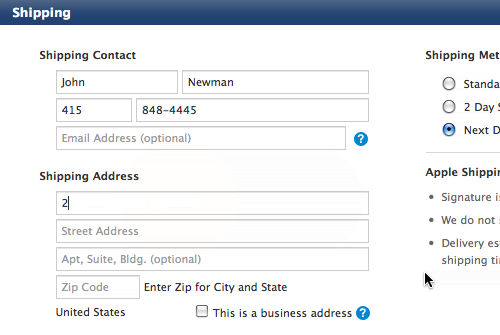
Inline labels, where the label is placed inside the form field as placeholder text, are horrible from a usability perspective. During our e-commerce checkout usability study, we saw numerous test subjects have serious issues with inline labels in Apple’s checkout process. While the approach makes for a simple visual appearance, the form is very difficult to interact with because each field loses its context the second the user starts typing. In the study, this not only made it more difficult for the subjects to fill out the form fields, it also made it very difficult for them to correct validation errors since the labels were missing.
Note that the importance of optimal positioning of the form field labels (and form field usability in general) are of course closely related to how many form fields the user has to fill in, and how often the user will need to complete the form. If it’s a single-field, single-use newsletter sign-up form, then choose whichever approach and design fits best with your overall layout. (Even inline labels would be acceptable in such a case.) But as soon as you have more than a handful of fields — e.g. a checkout process or a sign-up form that requires an address — I’d strongly recommend that you reduce friction as much as possible by following common form field usability guidelines, such as positioning the labels above the form field.
Any Questions?
If you have any questions that you would like me to tackle for a future Usability Q&A column here on Smashing Magazine, please ask them in the comments below!
Further Reading
- An Extensive Guide To Web Form Usability
- Forms On Mobile Devices: Modern Solutions
- Form-Field Validation: The Errors-Only Approach
- Useful Ideas And Guidelines For Good Web Form Design


 SurveyJS: White-Label Survey Solution for Your JS App
 Agent Ready is the new Headless


