Design Cutting Edge iOS Apps With Adobe Fireworks
Since the release of iPhone 4 and the iPad 3 (known as “The new iPad”), Apple has doubled the resolution of the displays, which are now 640 x 960 pixels (iPhone 4 and 4s), 1536 x 2048 pixels (iPad 3), and 640 x 1136 pixels (iPhone 5). To keep a good-looking user interface for both the old as well as the “Retina” resolution, Apple decided not to resize all graphics or make use of scalable image formats (such as SVG), but instead it now requires two sets of graphics for each device.
When building an app for iOS, you have to provide the normal-sized and double-sized images for each graphic. This is where the strongest Adobe Fireworks feature comes in — the capability to create sharp vector elements which scale up and down without any quality loss (including all effects and filters).
This article describes how to design an iOS app with Adobe Fireworks for the iPhone and shows a few techniques which allow you to design faster, achieving the best possible results.
High Resolution First, Scale Down Later
When creating your new document, choose the @2x-resolution (2x) as your canvas size (for example, this means 640 x 960 px for iPhone 4/4s in portrait orientation) and keep the PPI at the default of 72. iOS ignores the PPI setting stored in PNG files — the only thing we need to care about is to double the resolution (in pixels) of our images when working on Retina display designs.
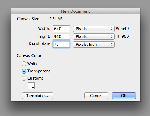
Creating a new document for designing an iPhone 4/4s app in Retina resolution (portrait orientation).
Starting with the higher resolution is my preferred way to design apps for Apple devices, as it allows me to set the appearance of each single pixel, and add details which won‘t be visible on the scaled-down version. In the worst case, if you have to use bitmap textures for some reason, the scaled-down version will look a lot better than a scaled-up one (which will have blurry textures).
When designing in 2x resolution, you have to think a bit more about what you’re doing. For example, you have to avoid sizes like 3 or 5 pixels for border widths, and the same applies to effects like drop shadows — a scaled-down blur ratio of 5 pixels would result in 2 or 3 px blur, and neither would be the result you want to achieve when aiming for real perfection.
I have seen other designers doing it the other way: starting with the normal size, and scaling the whole design up when it is done. Either way is absolutely fine — I think it always depends on the designer’s personal preference. However, in this article I will only describe the way to start with the 2x resolution graphics first.
Vectors Whenever Possible
When creating elements for your app, always use vector shapes, and never rasterize them (since Fireworks has very powerful vector editing abilities, it is advice that’s easy to follow). It’s also a good idea not to use any Photoshop live effects unless you absolutely have to. Why?
Use Fireworks Live Filters (They Scale Better)
The reason why you should only use Fireworks live filters is because Photoshop live effects will not scale as they keep their attributes (unless you change the size of the whole image or the separate shape). On the other hand, Fireworks will scale any attributes of your live filters (except in intensity-based filters, like the amount of noise), and this is something you should keep in mind when you are working a lot with drop shadows or glows.
Useful tip: Fireworks is very flexible. If you don't want to scale effects or strokes when changing your document size, you can turn this option "off" in Preferences (Menu Edit → Preferences → General → Scale Strokes and Effects). Turning it back "on" is just as easy.
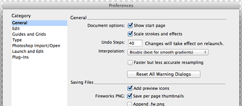
The Preferences dialog in Fireworks, when you can turn on or off the scaling of strokes and effects (live filters).
In the few very rare cases when the result of a scaled-down (or scaled-up) live filter does not really fit your needs, you can easily fine-tune the filter attributes manually after scaling.
Here’s a quick example of this feature — two buttons were resized, one had live filters applied to it, and the other Ps live effects.
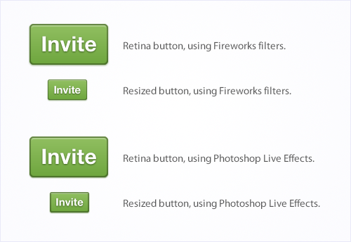
Both buttons are looking the same when rendered in the resolution that they have been created in (Retina). Once we resize the image, though, you will clearly notice that only the effects of the button that uses Fireworks live filters were resized correctly.
Note: Fireworks will scale attributes of your live filters, applied to both vector and bitmap objects. However, there is one exception to this rule: Fireworks will not scale live filters applied to text objects. For example, a Drop Shadow live filter (applied to a vector object), will scale along with the object. But a Drop Shadow applied to a text object will not — the text block will get smaller (or larger, depending on the direction of scaling) while the drop Shadow will retain its original attributes (Distance, Softness). This behavior of Fireworks is designed as such, and is something to keep in mind when text objects and live filters are involved.
Use Divisible Values For The Height/Width Of Your Shapes
Be sure to always use divisible values (that is, able to be divided into a whole number) for the height and width of your shapes. Sizes that do not divide evenly will result in half-transparent pixels when scaled down, which often looks blurry and imprecise.
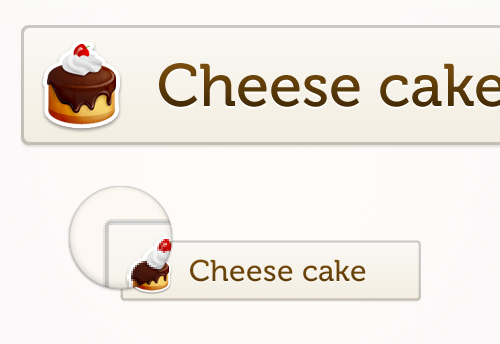
A 3px border will result in a blurry 2px border when resized. Since a width of 1.5 pixels is impossible, Fireworks is trying to achieve the logical result by adding half-transparent pixels — unfortunately the result doesn’t look so good.
When you are drawing icons, always keep them vectorized so you can scale them down later without the blurring that occurs from bitmap resizing (we will also cover icon resizing later in this article).
Dealing With Bitmaps (When You Have To)
When using bitmap textures, there are a few possibilities for how to get the most out of them:
Repeatable Patterns
You can build a repeatable pattern from nearly any texture — this means a bit of extra work, but is often worth it. When you are looking for textures, it’s often hard to find seamless, repeatable textures for your app. But in most cases, you just need to do a few color corrections for a “regular” texture before you can use it as a repeatable pattern.
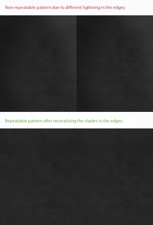
This is an example when a non-repeatable detailed leather texture can be transformed into a repeatable one, by just applying a few color corrections. I usually switch to Photoshop for this type of work, then import the pattern into Fireworks. You can also make the color corrections within Fireworks (if you prefer).
Useful tip: Download and try the Modify Commands pack, by Aaron Beall. It includes "Seamless Tile" -- a very useful command for seamless textures. It does not work equally well for all types of textures, but for the most types it can help you create a seamless pattern in Fireworks really easy. The command creates seamless textures from selected objects on the canvas, by blending their edges automatically (based on a specified percentage).
When you’ve built a repeatable pattern, you can apply it as background for any vector shape. To do this, just save your pattern as a normal PNG32 file somewhere (personally I prefer to have a “Materials” folder in my project folder, where I store any patterns I’ve used during a specific project). Then select the shape you want to apply the pattern to and set the fill mode to “Pattern Fill”. Fireworks has a few basic patterns pre-installed, but if you want to use your own pattern, just select Pattern → Other…, and then choose the pattern you have saved on your computer first.
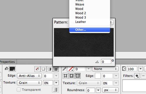
By setting the shape’s fill mode to “Pattern Fill”, you can easily apply either a pre-installed or a custom pattern.
When it comes to iOS design in Adobe Fireworks, the important thing is: patterns do not scale while their shapes do. This means the pattern will look the same on both resolutions. This can be very handy when you are using a few textures in your design — for example, a leather texture for the title bar. If you want to keep all the details of the texture in both resolutions, use a repeatable background pattern.
Useful tip: If you are looking for seamless repeatable patterns, take a look at Subtle Patterns. As of today, it offers 305 excellent free patterns... and counting!
Masked High-Resolution Bitmaps
When you want to scale down textures or other bitmap graphics, I suggest you use high-resolution graphics masked with sharp vector masks (for the 2x-resolution images).
When scaled down, the vector masks ensure that the masked graphics will keep their edges sharp while the graphic itself will be scaled down to its half-size. The normal version will look like an exact (yet smaller) version of the 2x image.
If you are using a bitmap graphic with small or fine details, you might want to use a masked graphic that has not been scaled down for the the normal version. In this case, you will need to manually replace the masked bitmap after the 2x version has been scaled down. Here’s how I’d recommend proceeding:
- Create the 2x-resolution image first and scale it down to half-size.
- Select the masked bitmap and ungroup it (
Ctrl/Cmd + Shift + G), then delete the scaled-down bitmap. - Add or import a new copy of the original, unscaled graphic, then create a new masked image with the scaled-down vector mask and the original graphic.
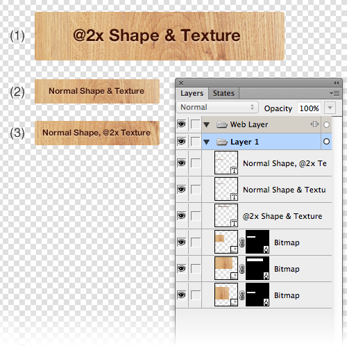
A simple vector mask in Fireworks, used to create a rounded rectangle filled with a wooden texture: while the first shape masks the @2x-texture (1), you can see how to modify the result for the scaled-down masks by using the scaled-down texture (2), or the texture re-applied to the scaled-down mask (3).
In general, bitmaps are your enemy when designing iOS apps. So instead, try to work more with vector shapes and live filters. The above mentioned techniques can be used in the cases where you can’t proceed without bitmaps.
Scaling Down
When you are ready with the 2x-resolution design for your app, it’s time to scale down everything. I suggest that you start by copying all pages into a new Fireworks document.
Note: Alternatively, you could also select all pages, right-click in the Pages panel, and choose the option “Duplicate Page” — pages will be duplicated, the duplicates will be placed immediately after the originals and each will have “Copy” appended at the end of its name. By using this method, you’ll be able to manage all of your 2x and 1x graphics inside the same document. The drawback is that once you’ve duplicated the original pages, you’ll need to scale down each 1x copy individually, since the Fw PNG document will now contain both the 2x and the 1x designs. Hence, I recommend going with the other approach and moving all page copies into a separate document, and then scaling the whole document down to 1x resolution.
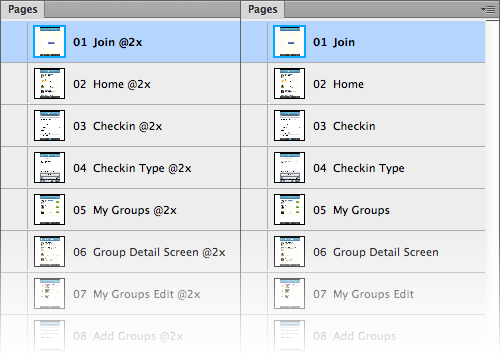
This is how you can manage both resolutions in separate Fireworks PNG documents: copy all 2x pages (left) into a new Fireworks document (right), then scale the new document down to 1x resolution.
Once you copied all your pages into a new document, you can scale it down by changing the image size (use menu Modify → Canvas → Image size). If you started with 640 x 960 px Retina design (iPhone 4 or iPhone 4s, portrait orientation), scale down to 320 x 480 pixels. Be sure to choose bicubic interpolation for resizing and uncheck “Current page only” (but keep “Resample image” checked). Fireworks will now scale down every page in your document and automatically redraw any contained vector shapes.
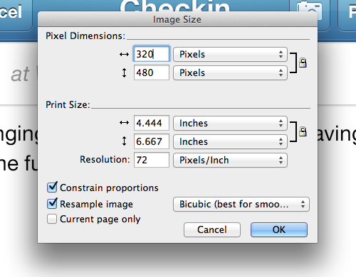
Scaling down the current page using these options will optimize all included elements for normal resolution.
Fix Blurry Pixels
Since Fireworks is primarily a screen design tool, it almost always snaps objects (both vectors and bitmaps) to a precise pixel grid. But sometimes after scaling down your pages, even if you used only even values for the sizes of your vector shapes, Fireworks might render a few pixels as half-transparent. This is because after the transformation, it is possible that some of them might have fallen between whole pixels (and rendered blurry). The good news is that you can easily fix this by selecting all layers (all objects) with blurry edges and apply Snap to Pixel (use menu Modify → Snap to Pixel, or press Ctrl/Cmd + K). This Snap to Pixel command will realign all objects to the pixel grid, restoring their sharpness.
![]()
By using “Snap to Pixel” you can easily fix blurry pixels in scaled-down designs. You can also apply “Snap to Pixel” to multiple elements by selecting all of them first.
Useful tip: Note that "Snap to Pixel" is available in Fireworks CS5 and later. However, if you still didn't upgrade to CS5 or CS6, you can use the Transform panel by Trevor McCauley, Custom Nudge extension by John Dunning, or Super Nudge extension by Linus Lim. All of these can help you fix any blurry pixels by manually adjusting vector paths (using sub-pixel values).
Fine-Tune Rendering Of Icons
Some icons (especially when they are very small) might look too “bold” after resizing. Applying the Snap to Pixel command won’t change this if these icons are built from either circles or rounded bordered shapes. In addition, I can’t recommend using Snap to Pixel for icons since this command often moves pixels in the wrong direction and may destroy the icon’s proportions.
Instead, my suggestion is to use the legacy vector rendering option in Fireworks (it can be found in Commands → Selection → Use Legacy Vector Rendering). In this way, Fireworks makes use of an older rendering algorithm for the selected objects. In most cases, both the “Improved” and the “Legacy” vector renderings produce equal visual results. But when it comes to very detailed and small vector objects like icons, the old vector rendering algorithm renders them a lot sharper than the new one.
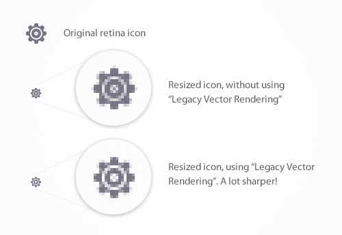
The “Legacy Vector Rendering” option allows to sharpen really small icons with a lot of details.
You can switch between the two rendering modes, depending on the task at hand.

You can easily apply the “Legacy Vector Rendering” to any vector objects (or switch back to the default “Improved Vector Rendering”).
Fix Border Radii
When your design is scaled down, even the radius of rounded borders will be reduced in half. Some shapes in your design might have a very small border radius (under 4 px in the 2x-resolution), and these shapes may look like a square after they have been scaled-down. To fix this little issue, manually increase the vector radius by just one or two pixels.

Even if it might not be mathematically correct, it sometimes makes sense to increase the border radius for scaled-down elements. As you can see in this example, a scaled-down version on a 4 px border radius is so small that we wouldn’t be able to recognize it.
Export Process
When it comes to the graphics export stage, I suggest that you use Fireworks’s slice tool. It can be used to quickly create intertactive prototypes (together with the Hotspot tool), but we can also make use of it for exporting graphics in a more efficient way.
Limitations Of The Slice Tool
Unfortunately, we can’t directly use the Slice tool in our Fireworks document because the slices to be exported won’t have a transparent background if any other graphics are positioned in the background of the slice. For example, if you want to export a button which is arranged in front of a bitmap background and you don’t isolate the button graphic on a transparent background first, the exported slice will include both graphics — the button, and parts of the bitmap background behind it. Also, it’s important not to create overlapping slices — each slice should be isolated and cover only the graphics you wish to export.
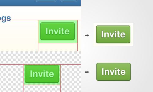
In this example, you can see the difference between exporting slices with a non-transparent background, and isolated slices without a background.
Useful tip: Before I speak about my exporting method of preference in more detail, I'd like to briefly mention a very useful extension by John Dunning -- Export Selection. This extension allows you to select an object (or group of objects) on the canvas and then export it without any backgrounds that may appear behind it. This method may come handy in scenarios when you need to quickly export one or two objects with a transparent background and you don't want to first copy and paste them into a new document for this specific purpose.
Using The Slice Tool (In A Separate Document)
To overcome all of these limitations, I’ve developed my own preferred exporting method:
First, create a new document with a really big size, let’s say 2000 x 4000 pixels (maybe you will have to increase the size of this document later if your app includes a lot of custom graphics). Next, create an export preset (this can be done inside the Optimize panel) with PNG32 as the selected file format and with a transparent background. When done, save the preset and name it however you want.
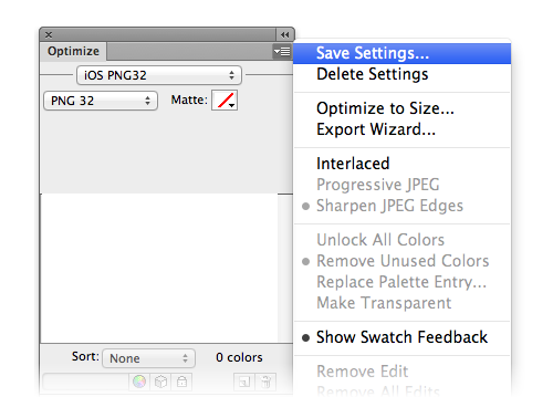
Create an export preset in the Optimize panel — I’ve called mine “iOS PNG32” (note that the preset you have created will be available anywhere in Fireworks where there is an optimization choice available: Optimize panel, Export Image Preview window, etc).
After these little preparations, it’s time to copy all the graphics you want to export from your original document to the newly created document. Arrange all of the graphics on a simple grid, keeping in mind that they should not overlap. Then set your document’s background color temporarily to grey to make sure you can see if any live filters (such as a subtle glow) are overlapping with others. Now you can use the Slice tool to create all the slices you want to export.
Useful tip: When you need to create a lot of slices, creating them manually can become a time-intensive process. To generate all slices in a single pass, select all elements in your design, right-click and use the "Insert Rectangular Slice" option — Fireworks will ask you if you want to create a single slice or multiple slices for the selected elements. Just select "Multiple" and enjoy the time you are saving!
Make use of your created export preset for each slice and name your slices properly, since these will be the file names after export is completed. You can rename each of your slices in the Layers panel or in the Property Inspector panel. After you’ve prepared your 2x document, save it. You should also scale it down using the techniques as described above, and save it as a normal resolution (1x) document.
Export time! For both image files (2x and 1x), go to File → Export, and choose “Images Only” here. Because we only want to export all of the created slices, select “Export Slices” and uncheck both of the other options (“Selected Slices Only” and “Include Areas without Slices”).
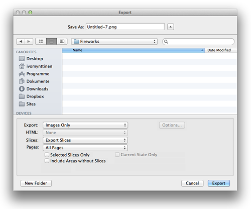
Export all your slices with one click!
These steps describing how to resize your designs should be applied to your new (down-scaled) document as well. In the end, you should have two separate image files: one with all 2x slices (included) and one with the normal resolution slices (1x).
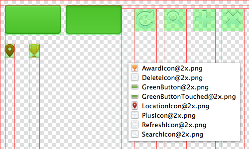
This document will export all included slices into a folder. (Hint: name your slices if you want specific filenames for the exported images.)
A Few Words About File Types And Image Compression
Apple recommends that you use the PNG file format for any images used in iOS applications. PNGs are lossless, and I would recommend them for nearly any implementation into apps (or websites). However, when you’re going to display huge images (such as high-resolution photos) it might be a good idea to use JPG files instead.
When working on website designs, it’s really important to reduce the file size of your exported images. In general, designers use tools such as ImageOptim or Web services to radically reduce the size of images. However, in the case of iOS Apps, image compression is not important since Xcode will modify PNGs (by swapping the red, green and blue bytes) and will undo any previous compression applied.
Examples Of iOS Designs Made with Adobe Fireworks
Finally, I would like to share a few examples of iOS designs, made with Fireworks. Some are mine, and some are by other designers who use Fireworks extensively. I hope that they can inspire you!
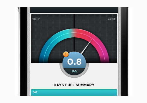
Graph design by David Perel
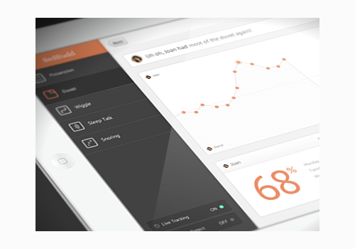
Huh 2 by Pete Lacey
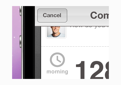
iPhone Button Polish by Anthony Lagoon
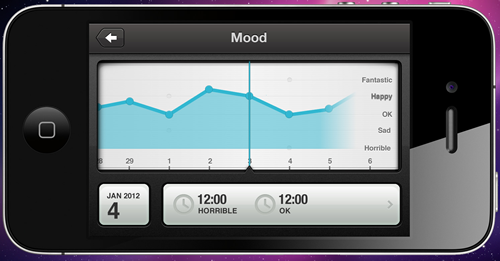
iOS Trend Chart by Anthony Lagoon
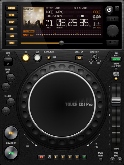
UI Touch CDJ Pro by Gianluca Divisi
![]()
Nikon iOS icon by Gianluca Divisi
Conclusion
Hopefully my personal experience with designing iOS apps with Adobe Fireworks (as well as the tips and tricks that I shared) may help you with future projects, as well.
If you have any more useful hints about how to improve the iOS design workflow, please let me know in the comments!
Further Resources
- “Refining Your Design In Adobe Fireworks,” by Benjamin De Cock
- “Clarification on Apple PPI,” by Marc Edwards
- “How to achieve pixel perfection in your designs with Adobe Fireworks,” by Ivo Mynttinen
- “10 tips to create perfect visual assets for iOS and Android,” by Matthijs Collard
- “Get Started Writing iOS Apps With RubyMotion,” Clay Allsopp
- “Designing for iPhone 4 Retina Display: Techniques and Workflow,” Marc Edwards
- “Simulating The Letterpress: From Live Filters In Fireworks To CSS Code,” Jose Olarte
Further Reading
- Sketch, Illustrator or Fireworks?
- Switching From Adobe Fireworks To Sketch: Ten Tips And Tricks
- The Present And Future Of Adobe Fireworks
- The Power of Adobe Fireworks: What Can You Achieve With It?


 Agent Ready is the new Headless
 SurveyJS: White-Label Survey Solution for Your JS App


