The “Other” Interface: Atomic Design With Sass
As front-end developers and designers, we’re constantly refining two interfaces simultaneously: one for visitors who load the website, the other for developers who have to tackle the code in the future, when adjustments or full-scale redesigns must be made. Yet we tend to assign the role of “user” to the first group, often forgetting that the code we write must work for developers in a similar way. We shouldn’t forget that developers are users, too.
If this is the case, then our convention for naming and organizing files is critical if we are to ensure active (and efficient) development in the future. But do we really design the partials, files and directories that make up this interface with a particular set of users in mind, with a set of clear goals, combined with precise, well-defined documentation? I don’t think we do.
Recently, I’ve been working on many different projects, each wildly different from each other. And the various problems I’ve faced while switching between the projects has made me wonder how we can drastically improve front-end accessibility.
We Need To Follow Atomic Design Principles In Our Style Sheets
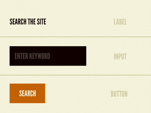
Last month, in a post titled “Atomic Design,” Brad Frost argued that Web development could be improved. He suggested to developers that, instead of coding a form as a component that is reused throughout a website, they could style small modules — such as a placeholder, input field and text field — and then create each form by combining these chunks together. This process could be duplicated for navigational items, text with icons, floated objects and pretty much any other sort of front-end module that needs to be reused regularly.
"Atomic design gives us the ability to traverse from abstract to concrete. Because of this, we can create systems that promote consistency and scalability while simultaneously showing things in their final context. And by assembling rather than deconstructing, we’re crafting a system right out of the gate instead of cherry picking patterns after the fact."
The theory is that by employing these distinct elements, a developer can speed up their workflow and write code more efficiently because they’re not forced to repeat themselves. This much appears to be common sense. Essentially, what Brad calls for is object-oriented design, which has been discussed in numerous articles and blog posts recently. That isn’t really what interested me about the idea, though — it was the naming convention that Brad chose.
He uses scientific terms to quickly describe what sections of a design should do; “atoms” are the discrete chunks (placeholders, labels, etc.), while “molecules” are combinations of these standard atoms. The simplicity here grabbed my attention, because ultimately what we’re discussing isn’t just a process for design, but also a distinction to be made in the user interface, as I mentioned earlier.
Problems With The Front-End Interface
Before we retroactively squeeze some of Brad’s ideas into our current workflow, we have to figure out precisely which problems need to be solved. So, as I switched between my projects, I started to take note of the flaws that appeared to be wasting much of my time. By the end, I counted three main problems that affect the developer’s workflow:
1. Finding Code Should Be Easy
Although I had written some components with Sass early on in a project, I found that towards the end, I was simply incapable of remembering where in the stack I needed to make adjustments. This forced me to try to memorize where each block of code was and had me scurrying around, completely lost, even with the advanced search features of a great text editor.
Developers are probably quite familiar with Sass files, which contain thousands of lines of code. The legacy Ultimate Package, a tool that we used as a boilerplate for all of our front-end code at Erskine, also contained that unfortunate mistake. The main problem with keeping all of this code in one place and not breaking the files into smaller parts is that you’re likely to forget where a particular section of code is. This eventually wastes the developer’s time and could slow down the project considerably.
Of course, these problems become infinitely worse when you must navigate someone else’s project or an entirely unfamiliar code base.
2. Figuring Out The Relationships Between Modules Should Be Straightforward
Whenever I try to add a component to an old website, I have to figure out the mental model of the relationships between elements. I have to wonder how removing a portion of the website would affect another totally unrelated thing elsewhere. This could be a background color or margins or padding or even the order of elements in a module (such as an image in a comments section combined with text from the same object).
Nicole Sullivan mentions in her fantastic talk at Webstock that these elements can become so interwoven with one another that they pose hurdles down the road. This problem often forces me to move from the text editor to the Web inspector and manipulate elements by hand in order to get an idea of how things work together, and then move back to the editor to make the fix.
This is unnecessarily slow and cumbersome. With atomic design, we would know precisely how one element affects another; we wouldn’t have to worry about editing components, or even adding new ones.
3. Websites Need Tailor-Made Components
Sometimes a design requires a component that is never reused, a sort of one-of-a-kind embellishment that sparks interest or delight in the user in some way. If it were repeated, it would become boring or, worse, repellant. Ideally, a new organizational system would allow for the sort of design components that Allen Tan describes in his article “Made to Measure”:
"Design is about establishing a set of relationships between elements. By codifying these relationships as a set of principles instead of a single, stand-alone template, we make it possible for other designers to extend our work (per article) while remaining faithful to its core ideas."
Yet we know that these minute design variations can quickly turn into a royal pain. Having to maintain all of these various fluctuations of commonly used structures would turn most projects into very hostile coding environments.
Of course, if we used some of this atomic design thinking, we wouldn’t have to worry about unnecessary code bloat when we add a fancy banner or an alternative text style to a figure. Hopefully, it would encourage us to scope components of the code base so that another user could easily identify which objects are global and which are specific to a single template or module.
What we need to do here is group components according to the sort of effect they might have on the entire system. Atomic design to the rescue!
The System
Last month, I stumbled upon the wonderful Inuit.css framework, which is probably the best place to start learning if you’re unfamiliar with modular design in Sass. After a few moments of playing around, I saw that this is a phenomenal step forward for developers and designers alike. It employs BEM’s syntax, object-oriented CSS (OOCSS) and many aspects of atomic design, which all might seem a little overwhelming at first but is definitely worth going through because you’ll likely see the advantages soon enough.
The problem I had with Inuit.css was with its naming conventions. What was contained in the base, generic and object directories wasn’t entirely obvious. These relationships should be obvious and immediate; developers shouldn’t have to read hundreds of lines of code and tediously experiment in order to be able to fix a bug or add a feature.
So, I decided to fork my own version and combine these atomic design ideas with the principles of BEM and OOCSS from Inuit. I’ll describe this alternative convention here. Now that we’ve discussed some of the key problems, we can look at how atomic design can help us.
The Control Panel
First, it’s worth mentioning that we’ll have a style sheet that imports all of the Sass partials we’re about to make. Think of this as our control panel, because in the future we won’t want to write all of our code from scratch; for most projects, we’ll just want to set things up quickly and turn an object on or off. All of the partials will be compiled to this file before we convert it to plain old CSS and serve it up to our website. So far, so good.
Utilities
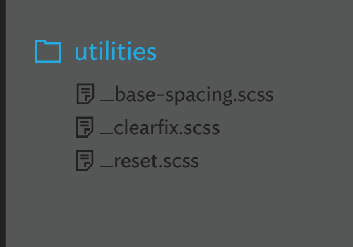
Atomic design encourages us to first think as vaguely as possible, and then to focus our energy on the smallest pieces later. This means that we need a set of system-wide styles to begin; this directory of Sass files will need to define the foundation; effectively, what’s required is a set of utilities that make up the basic plumbing of the website. This directory of partials is also important because we’ll need to define global classes, mixins and styles that can be used anywhere and at any time. Our utilities directory might look something like this:
The code in our reset, clearfix and base-spacing partials have a global impact, changing almost every page, template, element and module. By scoping our code in this way, we can easily find these partials later and hide them when our focus is needed elsewhere.
Quarks
Next up, we ought to define the basic building blocks of the website, including paragraphs, tables, images and links. Be careful here: We need to slowly build up to the complexity that is required so that we don’t step on our own toes later. At this stage, we should still be thinking globally and not styling for any particular section of the design.
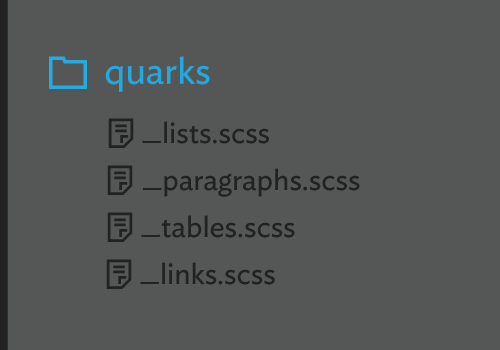
Therefore, this next directory should focus only on default HTML elements. I’ve started to call these components quarks — classless objects that, within the files themselves, contain nothing more than a few elements:
Note that these files contain only the default styles for these elements, not modified elements. For example, if we have a table that looks and works entirely differently from the default tables used throughout the website, it would not be a quark.
This system might look like overkill at this point. Why do we need a separate partial to style almost every default element individually? My argument is that if we were to combine all of these small pieces together, we would make the files less readable, especially on a large website. Having a substantial number of partials is fine, as long as they’re easy to find and organized properly.
Quarks are also helpful when we set up a style guide or an elements template page that lists the various default components of a project.
Atoms
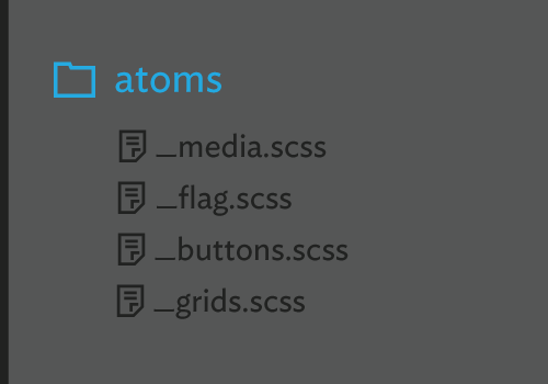
Now we need to start thinking about the relationships between these quarks, and so we start to introduce aspects of BEM and OOCSS. In this system, I’ve called these modules “atoms” — universal abstractions, such as the media or flag object. For example, we might include a partial that sets the default style for buttons, so that we can plan for those styles to be extended and built upon:
The styles in an atom should almost never be attached to an HTML element itself; we might not be able to guarantee what the markup will look like in the future. Specifying a class instead is always safer.
In this way, atoms will save us from writing hundreds of lines of code and keep things relatively abstract. Just as Brad suggests, this concept is powerful because atoms can be combined to form more complicated structures.
Molecules
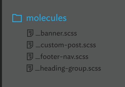
As I mentioned earlier, sometimes we need one-off structures, such as a banner or navigation element or footer, that we don’t intend to replicate. This is where we can combine multiple quarks and atoms, without interfering with any of our global styles:
A molecule can take advantage of an atom for layout (such as the heading-group molecule, which might manipulate the styles of the heading quark, which lists the styles for h1, h2 etc.). But then, within this molecule, we can extend, modify and combine other styles and modules.
So, while atoms and quarks define rigid and clear rules for the system overall, and utilities provide the outlining structural styles necessary to keep things tidy, the molecules are where the design can be more flexible and extend styles out from those central tenets of the system.
As you can see, quarks, atoms and molecules break up those monster Sass files that I mentioned earlier and make code faster to read and easier to maintain in the long run.
We Need To Revise Our Current Best Practices
Although the system outlined here is pretty rigid, these are not die-hard rules. This is not the only way to organize styles with Sass, and I’m not arguing that it’s a panacea for our front-end woes. I’m simply proposing that we take a good look at the developer interface and try to make things better for everyone.
This system could even be based on another kind of taxonomy or categorization, completely unrelated to biology or chemistry. But, as you can see, this is more than just a goofy way to name files and directories — rather, it suggests the kinds of relationships between these independent components. Thanks to this system, our code should be much faster to read and organize and, alongside detailed instructions and documentation, enable another Web developer to be up and running in minutes.
In the past, directories and file names were often poorly designed navigational tools. But if we think long enough about the other interface (the one for developers) and about alternative frameworks and helpful tools to make our code base more human-readable, then we can finally put some of these problems to rest and worry about other more elusive issues.
Relevant Talks
- “Breaking Good Habits,” Harry Roberts, Front-Trends 2012
- “Atomic Design,” Brad Frost, Beyond Tellerand 2013
- “CSS Tools for Massive Websites,” Nicole Sullivan, Webstock 2011
Further Reading
- Extending In Sass Without Creating A Mess
- An Introduction To Object Oriented CSS (OOCSS)
- Getting Started With CSS calc()
- Smarter Grids With Sass And Susy


 Devs love Storyblok - Learn why!
 JavaScript Form Builder — Create JSON-driven forms without coding.
 Register For Free