Smashing Book #4: Behind The Scenes
If you’re a graphic designer, you will often have to work with off-the-shelf material created by others — for instance, combining ready-to-use fonts with images from a photographer or stock website. Also, you’ll often have to follow the branding already developed by someone else. It’s OK; it’s a part of the job, and you shouldn’t be bothered by it.
But the part of a project that almost every graphic designer likes and is proud of the most is something that you can do from scratch, something that you have control over and can sign off on confidently: illustration. It’s why I love illustration projects so much. You can show your individuality in every detail and create every stroke of the artwork, trusting your vision and fully exercising your skills.
Given this love of mine, it’s no surprise that I took on illustration duties for the Smashing Book #4 without hesitation, despite it being quite a large and lengthy project (20 illustrations). I pulled myself together and started working, promising to myself that no matter how hard it turned out to be, I would find the time and internal resources to complete the project.
I’m very keen on the traditional way of drawing — by hand, using paper, pencil, watercolors and so on. Of course, I’m not against using computers when necessary — especially nowadays, when we have drawing tablets and pens and all of that other digital stuff that mimics hand-drawn work. But it seems to me that there is still no substitute for the charm of a well thought out and elaborate handmade drawing.
My process for transforming illustrations into vector files is a little complicated and sometimes long, but it’s the only way to capture my drawings down to the smallest details. Retracing every line of the illustration as a curve using the Pen tool (in Adobe Illustrator, in my case), I am able to really feel every line and make the drawing as close to perfect as possible.
I began each of the 20 illustrations with many ugly sketches, trying to grab hold of an idea. I’m not able to think first and draw after. The two processes are one for me: I draw while thinking. I’ll waste piles of paper and use any surface at hand to capture an idea that suddenly comes to me. Reviewing the sketches now, I’m intrigued by the evolution of the ideas and the birth of the characters.
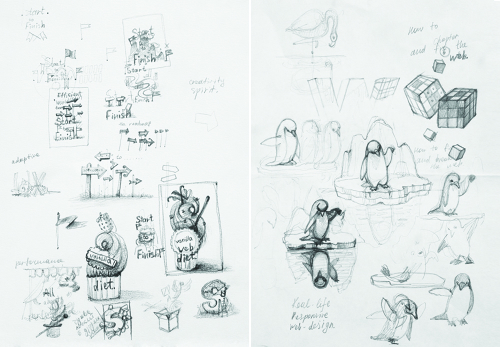
Looking for ideas. (View large version)
The evolution of a character from start to finish. (View large version)
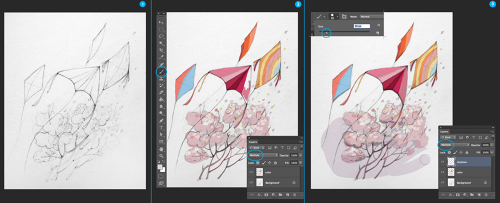
Then, I made detailed drawings in pencil, which became the prototypes of the vector images. The more developed the drawing, the easier it was to create a vector image. When the pencil drawings were ready, I scanned or photographed them, and then painted with the usual brushes in Photoshop. These were the prototypes that I submitted for approval.
To color the sketches, I’ll choose one of the basic brushes with a sharp edge and just paint over the scanned image on a new layer. “Multiply” mode is on for this layer to make the texture of the drawing visible. Then, I’ll create one more layer for shadows (with “Multiply” mode enabled again).
Adding color to the sketch. (View large version)
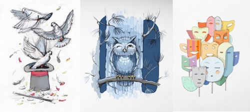
This is a fast and easy way to estimate the color spectrum of the final illustrations (I’ll sometimes do several color sketches). I sent the colored sketches to the Smashing team for approval of the direction and concept of the illustrations.
The colored sketches retain a kind of watercolor effect. I love that this quality can be achieved so easily.
The colored sketches. (View large version)
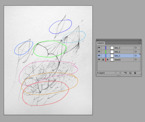
Once the sketches are approved, I start the most important part of the work. I paste each scanned pencil drawing into an Illustrator file and trace it. I’ll put the pencilled prototype on the bottom layer and lock it. Then, I’ll look at my illustration carefully and divide it in my mind into several areas, creating a separate layer for each area. Working with layers is very convenient if the image is complicated and has many small details.
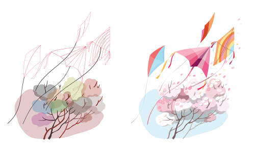
You can lock or hide layers that you are not working on to focus on the areas that you are. From the screenshot below, it is obvious that every kite will have layers and that the background will have several layers. I also separated each animal into different layers; for example, one layer for the body, one for the head (usually including the eyes and nose) and one for the limbs (legs, wings and so on).
Creating separate layers. (View large version)
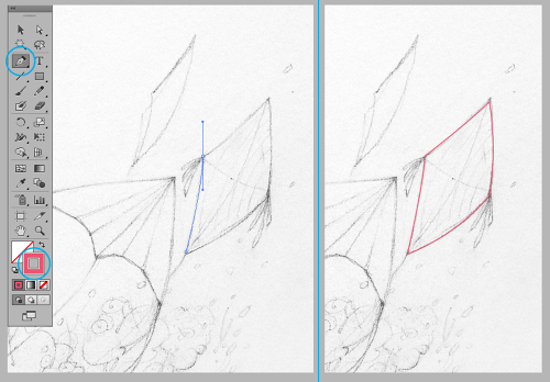
There is no trick to tracing an image by hand. Just take the Pen tool  and trace the contours of the sketch. I usually choose a bright color to mark off the contours well. The process is boring, but once you’re skilled at it, it doesn’t take much time. It can almost be meditative, sitting and calmly tracing element after element as your thoughts drift away.
The outlining process. (View large version)
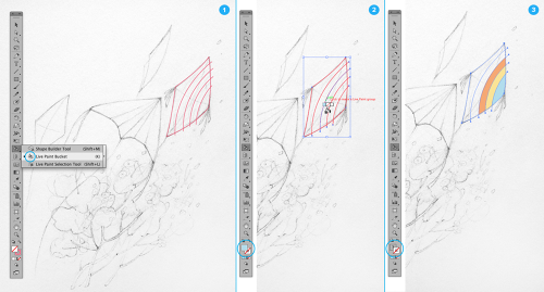
I’ll usually use the Live Paint Bucket tool to divide a shape into several color areas. I draw lines that will be the borders between colors, and then select the group of shapes and enable the Live Paint Bucket tool  . By clicking on each shape with the tool, I can assign a unique color to it. By the way, if you use colors from the swatches, you can find the appropriate tool by clicking the left and right arrows.
Using the Live Paint Bucket tool. (View large version)
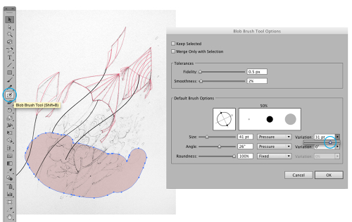
If an element of the illustration doesn’t have a defined shape and needs a bit of improvisation, then I’ll use the Blob brush  . Working with this brush on a drawing tablet is a real pleasure.
You can configure the settings of the Blob brush by double-clicking in the Tools panel. I’ll usually set it to the biggest brush to make the pressure of the pen as sensitive as possible. With several assured brush strokes, I’ll draw the background and the bushes, using random colors according to my feeling and then choosing more appropriate colors later. I’ll also draw the branches of the bushes with the Blob brush. If I need to correct the shape, I’ll usually use the Erase tool.
Using the Blob Brush tool. (View large version)
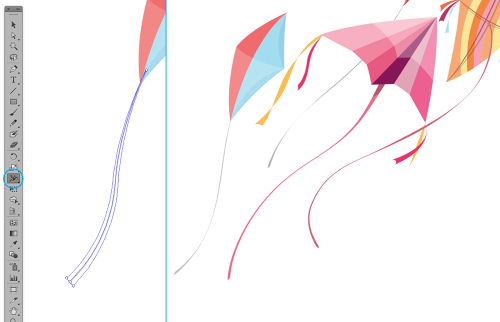
Here’s a tip if you ever have to transform a regular line into a ribbon flapping in the wind. I’ll use the Width tool  to make the stroke weight variable. Using this tool, select the dot on the line where the stroke weight is to be changed, and drag the auxiliary lines until the ribbon looks the way you want.
Creating a ribbon from a line with the Width tool. (View large version)
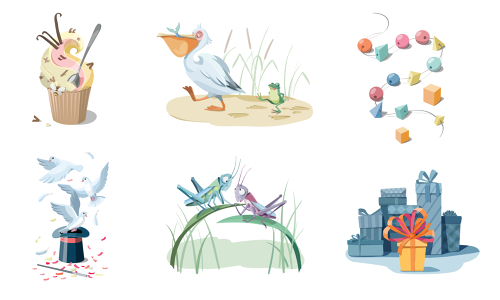
Now, the image is ready for coloring. Yes, it looks weird without colors. But you need just a few minutes to fill in the shapes and get the image close to being complete. To complete the kite image, I added some small flowers on the bushes with petals flying up into the wind (using the Blob brush). I also added shadows using Multiply mode.
The outlined and finished illustrations. (View large version)
The technical work was not the hardest part for me. I’ll often spend much more time on sketching and developing the ideas. Now that the Smashing Book #4 is complete, I can say that the most difficult part was devising a “plot” for each chapter title. When I got the plan for the book and read the titles, I was at a loss.
Some of the titles are quite conceptual, suggesting obvious metaphors. But others are concrete and related to code, and those were hard to illustrate (especially with cute animals). When my imagination gave up, the guys from the Smashing team were ready to pitch in some inspiring ideas. So, this creative project was genuinely collaborate, and I think we were on the same wavelength.
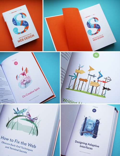
So, enjoy the Smashing Book #4. It contains so much useful stuff. (Believe me, I know.)
Further Reading
- Life Is Too Short For A Broken Front-End - A New Smashing Book
- Smashing Book #4 — New Perspectives on Web Design (eBook)
- How To Boost Your Design Workflow With Setapp
- Is The Internet Killing Creativity?


 Agent Ready is the new Headless

 SurveyJS: White-Label Survey Solution for Your JS App


