Building The Web App For Unicef’s Tap Campaign: A Case Study
Since a smartphone landed in almost everyone’s pocket, developers have been faced with the question of whether to go with a mobile website or a native app. Native applications offer the smoothest and most feature-rich user experience in almost every case. They have direct access to the GPU, making layer compositions and pixel movements buttery-smooth.
Native applications also provide native UI frameworks that end users are familiar with, and they take care of the low-level aspects of UI development that developers don’t have time to deal with. When eschewing an app in favor of a mobile website, developers often sacrifice user experience, deep native integration and a complex UI in favor of SEO and accessibility.
But now that JavaScript rendering engines are improving immensely and GPU-accelerated canvas and CSS animations are becoming widely supported, we can start to consider mobile websites a primary use case.
Unicef’s latest campaign, Tap, presented us with the challenge of combining the accessibility of a mobile website with the native capabilities, UI and overall experience that someone would expect of a native app. Our friends at Droga5 came to us with a brief to create a mobile experience that tracks how long a user avoids using their phone.
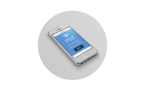 \ Unicef’s 2014 Tap campaign was initially launched to fight the world water crisis.
For every 10 minutes that a user gives up their phone, a sponsor would donate a day’s worth of water to children in the developing world. While the user patiently waits, they are presented with real-time and location-based statistics of other users who are sacrificing their precious phone time.
We’ll discuss a few of the biggest challenges here: detecting user activity, achieving performant animations, and building an API integrated with Google Analytics.
Detecting User Activity
Detecting user activity through a mobile browser was an interesting challenge and involved a lot of research, testing and normalization across all types of phones. The slightest differences and inaccuracies between phones became suddenly apparent. To explain the process, we’ll break it down into three categories: user movement, user exiting, and device-sleep prevention.
User Movement
One core piece of functionality is detecting any movement by the user. Fortunately, most mobile browsers today have access to the built-in gyroscope and accelerometer via JavaScript’s DeviceOrientation event. The unfortunate exception is devices running Android 2.3 (Gingerbread), which at the time of writing has roughly a 20% market share. In the end, the project was not worth abandoning due to one version of Android, so we pushed on. This decision proved to be even better than we thought because most devices that run version 2.3 are old, which means less memory, a slower CPU and aging hardware.
To detect movement, we first have to detect an “idle” position. We instruct the user to set their phone down, while we check the readings on the x and y axis. We start a timer with a setInterval, and if that position’s values remain within a 6° range for a few seconds, then we save those values as the device’s idle position. (If the user moves, then we restart the timer again until the phone does not move for a few seconds.) From there, we listen for the DeviceOrientation event and compare the new position’s values to the idle values. If there is a difference, then we fire off a custom user_move event.
The concept was simple to implement, but we found that most devices fluctuate by a couple of degrees when lying still. The sensitivity to movement is quite high, so we first had to determine a threshold above which we could be confident that the user has intentionally moved their device. After some trial and error, we decided on a 12° range of difference (+ and -) from the idle position, on both the x and y axis. If any movement occurs outside of that range, we assume it to be deliberate. Thus, users can bump their phone slightly with no consequence.
this.devOrientHandlerProxy = $.proxy(this.devOrientHandler, this);
window.addEventListener('deviceorientation', this.devOrientHandlerProxy, false);

MovementDetector.prototype.devOrientHandler = function(event) {
   var curr_x = Math.floor(event.beta);
   var curr_y = Math.floor(event.gamma);
   var curr_z = Math.floor(event.alpha);

   var didMove = this.calcMovement(curr_x, curr_y, curr_z, this.movement_threshold);

   if(didMove) {
      this.announceMovement();
   }
}

MovementDetector.prototype.calcMovement = function(new_x, new_y, new_z, threshold) {
   var x_diff = Math.abs(this.x_idle_pos - new_x);
   var y_diff = Math.abs(this.y_idle_pos - new_y);
   var z_diff = Math.abs(this.z_idle_pos - new_z);
   z_diff = z_diff > 180 ? 360 - z_diff : z_diff;

   return x_diff > threshold || y_diff > threshold || z_diff > threshold;
}
As you can see in the first four lines of the calcMovement method, we are obtaining the difference between the idle position and the new position. Because the difference in values could be negative, we make sure to get the absolute value (Math.abs(val)). You’ll notice that the z_diff formula is a bit different. Because the value for z_diff is between 0 and 359, we have to take the absolute difference and then check to see whether the difference is above 130; if so, then we need to subtract that difference from 360.
This gives us the shortest distance between the two points. For example, if the device moves from 359 to 10, then the shortest distance would be 11. Finally, we check to see whether any of those three values (x_diff, y_diff, or z_diff) are greater than the threshold; if so, then we announce a user_move event.
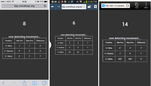
Movement detection on iOS and Android (Samsung Galaxy S3 and HTC One). (View large version)
We had to test extensively across both Android and iOS devices. iOS was straightforward, whereas we found subtle differences between Android versions and manufacturers, especially with the stock browser. Certain devices would jump dramatically between values on the z-axis. Thus, we decided not to consider any movement on the z-axis in our detection — meaning that users could slide a phone laterally on a tabletop with no consequence.
User Exiting
Another action that we wanted to detect was the user exiting the browser, to signal their intention to end the experience. We had to listen for a couple of events via the PageHide and PageVisibility API. (PageHide or PageVisibility is available in Android only in later versions — in the stock browser in version 4.3+, and in Chrome 4+. iOS 6 has PageHide, and iOS 7 has PageVisibility.)
We knew we couldn’t detect across the board, but we felt that implementing it for browsers that support it would be worthwhile. The following matrix shows which mobile browsers support PageHide and PageVisibility:
| Devices | PageHide event | PageVisibility API |
| iOS 6.0 Safari | ✔ | ✖ |
| iOS 7.0 Safari | ✔ | ✔ |
| iOS 6.0 Chrome | ✖ | ✖ |
| iOS 7.0 Chrome | ✖ | ✔ |
| Android 2.3 — 4.2 stock browser | ✖ | ✖ |
| Android 4.3 stock browser | ✔ | ✖ |
| Android 4.4 stock browser | ✔ | ✔ |
| Android 4.0+ Chrome | ✔ | ✔ |
Sleep Prevention
Keeping the device awake was the final core piece of functionality that we needed to detect user activity. This was crucial because the idea of the campaign is for users to stay away for as long as they possibly can. By default, all phones enter sleep mode after a few minutes. Some phones can be manually set to never sleep, or the user could keep it plugged in, but we could not rely on either of those options.
We had to think of interesting workarounds. iOS and Android had to be treated differently.
For iOS 6 devices, we make use of HTML5 audio and load a silent MP3 file asynchronously that loops endlessly during game play. We simply added the loop attribute, set to true, to our <source> element. For Android devices, we piggyback on what we do for iOS 6. However, Android’s display turns off after a few minutes even when an audio file is playing. Fortunately, unlike iOS, Android allows for inline video.
So, we run the same createMedia loop method shown above, but this time loading a 10-minute silent video with the <video> element, placed outside of the viewport. We found that the loop attribute doesn’t always work with inline video across Android devices, so we use HTML5’s media ended event instead. By looping a hidden video, we are able to keep Android devices from going to sleep.
Here is some sample code:
//for iOS 6
var media_type = 'audio';
var media_file = 'silence.mp3';

//for Android
var media_type = 'video';
var media_file = 'silence.mp4';

ExampleClass.prototype.createMediaLoop = function(media_type, media_file) {
   this.mediaEl = document.createElement(media_type);
   this.mediaEl.className = 'mediaLoop';
   this.mediaEl.setAttribute('preload', 'auto');

   var mediaSource = document.createElement('source');
   mediaSource.src = media_file;

   switch(media_type) {
      case 'audio':
      //create an audio element in iOS 6
      //and play a silent MP3 file
      this.mediaEl.loop = true;
      mediaSource.setAttribute('type', 'audio/mpeg');
      break;
      case 'video':
      //create a video element for Android devices
      //and play a silent video file
      mediaSource.setAttribute('type', 'video/mp4');
      var _self = this;

      this.mediaEl.addEventListener('ended', function() {
          _self.mediaEl.currentTime = 0;
          _self.mediaEl.play();
      }, false);
      break;
   }

   this.mediaEl.appendChild(mediaSource);
   document.body.appendChild(this.mediaEl);
   this.mediaEl.volume = 0;
   this.start();
}
iOS 7 is much easier. Thanks to a UI update in the browser, the address bar always remains on screen, unlike in iOS 6. So, we call an update to the browser’s URL, running the method every 20 seconds, thus preventing sleep mode.
setInterval(function(){
   window.location.href = 'tap.unicefusa.org';
   setTimeout(function(){
      window.stop();
   },0);
}, 2e4);
We cannot use this method for iOS 6 because the user would notice the address bar slide into the view and then slide back out.
Animations
Animations are important in reinforcing the theme of water and making the experience fun. Whether we were creating a water-ripple effect, bubbles or waves, we isolated each animation and programmed different approaches to achieve the best result. Knowing that we had to do this for a slew of browsers by various manufacturers, we took the following into consideration:
- Performance
Do frames get dropped when testing against supported devices? How does GPU rendering compare to CPU rendering? - Value added
How much does the animation really add to the experience? Could we conceivably drop it? - Loading size
How much does the animation add to the website’s overall load? Does it require a library? - Compatibility with iOS 6+ and Android 4+
Does it require complex fallbacks?
Bubbles
Let’s first look at bubbles, which animate from bottom to top. The design called for floating bubbles, whose size, focus and opacity would provide a sense of depth within the environment. We decided to test a few approaches, but these are the main two we were curious about:
- Animating DOM elements using hardware-accelerated CSS 3-D transforms (
transform: translate3d(x, y, z)); - Rendering all circles on a 2-D canvas element.
Note: Animating via the top/left properties is not an option due to the lack of subpixel rendering and the long time to paint each frame. Paul Irish has written more about this.

We tested several approaches to find the best method to animate the bubbles.
We pulled off the canvas method by creating two transparent canvases: one on top of the content and one below. We create our bubbles as objects with randomized properties in memory (diameter, speed, opacity, etc.). At each frame, we clear the canvas via context.clearRect(0, 0, width, height);, and then draw each bubble to the screen. To create a floating, bubble-like movement, we need to change each bubble’s x and y values in each frame. For the y-axis, we subtract a constant value in each frame: b.y = b.y - b.speed;.
In this case, we determine a unique speed for each bubble using (Math.random() / 2) + 0.1). For the x-axis, we need a smooth repetitive oscillation, which we can achieve by taking the sine value of its frame count: b.x = b.startX + Math.sin(count / b.amplitude) * 50;. You can view the extracted code.
The DOM-based implementation using CSS 3-D transforms follows a very similar method. The only big differences are that we dynamically create and insert DIV elements at the beginning and, using Modernizr, apply vendor-prefixed translate3d(x, y, z) properties on each animation frame. You can view the extracted code.
To optimize performance, we considered a canvas implementation because GPU acceleration has been enabled for the browsers we support (iOS 5 with its Nitro JavaScript, and Chrome for Android 4+); however, we noticed severe issues with aliasing and the frame rate on Android devices.
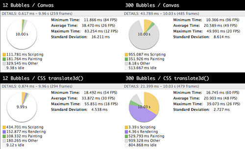
Timeline profiles using the canvas element and CSS 3-D transforms (View large version)
We also did some performance profiling in Chrome’s emulation mode on the desktop (better methods exist for doing more granular remote testing on a mobile device). The difference in results between the two was still interesting: A GPU-accelerated 2-D canvas showed better performance than GPU-accelerated CSS transforms, especially with a higher number of DOM elements, due to the rendering time for each one and the recalculation of styles.
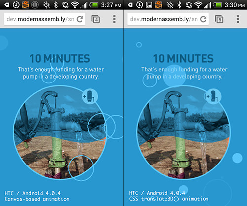
After carefully considering several techniques, we went with CSS 3-D transforms to animate the bubbles. (View large version)
In the end, we used CSS 3-D transforms. We only need to animate 16 bubbles at a time, and the CPU and GPU on supported devices collectively seem to handle the overhead just fine. The performance and anti-aliasing issues with canvas rendering on old Android devices were the determining factors. At the time of writing and in this particular case, canvas wasn’t an option for us, but browser vendors certainly are not ignoring it, and the latest rendering engines of mobile browsers have seen massive improvements.
Waves
We use wave animations throughout both the mobile and desktop experience — specifically, as a design detail to reinforce the water theme and as a transition to wash away old content and bring in new content. As with the bubbles, we explored using both canvas and CSS-based animations. And likewise, CSS animations were the way to go. A wave PNG costs us only 7 KB, and we get much better performance from mobile browsers across the board.
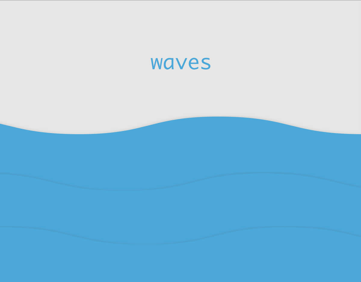
As with bubbles, we explored using both canvas and CSS-based animations.
Our isolated demo of the desktop implementation (which is similar to mobile) is really quite simple. Each wave is a background image set with background-repeat:repeat-x and a looping keyframe animation that moves left with linear easing. We make the speed of the waves in front slightly faster and the waves in the back slower to simulate depth. You can view the code, which uses Sass and Compass.
We also tried a very different vanilla JavaScript approach by creating a wave oscillation. We used a wave oscillator algorithm created by Ken Fyrstenberg Nilsen, adjusting it to suit our needs.

We abandoned the oscillation effect because of poor performance on old Android devices.
The effect turned out to be really nice and organic, but the performance was lacking on old Android devices, so we abandoned the approach altogether.
API
During gameplay, we wanted to provide some insightful facts and location-based statistics, as well as encourage users to keep playing. We used several APIs, combining them with scores from our database.
The back end is run off of the Laravel PHP framework and a few APIs. For location-based statistics, we could have asked the user for their location via HTML5 geolocation, but we wanted a more seamless experience and didn’t want to interrupt the user with a confirmation dialog box. We don’t need a precise location, so we opted for MaxMind’s GeoIP2 service. This service gives us enough data to get the user’s rough location, which we can combine with other services and data.
We also want people to know that they are a part of a bigger community, so we wanted to provide statistics based on website analytics. The obvious choice was to use Google Analytics’ new API, as well as its newer Real Time Reporting API.
Because we have access to different kinds of data, we are able to display facts that are relevant to the user. For example, a user in the US would get a statistic on how their state compares to other states in the country, according to Google Analytics. By using Google’s Real Time Reporting API, we see how many active users are on the website, and we display that to the user, illustrating other people’s participation. In our PHP code, we use Google Analytics for Laravel 4 which works great and handles a lot of code, making it much easier to get data back from Google Analytics’ API.
$ga_realtime_metric = 'ga:activeVisitors';
$ga_service = Analytics::getService();
$optParams = array('dimensions' => $this->ga_dimensions, 'sort' => '-'. $this->ga_realtime_metric);

$results = $ga_service->data_realtime->get([google profile id], $ga_realtime_metric, $optParams);
We also use GeoIP2’s service to record people’s times, to display the score of a particular city or state.
To prepare for spikes in traffic, to stay within each API’s rate limit (Google Analytics’ limit is 50,000 requests per project per day) and to optimize speed, we cache some data at 10-minute intervals. We cache certain other data, such as GeoIP2’s, even longer (every five days) because it doesn’t change that often.
Due to the ever-growing number of scores, the queries to retrieve certain statistics would take longer than is acceptable for each user. So, we set up a couple of CRON jobs to set these queries to run every 10 minutes, caching the updated statistics on the server.
When a user hits the website, an AJAX call to the server asks for the cached data, which is returned to the browser in a big JSON response. This increases loading times considerably and keeps us within the rate limit for each API that we use.
Conclusion
As mobile browsers continue to improve, offering new features and enhancing performance, new opportunities like this will arise. It’s always important to question whether you should build a native app or a Web app, and keep in mind the pros and cons of each, especially because the differences in their capabilities are narrowing rapidly.
Developing our Tap app for the Web not only was more affordable (with two Web developers working on a single code base, as opposed to a developer for each platform), but made it more accessible and easily shareable. We’ll never know, but we’re confident that we would not have reached 3.7 million website visits in the first month had we gone the native route. About 18% of those visits came from Safari in-app browsers — meaning that people had clicked on a link in their Facebook or Twitter feed and were taken directly into the experience. A native app would have seriously hampered that ability to share the experience or message quickly.
We hope this article has been helpful in illustrating both the thought process of Web versus native and the technical hurdles involved in building Tap. The project was really fun and challenging, it was for a good cause, and it introduced a unique mechanism for donating, one that we hope to see propagate and manifested in new and creative ways.
Other Ressources
- “This End Up,” Peter LePage
A great article aboutDeviceMotionandDeviceOrientationevents - “Using the Page Visibility API,” Mozilla Developer Network
- Reporting Developer Guides,” Google Developers
More information about Google Analytics’ APIs - “Quote Management,” from “Real Time Reporting API: Developer Guide,” Google Developers
- “Why Moving Elements With Translate() Is Better Than Pos:abs Top/left”, Paul Irish
Further Reading
- Touch Design For Mobile Interfaces: Defining Mobile Devices (Excerpt)
- WordPress Playground: From 5-Minute Install To Instant Spin-Up
- A High-Level Overview Of Large Language Model Concepts, Use Cases, And Tools
- Using CSCS Scripting Language For Cross-Platform Development


 Devs love Storyblok - Learn why!
 Get a Free Trial
 Register For Free
 Enterprise UX Masterclass, with Marko Dugonjic
 JavaScript Form Builder — Create JSON-driven forms without coding.

